Bottom line: Learn how to create this interactive chart where the data label metrics change based on a slicer.
Skill level: Advanced
I have written before about how I am NOT a big fan of stacked charts, and shared some alternatives to the stacked bar or column chart.
Basically, it's hard to make comparisons between the series in the bars because of the uneven baseline.
However, these types of charts are very popular and I am guilty of using them too. 🙂
But the stacked charts always seem to leave us with more questions…
- What is the grand total amount for the bar (sum of the series)?
- What is the percentage of total for each series (segment) in the bar?
- What is the percentage change from the prior period?
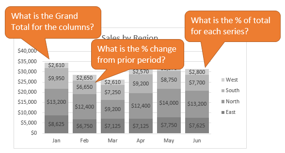
These are great questions that can help identify trends and the need to analyze the data further.
Dynamic Data Labels on the Stacked Chart
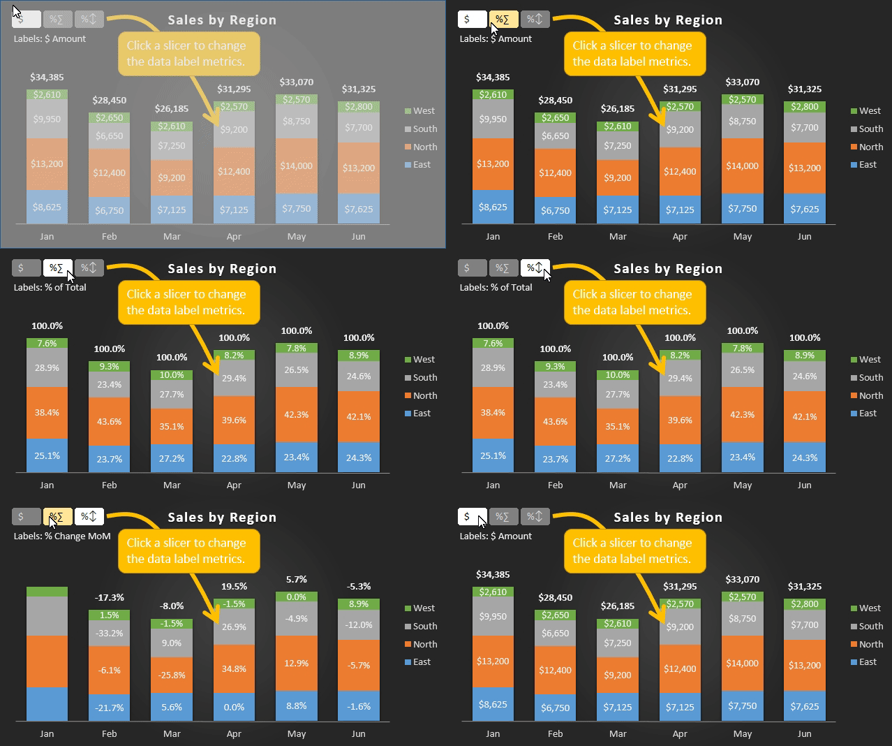
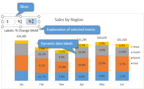
So this chart attempts to help answer some of those questions. It allows the user to change the data label metrics with a slicer.
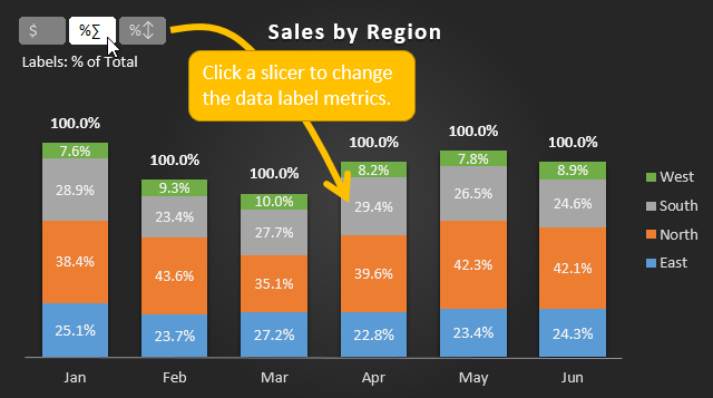
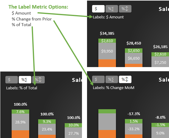
The user can then quickly see the amount, percentage of total, or percentage change for each series in each bar.
Of course you could put all these metrics in one label, but that typically leads to a very cluttered chart.
How to Create the Dynamic Chart Data Labels
Setting up the dynamic labels isn't too complex, but it does require a bit of labor.
So the ingredients for this chart are:
- The TEXT function
- The CHOOSE function
- One Pivot Table
- One Slicer
- One Column or Bar Chart (duh)
- Preferably Excel 2013 or 2016 for the “Value from Cells” label feature
In this article I will provide high level instructions on how to create this. You can download the file to follow along or modify for your own use.
Download the File
Download the example file to follow along.
Warning: This file works best in Excel 2013 or 2016 for Windows. It will work in 2007/2010 but you will have to reassign the labels using a method mentioned in step 5 below. It also works in 2016 for Mac, but not 2011.
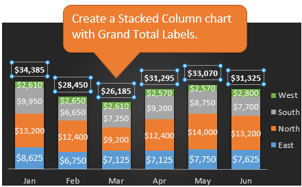
Step 1: Create the Stacked Chart with Totals
The first step is to create a regular stacked column chart with grand totals above the columns. Jon Peltier has an article that explains how to add the grand totals to the stacked column chart.
Step 2: Calculate the Label Metrics
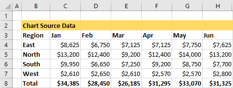
The source data for the stacked chart looks like the following. We will need to calculate the different metrics for the labels as well.
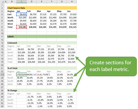
I created a section on the sheet for each metric: $Amount, % of Total, and %Change.
This is pretty easy and I won't go into the details of each calculation.
Step 3: Use the TEXT Function to Format the Labels
Typically a chart will display data labels based on the underlying source data for the chart. In Excel 2013 a new feature called “Value from Cells” was introduced. This feature allows us to specify the a range that we want to use for the labels.
Since our data labels will change between a currency ($) and percentage (%) formats, we need a way to also change the number formatting in the chart. Otherwise it will display a decimal number instead of percentage.
Fortunately we can use the TEXT function for this. The TEXT function allows you to feed it a value and specify the number format that you want to display that value in.
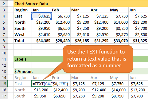
The TEXT function will actually return a text value to the cell, even though it looks like a number. So we can use this as the source of our data label and the chart will display the correct formatting.
Step 4: Use the CHOOSE Function to Determine Which Label to Display
We now have three sections that contain different metrics. Next we want to create one section that will contain the chart labels.
We will need to use some kind of lookup function to return the correct metric based on the slicer selection.
The CHOOSE function works great for this. CHOOSE allows us to specify an index number (1,2,3,…) and it will return a value based on the index number.
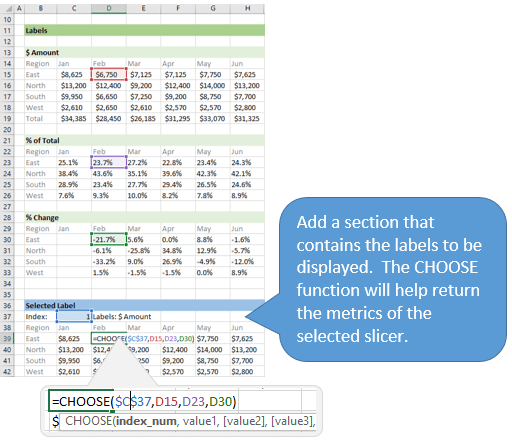
For now we will just add a cell that contains the index number, and point to the three metrics for each value in the CHOOSE formula. Eventually the slicer will control the index number.
Step 5: Setup the Data Labels
The next step is to change the data labels so they display the values in the cells that contain our CHOOSE formulas.
As I mentioned before, we can use the “Value from Cells” feature in Excel 2013 or 2016 to make this easier.
You basically need to select a label series, then press the Value from Cells button in the Format Data Labels menu. Then select the range that contains the metrics for that series.
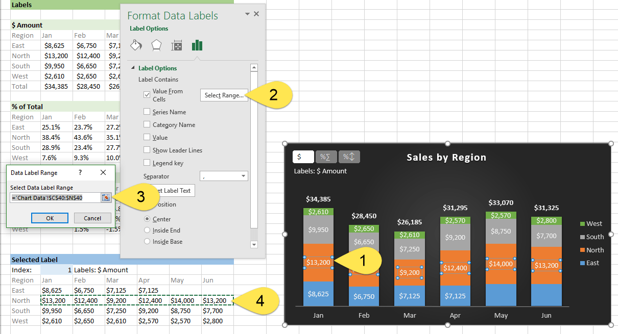
Repeat this step for each series in the chart.
If you are using Excel 2010 or earlier the chart will look like the following when you open the file.
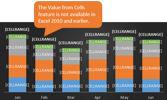
This is because Excel 2010 does not contain the Value from Cells feature. Jon Peltier has a great article with some workarounds for applying custom data labels. This includes using the XY Chart Labeler Add-in, which is a free download for Windows or Mac.
Step 6: Setup the Pivot Table and Slicer
The final step is to make the data labels interactive. We do this with a pivot table and slicer.
The source data for the pivot table is the Table on the left side in the image below. This table contains the three options for the different data labels.
It also includes the Index number that will be referenced in the CHOOSE formulas (step 4).
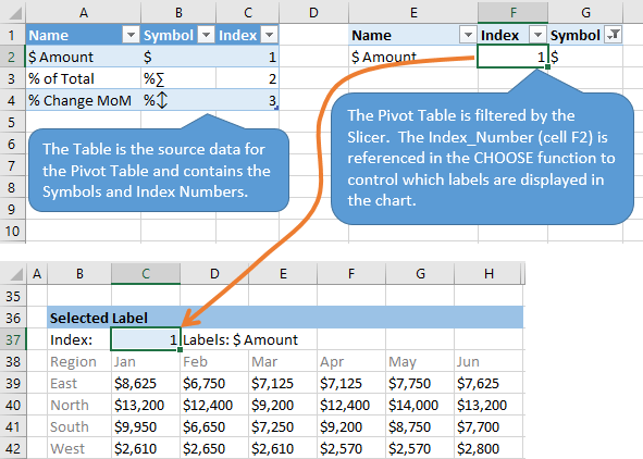
Add the Name, Index, and Symbol fields to the Rows area of the pivot table.
Then insert a slicer for the Symbol field. Checkout my free video series on pivot tables and dashboards to learn how to create a pivot table and add slicers.
The slicer can be formatted to match the theme of your chart. I also changed the Columns to 3 to show the slicer buttons horizontally.
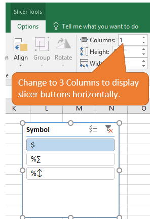
The last step is to reference the Index number in the pivot table (cell F2) in the Index Number of the CHOOSE formulas.
When the user selects a slicer button, cell F2 in the pivot table will display the index number of the selected item. The CHOOSE formulas will automatically return the label metric of the selected item.
Bring It All Together
There are a lot of steps that go into creating this interactive chart. Fortunately you can download the sample file and modify for your use.
The example below shows a lighter gradient color theme. You can move the slicer into the chart area and also add instructions so the user understands how it works.
What Other Metrics Can We Add?
There are a lot of possibilities with this technique. This could be applied to other chart types besides the stacked chart.
What other charts or label metrics would you use for this dynamic chart? Please leave a comment below with your suggestions or questions.


It is wonderful the work you are doing to benefit others! God bless.
Thanks Mauricio!
Thanks Jon for the wonderful case study [on the use of Excel]. The problem with the graph is that there is too much detail being presented – we need to show more imagination [in our case, economy] of what is shown. As a CFO, users of reports [senior management and directors] are struggling with the “rich charting environment” we are creating.
Keep up with your excellent articles.
Thanks John! I completely agree that the stacked charts can show way too much data. I have another article that explains alternatives to the stacked charts.
I probably should have shown this dynamic label technique on some other chart types. I think it can be used effectively with other charts as well.
Thanks again for the great feedback John! 🙂
Hi Jon Can you help me how to build a price elasticity graph
Hi Jon
Why when I try and hide the data columns and rows, the charts disappear?
I wanted to send the chart to my boss, but with the source data hidden
Hi Gerard,
You will need to change the formatting properties on the chart to “Don’t Move or Resize with Cells”. I explain that in detail at about the 9:00 mark of the video on this page about pivot tables and dashboards. I hope that helps.
Hi Jon
I am trying to use your spread sheet and add some extra rows, but I am failing miserably. Can I send you my spread sheet to see where I am going wrong?
Ged
Sure Ged. I can’t promise how quickly I will be able to look at it, but send it over. [email protected]
Hi There,
I have a question here.
Can we add a dropdown list of data validation to a Pivot Table which changes dynamically when a slicer connected to the Pivot changes the values?
Let me know if the question is clear or not..
Thanks,
Devika
Hi Devika,
I don’t think you can do that directly, but you could use another pivot table and add the field to the filters area to create the drop down. Checkout this article and video on how to add a search box to your slicers. The technique might be similar for what you are trying to accomplish. Thanks!
If I need on my graph not show columns with zero value…How I do it?…I have Jan, Feb, Mar, Apr with formula value (I mean with value) but rest of month with no value, but all month appear in graphs, I want not show this months.
Hi Carlos,
The chart source range needs to include the cells with zero values. If this is a pivotchart then you can change a setting in the Field settings to “Show items with no data.” I hope that helps. Thanks!
Dear Mr. Jon
I have a problem with showing values on the chart. I use the “Value from cells” option.
There is 50 series. It draws the lines correctly for every of 50 series but some values aren’t shown.
The mentioned worksheet also contains few VBA buttons (add row, remove row, clear table), 2 radio buttons and 2 Text Boxes.
When I manually recheck “Values from cell” option and after that press the “Reset Label Text” it becomes OK. But this works only for one selected series and I have 50 of them.
Also, next time I paste values in the table, it gone wrong again, but every time, some others values aren’t shown.
Is there any function or VBA code that refresh/update chart or data label text?
Thank you in your advice!
Milan
Hi Milan,
Great question! Yes, you can use VBA to loop through all the series and either assign the range for Value from cells, or reset the label text. I don’t have any articles on it yet, but this post from Stack Overflow has some solutions.
If you just want to hit the reset label text button for each series, then you should be able to loop through the series and set the DataLabel.AutoText property to true. Here is the MSDN help page on that property.
I hope that helps get you started. Thanks!
Wonderful work …really amazing…keep it up …God bless you..
Hi
I’ve gotten to step 6 and i’ve created the table on the left but i can’t get the pivot table to work.
With my pivot table i get it all under one column even though i have name symbol index in rows.
Anyone know how to get this to work like above?