Stacked bar or column charts are used a lot by the media and corporate world. I believe they are popular because they display a lot of information in one chart, and are relatively easy to create in Excel. However, I'm not a big fan. I'm going to explain why I consider them to be “bad charts”, and present some alternatives.
Bad Charts
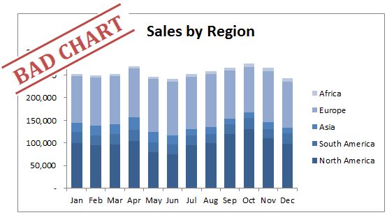
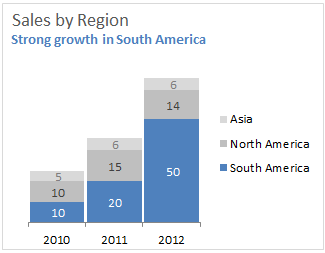
I consider the stacked column chart above to be a “bad chart” because it doesn't do a good job of displaying the trends in the data. There are a total of six data series displayed here; the five regions plus the total. But we are really only able to see trends in two of the six series. We can see trends in the North America and Total (height of entire column) series because the baseline for these series is flat. The baseline is basically the x-axis at $0. This is very important when creating a chart that is displaying a trend. Our eye is able to distinguish the baseline as the starting point for each column, and then compare the top point of each column moving from left to right. This works great for the North America and Total series, but it is very difficult to see the trends for the other four regions.
Uneven Baseline
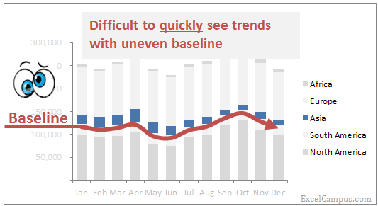
The image above shows the difficulty in quickly seeing the trend in sales for Asia because the baseline is uneven. I emphasize “quickly” because we want our chart to clearly and easily communicate a story or trend. It would probably be easier to just look at the actual numbers to see a trend versus trying to determine if the bars are increasing or decreasing in size over time. And these bars for Asia get hidden when you consider all the other regions that are also stacked above and below it. It's an absolute mess! 🙂
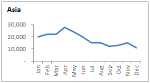
Here is a line chart that shows the actual trend for Asia. It's much easier to quickly see that sales are declining over the last three quarters of the year. This would probably draw attention to the performance of the region, and spark some action to be taken to correct the problem.
When to Use Stacked Charts
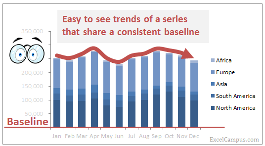
Stacked charts can work if there are drastic changes in your data over time, and you want to only display the trend of one or possibly two series. It's best to highlight these series in a color that stands out, and add some text to describe the trend. You also want to move the series to the bottom of the chart so it sits on the baseline, making it easy for the reader to see the trend.
Alternative 2 below also makes use of the stacked chart by giving it a dynamic baseline to quickly analyze trends.
Solutions
Now that we have an understanding of when NOT to use stacked charts, we can start thinking about alternative methods that clearly and quickly tell the story. The use of these will depend on what trends you find in your data, and how you want to convey the message.
Alternative #1: Panel Charts
Panel charts are a group of small charts organized together in a panel. This is a good way to break out each region into its own chart.
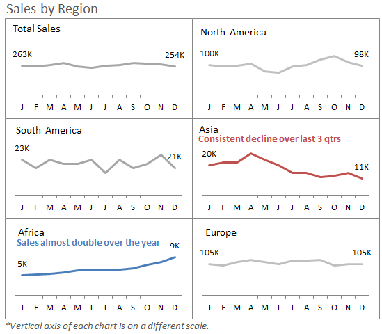
Now we can start to see trends within each region. These trends are not possible to see in the stacked chart because of the uneven baselines, and scale of the chart. Sales in North America and Europe are much greater than Asia and Africa, so the trends get lost. There are some important trends getting lost if you don't look at them closely. You can highlight those trends in a panel chart as I did above. We can see that sales in Asia are declining, while sales in Africa have almost doubled over the year. The dollars are small compared to total sales, but there might be great opportunities being missed if this is only analyzed in a stacked chart.
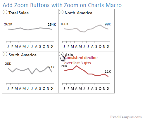
If you really want to impress your boss, you could add zoom buttons to each panel using the Zoom on Charts Macro (available for free download). This is a great feature to add to an interactive dashboard.
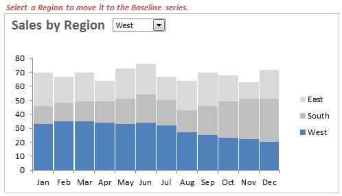
Alternative #2: Dynamic Baseline Stacked Column or Bar Chart
You might like this solution if you want to keep the stacked chart, or don't want to freak out your audience with something drastically different than they are used to seeing. I call this one the dynamic baseline stack chart because it allows you to quickly choose the series to display at the bottom using a drop-down menu. It is pretty easy to implement. NO macros or VBA are required. Just two different formulas and a drop-down form control. The workbook that contains the form is available for free download below. Instructions on how to create this chart are included in the file.
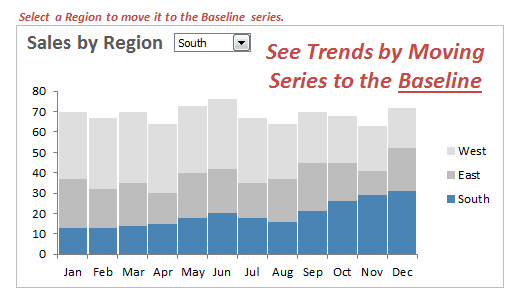
When the West region is at the top of the column stack it is difficult to see any trends. But when the West is moved to the baseline (bottom) series, we see that there is a steady decline in the last half of the year.
There are also some correlating trends between South and West in the second half of the year. This is easier to see when we move East to the top of the stack. This might be another way to present your data depending on the message you want to convey to the readers.
Alternative #3: ???
I'd love to hear about some alternatives from you. Make it as simple or complex as you like, there's no right or wrong answer. Just remember that the goal is to clearly and quickly tell the story to the reader.
Thanks!
Download
Additional Resources
If you're looking to learn more about charting, I highly recommend the dashboard course from My Online Training Hub. I have taken this course and it really helped me improve my charting skills. Checkout my video review of the course to learn more about it.


absolutely fantastic stuff!!
Thanks Don!
Thanks for a great article and a very handy Excel workbook. I like many aspects of the dynamic chart but there is also a simple way to add trend lines to the stacked chart to show the trends. Simply superimpose a line graph for the data in each category. You can even change the color of the line to match the color in the chart and you don’t have to create another data table to do this. This works well for a few categories. If you have a lot of categories then the chart can get pretty busy with too many lines.
Thanks Will. That is a good suggestion to quickly see the trend of the bars. In my opinion, the line chart makes it easier and faster to spot trends. Your eye simply follows the line instead of having to jump to each column or bar.
You can also add trend lines automatically to the column or bar charts. Select “Series Lines” from the Chart Tools > Layout > Lines menu on the ribbon. This adds lines between each bar/column for each series. I’m NOT a big fan of this though. It looks messy, and you typically run into the same problem where the only line that makes sense is the baseline series. All other lines above the baseline have uneven baselines.
Thank you Sir for the wonderful Blog – keep it up
Thank you John! I am glad you are enjoying it!
Just came across this — I like the idea for the combo box selector. One thought I have is I prefer the look of the line chart for trending purposes. Building off of what you built, you can just add an extra series (=’Dynamic Stacked’!$C$4:$O$4,’Dynamic Stacked’!$C$11:$O$14) in row 14. Keep the indices in b12:b14 static as 1,2,3, and have your combo box adjust cell b11. Your range on your chart in d11:o11 can then be formatted as line chart (or even just a polynomial trendline only), relabeled in cell c11 as “=INDEX(C$5:C$7,$B11)&” trend”” and you’ve got your dynamic trend of that sales region.
Thoughts?
Thanks Tyler! This is a bit of a hybrid approach where a trend line for a single category is plotted on top of the stacked bar chart. The drop down allows you to select the series that you want to see the trend line for. I think this would be especially useful for a chart with more than three series, similar to the one at the top of this post. It would also help with your transition away from stacked charts if your management team is used to seeing them every month. You can introduce this line chart on top of the bars to help show its effectiveness over a chart that only contains the bars.
Thank you Tyler for taking the time to send this one in. You can download Tyler’s file with the modification here.
Dynamic Stacked Bar and Trend Line Chart.xls
Great site Jon! I tried this in one of my files and wow very cool… have had great feedback from the sales mgmt team when I walked them through their report. Keep the good ideas coming 🙂
Thanks Jess! I’m glad to hear your management team was accepting of this concept. It’s not always easy to break old habits… 🙂
Hi Don, thanks for a great article. I’m trying to decide on the best way to represent certain data in a chart. The customer suggested a stacked bar chart but I don’t think it’s the best solution. Basically the data is as follows:
1. Total sales forecast for this year, eg $200,000
2. Total sales forecast for next year, eg $230,000
3. What makes up the +$30,000 difference between these two forecasts? These could be positive or negative, eg
Store Closures -$40,000
New products +$60,000
Loss in Market share -$10,000
Price increases +$20,000
Thanks for your help
Hi Phil,
You might want to look at a waterfall chart for that. I have an example of a waterfall chart on this page. Please let me know if you have any questions. Thanks Phil! 🙂
Hi,
Really love the dynamic chart. I’ve made one myself thanks to your file, but I need to have my chart in an excel file. Is there anyway to import a chart with the drop down menu into an MS word file?
Thanks
Jimmy
Hi Jimmy,
I’m sure it can be done, but don’t have experience on how to do that. I’m not a Word expert. You might be able to do it with VBA. Sorry I couldn’t be more help on that one.
Hi Jon – I have a question regarding the Stacked Column Chart. Is there a way to select a series and the color that represents that series remain the same? For example, in the sample chart above, if the Region “South” is represented by the color blue, when I select South from the drop down, I want it to remain blue. If the Region “East” is represented by the color red, then I want it to remain red. Still being moved to the baseline, but keeping it’s corresponding color.
Please let me know if there is a way to do this.
Hi Ekendrea,
Great question! I think the only way you could do that is with a macro. Since the underlying data is changing, the chart formatting isn’t actually associated with the series.
you could replot the first two series, in their appropriate colours (ie S, W, E, S, W) and hide 1 of each pair according to which region was chosen from the dropdown
so you’d only see S, W, E or W, E, S or E, S, W
does that make sense?
Hi Jon,
I have made a horizontal bar chart in order to compare the lead times for different processes for in a work flow for different vendors. Vendors in the Y column and lead times for processes in the X axis. But the chart looks unclear due to presence of 9 colours in each bar.
Please suggest alternative to represent such data.
Y axis – Vendor-1, Vendor-2, Vendor-3 etc
X axis – order processing time, fabric lead time, pre-production, queing, etc.
Hello Jon,
I am preparing a chart for prior year and current year. Prior year data is on annual basis and for the current year I have the data on a monthly basis. I have the data for actuals, forecast and plan. Below is the data for the same.
2016 AUG SEP OCT NOV DEC Forecast Plan 2017
Annual 188 288 211
Plan 2017 213 239 233 229 220
Forecast 208 297 206 206
ACTUAL 2017 288 – – – –
I have used a Combo Chart Type to prepare the chart, following is the method I have used to prepare the chart
1) Year is a clustered column chart type on Primary Axis
2) PEX 2017 is a Line with Markers chart type on Primary Axis
3) Actual 2017 is a Clustered column chart type on SECONDARY Axis
4) Forecast is a Line with Markers column chart type on SECONDARY Axis
For 2017, either I have actuals or forecast for any particular month. I have actual for Aug’17 and from Sep’17 to Dec’17, I have the forecast numbers.
The first 3 charts are coming properly, however, the 4th one forecast is showing zero for Aug’17 and hence the chart is starting from 0 to 208 followed by 297, 206 and 206
Kindly guide me on how to ensure that the 4th chart is prepared only from Sep’17
Thanks,
Lucy
MAYTHAM ALMOUTHEN
1 second ago
Great site Jon! and great YouTube channel 🙂
Thank you for your time and reply.
I feel Alternative #1 is not that practical as it need space to include all of Panel Charts in the report .
Alternative #2 are good but when you put in report is hard to have it dynamic.
For Alternative #3: what about Stacked Column Bar Chart with adding total values on the top.
OR Waterfall Chart ?
There’s nothing wrong with a line chart (NOT a stacked line chart), with or without totals.
https://imgur.com/m14Lu01
There’s also what I call a “layer chart”.
https://imgur.com/dpsttgo