

A line chart with eight overlapping lines is basically a plate of spaghetti. Everyone can see something is happening, but nobody can tell what.
In this post, we'll do a full line chart makeover using Pivot Tables, a slicer, and three modern Excel array functions: TRIMRANGE, DROP, and HSTACK.
The result is an interactive chart where one click highlights any single trend against the rest of the group, and the whole thing expands automatically when new data arrives.
Download the Excel Files
Complete the form below to instantly access the Excel files and Excel Formula Prompting Guide.
Video Tutorial
Watch on YouTube & Subscribe to our Channel
The Setup: A Pivot Table for Chart Data
The scenario here is an e-bike rental shop that tracks a weekly health score for each bike in their fleet. The maintenance team wants to see how those scores trend over time and quickly spot which bike might need attention.
We start by building a Pivot Table with Week in the Rows area, Bike ID in the Columns area, and Health Score as the Values. This gives us one health score per bike per week in a clean grid, which is exactly what a line chart needs.
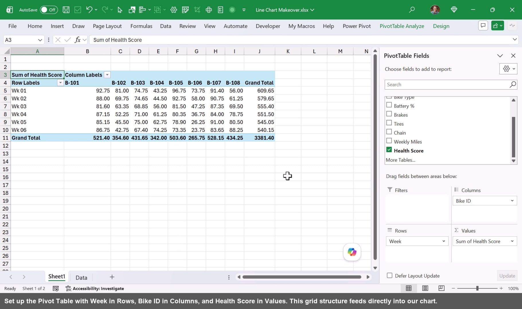
Before building the chart, remove the Grand Totals from both rows and columns. Right-click anywhere in the Pivot Table, go to PivotTable Options, and turn them off. Clean data in means a clean chart out.
Next, rename this sheet “All Chart Data.” Then duplicate it by holding Ctrl and dragging the tab to the right. Rename the copy “Selected Data.” The slicer will connect only to the Selected Data pivot table, filtering it down to one bike at a time while the All Chart Data sheet always shows the full fleet.
Using TRIMRANGE to Pull the Pivot Table into a Spill Range
Create a new sheet called “Chart” (or “Chart Data”). This is where we'll build the combined data source for our chart. We want to pull the live Pivot Table data from both sheets into this one range, and we'll start with TRIMRANGE.
Here's a quick look at the TRIMRANGE function. It returns the used portion of a range, trimming away any empty rows or columns at the edges. The function arguments are:
- range: the range to trim, which can reference an entire sheet
- row_trim_mode: controls trimming of empty rows from the top and/or bottom (optional)
- col_trim_mode: controls trimming of empty columns from the left and/or right (optional)
Click in cell A1 of the Chart sheet and enter a TRIMRANGE formula that references every cell on the All Chart Data sheet. Clicking the top-left corner of a sheet tab creates a reference to all rows on that sheet.
=TRIMRANGE('All Chart Data'!1:1048576)
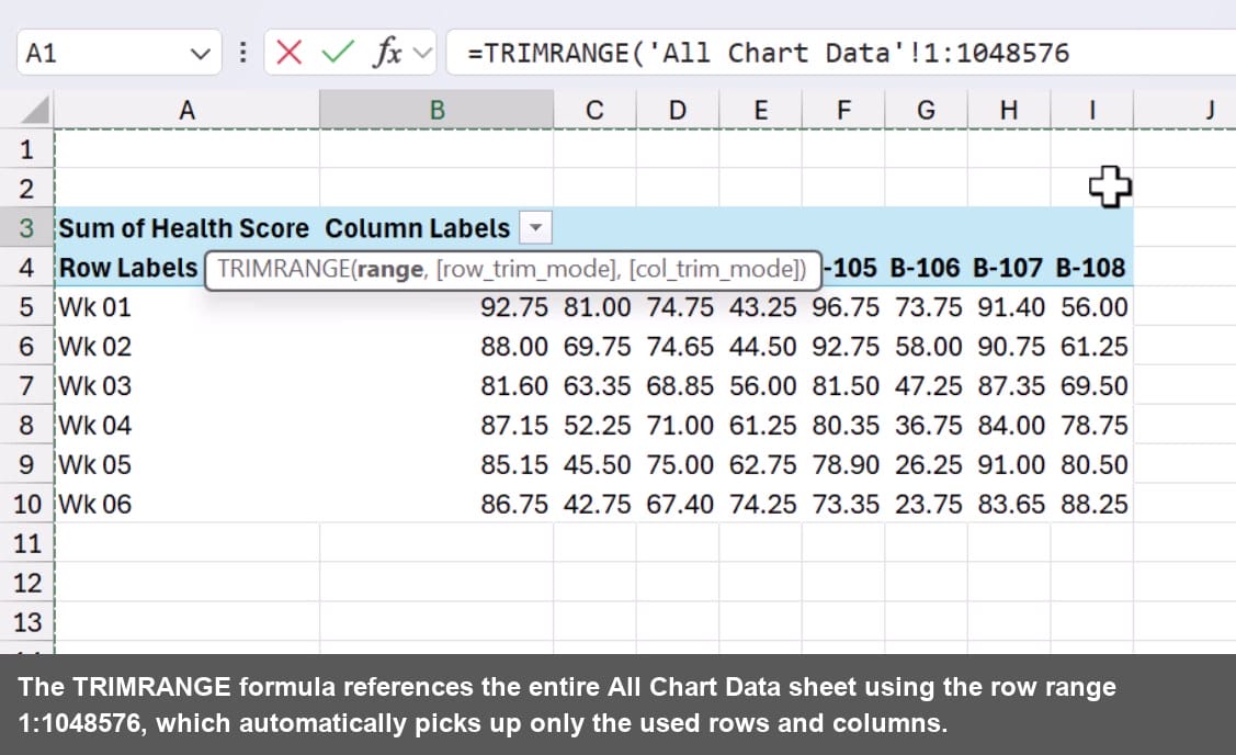
Once entered, TRIMRANGE spills the full Pivot Table data onto the Chart sheet. You'll notice it looks right at first glance, but there's a problem at the top: a header row filled with zeros has come along for the ride. That happens because the Pivot Table column headers are numeric Bike IDs, and Excel treats them as zeros in the spill output. We'll clean that up next.
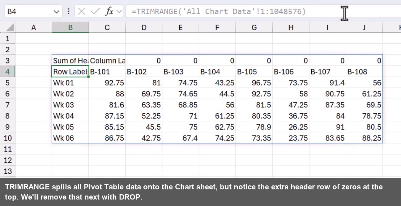
Cleaning the Data with DROP
The spill range includes an unwanted header row of zeros at the top. The DROP function removes it cleanly without any manual adjustments.
Before diving in, a quick look at the DROP function. It returns an array with a specified number of rows or columns removed from the beginning or end. The function arguments are:
- array: the array or range to drop from
- rows: number of rows to drop from the top (use a negative number to drop from the bottom)
- columns: number of columns to drop from the left (use a negative number to drop from the right) (optional)
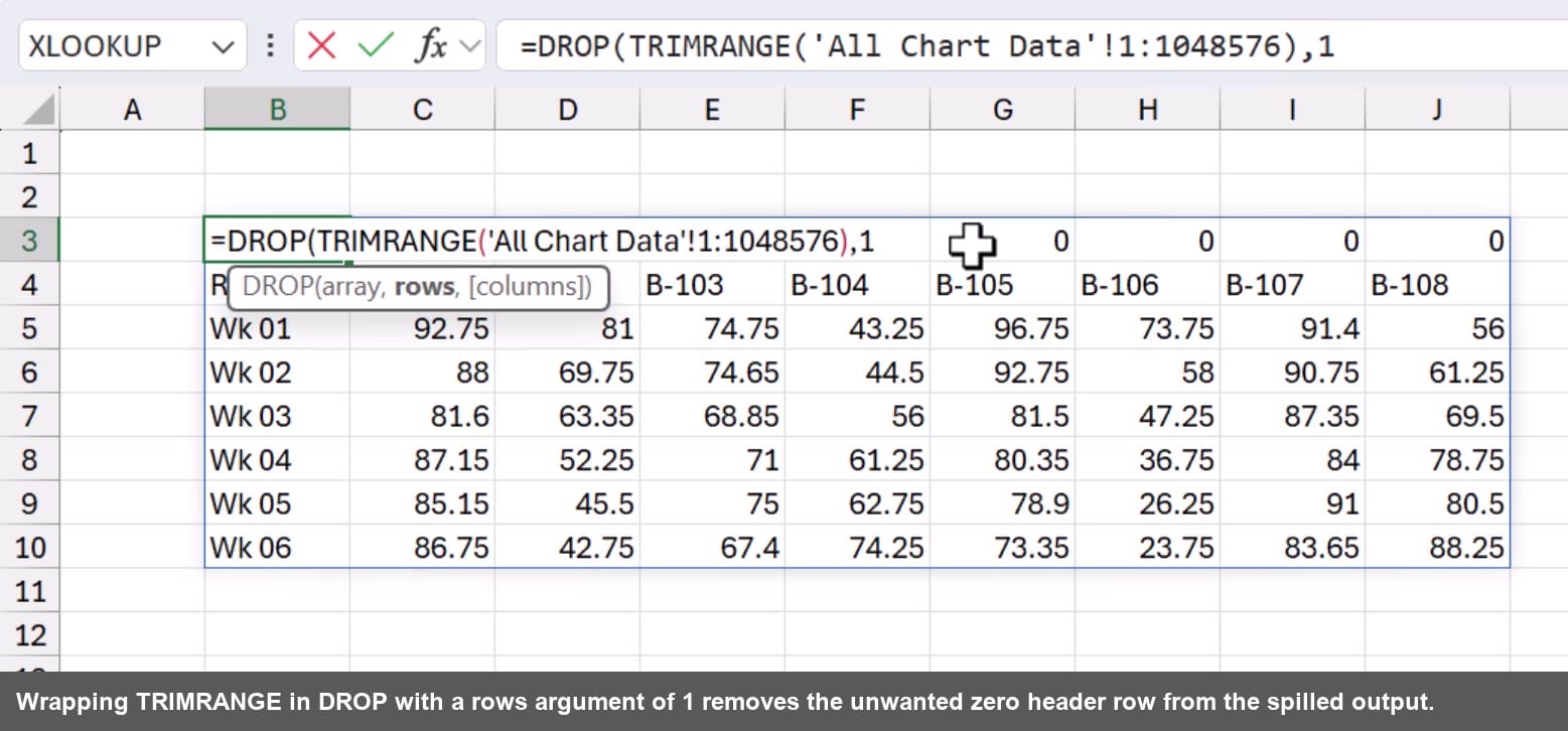
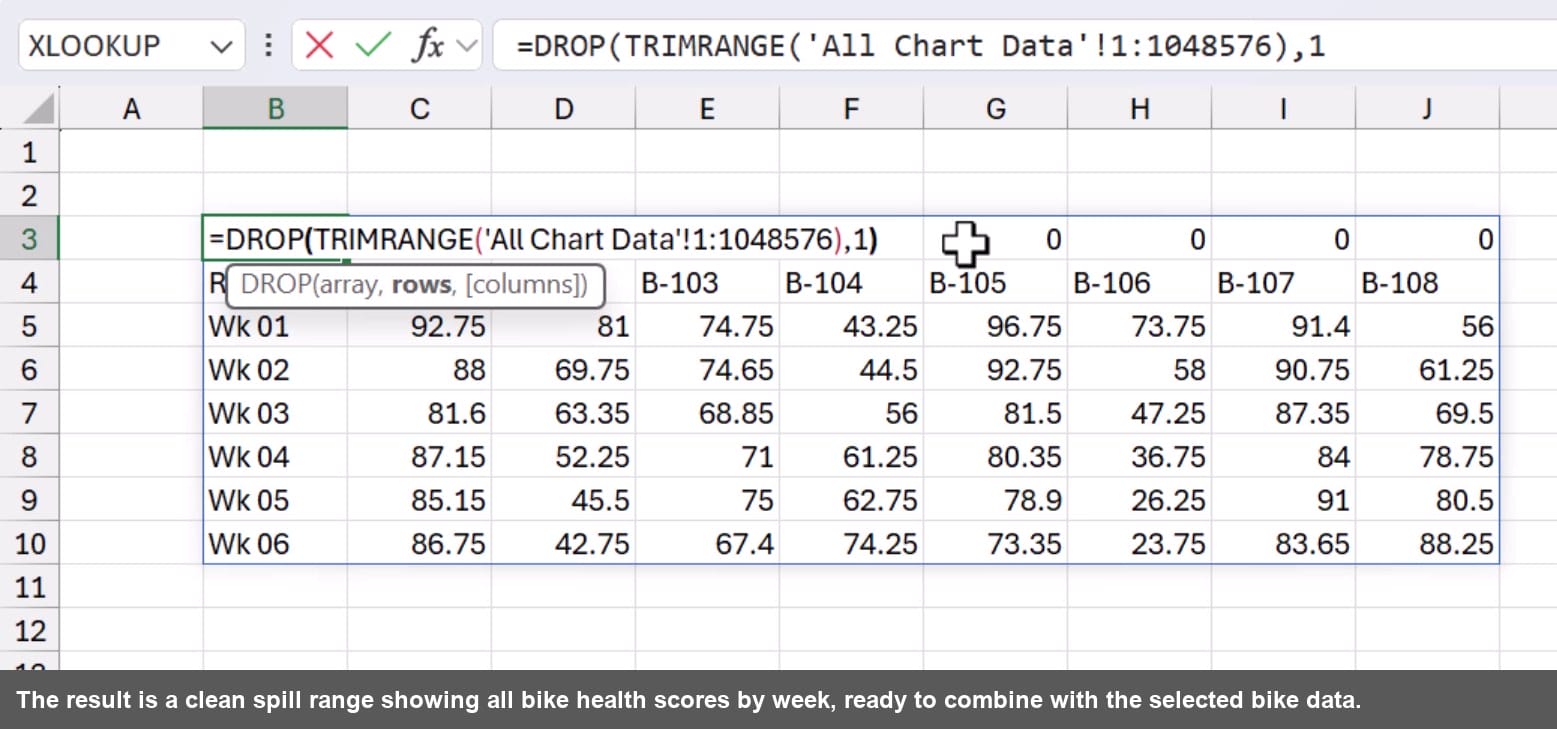
Wrap the TRIMRANGE formula inside DROP and tell it to remove the first row. This strips the zero-filled header and leaves only the real Pivot Table data.
=DROP(TRIMRANGE('All Chart Data'!1:1048576),1)
Combining Both Pivot Tables with HSTACK
Now we need to add the Selected Data Pivot Table alongside the All Chart Data. HSTACK joins two arrays side by side in a single spill range.
A brief word on the HSTACK function. It appends arrays together horizontally, returning a combined array with more columns. The function arguments are:
- array1: the first array or range
- array2, …: one or more additional arrays to append to the right of the previous array (optional)
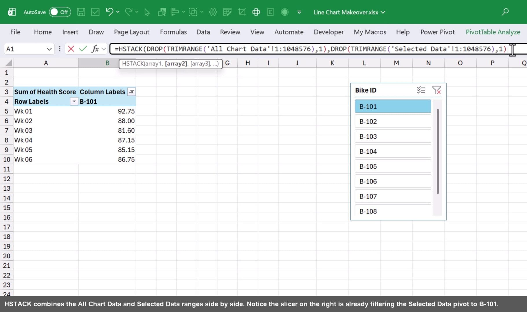
Edit the formula in cell A1 and wrap the existing DROP+TRIMRANGE expression inside HSTACK as the first array. For the second array, apply the same DROP+TRIMRANGE pattern to the Selected Data sheet.
=HSTACK(DROP(TRIMRANGE('All Chart Data'!1:1048576),1),DROP(TRIMRANGE('Selected Data'!1:1048576),1))
Removing the Duplicate Week Column
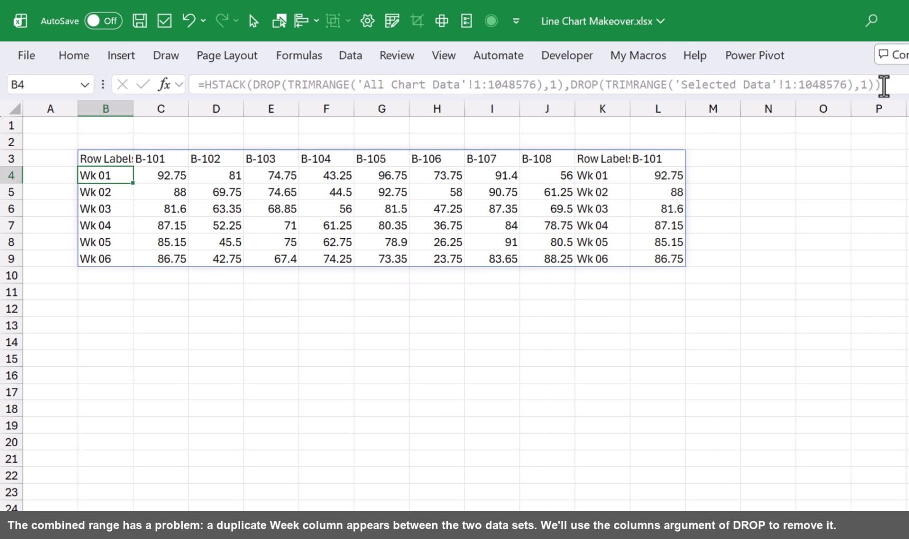
The Selected Data Pivot Table includes its own Week labels column, which creates a redundant column in the middle of the combined range. The DROP function accepts a columns argument to cut it out.
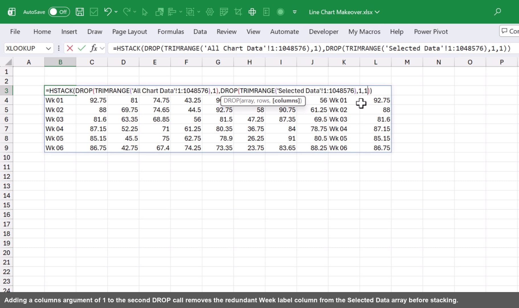
Update the second DROP call to also drop 1 column from the left. This removes the Week labels from the Selected Data array before HSTACK joins it to the right.
=HSTACK(DROP(TRIMRANGE('All Chart Data'!1:1048576),1),DROP(TRIMRANGE('Selected Data'!1:1048576),1,1))
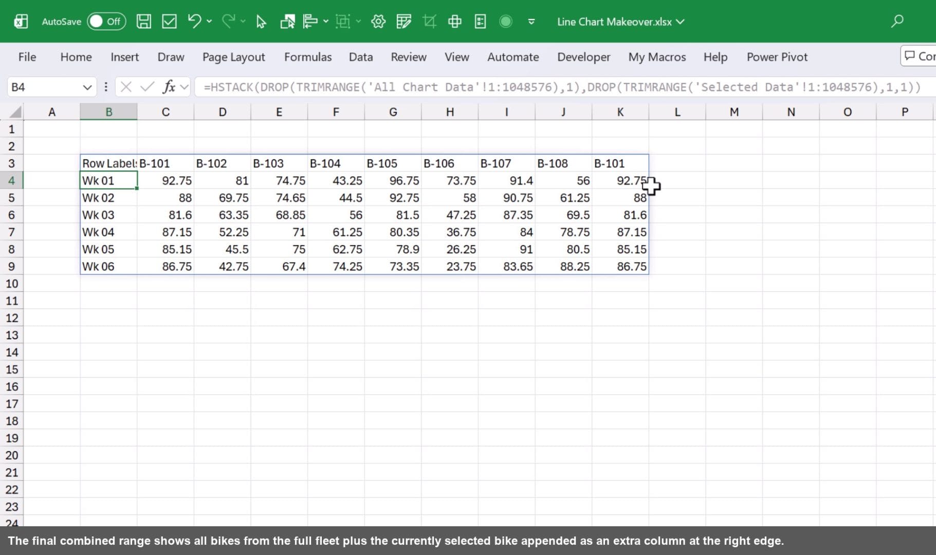
Building the Chart on the Spill Range
Cut the slicer from the Selected Data sheet and paste it onto the Chart sheet. When the slicer filters the Selected Data Pivot Table, only the last column in the spill range changes. Everything else stays the same.
Select the entire spill range, go to Insert, and insert a regular 2D Line chart (not a Pivot Chart). Once inserted, click Switch Row/Column under Chart Design so the weeks appear along the bottom axis.
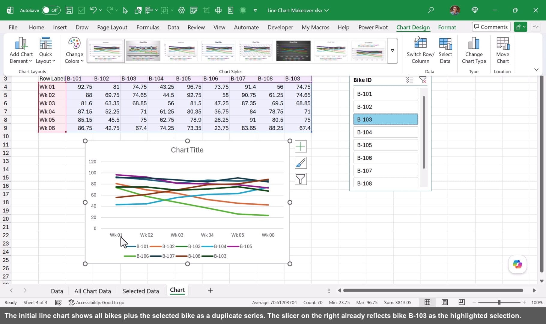
Styling the Chart for Clarity
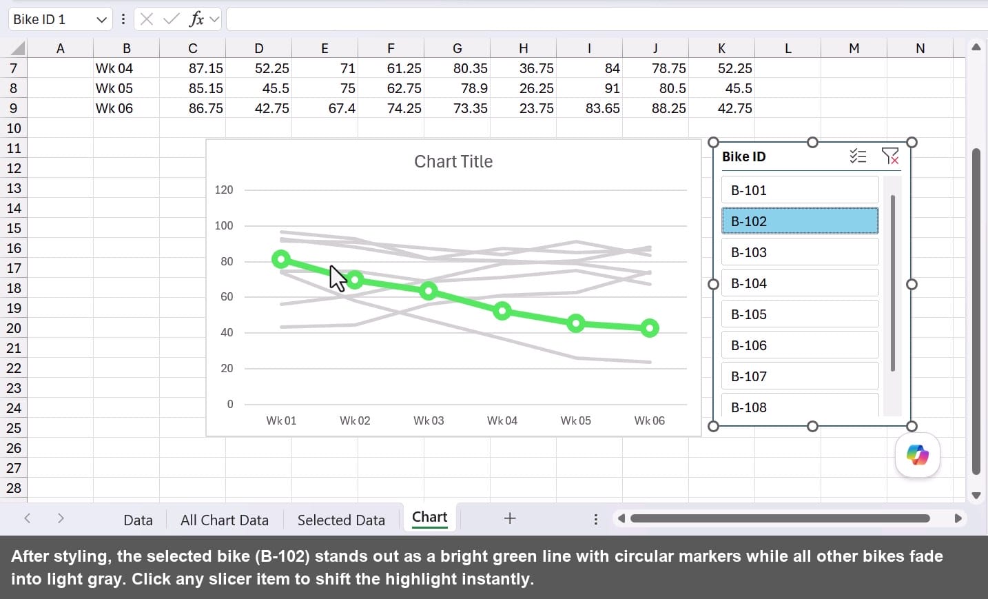
Select each background line (all bikes except the highlighted one) and change the Shape Outline to a light gray. If a line is hidden behind others, use the dropdown in the Format tab to select it by name.
For the selected bike line, change the outline to a bright color like green, increase the line weight, and add circular markers through Format Data Series. Setting the marker fill to white gives it a bike-chain look that works nicely for this dataset. Remove the legend if you prefer a cleaner look.
The Chart Expands Automatically with New Data
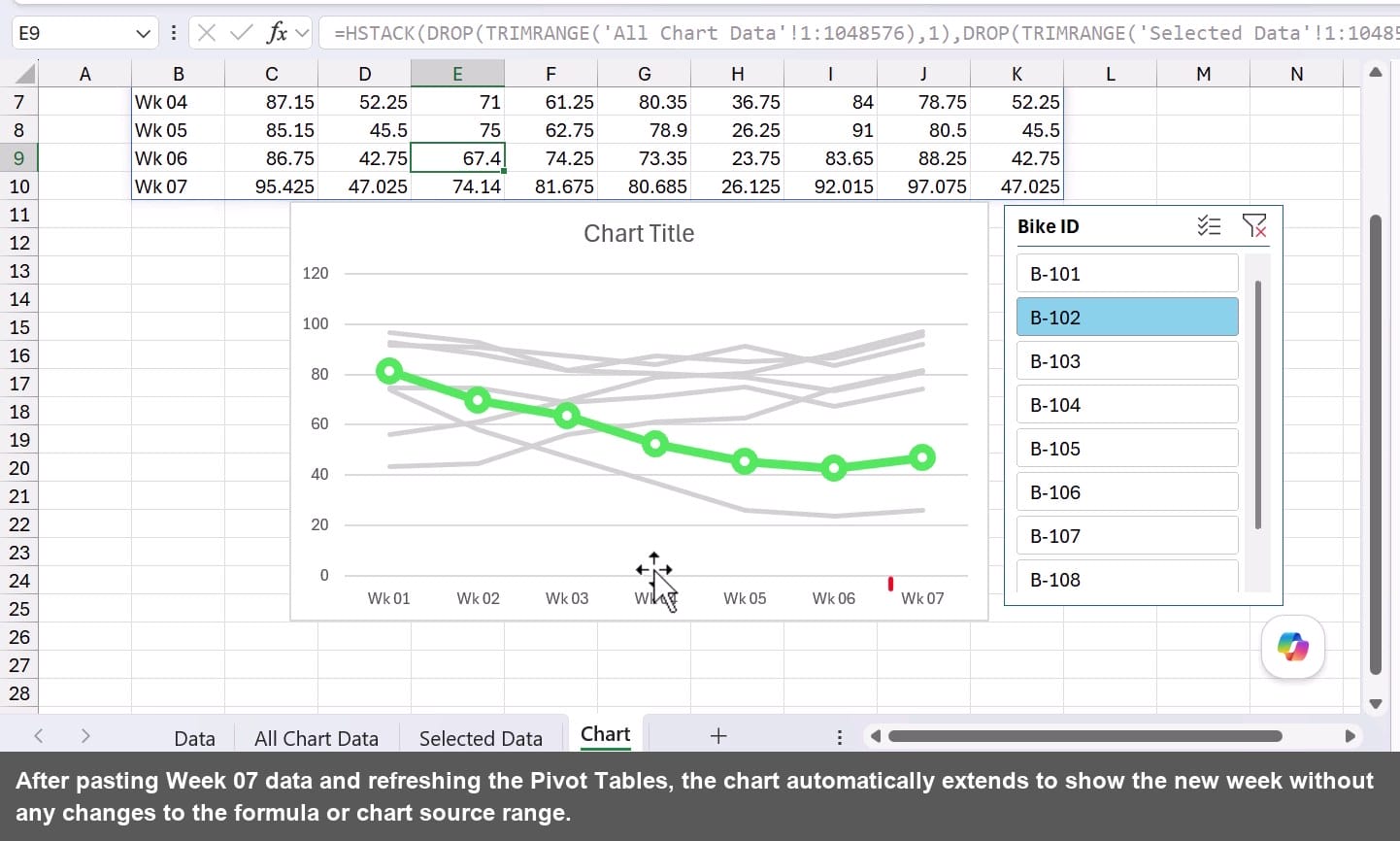
Because the chart source is a spill range, it updates whenever the spill range changes. To add new weeks, paste new rows into the source data table. The Pivot Tables extend automatically since the source is an Excel Table.
Right-click either Pivot Table and choose Refresh. Both pivot tables update at once. The TRIMRANGE formula picks up the new rows, DROP and HSTACK rebuild the combined range, and the chart adds the new week with zero manual intervention.
Taking It Further: A Dark Mode Version
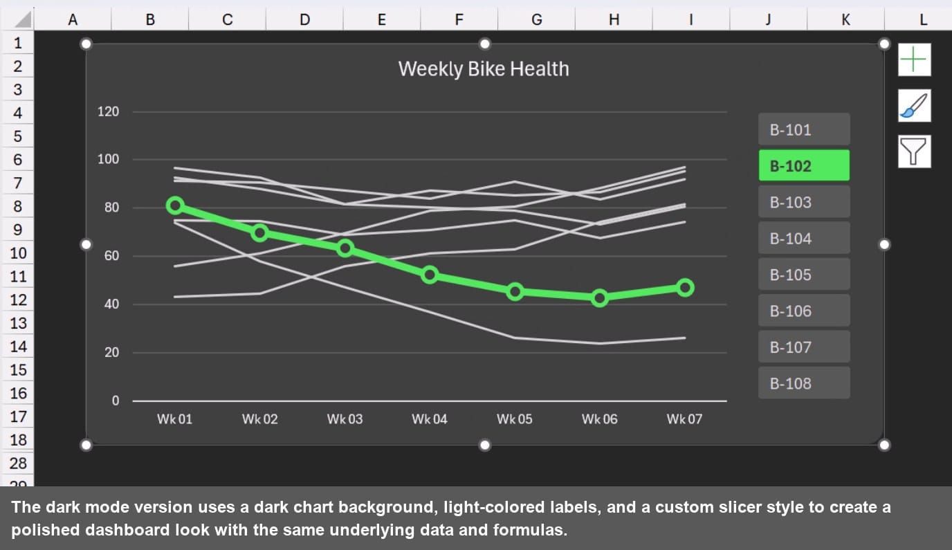
The same chart looks completely different with a dark background, and it is easier to achieve than it sounds. Change the chart area and plot area fill to a dark color, then update all font colors to white or light gray so labels and axis values remain readable. The gray background lines stay subtle, and the bright green selected line pops even more against a dark canvas.
The slicer gets the same treatment. Right-click the slicer, open Slicer Styles, and duplicate an existing style. From there you can control the background, font color, and border for every element, including selected and unselected items. Turning off the slicer header in Slicer Settings also removes the clear and multi-select buttons, keeping the UI focused on single-bike selection. The end result is a dashboard-quality chart that fits right into a dark-themed report.
Summary
This technique turns a cluttered multi-line chart into a focused, interactive visualization by combining two Pivot Tables into one dynamic source range.
TRIMRANGE captures only the used data on each pivot sheet. DROP strips unwanted header rows and the duplicate week column. HSTACK joins both arrays side by side so the selected bike always appears as an extra series the chart can highlight independently.
Connect a slicer to the Selected Data pivot table, style the background lines gray and the selected line a bold color, and you have a chart that practically reads itself. Add new data to the source table, refresh, and the chart grows with it automatically.
And if you want to take the presentation up a notch, the same chart translates beautifully into a dark mode layout with a custom slicer style.




Add comment