Download the Excel Files
Complete the form below to instantly access the Excel files.
Video Tutorial
Watch on YouTube & Subscribe to our Channel
In this tutorial, we take the dashboard design we created with AI tools in the previous video and build it out completely in Excel, step by step.
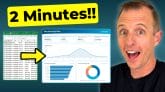
We start with the raw data and walk through creating every Pivot Table that powers the dashboard, from the KPI cards to the charts. From there, we build out each chart, including a top 5 items chart, a sales-over-time chart with a week/month toggle, and a customer mix chart. We also connect a slicer so one click filters everything on the dashboard at once.
The best part is that none of this requires complex formulas or VBA. Every piece of the dashboard is powered by Pivot Tables, so it stays fully dynamic and updates with the click of a button as new data comes in.
If you haven't seen the first video where we designed this dashboard with AI, check that out after watching this one, to see how the look and layout came together.


Thanks
I am learning data analytics. I need the Excel file.
Thank you in advance
thanks for such amazing content.
Very nice.