Designing an Excel dashboard is one of those tasks that trips up even experienced analysts. The data work is the easy part. The design part, figuring out which charts to use, how to lay them out, and what your audience actually needs to see, that is where most people get stuck.
In this post, I'll show you a three-step AI workflow to rapidly prototype a dashboard design using Claude, Gemini, and ChatGPT, so you can iterate in minutes instead of days and get buy-in from your team before you build a single PivotTable.
Download the Excel Files
Complete the form below to instantly access the Excel files and Excel Formula Prompting Guide.
Video Tutorial
Watch on YouTube & Subscribe to our Channel
Step 1: Generate a Fake Dataset with ChatGPT
Before you can design anything, you need data to work with. But uploading real company data to an AI tool is often a non-starter due to privacy policies. The solution is to generate a fake dataset that closely mimics your real data.
Jump into ChatGPT (or any large language model) and describe your data without sharing anything sensitive. Be specific about the columns, the volume of rows, any seasonality or trends, and any specific dimension values like employee names or product categories. The more context you give, the more realistic the output.
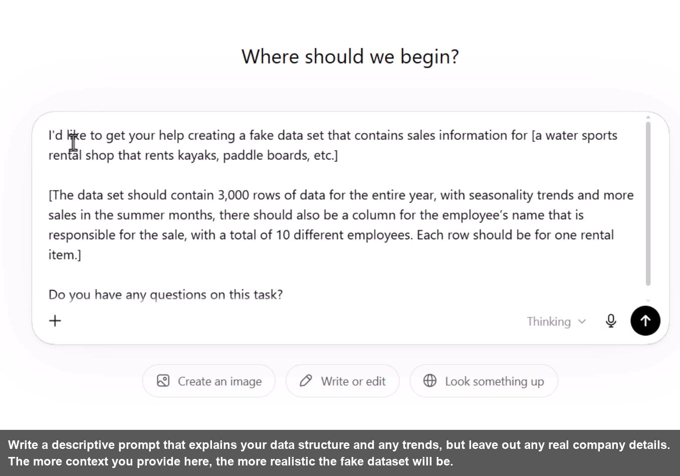
One prompt tip that works well: end every prompt with “What questions do you have about this project before you get started?” This stops the model from making silent assumptions and gives you a chance to clarify upfront.
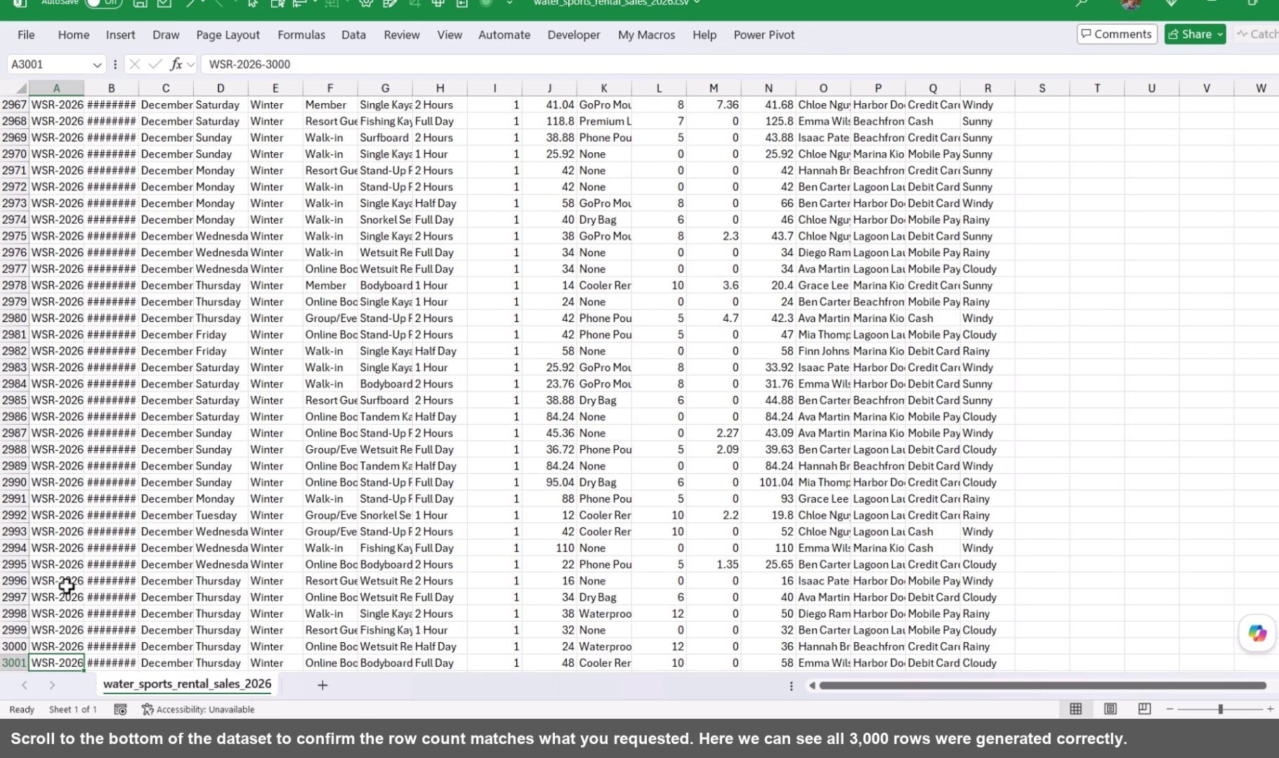
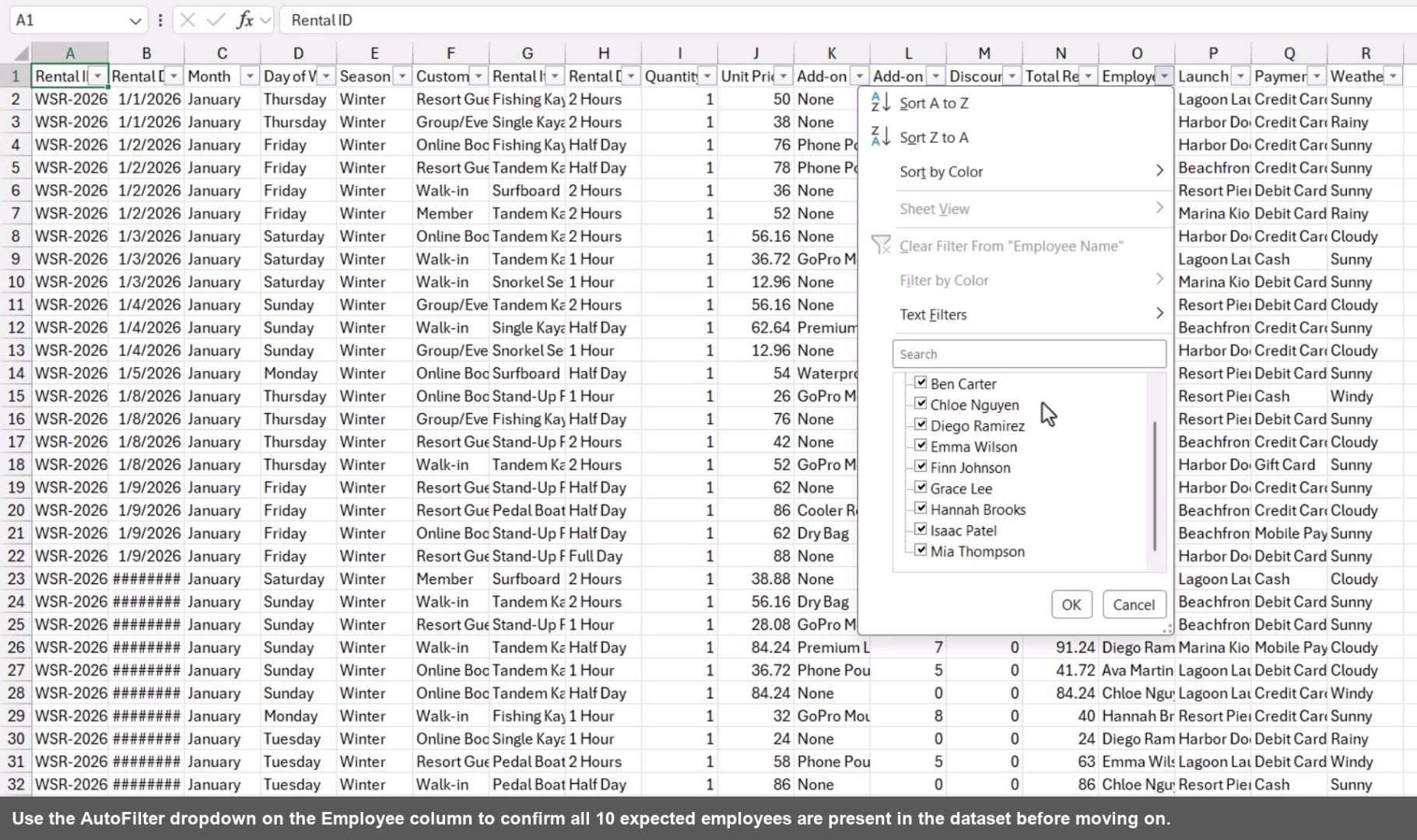
Once ChatGPT generates the CSV file, download it and do a quick spot check in Excel. Scroll to the bottom to confirm the row count, then turn on filters to verify that dimension columns like Employee or Product have the right number of unique values.
Step 2: Design the Dashboard with AI
This is the core of the workflow. Instead of jumping straight into Excel, use an AI tool to build an interactive web page mockup of your dashboard first. This lets you iterate on the design instantly with plain English, no rebuilding charts, no reformatting cells.
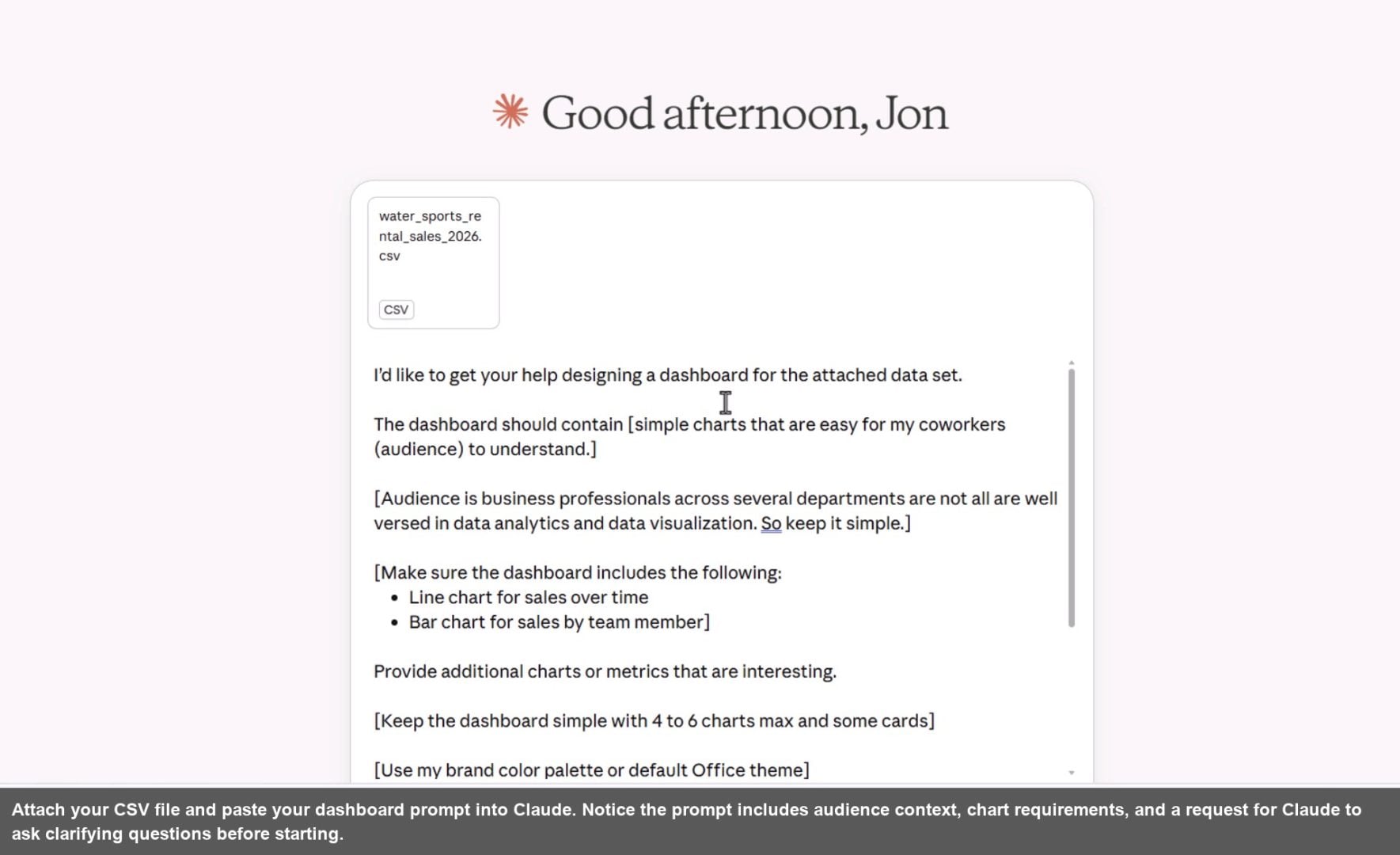
The key is a well-structured prompt. Describe who the audience is, what charts you want to include, how simple or complex the layout should be, and that the final output will eventually live in Excel. Then ask the AI to output a web page so you can see and interact with the design right away.
Designing with Claude
Claude is a great starting point. Attach your fake CSV file, paste in your dashboard prompt, and Claude will read the data, plan the layout, and write the full HTML web page in just a few minutes. The result renders directly in the Claude interface.
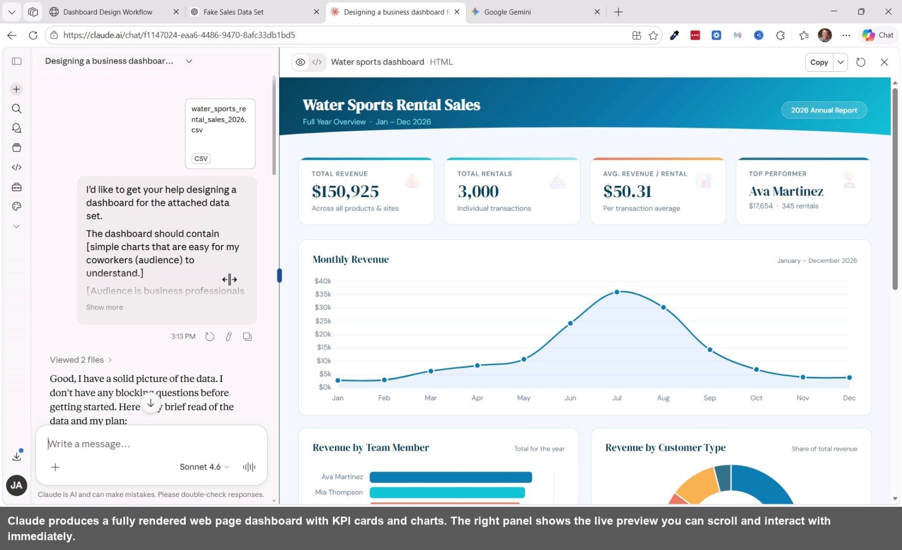
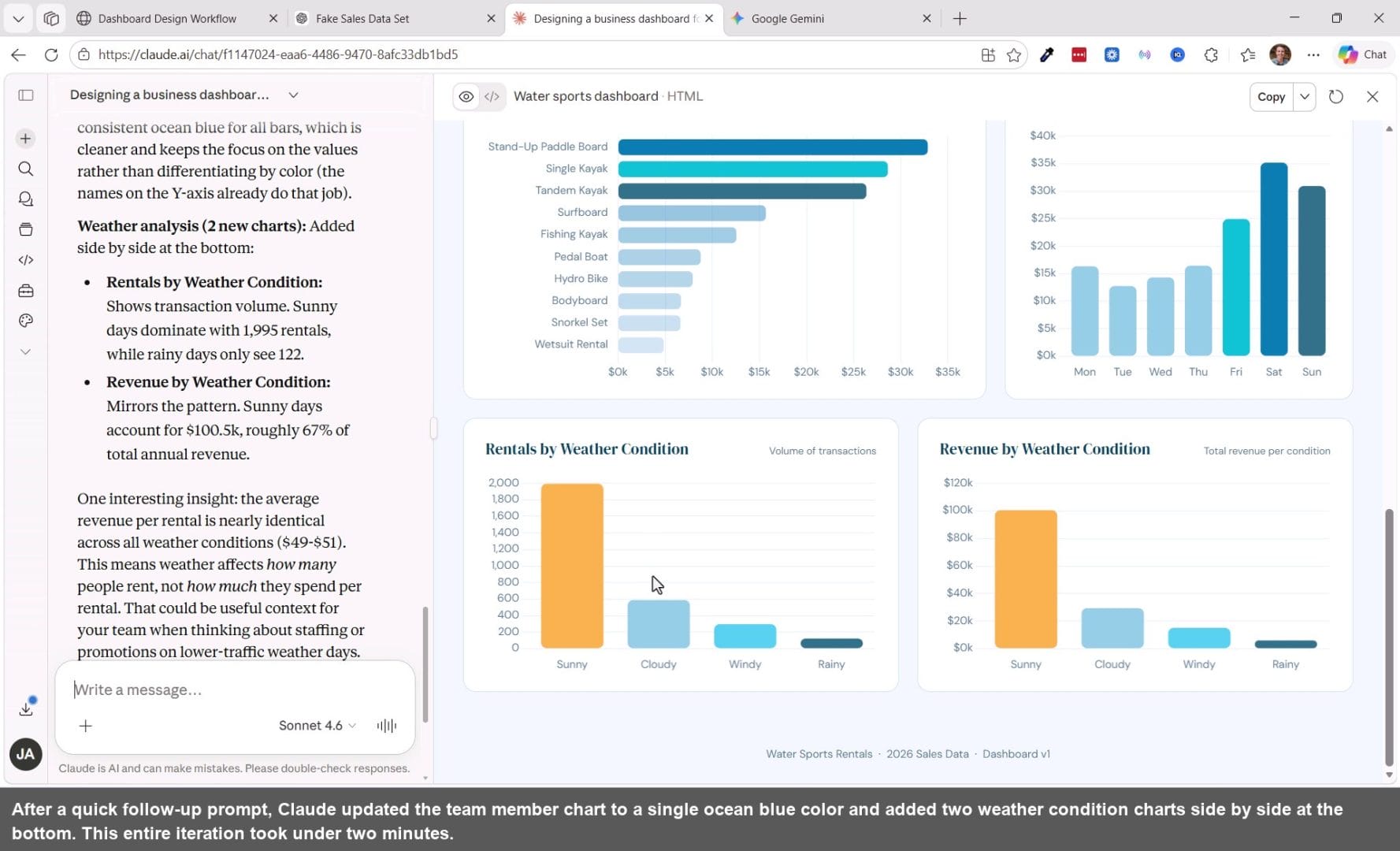
If something doesn't look right, just say so in plain English. For example, you might ask Claude to use a single color in the team member bar chart, or add a chart that analyzes weather conditions. Claude will rewrite just the relevant parts of the HTML and update the preview instantly.
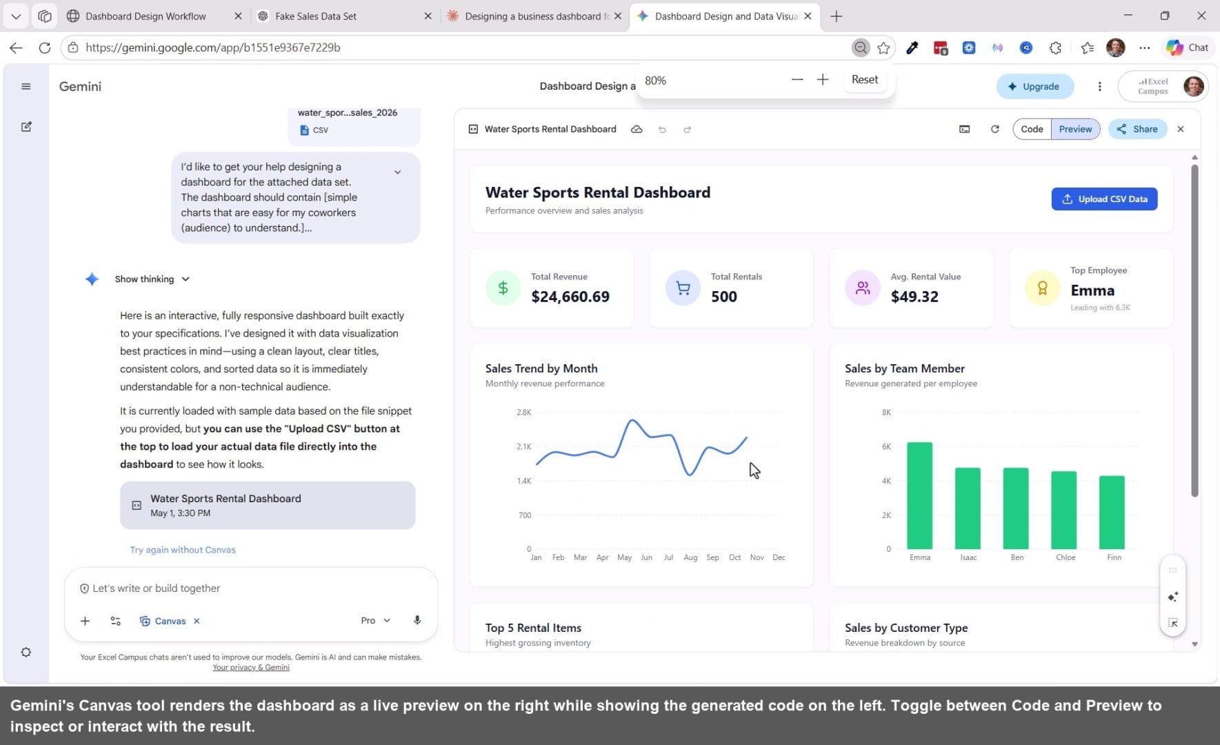
Designing with Gemini
Gemini from Google has a Canvas feature that works similarly. Enable Canvas under the Tools menu, attach your CSV, paste the same prompt, and Gemini will generate an interactive web page dashboard with a code view and a live preview side by side.
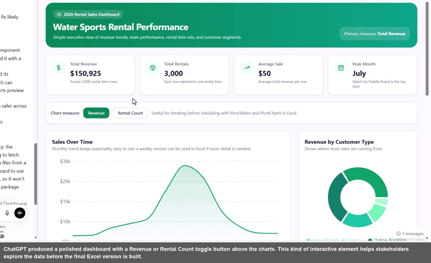
Designing with ChatGPT
ChatGPT also has a Canvas feature, available under the More submenu in the prompt box. Attach your file, enable Canvas, and paste your prompt. In testing, ChatGPT occasionally returns a console error on the first try, but clicking the error message and using the Fix Bug button resolves it quickly.

Compare the Designs Side by Side
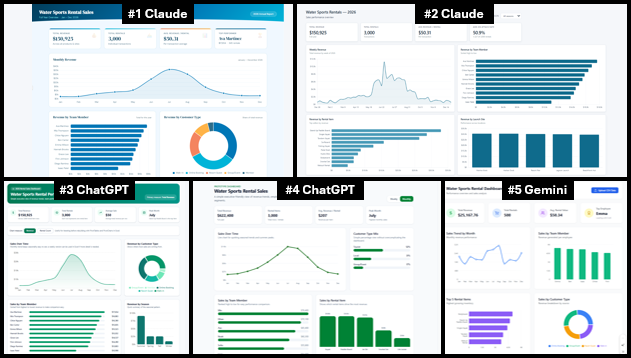
One of the best parts of this approach is that every run produces a slightly different result. That is actually a feature, not a bug. Run the prompt a few times across different tools and you end up with several distinct design options to choose from or mix and match.
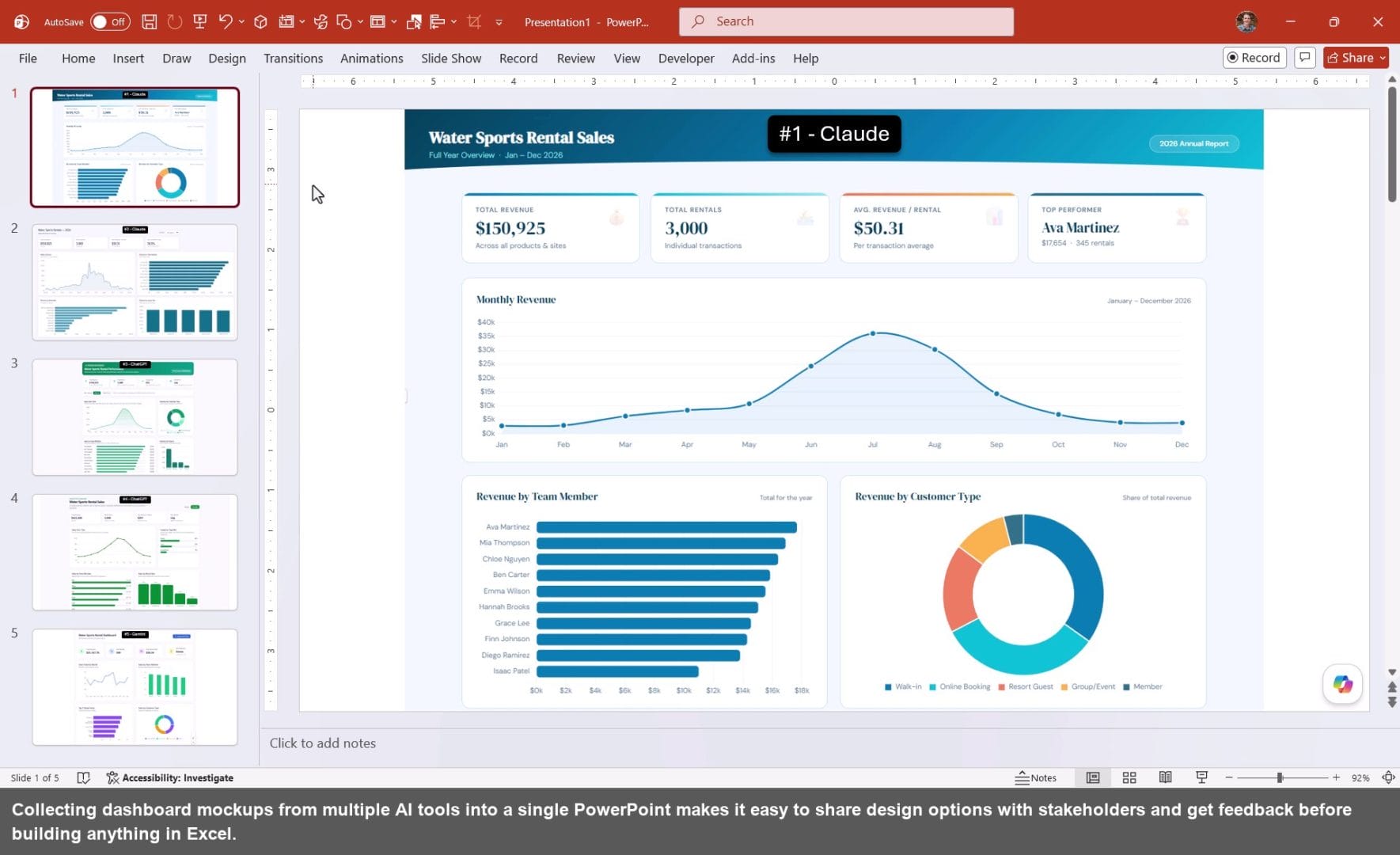
Paste screenshots of each mockup into a PowerPoint slide deck and share it with your manager or team before building anything in Excel. Getting alignment on the design early saves a huge amount of rework later.
Step 3: Build the Dashboard in Excel
Once you have a design direction approved, it is time to build it in Excel. You can do this manually using PivotTables and PivotCharts, use AI to generate a starting point, or do a combination of both.
Microsoft Copilot can generate a working Excel dashboard directly from your data. It creates PivotTables on a source sheet and connects them to charts and KPI cards on a dashboard sheet. The result may need some visual cleanup, but it is a solid foundation to build from.
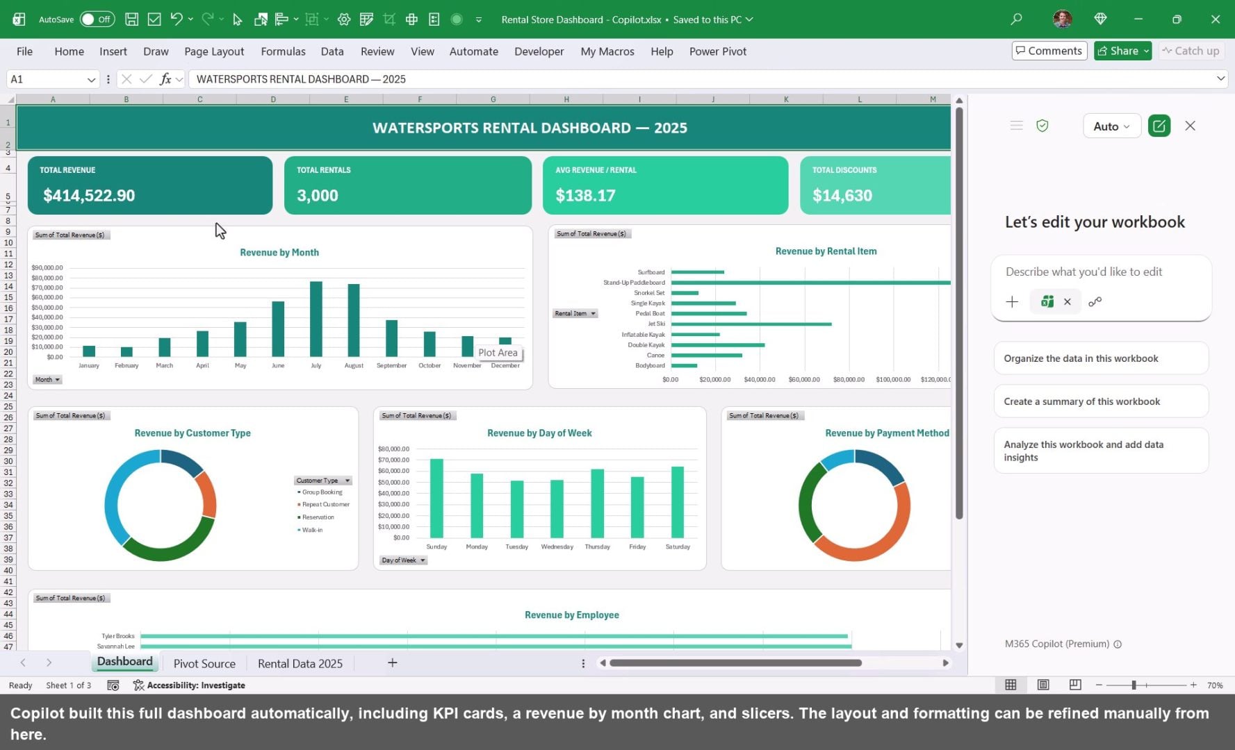
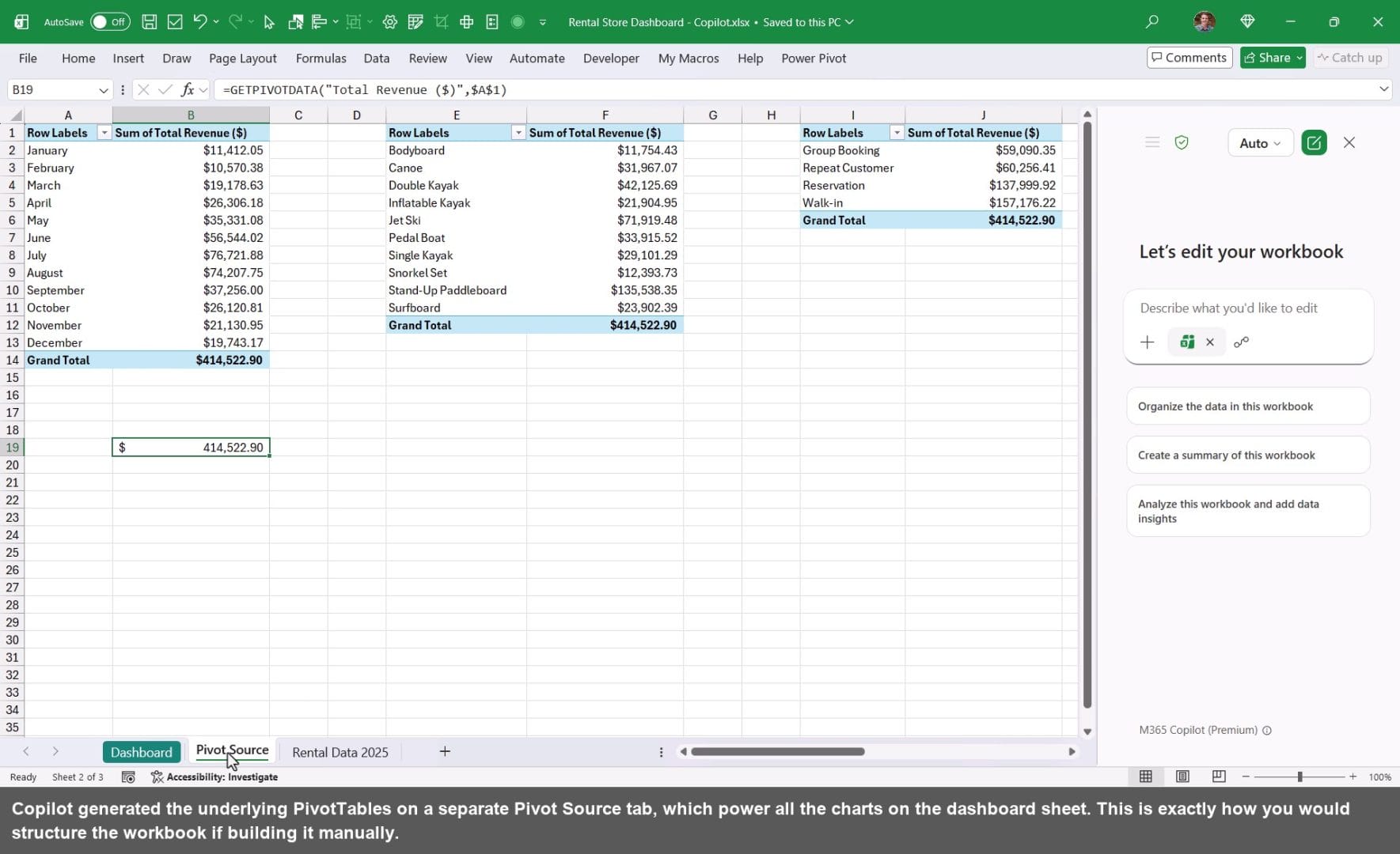
Whether you use Copilot or build it yourself, PivotTables and PivotCharts are the right foundation for an Excel dashboard. They make it easy to update as new data comes in and keep your formulas simple.
Summary
The hardest part of building a dashboard is not the formulas or the charts. It is the design decisions.
This three-step AI workflow helps takes that friction away.
It also allows you to share the designs with your boss, coworkers, or clients to gather feedback and quickly iterate.
Let me know which design is your favorite in the comments, and I'll do a follow-up tutorial on how to build it in Excel.


#4 ChatGPT
To be clear, none of these are free. You must pay for the dashboards to be made; otherwise you on,y get written feedback on what to design. None of these AI products actually build a useable dashboard in Excel? The human must still build the work product. For small business it becomes a non-starter — budgets are smaller in the current economic conditions and staffing is always lean in the area of administrative support.
Hi Gabe,
This post is about the design process, and using AI tools to assist with design. It’s not about the buildout. I explain more about this at the beginning of the video.
I agree that the human must be involved in the buildout. I will be doing a follow-up video on the buildout.
I hope that helps. Thanks again and have a nice day! 🙂
#4 ChatGPT
Thanks for voting, Dave!
#4 Chat ChatGPT
When I opened the sample workbook the only a few columns are visible on the R/H side of the Excel sheet. Scrolling to the right is restricted and remaining columns hidden.
Did you use the same prompt in Copilot as you did for Claude or a different one since the output is in excel?