Bottom Line: Enhance your calendar chart to include a spin button, different styles, or weekly goals.
Skill Level: Intermediate
Watch the Tutorial
Download the Excel Files
Follow along with the BEGIN file, or copy the charts directly into your own workbooks from the FINAL file below.
Calendar Chart Creation
Welcome to Part 2 of a brief 2-part series on Calendar Charts. In Part 1, we learned how to build a Calendar Chart, and you can access that tutorial here. This is part of a bigger series where we are learning how to build 8 different types of progress charts, including Gauge Charts and Steps Charts.
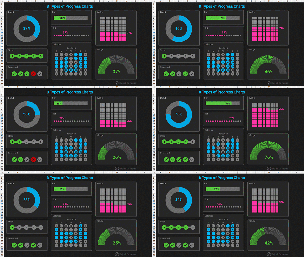
In this post, we are going to look at ways to make this chart more interactive and change the formatting for different styles. Let's start by adding a spin button for changing the calendar month.
Add a Spin Button to the Calendar Chart
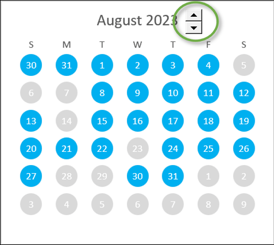
To make this chart interactive, we are going to add a spin button, which is simply a button with up and down arrows to go to the next or previous month.
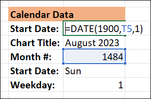
We start by creating a formula in the cell labeled Start date. This formula uses the DATE function to display the current month, but the way we are calculating it is a little funny. For the Year, we are going to enter the year 1900. That is the year that Excel starts its calendar. Then for the Month, I entered the value of cell T5, (which is 1484). This is the number of months that elapsed from January of 1900 to August of 2023, when this video was made. For the Day, we enter the number 1 because we always want our calendar to start on the first of the month.
Next, go to the Developer tab (Click here if you don't have a Developer tab). Click the menu for Insert. Choose the Spin Button from the menu.
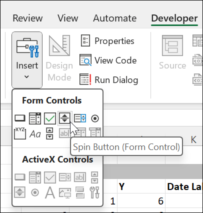
This will put your cursor into drawing mode and you can draw your button right on the calendar by clicking and dragging.

Right-click on the spin button and choose Format Control. That will bring up a window where you will change the settings to read:
- Current Value: 1484
- Minimum Value: 1
- Cell Link: $T$5
- 3-D Shading: Unchecked
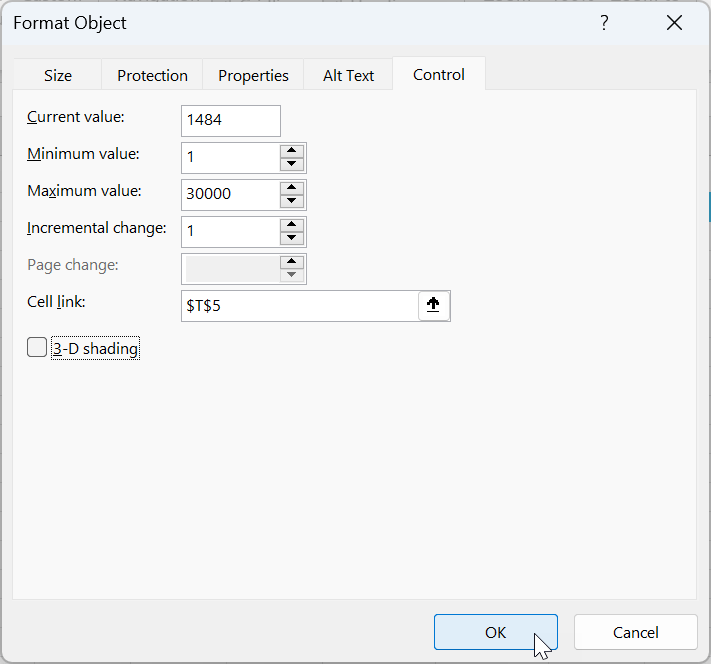
Now, when you click on the up or down arrows in the spin button, the month will change thanks to the formula.
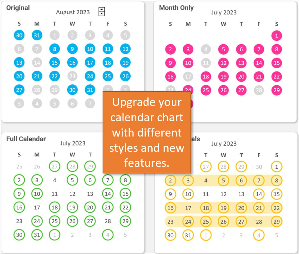
Month-Only Calendar
Next, let's look at how to format the chart so that it only displays the current month, without days from the prior or next month showing.
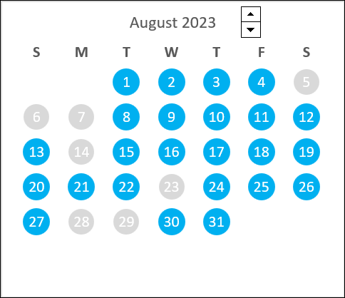
To accomplish this, I've added a new series of data under the columns that say Prev/Next Month. In the X column, I've added a formula that essentially says, if the date in the Date Label column is not in the current month, then display the X value from the Current Month column, and if it is in the current month, then display the NA error.

Having an NA error means Excel will not plot a marker for that cell in the chart.
For the new series that I've created, I just changed the formatting to be a little bit bigger than the colored dots (21 instead of 19) and filled them with white.
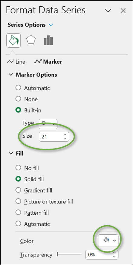
So those dates are actually still in the chart, but they are being covered up by my new series of white dots, so you can't see them.
Bubble Style Calendar
We can also change the formatting so that the next and previous month's labels are grey while the current month's labels are black. Then we can change it so that the markers have a colored border instead of a solid fill. This gives each day sort of a bubble look.
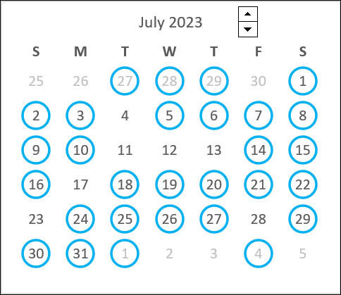
To achieve this look, I've added Date Label columns to my data. These are populated using a formula to determine if the date is in the current month or not.
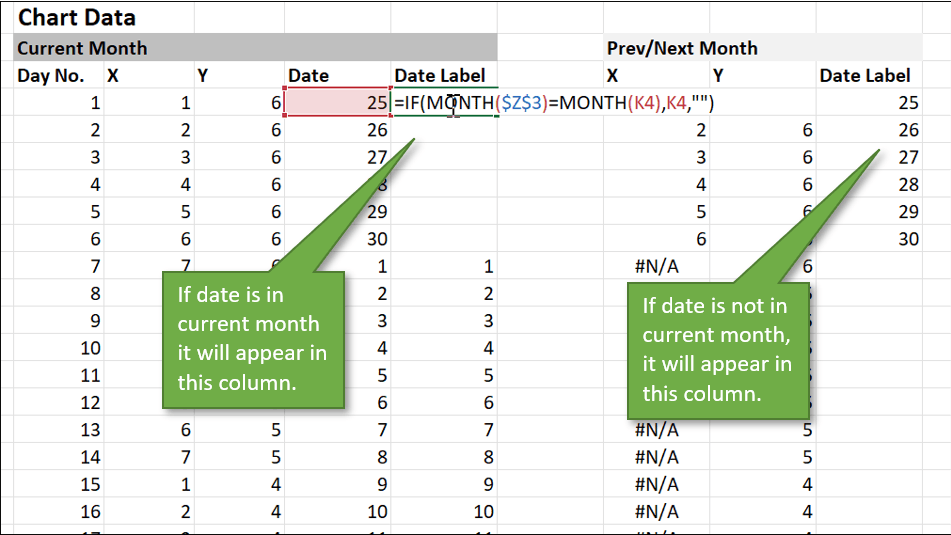
Then I just format those two new data series to display either black or grey text.
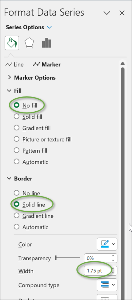
To achieve the bubble around my date labels, I changed the settings to No fill and Solid line border. I also beefed up the width of the border to 1.75.
Showing Weekly Goals
One enhancement you can make to the calendar chart is to add a weekly goal feature. By that, I mean we can highlight the entire week if that week meets a preset goal amount. For example, if a task was completed 5 days out of the week, that entire week can be highlighted.
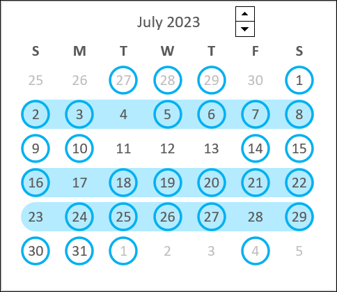
To create this effect, I've added some more data columns to our sheet for Goals. The Goal amount (days per week) can be adjusted to however many days you want.
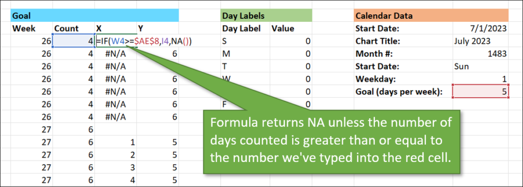
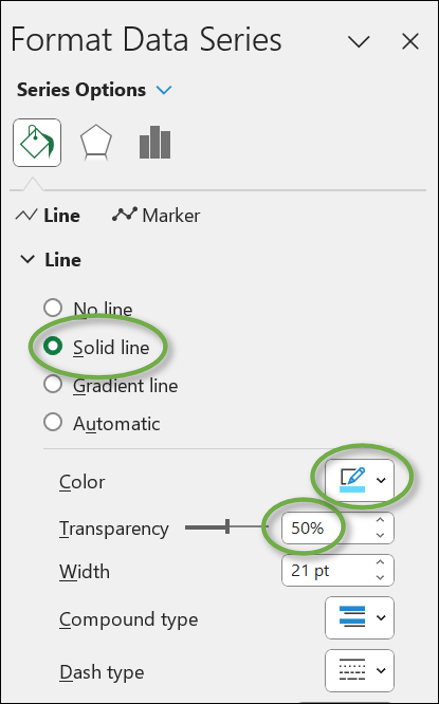
This new set of data becomes yet another series in the chart, and this time we format it using a line. The format settings for this series would be:
- Line: Solid Line
- Color: Light Blue
- Transparency: 50%
Hopefully, this sparks some ideas for other ways you could format the calendar to track progress and highlight goals.
Conclusion
If you didn't necessarily understand how the formulas work for these enhancements, or the thought of creating all that new source data feels overwhelming, the great news is that you don't have to. You can copy and paste what I've done into any of your own sheets and use it for your own!
I'm curious to know how you will use these charts. To track attendance? For displaying the number of days without a particular error or accident? To brag about the number of days in the month your department met a sales goal? Let us know in the comments below. We'd love to hear from you.


This is really cool!
Thanks so much, Jon! 🙂