This post and video contain lots of tips for moving your charts and shapes with the arrow keys. This is very useful when you need to arrange and align multiple shapes on your worksheet. I also have a free Chart Alignment add-in that allows you to move the objects inside a chart (titles, labels, legends) with the arrow keys and alignment buttons.
Video
Move Chart with Arrow Keys
Typically when you select a chart with your mouse, the box surrounding the chart looks like the following.
![]()
When the chart is selected like this, nothing happens when you press the arrow keys to try and move the chart around the worksheet. Instead, the objects within the chart are cycled through and selected. Not what we want.
Solution #1
Hold Ctrl and Left Click the chart – This selects the shape object that the chart resides in. Circles will appear on each corner of the chart.
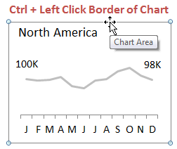
The chart can now be moved around on the sheet with the arrow keys, making it easy to align it with other shapes, charts, or cells in your worksheet.
Solution #2
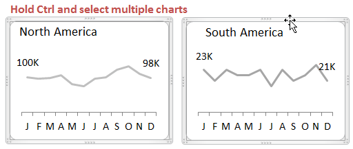
Select multiple charts or shapes – Hold the Ctrl key and select at least two charts using left click. The bounding box will still look like the same as when you only have one chart selected, but you are able to move the charts with the arrow keys.
Move or Create a Shape Inside a Chart
Moving shapes inside a chart can get a bit confusing. Shapes, such as a text box or rectangle, can reside in two places:
- either inside the chart object,
- or on the worksheet (outside of the chart).
The confusing part is that a shape residing outside the chart on the worksheet can be placed on top of the chart. This makes it look like the shape is inside the chart even though it is not. In this case, when you move the chart, the shape will NOT move with it unless you have both the shape and the chart selected.
A shape located inside the chart will move with the chart. This makes it easier to move and align the chart because you don't have to worry about selecting multiple objects when doing the alignment.
There are two ways to get a shape inside a chart:
- Create the shape inside the chart – First select the chart so the bounding box appears around it, then draw the shape inside the chart object area (Insert tab
> Shapes menu). - Paste a shape inside the chart – Cut or Copy an existing shape on your worksheet, then select the chart and paste the shape. This will put the shape inside the chart.
Move Shape Inside Chart with Arrow Keys
Now that your shape is residing inside your chart, you can use the arrow keys to move it around and align it with the other objects in your chart (title, axis, legend, etc.) See instructions below the screencast.
![]()
To move a shape inside the chart with arrow keys:
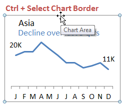
- Ctrl+Left Click the border of the chart so you get the circles on the corners.

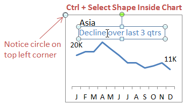
- Then Ctrl+Left Click the shape inside the chart. You will notice that the circles remain on the top left corner of the chart.

- Keyboard arrows are now enabled so you can move and align your shape (text box) within the chart.
Conclusion
You should now be able to get all your charts and shapes lined up to perfection using the incremental movements of the arrow keys. This is very useful if you read my post on Panel Charts as an alternative to Stacked Charts and want to create panel charts. In a future post I will share more tips and shortcuts for aligning and viewing your charts.
What are some shortcuts you use to align your charts?


This is what I have been looking for…
Thanks for sharing!
Glad you found it useful!
Hi Jon, is it possible to do that for Chart Object inside the chart? e.g. legend, data label?
Great question!
I have not found a way to move the Chart Objects with the arrow keys. However, they can be moved with VBA. This has got me thinking… I will let you know if I can find or create a simple solution that will provide this functionality.
I developed a Free add-in that allows you to use the arrow keys or alignment buttons to move the objects inside the chart.
You can download it and get all the info on the following page.
https://www.excelcampus.com/keyboard-shortcuts/chart-alignment-add-in/
Thanks! I’ve been frustrated trying to align charts in Dashboards for more time than I’d like to admit.
Thanks PM! I completely agree. 🙂
I thought this wasn’t doable in Excel till I looked this up. Like PM, I have probably spent more time that I would like to admit getting my graphs to align moving them with my mouse and relying in excellent eyesight to assume the line up (and then cringe at the slight misalignment when I am presenting). Thanks Jon, this is one of those small things that seem like a big rock off your shoulder, if you know what I mean!!
Thanks B! I’m glad you found it useful. You can also use the Alignment tools to line up your charts to perfection. I explain more about those at the end of the video on this page about dashboards.
https://www.excelcampus.com/charts/pivot-tables-dashboards-part-3/
If you haven’t used the Alignment buttons yet, this might be mind blowing. It was for me when I learned it. 🙂
Hi ! Thanks for the add-in !
I was used to move objects around with the arrow keys in Excel and Powerpoint, but it suddenly stopped working. I know it sounds a bit dumb put like this but I can’t get the slightest idea about why. It now selects the next objet in the direction I pressed. ctrl + left click doesn’t seem to work as it did neither. It’s really frustrating to have to use this terribly imprecise mouse now, especially when putting significance levels on a chart ! :p
Do you have any idea how I might have provoked that ?
This was really useful. I used to spend hours earlier until I found the “Align” option in the contextual menu. But still that helped only to some extent, adjusting the shapes at most places required extra effort using mouse and was yet unsatisfying. But, now its looking so good. Thanks a ton, Jon for this knowledge!
Or you could just “ctrl + click” to select the object chart and then use the arrow keys to move it.
Thanks for the tip. And I also found out by trying that when it is selected that way, you can also size it with Ctrl+Up/Down (larger/smaller) roughly or Ctrl+Shift+… finely – heaps easier than with the mouse aligning multiple charts. Perhaps, there are keyboard shortcuts for sizing/positioning multiple objects together to largest/smallest, top/bottom-most etc, but I did OK by just copying size measurements.
Hi, I’d like to build off this macro. How can I get the password for it? Is it available for purchase?