Bottom line: Learn how to create a progress doughnut chart or circle chart in Excel. This chart displays a progress bar with the percentage of completion on a single metric. We will apply conditional formatting so that the color of the circle changes as the progress changes. This technique just uses a doughnut chart and formulas. It is pretty easy to implement.
Skill level: Intermediate
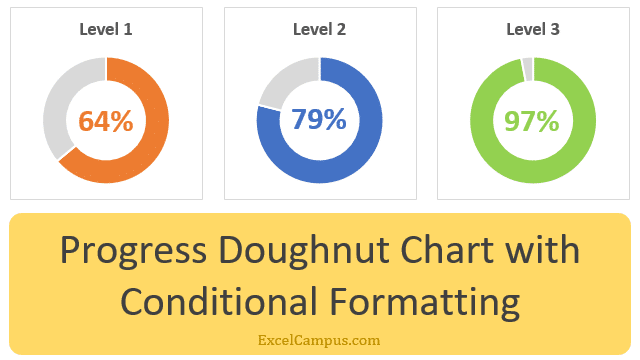
Progress doughnut charts have become very popular. We see them on mobile apps, television broadcasts, sporting events, and financial reports. The progress doughnut (circle) chart is a simple visualization that typically just displays one metric.
This makes it a great addition to any dashboard because the chart (graph) is easy to understand. The reader can quickly see the percentage of completion towards a goal.
We can add the progress doughnut charts to our reports and dashboards in Excel too. In this post, we'll take a look at how to create the chart, and also apply conditional formatting so the color of the progress bar (circle) changes as the percentage of completion changes.
Required Ingredients
The setup is pretty simple and just requires an Excel doughnut chart and a few formulas. This technique will work in all versions of Excel including both Windows and Mac Editions.
Download the Excel File
Download the Excel file to follow along with the videos.
Video #1 – How to Create the Progress Doughnut Chart
Video #2 – How to Add Conditional Formatting to the Progress Doughnut Chart
When to Use the Progress Chart
The progress doughnut chart displays the percentage of completion on a single metric. It can be used for measuring the performance of any goal or target.
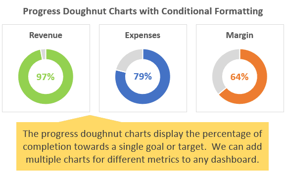
The chart is a great addition to any dashboard because it is very easy to understand. The reader can quickly see the progress of metrics that they are familiar with.
The conditional formatting makes it even easier to read because the changes in color alert the reader that a metric might need additional attention if it is not performing well.
How to Create the Progress Doughnut Chart in Excel
The first step is to create the Doughnut Chart. This is a default chart type in Excel, and it's very easy to create. We just need to get the data range set up properly for the percentage of completion (progress).
Step 1 – Set Up the Data Range
For the data range, we need two cells with values that add up to 100%.
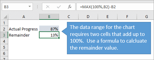
- The first cell is the value of the percentage complete (progress achieved).
- The second cell is the remainder value. 100% minus the percentage complete.
This will create two bars or sections of the circle. One for the percentage complete and one for the remainder. We can fill these bars with different colors to display the progress complete in a bold color, and the remainder in a lighter tone or gray.
Both cell values are formatted as percents.
We can use the following formula to calculate the remainder value.
=100%-B2
If the maximum percentage complete value can go over 100%, then it's best to use the following formula for the remainder value.
=MAX(100%,B2)-B2
This will change the remainder value to zero if the progress is greater than 100%. The entire chart will be shaded with the progress complete color, and we can display the progress percentage in the label to show that it is greater than 100%.
Step 2 – Insert the Doughnut Chart
With the data range set up, we can now insert the doughnut chart from the Insert tab on the Ribbon. The Doughnut Chart is in the Pie Chart drop-down menu.
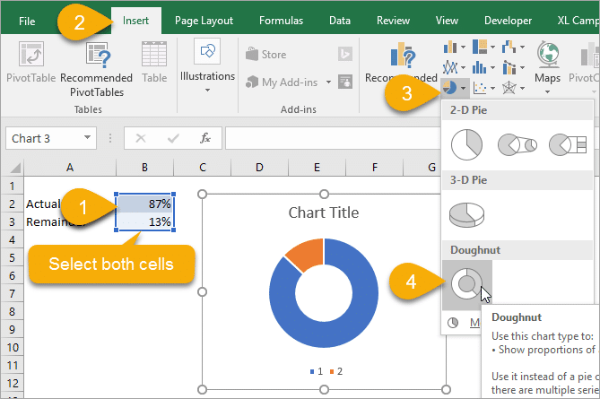
- Select both the percentage complete and remainder cells.
- Go to the Insert tab and select Doughnut Chart from the Pie Chart drop-down menu.
- The doughnut chart will be inserted on the sheet.
Step 3 – Format the Doughnut Chart
Now we need to modify the formatting of the chart to highlight the progress bar. The default chart will look something like the following. Here are the steps to clean it up.
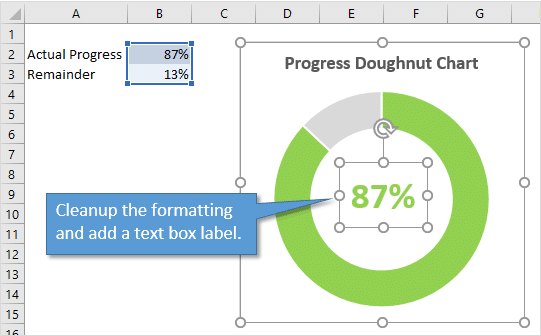
- Remove the legend. Select the legend and press the delete key.
- Change the colors of the progress and remainder bars.
- Left-click on the progress bar twice to select it.
- Go to the Format tab in the ribbon and change the fill color to a bold color.
- Repeat steps 1 & 2 for the remainder bar, and select a light color or gray.
The doughnut chart should now look like more like a progress chart. The last step is to add a label with percentage complete value.
I like to add a Text Box shape to the chart that displays the number in the middle of the circle.
- Select the chart.
- Go to the Insert tab on the ribbon and select the text box shape from the Insert Shapes menu.
- Draw the text box inside the chart. This will add the shape to the chart, and the shape will move and size with the chart.
- Select the outside border of the text box.
- In the formula bar, type the equal sign =, then select the cell that contains the progress value. Press Enter. This links the text box value to the cell value. When the cell value changes, the text box value will automatically be updated to reflect the change.
- Finally, change the formatting of the text box so the text color matches the progress bar color.
The width of the doughnut circle can also be changed by right-clicking the bar and selecting Format Data Series… Then modify the Doughnut Hole Size property.
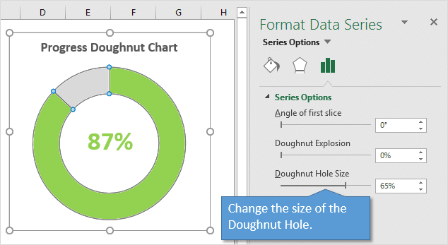
We should now have a progress doughnut chart that displays the percentage complete for a single metric. This is great for actual vs budget, target, and goal oriented metrics.
Getting hungry yet? 🙂
Apply Conditional Formatting to the Doughnut Progress Chart
Now we might want to spiff up our chart with different colors to indicate each level of progress achieved. This is called conditional formatting, and it makes it even easier for the reader to quickly see what level of performance has been achieved.
Here are the levels and colors we'll use for this example.
- Less than or equal to 75% is Orange.
- 76% to 95% is Blue.
- Greater than 95% is Green.
You can add as many levels as you'd like, and also change the percentages for each level. I prefer to use three levels to keep the rules simple for the readers.
Step 1 – Set Up the Data Range for Multiple Levels
The first step is to create a cell that contains the progress value for each level. In this example we have 3 levels, so we will create 3 rows of cells for the progress levels and 1 cell for the remainder value.
We use an IF formula to display the progress value in the row for its corresponding level/tier. If the progress value is in the tier, then a number will be displayed. If not, then the IF formula will return a blank.
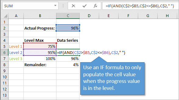
This creates a separate bar for each level. However, the bar will only be displayed if the progress level is within the tier. Otherwise, a blank cell will be returned and the bar will not be displayed in the donut chart.
Step 2 – Insert the Doughnut Chart for All Levels
The next step is to extend the data series to include all the cells in the Data Series column. This includes the 3 cells that contain the IF formulas and the remainder cell.
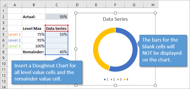
The doughnut chart will only display bars for cells that contain a value. If the cell is blank, then a bar will NOT be displayed on the chart.
This is the trick to creating the conditional formatting. When the actual value changes, the IF formulas will recalculate and show the value in the cell of the corresponding level. The chart will also update to display that bar. The Remainder bar will always be displayed on the chart, since the two visible values in the range add up to 100%.
Now we just need to change the color of each bar in each level. Check out the part 2 video above for instructions on how to color each bar.
Step 3 – Apply the Formatting & Data Labels
Finally, we need to clean up the formatting. This is the same basic process as step 3 above. The only difference is that we create three separate text boxes, one for each level. This allows us to change the color of each textbox to match the bar color.
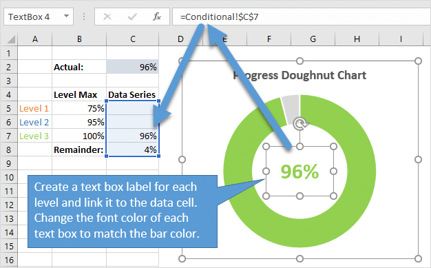
The text boxes are linked to each cell in the data range for the chart.
Free Chart Alignment Add-in
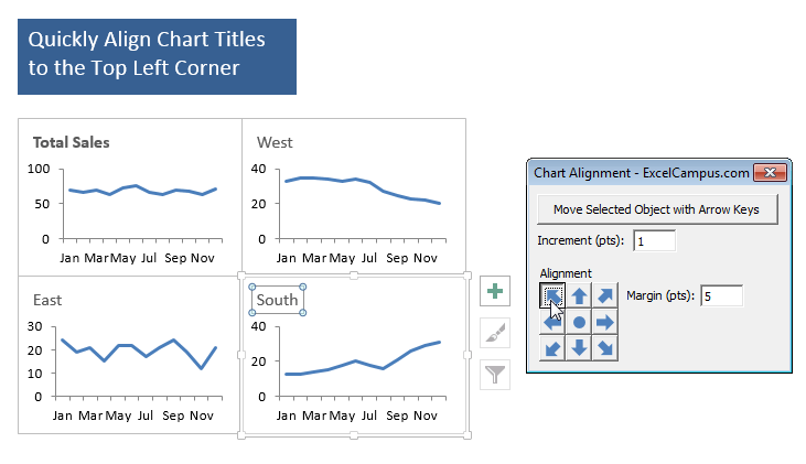
My FREE Chart Alignment Add-in allows you to move the chart elements (titles, labels, legend) with the arrow keys and alignment buttons. This can be very helpful and save time when building dashboards where we want the titles and labels to lineup perfectly between charts.
Are Your Dashboards Hungry for Doughnuts?
The progress doughnut chart makes a great addition to any dashboard or infographic. It provides a simple summary of progress towards a goal. We can then add other chart types to help identify trends and further analysis around these metrics.
What type of metrics will you use this chart for? Please leave a comment below with suggestions or questions. Thank you! 🙂


Jon, Thanks, another great job explaining Excel functions, keeping it simple and to the point. Have a great day!
Thank you Steve! Have a nice weekend 🙂
Jon,
Thank you for the video! A couple people I create reports for will love the progress doughnut chart. A simple yet powerful visual tool.
Video was well done.
Thanks again,
–Caleb
Awesome! I’m happy to hear it. Thanks Caleb! 🙂
Nice trick with the conditions to change colors. I am sure I will use this often. Thanks for sharing.
Thank you Indzara! 🙂
Good Job Jon….Thank You
Thanks Sam! 🙂
Great video. I learned several new tricks that will become part of my Excel skill set. For example, I’ve never used Ctrl-D to duplicate an figure or used conditional formatting with a graph.
Thank you Jon.
Thank you Mel! Ctrl+D can be used on all shapes including charts, slicers, timelines, & images.
Jon, this is awesome! Thanks for sharing!
Great video, thanks for sharing. I will put this in my Library for future use.
Sr. Acampora, reciba usted mis reconocimientos por su excelente capacidad para la enseñanza a traves de videos !!!!!
Un Abrazo !!!
John, this exercise suggested an idea. I’d like to have a chart looking at the minute-by-minute stock price for a few (5?)stocks. It would have the day opening price, high, low and would allow for alerts at an upper and a lower boundary for each stock. Is there an easy way to do that, assuming access to the data feed? Do you think it would be of general interest to your audience?
Thanks for sharing, amazing chart tip. Very useful for showing any project progression
Hi Jon, Thanks for another good video. Question on the formulas for the different levels. For level 1, would you not want to make sure that it would not go below 0%? The same would be for level 3, would you not want to ensure it does not exceed 100%? or am I missing something? Was that because this was just a simple example?
Hi Bernice,
That depends on the metric you are calculating or measuring. If your percentage of completion could be less than 0%, then you could add another level to account for that. This chart is going to work best for progress between 0 and 100%. Anything over 100% will show in the label and the full circle will be shaded with the green color.
You are a champ Jon…
thnx Jon for valuable information
Thank you for making Excel so easy to implement
Thank you Firas! 🙂
Hi, thanks for videos, but one issue with textbox is not supported in browsers.
do you have solution for it.
Hi Mahmoud,
Great question! The Excel Web App does not support those text box shapes yet. We can use the built-in data labels for the chart instead. The label for the Remainder bar can be deleted by left clicking on the label twice, then pressing the delete key. That just leaves the data label for the actual progress amount. Here is a screenshot.
The only drawback here is that the label will appear on top of the bar. You can drag it to the center, but it does change positions as the progress % changes. So you might want to leave it over the bar if the actual progress % is going to change with some type of interactive control on the dashboard. Here’s a screenshot of what it looks like on the Web App (Excel Online).
I think it still looks pretty good with the data label. Let me know if you have any questions.
Hi,
Thanks for your reply, it is a good solution but still, sometimes you need to add in the center. added in the bar will not satisfy the customer 🙂
Hey Mahmoud,

I totally understand. 🙂 Another option is to change the Fill color of the chart AND plot area to “No Fill”, then use a cell for the data label. The chart will be placed over the cell that contains the data label. The cell will just be a formula that references the cell with the actual value (=B2). Here is a screenshot. I have the cell selected in the screenshot to show the formula, but once you change the selection to another cell, the chart will look just like the original.
Then you can apply conditional formatting to the cell so the font color changes as the progress value changes. Hopefully that satisfies the customer… 😉
Thanks for quick reply, I have done that before also but it has some limitation in designing. but it is still better that nothing.
thanks and keep it up.
Great video! Thanks for the helpful tips.
I learned something new today. Thank you every much!
Thanks Jake! 🙂
Jon : I appreciate very impressive way of adding valuable Infor by way of donut chart.
Please help me how to incoperate Slicers to navigate the donut chart values by selecting a month etc.
January 35% 65%
February. 10% 90%
March. 40% 60%
Can I use donut chart for data series as above.
I appreciate all your tutorials . Thanks a million.
Just what i was looking for to show in my data.
Thank you a lot Jon i love so much 🙂
Hi Jon , nice tips here and explained very well. A little question. When I create the Progress Doughnut and make the Actual greater than 100% the text box shows the real value i.e 105% Is there any way around this? That is, when the actual is less than 100% the text box displays the actual , but if the actual is greater than 100% the text box is empty?
Hi John,
The textbox will still display the percentage over 100%. It does this in the example file. However, the chart really doesn’t display this well. That is why I added the formula to make the remainder amount 0% for anything over 100% progress. I hope that helps answer your question.
A really impressive and value adding tip ! Thanks for sharing Jon! You’re doing a great job !
Hello Jon, Thanks for explaining this function.
How to complete below conditional formatting? This is partially explained in video2 to setup specific colour for specific value. But how to ensure the colour changes in the below ranges.
• Less than or equal to 75% is Orange.
• 76% to 95% is Blue.
• Greater than 95% is Green.
Awesome! Very clear and detailed explanation. Really solved my problem,
creation of a visual dashboard for my indicators. Thanks!
Hello Jon,
I find this tutorial very helpful! Thank you for sharing your knowledge on this. I have a question though, I am working on this scenario where there is a success rate, suspended rate, and in failed rate. Now, lets say 100% of success rate will be lessen if there is a suspended rate and failed rate. I’m just wondering how can I do it.
E.g.
TOTAL = 100% (Success Rate)
Less 20% Suspended
Less 10% Failed
TOTAL = 70% SUCCESS RATE
Can you help? Cant do it as a progress chart.
Thank you!
Hi Jon,
I am trying to use conditional formatting to create a pie chart from data that varying in values from 1-25. This is broken down into 4 ranges 1-4, 5-9, 10-12 and 13-25. what do i need to do to identify the range in a cell…in a single cell there will be one of the four ranges, how do i set up another cell to detect the range calculated? this will enable me to create the pie chart on a pivot table…or is this way, way complicated…a novice trying to get excel to save me a lot of work.
Cheers Vince
Jon,
You are amazing! thank you.
I would like to thank you very much you make it simple & easy.
Any idea on how to make a progress chart for 3 comparisons? We would like to show actual spend YTD and budgeted spend YTD as an overlapping bar, and keep the annual budget as the “100%” remainder. I can’t figure out how to do a data overlay (with pattern fill instead of solid for differentiation) in a donut chart like you can for bar charts.
Hi Jon,
This has helped me a lot. Is there a way of making the colour dependant on another value? I have projects in the portfolio that I manage on 2 variables : (1) Percentage of completion which is your donut and (2) ratio of actual work/planned work (I call it SPI). So it would be great if the donut could show the Percentage of completion but colour it using the value of the SPI. This would give me a donut showing the POC but with the colour being red, amber or green depending on the SPI or progress value.I can have projects that are 45% complete but way behind plan in which case the donut would show for 45% completion but the colour of the donut piece would be red.
Do you think this can be possible?
That would be awesome because that would help me creating a portfolio dashboard.
Many thanks.
Jo
Its been an easy and great video for beginners like me but i cannot seem to keep the color formatting despite following each step of how to color format it..
IS there something i might have slipped up on?
It took time to understand the steps, the video explains very well and I practised twice and got it. Really nice!
Great Video! Any suggestions on how to do a conditional format on the donut if independent of progress but on binary? For example, the donut is at 75% completed but the progress is on hold so a text value of “On Hold” will change the donut to “Red”. For “On Plan” it would be green and the donut would change to green.
doctor jon:
very useful videos as my excel 2003 bible tells me nearly nothing about donut charts. for us, the donut chart was invented in 1941 by ethan allen [retired MLB outfielder] to show pct of plate appearances a guy struck out, homered, walked, etc, in the cadaco-ellis game ALL STAR BASEBALL. we had been making these batter discs by hand since the early 1960s, so excel donut graph is a great find. when others pass on their spreadsheets of MLB players, it is difficult to modify them until we see you doing it “live” on youtube. thanks for showing us where all the commands are hidden in the menu tree! now we are incorporating pitching discs into the game, maybe defense down the road.
curt young
chittenango NY
Hi,sir.too impretion vedio and ideas.realy thanks.
Just what I was looking for, thank you very very much!
Visualize your data and statistics quickly and easily with ChartExpo
Choose from over 50+ fully customizable chart types to find the perfect representation of your data.
ChartExpo is a data visualization tool for both Excel and Google Sheets.
ChartExpo for Excel: https://chartexpo.com/utmAction/MTErbWNhcnQreGwrU0IrQXIr
ChartExpo for Google Sheets: https://chartexpo.com/utmAction/MTErbWNhcnQrZ3MrU0IrQXIr
Happy Charting!
Good job, thanks for sharing
My favourite progress chart, Clients love it as well. It makes me happy 🙂 Thank you for sharing knowledge!
Hi Jon. Great tutorial! How can I modify Excel to show a percentage from two numbers? For example, of 30 students who took a course, 15 responded to a survey resulting in a 50% return rate.