Bottom Line: Create a fully customizable KPI scorecard chart in Excel using icons, emojis, and images to make your performance reports engaging and dynamic.
Skill Level: Beginner
Watch the Tutorial
Download the Excel File
You can access the Excel file used in the video here.
Creating a KPI scorecard chart in Excel is an excellent way to visualize key performance indicators (KPIs) and goals. Instead of sifting through pages of boring numbers, you can create an engaging and interactive chart that clearly displays your data from a high-level perspective. This tutorial will guide you through the steps to create a fully customizable KPI scorecard chart in Excel, using icons, emojis, and even pictures to enhance your reports.
Why Use a KPI Scorecard Chart?
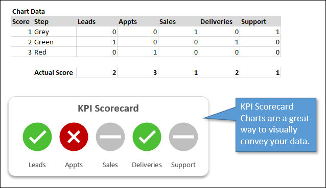
A KPI scorecard chart is ideal for presenting high-level data about your team's performance against set goals. It provides a quick snapshot of areas that need attention without overwhelming the viewer with too much detail. For instance, you might use it to track metrics like leads, appointments, sales, deliveries, and support.
Setting Up Your Source Data
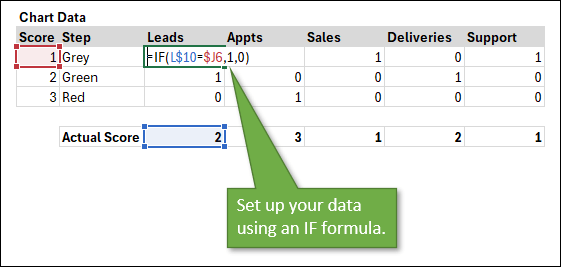
Before creating the chart, you need to set up your source data.
- Input Scores: Create a table with your KPI categories and input scores. For example, 1 = Incomplete, 2 = Pass, and 3 = Fail.
- Conditional Formulas: Use an IF formula to mark each score. For example,
=IF(L10=J6, 1, 0)where L10 is the actual score, and J6 is the score in your legend.
If you could use some practice or a refresher for the IF Function, here's a tutorial that will help: IF Formula Tutorial for Excel – Everything You Need To Know.
Note: You can change the category names in cells L5:P5 and they will automatically be reflected in the chart. You can also change the step names in K6:K8 to reflect the types of scores or steps in your chart.
Feel free to just download the example file above and customize it to your liking.
Building the Chart
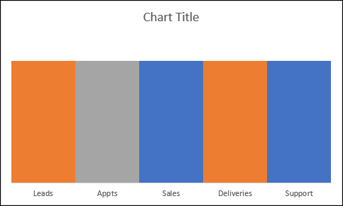
- Select Data: Highlight your data, excluding the score column, and insert a clustered column chart.
- Clean Up the Chart: Remove unnecessary elements like gridlines, legends, and vertical axis labels to keep your chart clean.
- Format Data Series: Set the gap width to zero and the series overlap to 100% to fill in the columns.
At this point, your chart should look similar to this:
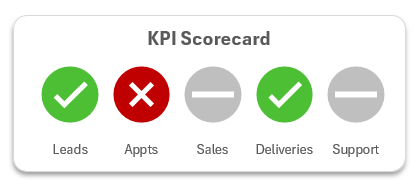
Adding Icons to Your Chart
Icons can make your chart more intuitive. Follow these steps to add them:
- Insert Icons: Go to the Insert tab, select Icons, and choose the desired icons (e.g., checkmark for pass, X for fail, dash for incomplete).
- Format Icons: Color the icons according to your preference. I chose green for pass, red for fail, and gray for incomplete.
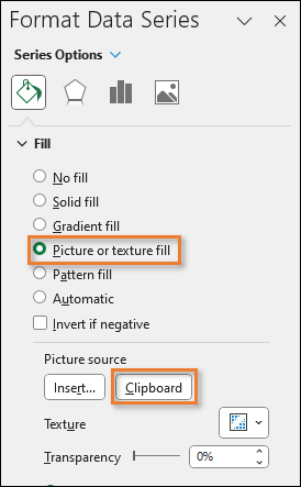
- Copy Icons: Copy each icon and paste it into the corresponding column in your chart using the Format Data Series pane, select Picture or Text Fill, then Clipboard as the Picture Source.
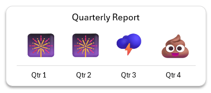
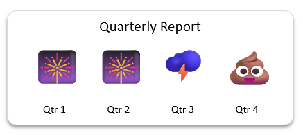
Using Emojis for a Fun Twist
If you want to add a bit of fun to your reports, you can use emojis instead of icons.
- Insert Text Box: Create a text box and insert an emoji using the Windows key + period shortcut.
- Copy and Paste: Adjust the size of the text box and copy it. Then, paste it into your chart the same way you did with the icons.
Customizing with Images
For a personalized touch, you can use images, such as pictures of team members or managers.
- Insert Pictures: Go to the Insert tab, choose Pictures, and select the image you want to use.
- Resize and Format: Resize the image as needed and paste it using the Format Data Series pane, as before.
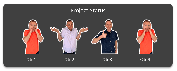
Because the chart elements are linked to your data source, these charts are dynamic, so the images or icons will automatically change as your data changes.
Final Touches
To ensure your chart looks professional:
- Adjust Chart Size: Resize the chart to ensure icons or images look proportional.
- Remove Gaps: Reduce any white space by adjusting the vertical axis maximum bound.
- Final Formatting: Turn off the primary vertical axis for a cleaner look.
Conclusion
Creating a customizable KPI scorecard chart in Excel is an engaging way to present performance data. Whether you use icons, emojis, or images, you can tailor the chart to suit your needs and make your reports stand out.
We'd love to hear how you plan to use this chart in your own work. Leave a comment below and share your ideas!
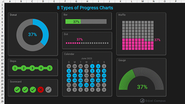
For more tutorials on different types of progress charts, check out our video series.
- 8 Types of Progress Charts
- Creating Gauge Charts in Excel
- Creating a Steps Chart in Excel
- Create a Calendar Chart – Part 1
- Interactive Calendar Chart with Weekly Goals – Part 2


thank you