There are a lot of different chart types we can use to visualize progress toward a goal. In this post, I share eight progress charts you can use in your reports and dashboards.
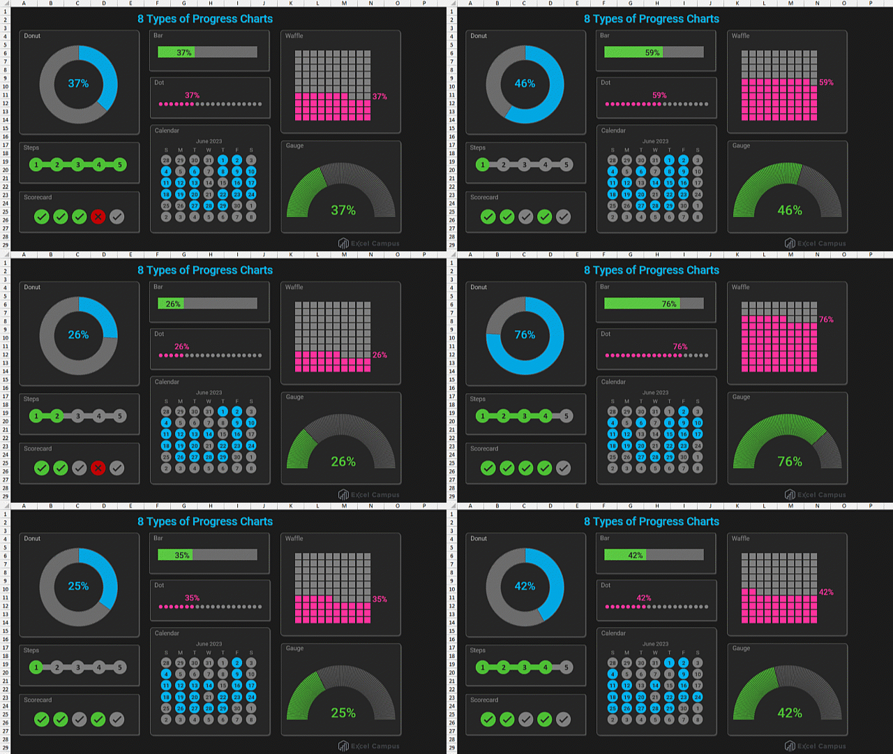
Most progress charts or graphs display the percentage complete out of 100%. However, I've also included the Steps, Scorecard, and Calendar charts. These are great for monitoring steps completed in a task or project.
File Download
You can download the Excel file that contains all eight chart types below.
1. Donut Chart
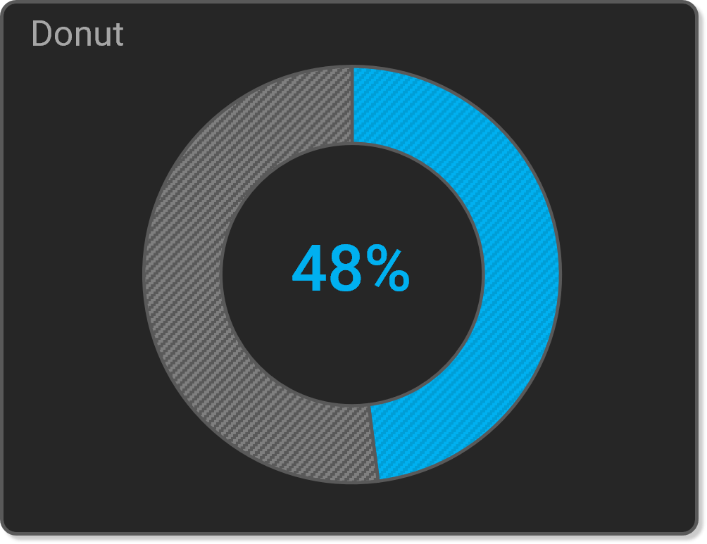
The donut chart shows progress as a percentage of the total, 100%. The shape is a circle or donut and it's a popular chart type in tracker apps, especially fitness apps.
2. Bar Chart
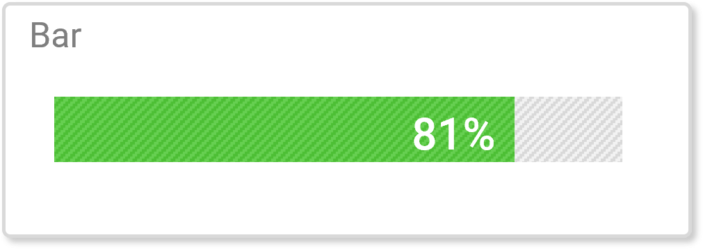
The bar chart is another popular chart type for displaying progress. This chart uses Excel's 100% Stacked Bar chart to display the current progress out of 100%.
3. Dot Chart
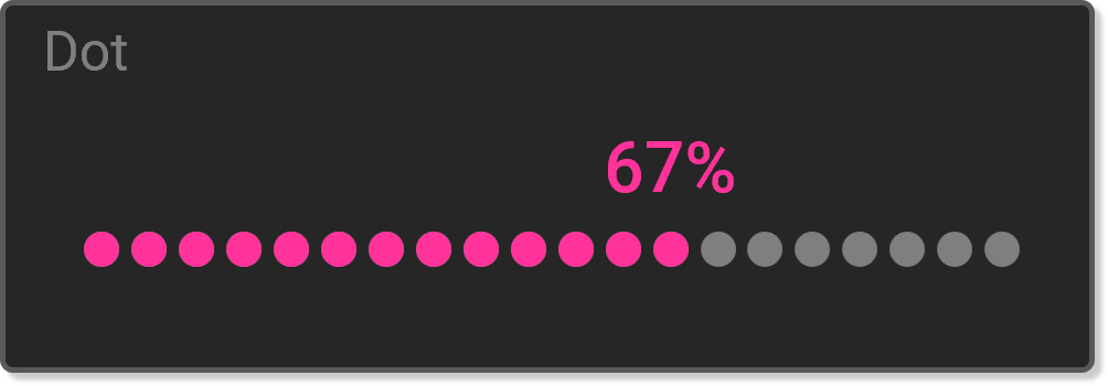
The dot chart is a “fancy” version of the bar chart. This chart uses a Line Chart with Markers to display progress to 100%.
4. Steps Chart
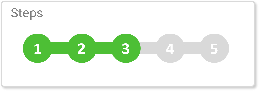
The steps chart displays the completion of a series of steps. This is useful for projects or tasks that have a set number of steps or milestones toward a goal. This chart also uses a Line Chart with Markers.
5. Scorecard Chart
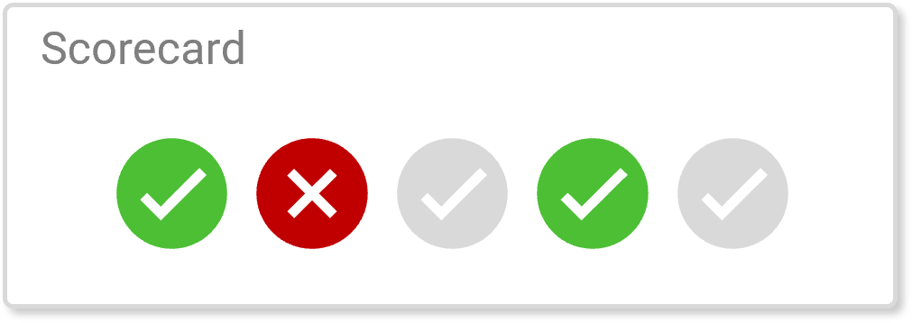
The scorecard chart shows the completion status of tasks or goals. The completion does not have to be in order. This chart uses Clustered Column Chart with Icons. The scorecard chart also has the option to show icons for incorrect answers or missed goals/targets.
6. Calendar Progress Chart
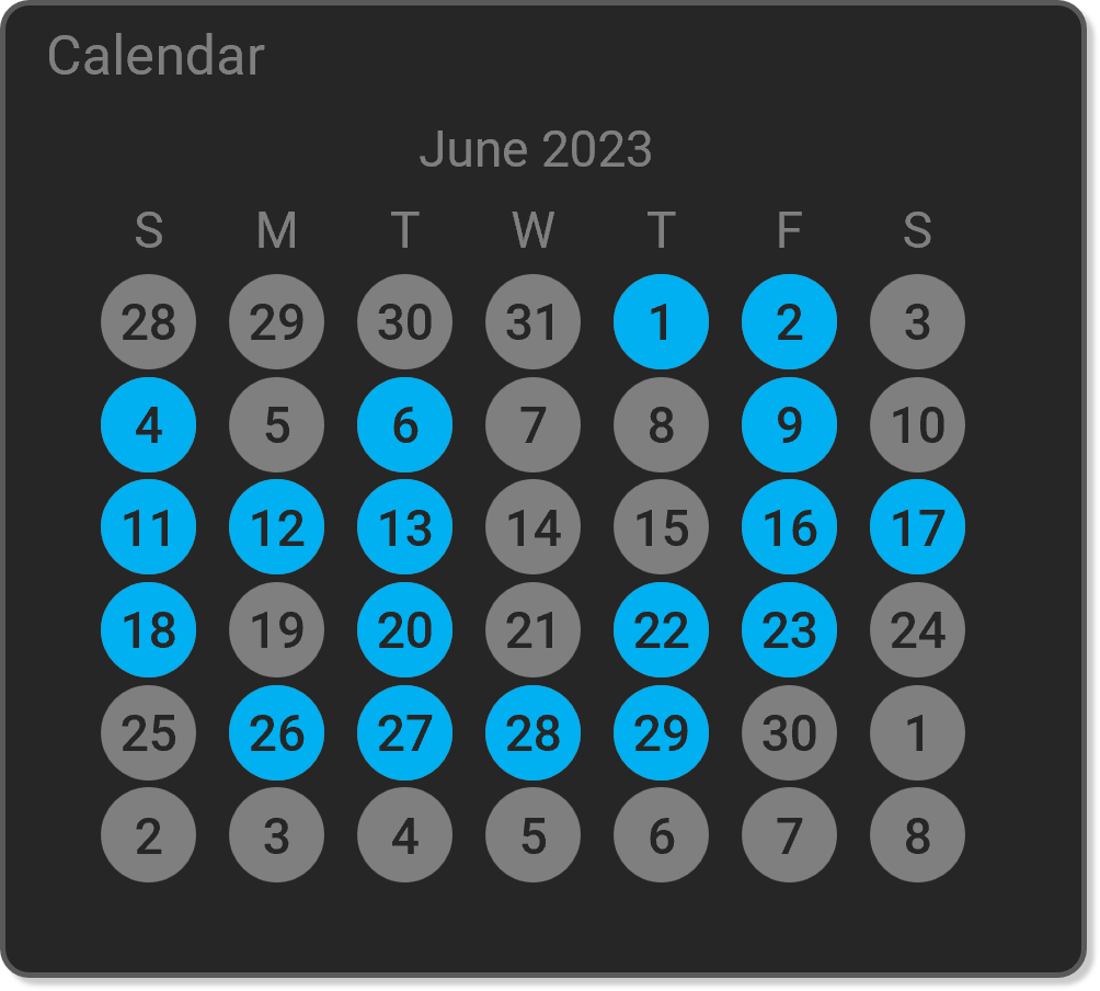
The calendar progress chart displays a month-view calendar with completion indicators for each day. This is great for tracking daily progress or streaks. This chart uses a combo chart with an XY Scatter Chart for the dates and a Clustered Column chart for the weekday names.
7. Waffle Chart
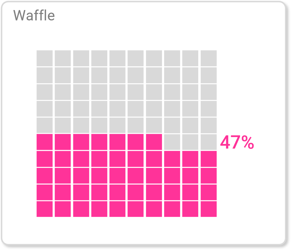
The waffle chart shows progress or percent completion to 100%. And just like the donut chart, its main purpose is to make you hungry. This chart uses an XY Scatter Chart.
8. Gauge Chart
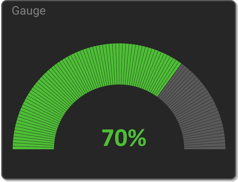
The gauge chart shows percent completion to 100% on a half circle. Or in the case of a gas gauge, it can show consumption until empty. This chart uses two Donut Charts to create the striped design.
Conclusion
I hope this post gives you some ideas for visualizing progress in your next dashboard project. Please leave a comment if you'd like to see tutorials on how to make the charts. And let us know which one is your favorite. Thanks! 🙂


These charts look amazing. They are clear, visually attractive and informative. A brilliant set of visualization tools. I would really like to know how to build them!
Agree, it would be a great idea to build those charts in a video or a step-by-step tutorial
I agree, a video would be awesome!
Fyi, they are available at his Youtube channel
I’d like to see a video of how to make the progress charts
I used a gauge a few years ago on a dashboard I made for work and it always got the attention of leadership. The issue was that it was extremely cumbersome to create and I had to watch and re-watch a few YouTube videos to get it to work properly. Has this chart type been added to Excel natively over the past 5 years or so, or is it still a more manual process to create it?
Thanks!
YES! I would love to see tutorials on how to make these charts!
I love the calendar chart and would enjoy learning tips to set that up.
Could you please send me the tutorials on how to make the progress charts?
Yes, I would love to see how you created all of these charts! Awesome job!
I love the dot chart. I’d love a tutorial on the scorecard chart and the calendar progress chart.
Would love to learn how to make all of these charts. Especially the calendar, scorecard and dot.
Excellent, Thanks for sharing!
They look great. Particularly interested in the scorecard, although hope that it could be made as a vertical?
This could be very useful for me. I would like to see a tutorial on any of them.
Hi Jon, I love that you put these together. The calendar really intrigues me. I would like to see a tutorial/video.
Best~
I would be interested in learning to create all the charts shown.
Yes please. I love learning new things in Excel and your tutorials are the best on the internet.
Me ha encando todos los gráficos en especial el de calendario. Sería genial poder ver un tutorial explicativo. Gracias.
Would like to know how all the charts are made. Please provide a link to that video when published.
Awesome, please show us how you made them, maybe just the most popular charts, along with their data files. Thanks Jon.
Hi Jon – these look amazing and I’d love for you to make a video on how to make them.
Amazing chart. It looks clear and critically informative to get insight. Appreciate your effort and genius in letting us know from raw data to informed-decision making.
It looks simple but it will take a hard time to create and innovate it. Thanks so much for share.
This is exactly what I was looking for! Our Health & Safety Officer has just made out an excel worksheet for contractors work being raised and going through the stages up to completion. Although I haven’t opened your ones as yet, I can already see that it will add a bit of sparkle.
Ditto regarding tutorials.
Great selection. I like the calendar chart – elegant hack. Thanks for sharing.
How do we access your instructions for building these charts?
Great job. I really want to know how make these charts. Thanks
Brilliant work. I would like to see how to build them
OMG, please make a tutorial on how to make all of these! One could figure it out, which is a part of learning, but some “how to” information would benefit that learning journey.
My students would enjoy creating these charts as a way to visualize their data. Basic chart types–bar, line, pie–have become sort of ho-hum. I try to give them many examples of charts so they can have various tools for data analysis. These look like a great way to add some variety. Thanks!
These are fantastic, great looking and actually do something that will be extremely useful.
Greetings, Jon! Great charts. I noticed that the progress bar chart goes backward from 84% through 99%. From 1 through 83% and 100% are normal.
Nice work, beatiful visualization and it would be much better to make the community understand how this can be done. Just showing those items without any explanation is more or less useless in my humble opinion
Yes, I would like to see the tutorial on creating these charts.
Thanks!
Would really like to see the building steps – these would set anyone’s work apart from and above the norm. Anticipating…. 🙂
Very useful. I would love to see a tutorial on how to make these charts. Thank you.
I think these charts are great, love the colours, and it just makes everything look more interesting. A tutorial would be great.
I came here from the Gauge Chart video! So good!
I would love to see a tutorial on each of them…especially the calendar score card and steps charts.
hi jon,
i do realise that you only have time for comments and not for questions, which i can very well understand, so i comment on the fact that although the videos to building a calendar chart parts 1 and 2 are extremly good, for a novice they do leave questions open: how do calculate the month number since 1900?
in your video to part 2, you were explaing the formula for the starting date:
=date(1900,T5,1)
but in your excel file the formula is:
=date(19900, 3000-T5,1) – which is hard for me to understand.
and, of course, i would have many more queries.
perhaps you make a video of how to build a calendar chart, using a blank sheet:
writing the data, column for column and explaining the methods, as you go on.
i would very much appreciate this, as i am sure that many other people would.
maybe i just overlooked the fact that you have such a video in your collection, if you do, then a link to it would be fantastic.
regards from berlin, germany (colin huntley)
I like the Donut chart and the Calendar Progress chart
I would like to create Donut chart & Calendar progress charts
I want to see tutorials!!! Please!!!!
Interested in knowing more about progress bar/chart
Great insights on progress charts! I particularly loved the examples you provided for each type. They really helped to clarify how to use them effectively in Excel. Looking forward to trying these out in my next project!
This post on the different types of progress charts is incredibly helpful! I love how you’ve broken down each type with clear examples. I’m excited to implement some of these techniques in my own Excel projects. Thanks for sharing such valuable insights!
Great post! I never realized there were so many different types of progress charts in Excel. The examples you provided were really helpful in understanding how to implement them effectively in my projects. Looking forward to trying some of these out!
Great post! I found the different types of progress charts really helpful for tracking my project milestones. The examples you provided make it easy to understand how to implement them in Excel. Looking forward to trying these out in my next report!
Great post! I found the breakdown of the different types of progress charts really helpful. The tips on how to customize them in Excel were especially useful. Can’t wait to try implementing these in my projects!