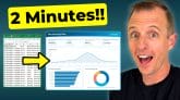
Bottom line: Learn how to create this interactive chart that displays monthly averages versus the current year.
Skill level: Intermediate
Mammoth Mountain is my wife and I's favorite place to go snowboarding in the winter here in California. It's about a six hour drive from where we live in Southern California, and well worth the long haul when the snow is good.
Unfortunately, the snowfall was almost nonexistent this year, and a bit of a bummer. So I had plenty of time to analyze why it was so bad… 🙂
Getting the Data
Mammoth Mountain makes their historical snowfall data available on their website. They have a table that shows monthly snowfall (in inches) for the last 40 years. Here is the link to the webpage.
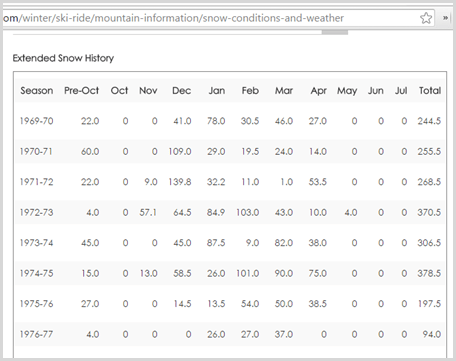
You can copy this data and paste it in Excel. Or, you can use Power Query to connect directly to the webpage, bring in the data, and then unpivot it into a normalized table that can be used for a pivot table.
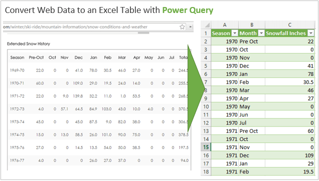
Once this is setup in Power Query, you can simply click the refresh button every month to pull in the new data directly from the website, and also update your pivot tables and charts. It's truly awesome!
The Monthly Average vs Current Period Chart
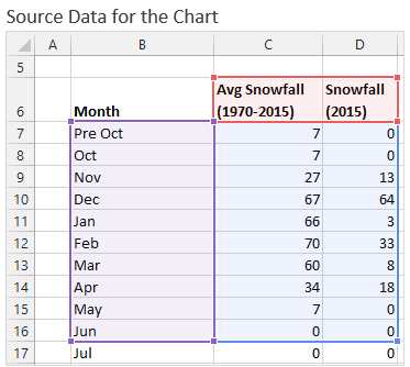
I'm not exactly sure what to call this chart, but my basic question was… “What is the historical average snowfall per month compared to the monthly snowfall this year?”
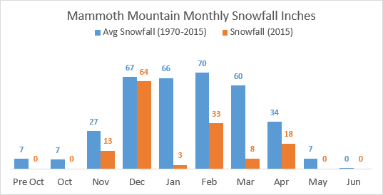
This is a basic Clustered Column Chart that displays the average snowfall by month for all the seasons (years), compared to the monthly snowfall for the selected year.
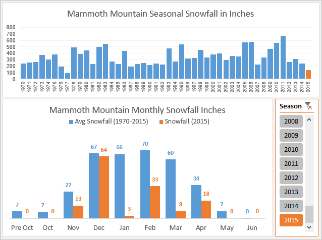
Looking at the winter months of Jan, Feb, and Mar you can start to see why the snow wasn't that great in 2015. Every month this winter was lower than average, and January felt more like a summer month. 🙂
Download the File
Download the file to follow along.
Setup the Source Data
The source data for this chart is really simple. We have one column that contains the average snowfall over the 40 years, and a second column that contains the snowfall for the current/selected year.
I used an AVERAGEIFS formula to calculate average snowfall in column C.
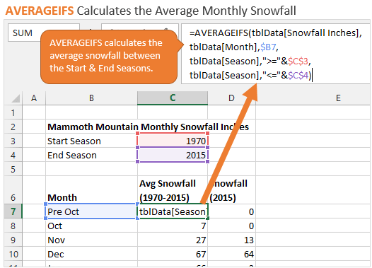
The AVERAGEIFS formula contains three criteria:
- The Month in the data table in equal to the month in column B.
- The Season/Year in the data table is greater than or equal to the Start Season.
- The Season/Year in the data table is less than or equal to the End Season.
This allows us to change the Start and End Season for the average calculation. So if we wanted to see the average snowfall for the last 20 years, we could change cell C3 to 1995. Or use the formula =C4-20.
You'll also notice that the formula contains Table and Column Names (tblData[Month]) instead of cell addresses (Data!$B$2:$B$507). This is because the data output from Power Query is in an Excel Table that I named tblData.
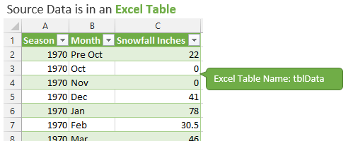
Excel Tables are extremely useful for calculations like this because you don't have to worry about updating the cell references when more data is added to the table.
By the way, this AVERAGEIFS formula could have also been easily calculated with a pivot table.
Pivot Table & Slicer for Selected Year
For the current/selected year I used a pivot table to calculate the average. This allows us to connect a slicer to the pivot table, and then display the data in the chart.
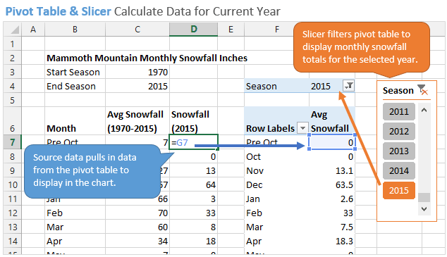
The slicer makes the chart interactive, and the user can quickly select a year to compare it to the average of all the years.
The nice part about using a pivot table and slicer is that it makes the chart interactive without having to use VBA macros. It's a great addition to any dashboard.
Dynamic Chart Series Name
I also used formulas to create the Series Names for the chart. These are the names that are displayed in the legend of the chart.
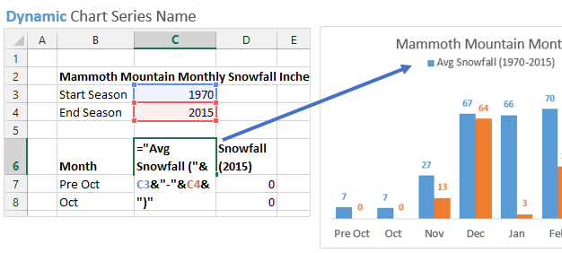
Since the chart is interactive, it's best if the names in the legend are also updated when the user changes the chart.
Putting the Chart & Dashboard Together
Once the data is setup we just have to create the chart and put it all together.
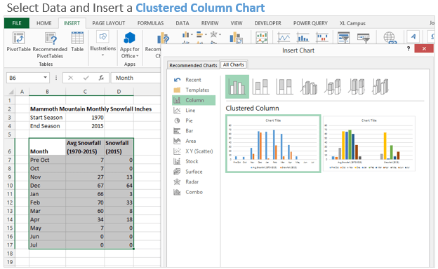
Select the data range and choose Clustered Column Chart from the Insert Chart menu. Now we just need to clean up the default formatting, and add the chart to the dashboard.
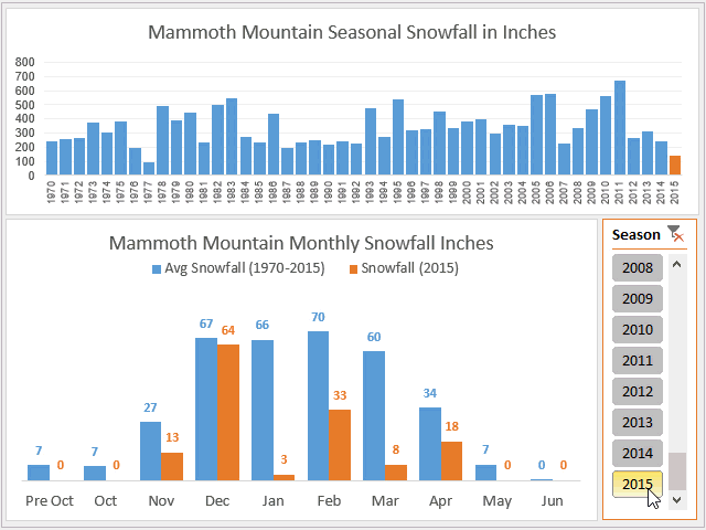
The dashboard also contains a Column Chart that displays the seasonal snowfall trend from 1970-2015. That chart actually contains two data series to display the selected year in orange. I explain more about the using the secondary axis in this article about waterfall charts.
The following screencast shows the dashboard in action.
Analyzing the Data
Well, the 2014-2015 season was one of the worst years in history for snowfall in California. Our winter months (Jan, Feb, Mar) were extremely low compared to average. But, we are optimistic that it will climb back like it did in 2007-2011 (record high year).
I know our friends on the east coast got hammered with storms this winter, so I'll try not to complain too much.
Fortunately, we made the best of it with lots of warm weather and great surf this winter. It's hard to complain about anything in Southern California, except for the cost of living… 🙂


Hell Jon. Thanks for this tutorial. I’ve asked myself the same question, “how to show a historical monthly average for easy comparison to any month in any specific year (1970-2015). I came up with a slightly different, “poor man’s” way of doing this.
My primary desire was to show the monthly average as a static value while allowing for the column chart allowing the various monthly totals to change (with the YEAR slicer selection).
1. I created a pivot table to calculate monthly averages from 1970 through 2014.
2. I created a line chart with data labels of the monthly averages.
3. I hid everything except the “average” line with data labels, then set the background to ‘Transparent’.
4. I laid the monthly average chart OVER the column chart of monthly totals for any year (controlled by a YEAR slicer).
5. Lastly I protected the entire Dashboard, except the slicer.
As far as I know, I can’t post screen shots of the result here, so I will e-mail them to you.
Your way is good! Mine was simply the best I could come up with given my Excel knowledge and my wish to have the averages shown as a static value.
Thanks again for this tutorial.
Thanks for sharing Bob! I uploaded a screenshot of your dashboard so everyone can check it out. Bob’s Snowfall Dashboard
I really like how you made the annual trend at the bottom look like snowy mountains. That’s awesome! 🙂
Thanks for the kind words. Again, it was a product of your inspiration. And you hit the nail on the head: it’s amazing how much can be done with one data table.
Bob’s dashboard below is EXACTLY the type that I am looking for. I am a quality manager for a repackaging company. I am asked repeatedly for Year over Year defect comparisons, month versus month, improvement trends etc., but I have yet to find a dashboard that would work for my needs. Most of the instructions that I have seen, including Jon’s above, are for an intermediate level. I am a between a beginner and intermediate and AVERAGESIF, and other formulas are foreign to me. I am learning as quickly as I can but the needs outpace my learning capabilities (time frame). Any suggestions would be greatly appreciated.
Hi Jon,
Please send me a sample of dashboard for a workshop activity if you have if no just a sample of sales revenue
Thanks,
Lois
Dear Alan,
Thanks for the kind words. Yes, learning applications like Excel Dashboards & Access databases are almost a full time job in itself, so I fully understand how our needs out pace the time necessary to take advantage of an application’s capabilities.
First, would it be of any assistance to you to see the Excel file? I realize your interest is in the concept, not snowfall data, but it might shorten the learning curve.
This was a demo I made (mostly to see if I could do it) from publicly available data, so I have no qualms about emailing it to you.
If yes, you can email me at [email protected] and I will attach it to a reply.
Regards,
Bob
This site has been of tremendous help to me. I never used to understand texts wrtitten on various sites or excel books (used for reference purposes) mostly because they simply bored me to death!
As a beginner I preferred learning via watching live examples or videos/practical sessions. For me this site has a pefect combination of both.
Thank you so much @Jon Acampora for making Excel easier to understand for someone like me 🙂
Thanks for the great feedback Saumika! I am happy to hear you are learning Excel and enjoying the site. 🙂
This blog was… how do you say it? Relevant!! Finally I’ve found something which helped me. Cheers!
Hi Jon,
I came to this exercise from the 10 Advanced Excel Charts email. I really like the visual offered by the charts above, but I have one question: Is there a way to make the top chart show when multiple periods are selected in the slicer? (is there a relatively easy way, if it requires VBA or other programming, it’s probably not worth it).
Thanks for all of your contributions! I learn a lot from your blog and enjoyed your course that was offered for CPE.
Hi,
This is very useful. However, I am stuck at dashboard where two charts are displayed on top of each other and dynamic moving selection using slicer. Any help is appreciated.
Hi
I really love this
Hello Jon,
How did you make a slicer to highlight not to filter the selection.
Thank you.