Bottom line: Add a scroll bar to your histogram or frequency distribution chart to make it dynamic or interactive.
Skill level: Advanced
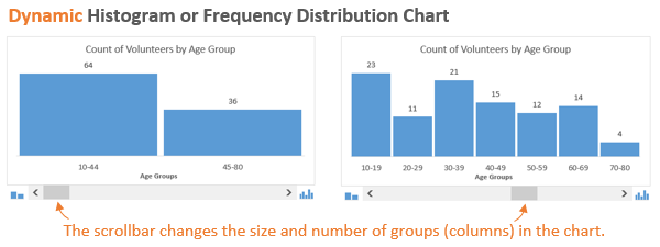
Here is a screencast of the dynamic histogram chart in action.
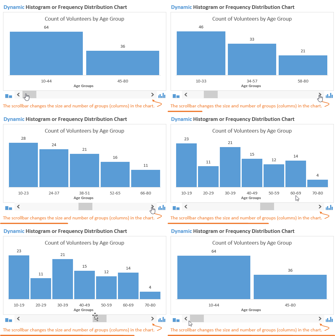
Video: Dynamic Histogram Chart Explained
Download the File
You can download the file below.
What is a Histogram or Frequency Distribution Chart?
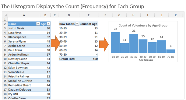
The histogram chart groups numbers from a column in a data set, and displays the count (frequency) of the number in each group. It is also referred to as a frequency distribution chart because you are able to see how the numbers are distributed over the entire data set.
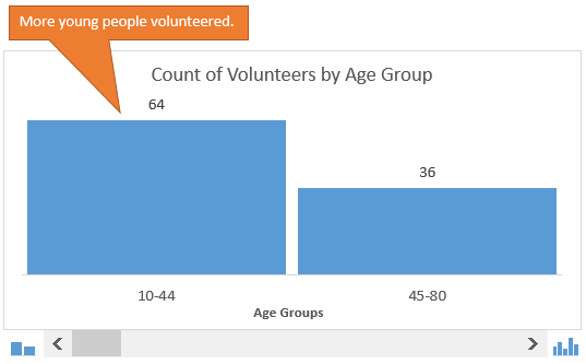
In this example we are displaying the number people that volunteered for an event by age group. We basically create age groups, count how many people are in each group, then display that on a column chart.
What Questions Does the Histogram Answer?
The histogram is one of my favorite charts because you can quickly learn a lot about a data set from it.
In this case we might want to know how many volunteers were in their 20s, 30s, 40s, etc. The histogram displays this in a visual way that makes it easy to spot patterns or anomalies.
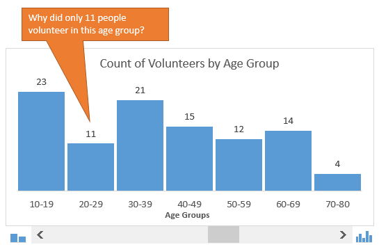
“Are we not appealing to people in their 20s?”
We might also want to zoom out a bit and just split the population in two groups. This quickly tells us that more young people volunteered for the event.
The Dynamic Histogram
After seeing a histogram, we often want to change the size of the groups to answer different questions. The dynamic histogram chart accomplishes this with the scroll bar (slider) below the chart. The user can press the arrows on the scroll bar to increase/decrease the size of the groups.

This makes the histogram interactive, and lets the user zoom in/out to adjust how much detail they want to see. It's a great addition to any dashboard.
How Does It Work?
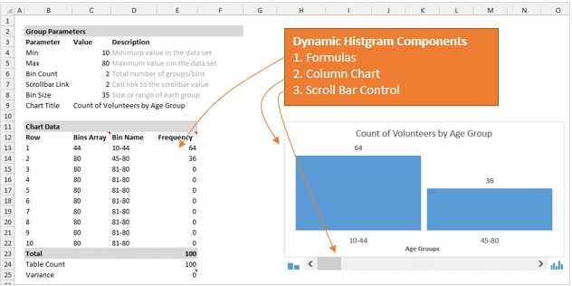
The short answer is formulas, dynamic named ranges, a scroll bar control, and a column chart.
The Formulas
For this to work we first need to use formulas to calculate the bin (group) size and the count of items in each bin.
The bin size is found by taking the total spread (max-min) divided by the bin count. The bin count is set by the scroll bar. More on that in a bit.
I then use the FREQUENCY function to calculate the count of items in each bin for the given column in the data set. In this case we are returning the frequency from the Age column.
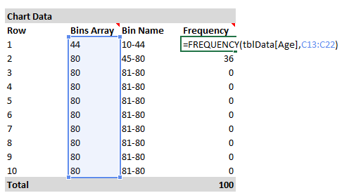
The FREQUENCY formula is entered as an array formula by pressing Ctrl+Shift+Enter. My friend Jon Peltier has a good article on the Histograms and the Frequency function if you want to learn more about it.
The Dynamic Named Range
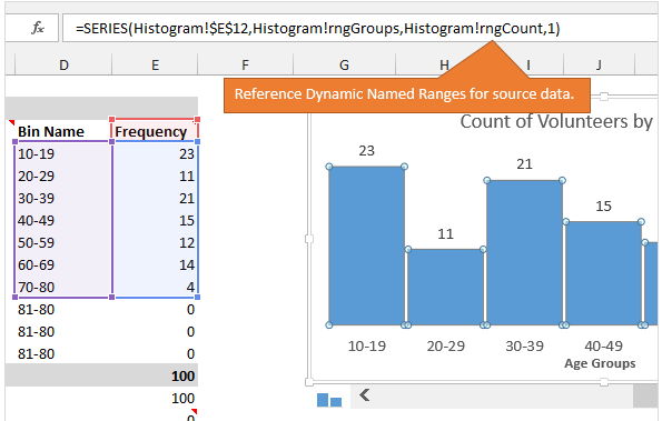
The source data for the chart uses a dynamic named range to only include the data for the number of bins that is currently selected.
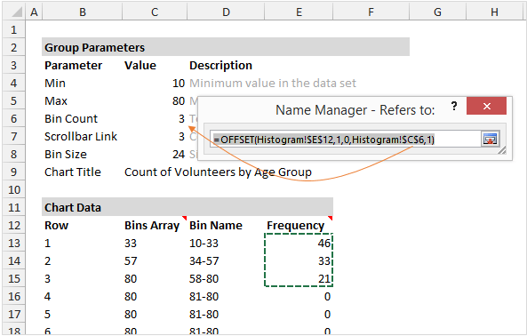
As the user changes the scroll bar, the number of rows included in the ranges will increase/decrease to only include the relevant data on the chart. There are two dynamic named ranges, one for the data (Frequency) and one for the horizontal axis labels (Bin Name).
My friend Mynda Treacy has a good article on dynamic named ranges using both the OFFSET and INDEX functions.
Scroll Bar Control
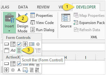
The Scroll Bar Control can be inserted from the Developer Tab on the Ribbon.
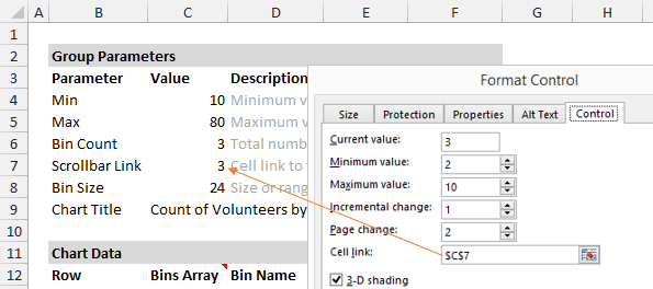
In the image below you can see how I adjusted the properties of the control, and also linked the output to cell C7. This drives the formulas when the user makes a change with the scroll bar.
If you don't have the Developer Tab enabled, by friend Chris Macro has a good article on how to enable the Developer Tab.
The Column Chart
The chart is actually the easiest part. It is just a simple column chart that references the dynamic named ranges for the source data.
Jon Peltier has another good article on how to create dynamic charts with named ranges. This will help explain this technique in more detail.
Any Questions?
Well, that was a brief overview of how the dynamic histogram chart works. You can download the file below and use it with your own data.
I'll admit that it's not the easiest chart to create, but I think your audience will enjoy using it. It's definitely an interactive chart that can be added to a dashboard.
You can also create a much simpler version of the Histogram Chart using Pivot Tables. Checkout the video on this page for instructions on how to create a distribution chart with a pivot table. It's really easy! I explain it at the 4:15 mark in the video.
Please leave a comment below with any questions or suggestions. Thanks!


Hi Jon,
Good idea in creating a dynamic histogram!
Instead of using flexible formula for different bin sizes, I think it would be better to have it predefined. As it would make more sense to reader for a bin size of 5, 10, 15, 20, 30, 40 instead of 7, 9, 12…
Cheers,
Thanks MF! That is a great idea. A lot depends on the numbers in your data set. If you have sales transactions that could range from $1,000 to $300,000 per sale, then you would obviously need bigger bins. You could add an input for the base size of the bin and then use the slider output as a multiplier.
The nice thing about the way it is currently setup is it that it divides the population into equal parts. So, if I moved the slider to display four columns on the chart, I could answer questions about the top/bottom 25% of my data set. That example might not work well with ages. But finding how many sales transaction are in the top 25% of the dollar range can be useful. Again, it all depends on your data set and what questions you want to answer. Thanks again for the great suggestion MF!
Hi Jon,
It’s my pleasure to interact with and learn from you!
Totally agree with you that it depends on the data set and more importantly what are we going to present to audience. 🙂
Cheers,
Likewise MF! I appreciate your comments and learning from you as well.
Hi Jon,
I really like the idea of using this dynamic histogram as it gives the user a choice on how to display the data. I have 2 questions:
1) When starting the bin array, a “-1” is used. Would this always be the case, even if your data set does not consist of whole numbers?
2) Also when naming the bins “+1” is included. What if my data set is all <1?
I am sure the answer is staring me in the face, but I would like to use this graph to represent data sets that change all the time, i.e. sometimes the data is all <1, sometimes it is in the 10's and sometimes it is in the 1000's. How can I calculate the bins so that they provide logical bin sizes no matter what the data set?
Rgds,
RP
Hi RP,
The way it’s setup in the example file, you can change cell C7 to change the number of bins. It will automatically calculate the bin size.
Can you send me an example of your data and these scenarios. I’m not sure I fully understand your question. Sorry, it’s late in the day… 🙂 [email protected]
Hi Jon,
I have a list of 852 materials, ordered over a period of two years with different order sizes. I wish to make a histogram of each material separately by applying some sort of filter. I understand bin sizes will vary for each material ordered, can you help me out on this one?
Thank you,
Zermeena Khan