I love watching the Olympics. It's cool to see the best athletes in the world compete in fun, weird, and exciting sports. And I'm always amazed at how close their results are. Gold medals are often decided by a hundredth of a second.
As my wife and I started watching the Olympics on TV last week, we quickly noticed that there were a lot of commercial breaks during NBC's nightly primetime coverage (NBC is the TV network that broadcasts the Olympics in the U.S.). It seemed like there was a commercial break every 5 minutes. We started wondering how many commercials we were watching.
So the Excel geek in me had to investigate…
Download the Dashboard File
I won't be able to explain every chart and calculation in this one article. However, you can download the file to learn more about how it all works.
Gathering the Data
I analyzed a recording of NBC's prime time coverage on Thursday, August 11th, 2016 from 8 pm to 12 am. That's a 4 hour TV program of the most popular events that happened that day in Rio.
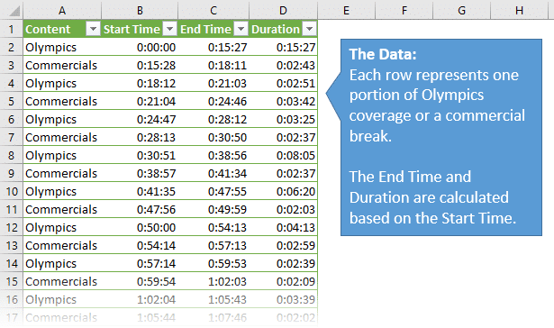
I created a simple data set that listed the start time of each change between Olympic coverage and commercial breaks. I then used formulas to determine the end time and duration of each segment (Olympics & commercials).
Creating the Dashboard
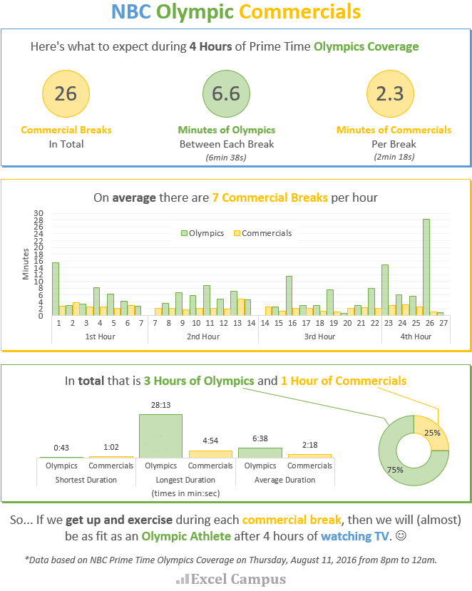
The following dashboard highlights some of the metrics I found interesting.
Dashboards or info-graphics like this allow us to tell stories about the data…
When creating a dashboard it's best to start with a few initial questions you want to answer. My initial question was, “How often are the commercial breaks?”
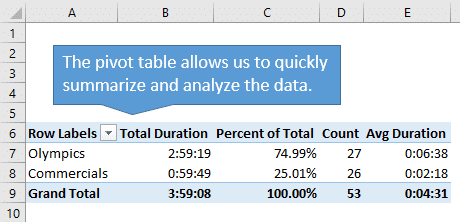
I created a simple pivot table and added a few calculations for sum, percentage of column total, count, and average.
Check out my 3 part video series on pivot tables and dashboards that has step-by-step instructions on how to create pivot tables with these metrics.
My initial assumption was wrong. Instead of every 5 minutes, there were actually commercial breaks every 6 minutes and 38 seconds (on average). Each commercial break lasts about 2 minutes and 18 seconds.
During 4 hours of TV coverage, there were 26 commercial breaks. That's an average of about 7 breaks per hour. The longest segments of Olympics coverage came at the beginning and end of the program.
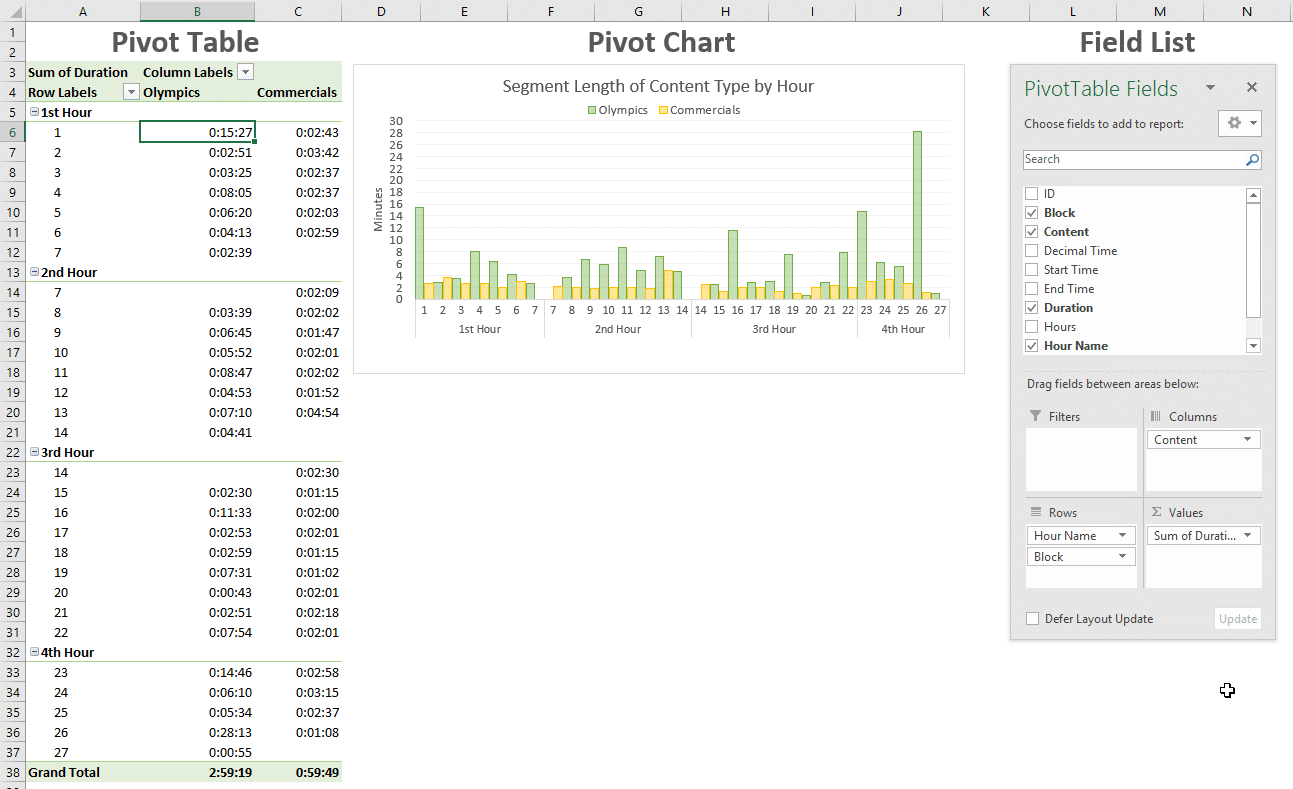
The shortest segment of coverage was 43 seconds and the longest commercial break was 4 minutes and 54 seconds.
My 3 part video series on pivot tables and dashboards explains how to create interactive dashboards with pivot tables, charts, and slicers.
It's About Time
Most of the metrics in this data set and dashboard are about time. In my article and video on the date system in Excel, I explain that each day on the calendar is represented by one whole number.
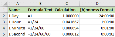
This means that times in Excel are a fraction of a day, or a fraction of 1. So an hour is represented by the fraction 1/24, since there are 24 hours in a day.
1 Hour = 1/24 = 0.041667
A minute is represented by the fraction 1/24/60, since there are 60 minutes in an hour.
1 Minute = 1/24/60 = 1/1440 = 0.000694
A second is represented by the fraction 1/24/60/60, since there are 60 seconds in a minute.
1 Second = 1/24/60/60 = 1/86400 = 0.000012
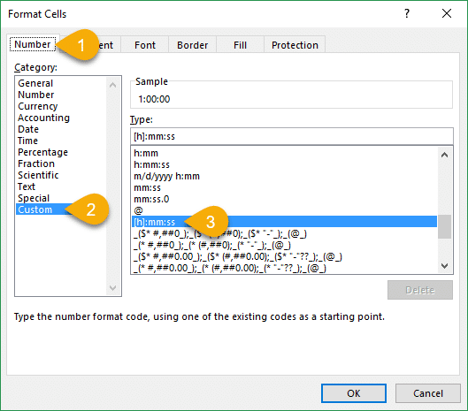
We can then use formatting to display these decimal numbers as hours, minutes, and seconds. The basic number format for time is h:mm:ss. This format can be found in the Custom category on Number Format menu in Excel.
My article on how to group times in Excel explains 3 ways to summarize times for reporting with pivot tables and formulas.
What Do You Think About the Commercials?
I hope you've seen how we can create a dashboard from just about any data set in Excel. This entire dashboard was created from one list of time values.
When I first started watching the Olympic coverage, I was honestly surprised at how many commercials breaks there were. My wife and I cut the cord on cable over 3 years ago, and we haven't watched many commercials since. So this probably contributed to our shock.
However, I've come to realize that producing a program like this is a massive undertaking. In my opinion, NBC's coverage of the Olympics is absolutely fantastic. If you think about all the cameras, crew, and commentators they have, and the way they bring this all together, you realize that it must cost A LOT to produce this event. All-in-all we have been thoroughly entertained with the coverage.
Plus, we have really enjoyed some of the commercials. The series by AT&T with the family that loses their internet connection is great (no longer available to watch). Funny and true!
What this all means is that NBC is keeping us active as we watch our favorite athletes shed their blood, sweat, and tears at a chance for gold. Whether that's pressing the fast forward button on your DVR remote, or getting up off the couch for a stretch, you're going to stay busy while watching the Olympics. And now you have the data to back it up. 🙂
Original publish date: August 16, 2016


You should move to the UK during the Olympics, no adverts at all on the BBC, although a lot of it is on in the middle of the night.
Wow, good to know. Thanks Peter! 🙂
Hi Peter
Just remember that the BBC is a publicy funded TV station, as with the other European national TV stations. It’s the same thing here in Denmark 🙂
Thus they don’t show commercials at all. So NBC can’t really be compared to BBC. They should be compared to other commercial TV stations 🙂
Rock on for both the US and UK for leading the medal race!! 😉
Thanks Andreas! I didn’t know the BBC was publicly funded. They have some great content too and I really enjoy their nature documentaries. Well I guess our friends in the UK are spoiled. They get to watch their team win a ton of medals, commercial free. 😉
How does the number of commercials and minutes per commercial compare to an average weeknight show or to another network? Would be interesting to compare to other big events too, like the Super Bowl.
That’s a great question Nick! I couldn’t find much data on this, so I actually plotted the times manually. I think the overall proportion of commercials at 25% is on par with other shows. It seems like most 30 minute shows have around 22-23 minutes of content and 7 minutes of commercials (~75%/25%). It would be interesting to compare the frequency of the commercial breaks though. I think that is what made it initially feel like there were a lot of commercials. Maybe we can visit this again after the next Super Bowl. 🙂
I’m pretty sure they are allowed to have 8 minutes of commercials per half hour – thus 22 mins of content. Maybe the FCC regulates over-the-air broadcasts?
I agree with the number of commercials. I watch the live streams on nbcolympics.com and that feels like a lot of commercials too.
I have been working on an Olympics dashboard as well. Collecting data on results from the web has been a challenge. Will post it soon.
Thanks.
You can’t escape them on the NBC platforms. They have done a really good job of that. 🙂 Looking forward to seeing your dashboard too. Feel free to post a link here. Thanks Indzara!
Thanks Jon! This is helpful! I’m creating an Olympic themed dashboard for a contest with my company, so this came at the right time!
Awesome! Thanks Char! If you’d like, send me your dashboard when you are finished and I will post a pic of it here.
As always, great data to use for your latest example for developing dashboards. I have reviewed and saved a few of your dashboard examples and share them with my students. They too are impressed with your dashboard skills.
Thanks for sharing Karen! 🙂 I’m happy to hear your students are learning dashboard skills. These skills are definitely in high demand by employers.
Nice dashboard but 6.6 and 2.3 in the circles do not correspond to calculations and your narrative. It would be better to make them dynamic by linking to calculations.
Thanks for the suggestion Leonid. I put the min:sec numbers under the circles because I felt the decimal numbers might be confusing on their own. It might be better to have 6:18 in the circle with (min:sec) right below it.
I like the idea of linking the shapes to the calcs too.
Dashboards typically take a lot of iterations after users view them. I put this together yesterday and haven’t iterated on it yet. But it’s great to get feedback from the thousands of members of the Excel Campus community like yourself. 🙂
Thanks again for the suggestion!
Great dashboard – and commercial breaks under 2.5 minutes though that is still 15 minutes per hour. I suppose that is what pays for the channel to exist and I bet they charge a lot for adverts during peak events. Yes – we are lucky in the UK with the BBC to have excellent coverage advert free – they even delay other programmes if an event goes on a little longer (especially when Team GB still has interest like the cycling the other evening when the news was delay for over 35 minutes).
Scenario is We have tasks which need to be completed with in the scheduled timelines however employees take extra days to finish the task.. existing excel has 3 dates …start time, end time and actual end date. In actual end date employee updates the date they completed the task. I need to get duration of days and if they have met or not met the deadline. Accordingly I have to find out the compliance percentages too. There is so much stuff in it and I need to get a dashboard out of this excel file on a MTD and Daily.
Please let me know if I provide u the excel can you help me on the outcome.