Bottom Line: Learn a workaround for creating an interactive stock chart in Excel, since the stock chart is not available for pivot charts by default.
Skill Level: Intermediate
Watch the Tutorial
Download the Excel File
You can follow along using the same workbook I use in the video. Download it here:
Create an Interactive Stock Chart
We received a question from John, a member of our Elevate Excel training program. He asked about creating high low stock charts that are interactive, since stock charts aren't available for pivot charts by default.
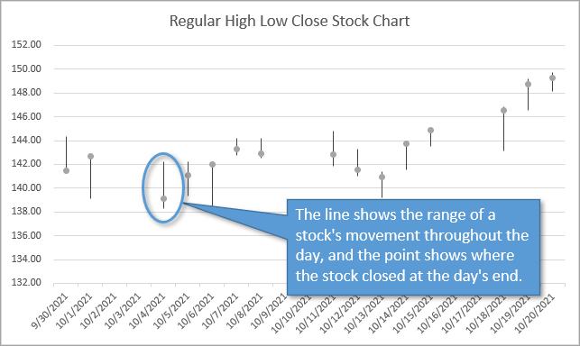
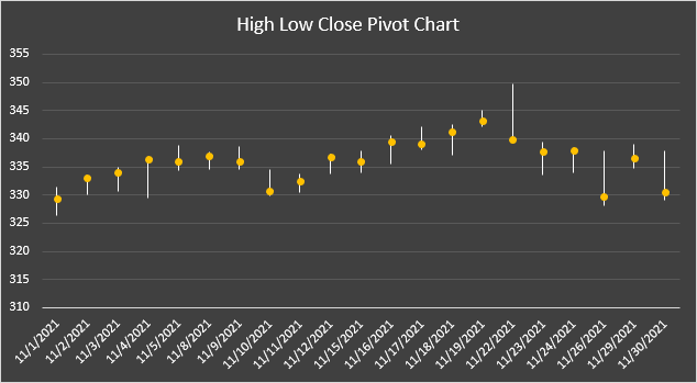
High low stock charts are a great way to visualize stock data. The vertical lines represent the movement of stock during the day. The circular points represent the amount that the stock closed at.
These kinds of charts are available as regular charts in Excel, but not as pivot charts. However, we can create our own interactive stock chart by manipulating a line chart and adding some slicers. Here's how.
Make a Pivot Table
Begin by creating a pivot table from a set of stock data. To do this, select Pivot Table on the Insert tab. Select OK to create the pivot table on a New Sheet.
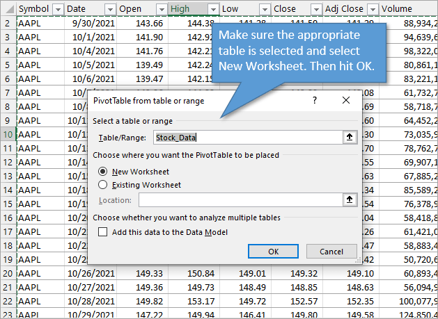
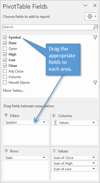
To set up the pivot table, put the Date field in the Rows area. Then put the High, Low, and Close fields in the Values area. And finally, place the Symbol field in the Filters area.
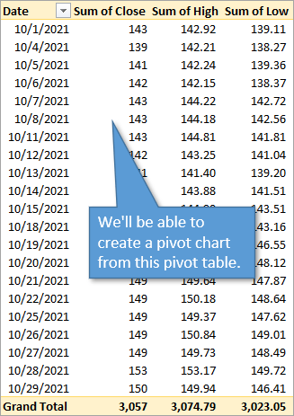
This set-up creates a pivot table that looks like this:
Create a Pivot Chart
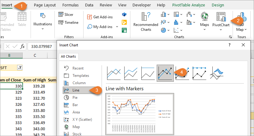
The next step is to create a chart from the pivot table. Go to the Insert tab and select Pivot Chart, then Line, then Line with Markers.
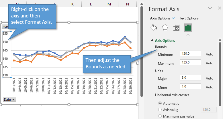
You can declutter the chart by hiding all the field buttons and the legend/key. (Use the right-click menu to hide or delete those.) If needed, adjust the Bounds in order to zoom in on the pertinent area. That allows you to better see the variance between highs and lows.
Next, we will be changing the formatting of the graph to remove the lines and accentuate the variance.
Start by clicking on any of the dots in the Sum of Close series to select that series line. If that's difficult to do because your lines are too close together, you can also select it by going to the Format tab and finding Sum of Close in the first drop-down menu.
Now that the Close line is selected, go to the Design tab and choose Add Chart Element. Choose Lines, and then High-Low Lines.
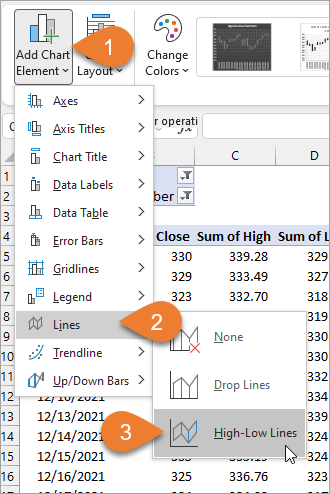
This will add vertical lines between the high and low points of each day.
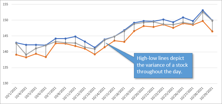
Now we want to hide the high and low horizontal lines that connect the points for each day. To do this, first, select the High series and go to Shape Fill and select No Fill to remove the circles. Then go to Shape Line and choose No Outline to remove the lines. Repeat the circle-removal and line-removal process for the Low series.
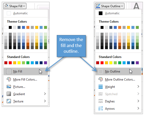
This leaves just the Close series visible.
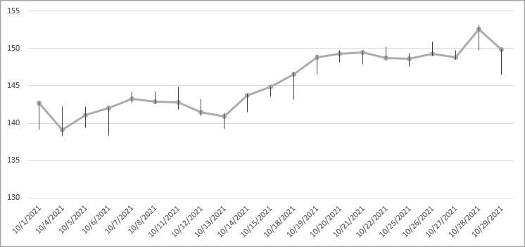
For the Close series, we want to remove the Outline, but not the Fill. That will leave the circles, but not the line.
You can adjust the fill color and the vertical line thickness to your taste. You can also add a title and make any other formatting changes you might prefer. The final result can look something like this.
Add Slicers
Let's add two slicers to our example chart. If you go to the Analyze/Options tab and then choose Insert Slicer, you'll see a list of fields to choose from. Select Symbol and Month Name to create slicers for those criteria.
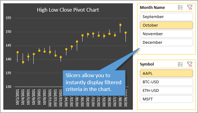
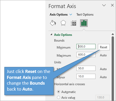
At this point, you should probably change the Bounds back to Auto so that you can see all of the appropriate data when you use the slicers.
Conclusion
Creating this type of pivot chart in order to make it more interactive is great if you have multiple dates or categories that you want to examine separately from the other data.
If you could use more training or a refresher on Pivot Tables, I recommend you start here: Introduction to Pivot Tables and Dashboards. And if you are interested in other cool chart and graph creations, check out this post: 10 Advanced Excel Charts.
I hope this tutorial has been helpful to you. If you have thoughts or questions, please leave them in the comment section below. Thanks!


Thanks for the information it has been very helpful. How can can I import other stock symbols.
If you want a candlestick chart, you can plot Open-High-Low-Close in the line chart. Then add high-low lines as you did, and also add up-down bars.
I wrote about this in my tutorial about Excel Stock Charts. Scroll down to ‘Home-Made OHLC Candlestick Chart’.
Do you know what the default minimum/maximum axis values are set to when it is Automatic? Is it based on a certain percentage above the maximum value and below the minimum value? Also, is there any way that you could use a formula for each min/max value to ensure consistency in scale when visualizing the data?
I gained huge knowledge from your blog post