Bottom Line: Explore 10 different advanced Excel charts, including what type of data to use them with, when to use them, and the advantages they provide over traditional charts.
Skill Level: Advanced
Watch the Tutorial
Download the Excel File
Here's the workbook I use containing all of the chart types. Feel free to download it and play with the charts on your own.
Improve Your Charting Skills
In this post I share a compilation of charts that I've created over the years. The goal of any chart is to tell a story about the data. We want to make it easy for the reader to quickly understand the chart. We might also want to make the chart interactive so that they can explore the data and find additional insights.
The charts in this post are definitely more advanced creations where I've added functionality to the existing chart types in Excel. The goal is to make them: easier to read, interactive, and/or more dynamic.
The possibilities with charts in Excel is endless, and I hope this post inspires you to create charts that tell the story of your data in new ways.

Here is a list of the ten charts mentioned in the video. Each section includes a brief description of the chart and what type of data to use it with. There is also a link to the tutorials where you can learn how to create and implement the charts in your own projects.
1. Column Chart with Percentage Change
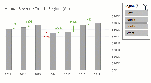
Data: Time Series
Use: Display % change between time periods or events.
Tutorial: Column Chart That Displays Percentage Change or Variance
Description: Between each of the bars on the chart you'll see an arrow and and the variance (or percentage change) from one time period to the next. The arrows and text are conditionally formatted to change colors for positive or negative variances.
This dynamic chart changes when you slice (filter) the data using a slicer. The title also changes according to the region selected in the slicer.
2. Conditional Doughnut Progress Chart
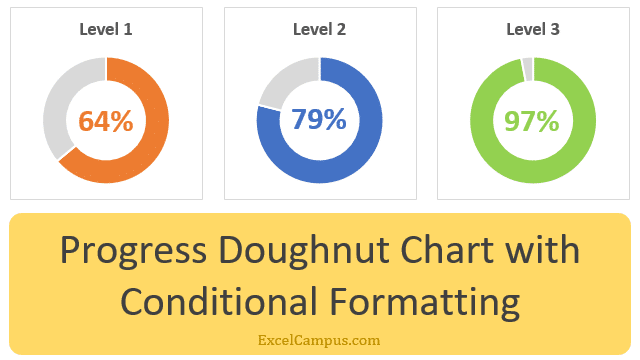
Data: Progress to Goal
Use: Display % completion with conditional colors for levels or milestones.
Tutorial: Progress Doughnut Chart with Conditional Formatting in Excel
Description: A cool feature about this doughnut chart (circle chart) is that the color changes as the percentage increases so that you can better visualize the passing of milestones toward your goal.
3. Interactive Histogram with Details
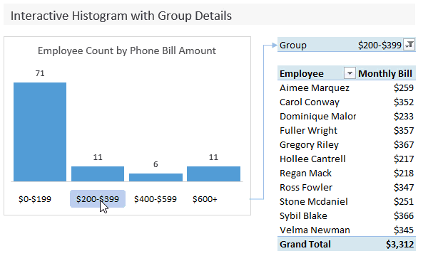
Data: Categorical
Use: Display the count of items in each group & a detailed report of the selected group
Tutorial: Interactive Histogram Chart That Uncovers The Details
Description: When you click the dollar range under each bar, you're actually activating a slicer that displays a pivot table to the right detailing each of the entries that make up that data set. This interactive chart is great for diving deeper into the data without losing the bigger picture.
4. Dynamic Histogram or Frequency Distribution Chart
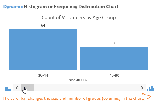
Data: Categorical
Use: Quickly change the group or bin size to tell a different story.
Tutorial: Dynamic Histogram or Frequency Distribution Chart
Description: This histogram includes a scroll bar at the bottom that allows you to change the number of groups you are examining. The data tells different stories as you increase or decrease the number of ranges that you're looking at.
5. Annual Trend with Monthly Details
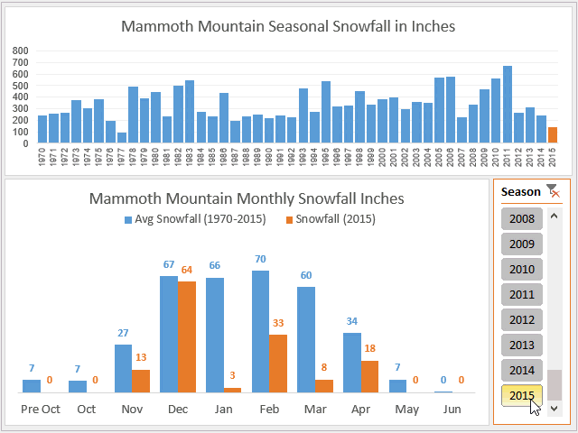
Data: Time Series
Use: Display a trend within a trend and compare it to averages.
Tutorial: Monthly Average vs Current Year Chart
Description: With this chart you can simultaneously see how your data is trending for two time increments (years, quarters, months, weeks, etc.), and also how it compares to past averages.
6. Interactive Waterfall Chart
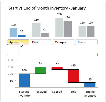
Data: Time Series, Inventory, CRM, Pipeline
Use: Display the details of how numbers changed over time.
Tutorial: Interactive Waterfall Chart Dashboard
Description: This chart is really a mini-dashboard that is good for telling what happened from a starting number to an ending number and how different factors added to or subtracted from that number over time.
7. Variance on Clustered Charts
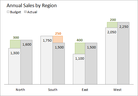
Data: Categorical
Use: Display the variance when comparing two categories for multiple series.
Tutorial: Actual vs Budget or Target Chart in Excel – Variance on Clustered Column or Bar Chart
Description: Regular clustered bar/column charts don't display a variance between the bars. This technique not only shows the variances, but also conditional formats the variance with different colors for positive or negative changes.
8. Actual vs. Multiple Targets Chart
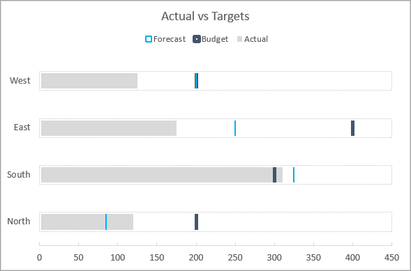
Data: Categorical
Use: Display multiple targets or goals compared to actuals.
Tutorial: Actual vs Targets Chart in Excel
Description: These charts compare a number to multiple targets. This is great for actuals versus budget, forecast, goal, etc. They can be oriented horizontally or vertically, and you can also include an attainment percentage for a better idea of how close you are to meeting your goals.
9. Stacked Bar with Dynamic Data Labels

Data: Time Series and Categorical
Use: Quickly switch data between data labels to make stacked charts easier to read.
Tutorial: Create Dynamic Chart Data Labels with Slicers
Description: I'm not a big proponent of stacked bar charts because they are often hard to read. It's difficult for our eyes to compare the size of the bars due to the uneven baselines.
So this chart allows you to quickly change the data labels to make it a bit easier to compare the series within the bars. For alternatives to stacked bar charts, such as a panel chart, checkout this post: Stacked Column Bar Chart Alternatives – Find the Missing Trends.
10. Comparative Distribution Chart
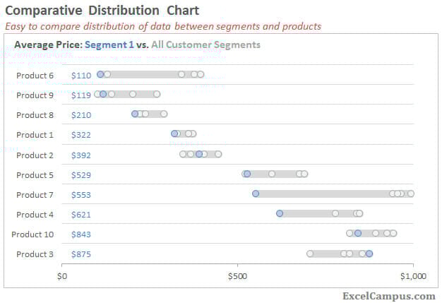
Data: Categorical
Use: Compare a segment or category to all other categories for multiple series.
Tutorial: Comparative Distribution Chart – Histogram or Box Plot Alternative
Description: This chart allows you to compare values to multiple segments across multiple categories. It can be a great alternative to quartile plots or multiple histograms.
Bonus: Zoom on Charts Macro
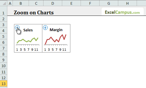
Data: Any
Use: Sheet or dashboard contains a lot of small charts that are difficult to read.
Tutorial: Zoom on Excel Charts
Description: The macro I created adds a button to the chart for an easy zoom feature, allowing you to focus on one chart at a time if you have several on one page.
Conclusion
I hope these charts whet your appetite for displaying your data in creative ways and telling the stories behind your data with visualization. If you're not getting our weekly emails yet, then click here to join our Free Excel Pro Tips Newsletter. We send out a practical and useful tutorial at least once a week to help make you the Excel Hero of your workplace.
Until next time, happy charting! 🙂


Hi Jon,
Need your suggestion to create suitable chart for asset delivery report.
Centre NHs with Laptops Not required Configured – waiting for the employee In Progress In Progress Total Couriered – In transit Couriered – In transit Total Ready for Dispatch Ready for Dispatch Total Grand Total
Finance Talent Finance compliance Less than 10 days Less than 2 days 3 – 5 days
Jon, a very nice presentation. I wonder about being able to best compare two variables in which “best” or “preferred” is a matter of how far to the top right, in a scatter plot, the variable is shown. However, a high value on the y-axis and a low value on the x-axis, might be better. Hence, a graph that shows lines between the x and y axes (and are thus diagonal), would quickly show the categories of values. Any suggestions?
Hi Jon,
I didn’t see the bonus: zoom on charts macro included in the workbook? Best regards
Super perfect excel lessons
Jon, this is awesome. Thanks!
I would love to see you do a comparison on how your charts compare to Power BI.
My company has Power BI but most people do not use it since they are more comfortable with Excel.
Hi Jon,
I’m hooked on your tutorials. They give great insights and are truly a source for finding focused solutions.
You serve a great community!
Thx.
Thank you for the very well done charts.
All of them look amazing!
Fantastic charts! I really love them
Is there an easy way to present revenue per region on a world map?
power BI
OMG it’s mind blowing. This is the type of chart I work everyday but mine was a simple boring one and now I know how to make it more efficient. Hats off to you Jon you are a legend. 🙂
i have stats by department difference data ranges i.e.some are1000 some are 1.5 would like to bput them all on one dashboard
awesome tutorials
Fantastic GREAT work!!! Thank you so much for sharing!!! A FANTASTIC learning adventure!! THANK YOU!!! I am looking through now to see if I can see any additional ones for the Stock Market!! Thanks again!!
Hi
send the file
Hiiiiiiiiiiiiii