Bottom Line: Learn how to create a column or bar chart that compares two or more numbers. Actuals versus budget, goal, forecast, target, etc.
Skill Level: Intermediate
Video Tutorial
Download the Excel File
Feel free to download the workbook that I use in the video so you can play around with the charts and reconstruct your own versions.
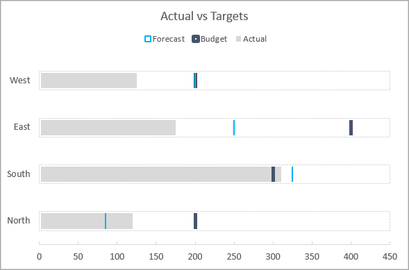
Charting Actuals vs. Targets
When the boss wants to know if we've hit our goals for the month (or quarter, or year, etc.) it's always a good idea to give him or her a visual report in the form of a chart that shows each goal in relation to the actual numbers achieved.

While you can compare these numbers side by side, it looks a whole lot cleaner to overlay these numbers, especially when there are lots of target goals to fit onto the chart.
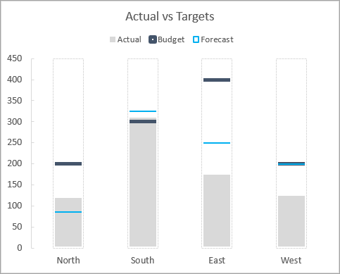
In this tutorial, I'll explain how to format a column or bar chart to achieve a cleaner look (and impress the boss). Here's an example:
The advantage of this technique is that it only uses the primary axis. There are alternative solutions that use a secondary axis. However, using only the primary axis will prevent errors and reduce maintenance as the data changes in the future.
The chart can also be quickly converted between a column (vertical) or bar (horizontal) chart, which makes it more versatile than some other solutions.
Start with Your Data
For this type of chart, you are going to need at least four columns of data.
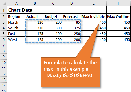
- Your actual numbers. These are the gray filled bars that you see in the chart above.
- Your target numbers. These are represented by the horizontal lines. You can have more than one set of target numbers. In my example, I include both budget and forecast numbers, so I have a total of five columns in my data set.
- A Max Invisible column. In this column, a simple formula using the MAX function returns the largest value in your data range. This is used to cover the vertical lines of the target bars in the column chart. Add a cushion to the formula so that none of your target lines are at the very top of the chart. In my example, I added 50, but if you are working with larger numbers you might need to add a number in the thousands or millions. This ensures that the invisible line won't overlap the largest number in your data set.
- A Max Outline column. This is the exact same data as the Max Invisible column, and we use it to create that nice perforated border that you see above. This series is optional.
Create a Chart
Here are the steps to create the chart. I recommend you watch the video as it will likely help you to follow along.
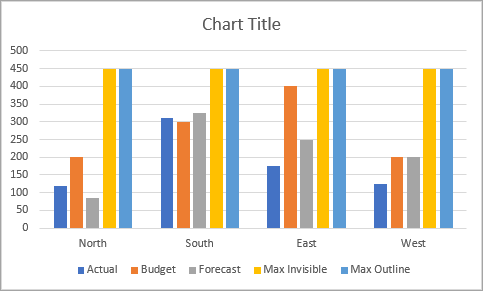
- Select all of the data in your table, including the header row and column.
- From the Insert tab on the Ribbon, click on the icon that shows a column chart. This opens a drop-down menu, and you can select 2D Clustered Column Chart.
- You'll notice that the data points are listed along the X axis, and we want the regions listed there instead. So we can easily flip that. With the chart selected, go to the Chart Design tab on the Ribbon and click the button that says Switch Row/Column.
- Format the chart to your preference. I will detail how mine is formatted in the section below, but for now, your chart should be looking something like this:
Formatting the Bars in the Chart
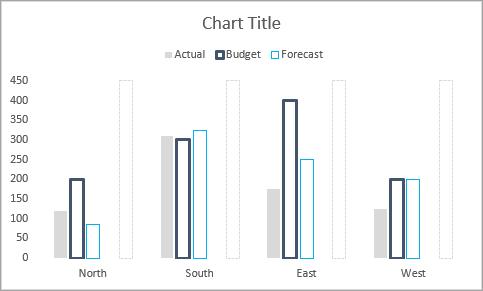
- Remove the gridlines by clicking on any one of the lines so that they are selected and hit the Delete key.
- We will leave the bar that shows the actuals alone, but moving on to the first target bar, right-click on it and then choose Format Data Series. That will bring up the Format Data Series pane.
- Select the Fill & Line button, which looks like a tipping paint can.
- Choose No fill for the Fill option. Choose Solid line for the Border option. Select a color of your choice. Increase the width to 1.5 pt or more.
- If you have more than one target column, follow the same procedure as in Step 4, but use a different color.
- Moving on to the Max Invisible column, again choose No fill, but this time, make the border color the same as the chart background. In our case, that color is white. This essentially makes the border invisible. Make the width the same as the widest width you've used so far. In our case, that is 1.5 pt.
- For the Max Outline column, choose No fill, Solid line, a light gray color, and select a dash type, if desired.
At this point, your chart should look similar to this:
Overlaying the Columns
Now that we've formatted the columns to be the way we want them, we want to overlap the columns so that they are essentially combined into one column per data point. To do this,
- Click on the Series Option icon on the Format Data Series pane. This is the one that looks like three columns.
- Using the slider for the Series Overlap, slide the indicator all the way to the right so that it reaches 100%.
Additional Formatting
To make things just a bit cleaner, you can do a little more formatting. See the video if you don't know how to do these things. These are all optional, according to your taste:
- Change the fill color of the Actual column to a light gray.
- Remove the horizontal line on the X axis.
- In the legend, delete the Max Invisible and Max Outline.
- Change the Maximum amount from 500 to 450 on the Y Axis.
- If you are using more than one target, and you have some equal amounts, the indicator lines for those amounts might not be distinguishable. You can change the thickness of the lines to make it so that both colors show in your chart.
- You can move the legend to the top instead of the bottom.
Again, here's how the end result appears.
It's important to note that the order of the columns matters. If your data is in a different order than the one that is presented above, some of your columns may hide others that you want to be visible. You can change the order of the data in your chart by choosing Select Data on the Chart Design tab on the Ribbon.
Converting a Column Chart to a Bar Chart
Changing your chart to to a bar graph is actually really easy.
- With the chart selected, go to the Chart Design tab on the Ribbon, and then select Change Chart Type.
- Choose a Clustered Bar Chart from your options.
- You'll just need to perform the overlap procedure again. (Under Series Options, slide the indicator to the right until it reaches 100%.)
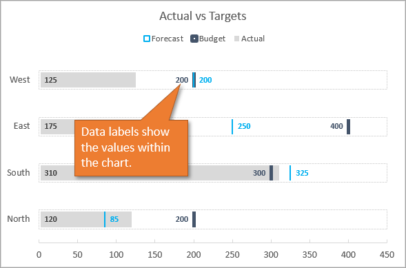
So now we have the exact same information, but the data is represented horizontally in a bar chart:
More Bar Chart Options
I also wanted to show you that you can add data labels to your chart in order to show:
Values
Percentage of Target
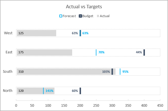
Learn more about how to go about that from this tutorial.
Variance

If you are interested in learning more about variance, I recommend this tutorial: Variance on Clustered Column or Bar Chart.
Conclusion
Charting an actual number in the same bar or column as its target number makes for great visual comparison. If you have questions or comments about creating or using these helpful charts, I hope you will write them in the comments section.


Love this one! Can’t wait to try it out 🙂
Thanks Rachel! 🙂
this is easy to follow and nice presentation.
Thanks Ben! 🙂
Hi Jon,
Very nice, definitely I am going to use this in my next presentation :-)…
In format axis (set up), maximum is set to 450. If data is changed or it crosses above 450 then we will have to change it manually. How can we make it dynamic to max invisible value?
Kind Regards
Arun
Hi Arun,
The cells in the Max Invisible column use the MAX function to make this dynamic. If the values in any of the data columns change, the MAX function will return the Max of those and also add 50. I explain more about this in the video.
I hope that helps. Thanks again and have a nice day! 🙂
Hi Jon Acampora,
Thanks for your outstanding and interesting tutorial topics.
I’m so passionate about them.
Please, go on.
Best regards.
Thank you, Dr. Hesham! I appreciate your support! 🙂
Awesome!!
Hi Jon, really enjoyed your presentation. I run 130 sales people and need a simple way to show actual to target to short attention span executives :-). The link to the Excel sheet in your post has expired. Can I ask for a copy of your XL sheet with this example you showed? Thanks in advance!
Thank you, very easy to follow. I will use in my monthly reviews Actual vs FC.
Great tips! Totally agree with you on the stacked bar charts. This is a much easier way to tell the budget/actual/forecast story. Thanks!
Thank you! That’s exactly what I needed.
Hi. I am unable to download the workbook. It asks for email address, but sends me a general link. It’s kind of a loop. 🙂
Hi Salman! Sorry about that, would you mind trying again after refreshing the page? We removed the content lock for now. Thanks!
Jon,
I am trying to run this with a single data row. It is not combining the bars for me. Please let me know what else I need to do on this.
Great tutorial, easy to follow. Found a good application for this at work. Much appreciated.
This is extremely helpful, thank you! How would you suggest going about this for an annualized viewpoint? I have the stacked comparison of actual, projections, target and a stretch goal. I’d like to do this data across Jan-Dec. Do you have suggestions on how to organize the data?