Bottom line: Learn how to create a column chart that displays the percentage change or variance between the columns.
Skill level: Intermediate
Video #2 – Dynamic Color Bars
Video #3 – Macro + Combo XY Scatter Chart
Download
Download the Excel file to follow along or use in your own projects. The file has been update with the chart from video #2.
The Column Chart with Percentage Change
This post was inspired by a chart I saw in an article on Visual Capitalist about music industry sales.
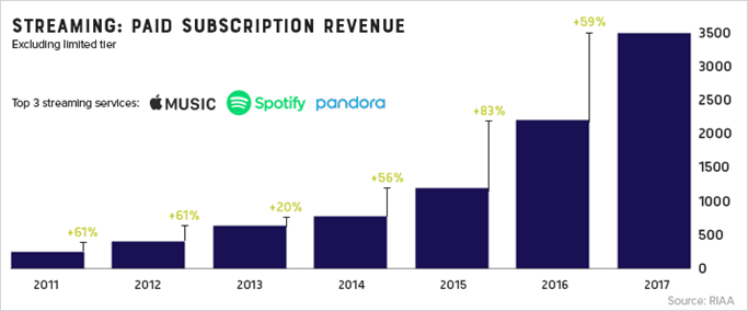
I like how they displayed the variances between years, and decided to recreate it in Excel.
When creating simple column charts for trends, we almost always want to see the amount or percentage change between each column. There are many ways to go about this, including displaying the variances on a separate chart.
Chart Iterations
Updated November 19, 2018
This chart has gone through several iterations since I first published it.
Iteration #1
We originally had some great feedback from Conor Foley and Wayne Edmondson.
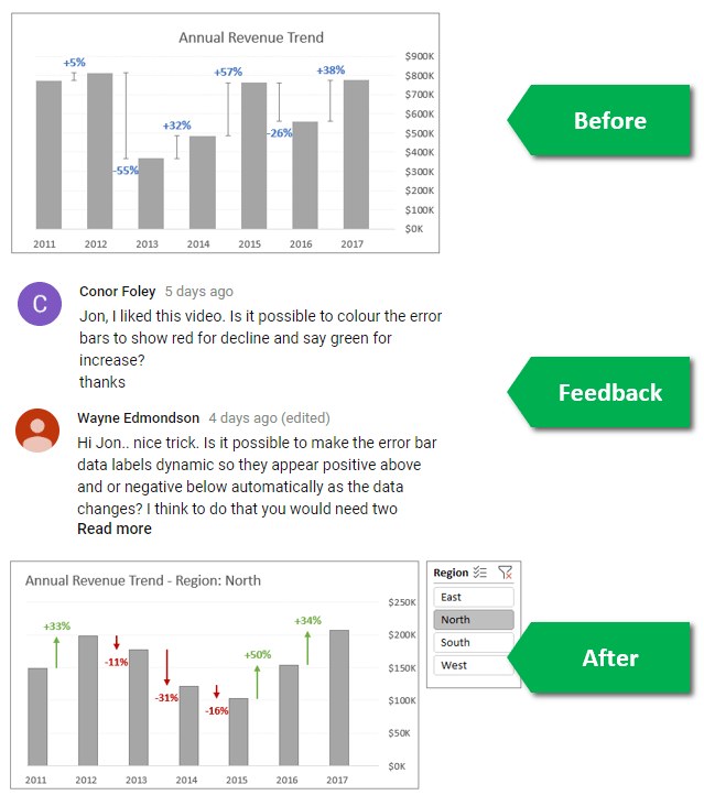
The original solution used an invisible series between the data columns, with error bars that sat above the column. This allowed us to display both positive and negative change between periods.
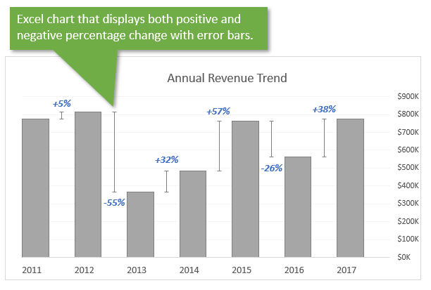
I explain it in more detail in the first video above. The article below also explains how to create this chart step-by-step.
Iteration #2
For the 2nd iteration the positive and negative error bars use a separate series. This allows us to change the formatting of the positive and negative bars individually.
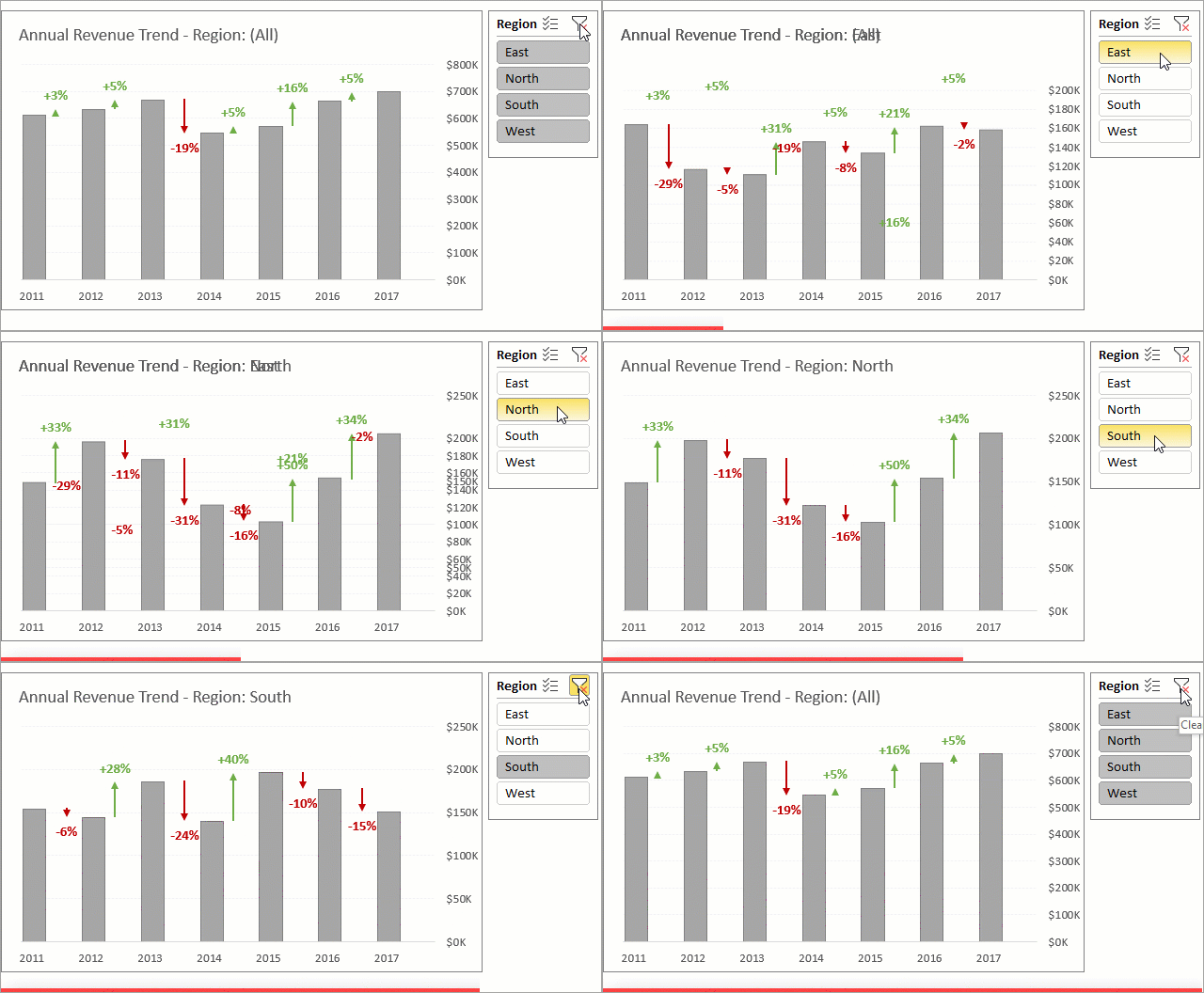
I created this alternative based on a suggestions from Conor and Wayne on the YouTube video. I've included it in the example file that you can download above on the ‘Conditional Format' sheet. I believe this will be the most popular choice. You do NOT have to change the label position for the negative bars for this solution.
The 2nd video above explains more about this solution.
Iteration #3
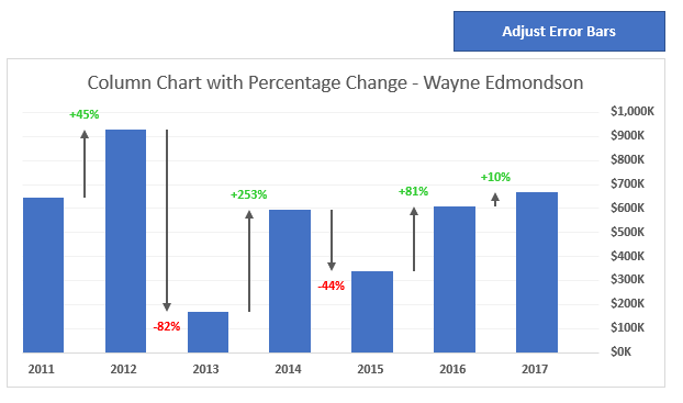
The 3rd solution came from Wayne Edmondson and uses a macro to move the data labels above/below the positive/negative error bars. The macro also changes the font color of the data labels. This macro can be called with the Worksheet_Change event to update the chart every time the source data changes.
Iteration #4
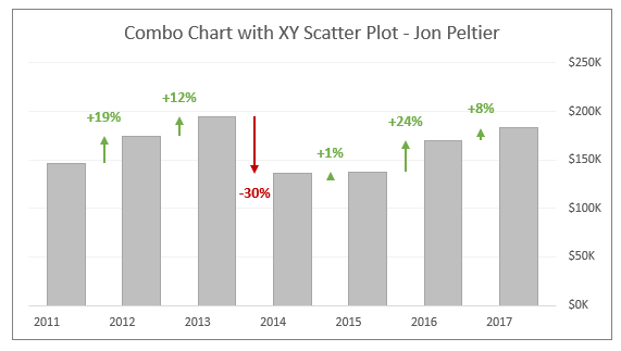
The 4th solution came from my good friend and charting master, Jon Peltier. This solution uses a combo chart with an XY Scatter for the error bars.
This is another great solution because we don't need the invisible error bars. Instead, he used an invisible data point for the XY scatter and 0.5 increments for the X-axis data. This puts the data points and their vertical error bars between the data columns for revenue.
You can read Jon's full article on this combo chart solution over at the PeltierTech blog.
Keep Improving Your Charts
I'm showing all the chart iterations to help you see the process for improving our charts. We don't always get it perfect the first time we create a chart, and that is OK!
You will get new ideas as you gather feedback from your audience (boss, co-workers, colleagues). The look of a chart is a highly subjective matter anyways, so don't be afraid to publish. You will learn a lot and improve your skills faster when you do. 🙂
Creating the (Original) Chart
The rest of the article explains how to create the original chart. Even though we have made several iterations, this should still help you learn how to use the different chart elements to get creative with your charts.
The chart isn’t too difficult to setup. It does require a few columns of formulas to create the source data for the chart columns, error bars, and data labels.
I explain the steps to create the chart below, which will also help you learn more about the different chart elements and techniques available to us. However, you don’t have to create the chart. You can just download the example file and plug in your own data.
Here are the steps to create the chart.
1. Source Data Formulas
The chart uses a few columns of formulas to calculate the amounts for the invisible columns and variances used for the error bars and labels.
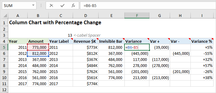
Here is a quick explanation of each formula starting in column C:
- Year Label: Uses the REPT function to join the year in column A with a repeating number of blank spaces. This makes the label longer and moves the text to the left to align with the visible bar for the amount. Otherwise, the label would align under the center of the visible and invisible bars.
- Revenue $K: Reference to the amount in column B with thousands ($#,###,K) number formatting applied.
- Invisible Bar: Reference to the amount of the next period (year). This is used for the invisible bars, that are the top/base of the error bars.
- Variance: The variance between the current year and next year.
- Var +: Uses the IF function to return the variance if it is positive. Used for the error bars. Returns a negative number to start at the top of the invisible bar and go down.
- Var -: Uses the IF function to return the variance if it is negative. Used for the error bars. Returns a negative number to start at the bottom of the error bar and go up.
- Variance %: Used for the labels on the invisible column under the error bars.
I explain each of the formulas in more detail in the video above.
2. Create the Column Chart
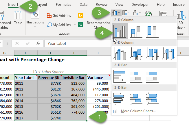
The first step is to create the column chart:
- Select the data in columns C:E, including the header row.
- On the Insert tab choose the Clustered Column Chart from the Column or Bar Chart drop-down.
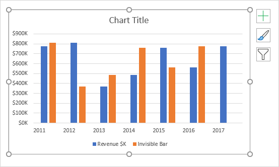
- The chart will be inserted on the sheet and should look like the following screenshot.
3. Remove Extra Elements
The default chart formatting includes some extra elements that we won’t need.
You can left-click each of the following elements and press the Delete key.
- Legend
- Horizontal gridlines – This is optional. You can keep the gridlines or make them a lighter shade of gray.
This cleans up the chart and allows the viewer to focus on the important elements.
4. Add Error Bars
The Error Bars draw the connection between the tops of the amount columns between each bar.
Here are instructions for inserting the Error Bars:
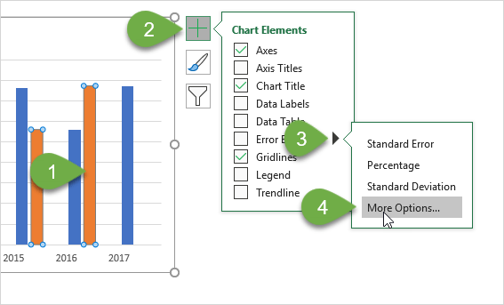
- Left-click one of the columns in the Invisible Bar series (orange columns).
- From the Elements menu, choose Error Bars > More Options.
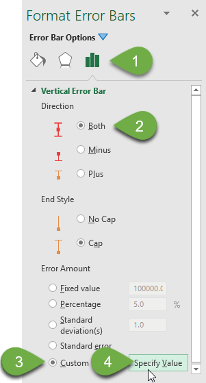
- The task pane will display the Format Error Bars options.
- The Direction should be set to Both.
- For the Error Amount option, select the Custom radio button, then click the Specify Value button.
- Select the Positive and Negative error value ranges.
- G5:G11 for the positive values
- H5:H11 for the negative values
- Click OK to add the Error Bars to the chart.
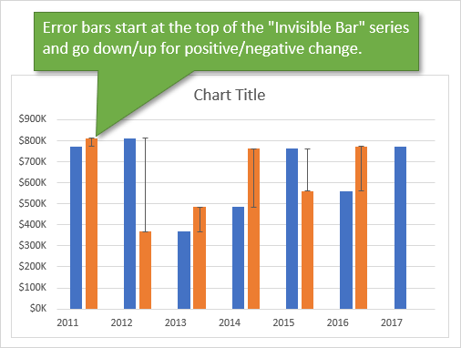
The error bars start at the top of the Invisible series (orange) columns to create the variance element. The Invisible Bar is the amount from the next period. The error bars go down for positive changes and up for negative changes. This connects the top of the column from the current period to the top of the column for the next period.
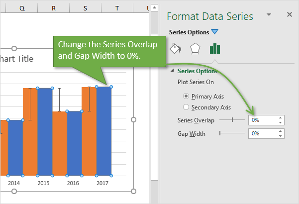
5. Change the Series Overlap and Gap Width
The next step is to make the bars wider and remove any overlap.
- Left-click any of the amount bars (blue) to select the entire series.
- Right-click > Format Series
- Change the Series Overlap and Gap Width amounts to 0%.
6. Format the Invisible Bars with No Fill
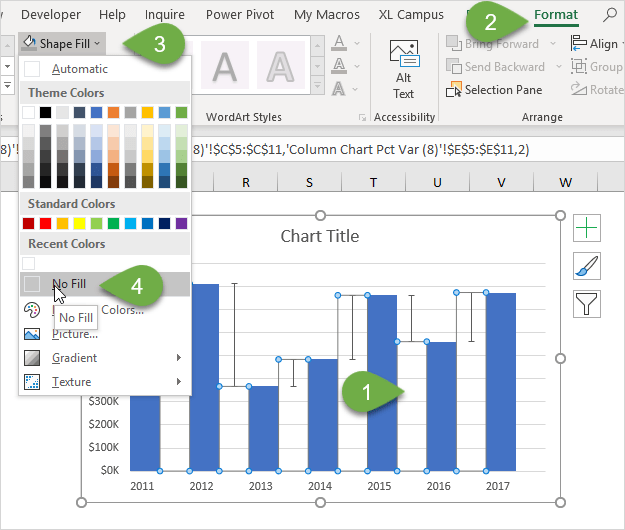
The orange bars are just used as the base of the error bars. We do not need to display them on the chart, and can make them invisible.
- Left-click any of the orange bars in the Invisible Series to select the entire series.
- On the Format tab, choose No Fill from the Shape Fill drop-down menu.
7. Add Data Labels
Finally, we need to add data labels to the columns and error bars. Here are the instructions for Excel 2013 and later. See my note below if you are using Excel 2010 or earlier.
- Left-click any of the invisible bars (orange) to select all of the bars.
Note: If you have trouble clicking on the bars. Select the chart, go to the Format tab in the ribbon, and select Series “Invisible Bar” from the drop-down on the left side. - Choose Data Labels > More Options from the Elements menu
- Select the Label Options sub menu in the Format Data Labels task pane.
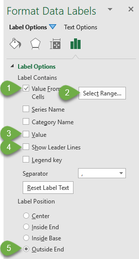
- Click the Value from Cells checkbox.
- Select the range I5:I11 and press OK.
- Uncheck the Value and Show Leader Lines.
- The Label Position should be set to Outside End by default.
- For any negative variances, select each data label and change the position to Inside End. See the video above for details.
The labels will now be displayed for both the amount and error bars.
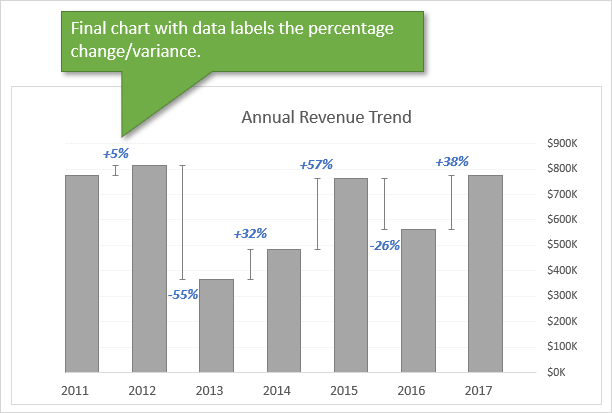
You can change the text formatting and colors as needed to match your report or dashboard.
Excel 2010 & Earlier
If you are using Excel 2010 or earlier you will not have the Value from Cells option for the data labels. However, you can use the free XY Labeler add-in from AppsPro to create the labels. This will save you a lot of time. Here is the link to download the add-in.
http://www.appspro.com/Utilities/ChartLabeler.htm
Alternate Solutions
I also have an older post that explains how to create the following chart with the variance between two series. This is great for actual versus budget reports.
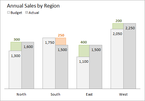
Check out the article on Variance on Clustered Column or Bar Chart: Budget vs Actual.
I also have a 3-part video series on pivot tables and dashboards that explains more about formatting charts.
And checkout my free Chart Alignment Add-in to help get all of the elements in your charts lined up to perfection.
Conclusion
I think this chart is a nice way to display the percentage change/variance between columns.
It will work best when you have a smaller number of columns, maybe 12 or less. Otherwise, I think the chart can become too cluttered looking. You will definitely want to remove as many extra elements (chart junk) as possible to give it a clean look that is easy to read.
I hope you are able to put this one to good use. Please leave a comment below and let us know what you think, or if you have any questions.
Thank you! 😊




This looks like a great way to add value to charts! Thanks Jon!
Thanks DC! 🙂
Great post !!!
i would like to use your idea in my reports
Regards from Italy
Awesome! I’m happy to hear you will be using this chart in your reports. Thanks Matteo! 🙂
Excellent work. Keep it up
Thanks Jordi! 🙂
Another excellent post, keep up the good work.
Thank you John! 🙂
Excellent. Thank you. Much appreciate your guidance. I found it very helpfull on many occasions. Look forward to further Excel education from you.
Thanks Danos! I appreciate your support. 🙂
Great post Jon – comprehensive, illustrative and well explained.
Why are error bars named so?
Thank you Sandeep!
Great question! The error bars are typically used to display the standard deviation on a data point. They can also be used to show other types of variances or a range from the data point.
Here is a post on Comparative Distribution Chart – Histogram or Box Plot Alternative. I show a quartile plot on that post where I also used error bars.
Microsoft has a more simple example and explanation here.
In this case I’m using the error bars as a bit of a hack to create the variance bars. I think there are a lot of possibilities with these and allows us to get creative. 🙂
I hope that helps.
Hi John,
Great video and excellent instructions.
Quick question, If i want to compare Q1-2018 vs Q1-2019 and Q2-2018 vs Q2-2019 to show a chnage between same quarters but different year. And then have Q3-2018 and Q4-2018 at the right of the table since there isnt anything to compare against. How do i go about that? Can you please advise?
Thank you,
Thank you! am getting a lot from you and it is really working. Am an expert in excel because of you Woooh!
Thank you Dickson! I’m so happy to hear that, and appreciate your support. 🙂
Hey Jon –
How would this work in Excel 2010?
I don’t have the option on Add Data Labels, step 4 – ‘Click the Value from Cells checkbox.’
Therefore, I can’t display the percentage variance.
Thank You
Hi Tahj,
You can use the free XL Labeler add-in for Excel 2010. I added a link and more info in the section under step 4.
I hope that helps.
Jon, great podcast like always. I am looking forward to find out how you did these arrows as an alternate to the error charts.
Hi Tytus,
Thanks so much! I just posted another video that explains how to create the arrows with the error bars. The video is the 2nd one at the top of this page.
I hope that helps.
Excellent tip Jon! I love it.
Thank you Chuck! 🙂
Hi Jon,
Thank you for this video – Creating bar chart with the percentage change between each column. This tutorial is impressive I thought. I use Excel 2010 version, I hope it will work.
Excellent presentation.
Best,
Lemma
Hi Lemma,
Thanks for the nice feedback. You should be able to create it in 2010. You will need to use the XY Labeler add-in to create the data labels from cell values. I mention that in the section on 2010 above.
Hello,
thanks for great tips and this visualization.
I can’t seem to open that practice Excel file or save it at all. Any tips?
Thanks,
Melisa
Hi,
I can’t seem to get the example file to open either. Excel loads and consistently closes again. I must have tried it 30 times. Where you able to find a solution?
This post is very impressive and helpful. Great!!!
Thank you,
Brad
Georgia, USA
Hey Jon,
Thanks for sharing very thoughtful and practical videos as always!
I’ve one question though not related to these videos–How do you see Excel as a visualization tool when we have other tools like Tableau, Spotfire, PowerBi and others gaining substantial market demand.
Thank you,
Deepak
Hi Jon, liked these post very much, including the iterations and the competition with the other Jon. MS has a long way to go with charting! But thanks to you both charting is fun!
Hi Jon,
In workbook, tab “Combo XY – Peltier”, if I choose region “East”, then % labels disappear. Why that so and how can it be modified?
Please advise.
Kind Regards
Arun
For a bar chart, the height of the bar must be either the counts or the percentage. If you want to display both the counts and the percentage value, you need to pass in the counts and use the Chart Designer to calculate the percentages from the counts.
Can this be done in Power BI also ?
Super
Hi Jon,
This is a great tutorial. I will find a lot of uses for it. I have one question, however.
How would I structure my data to accomplish this same YOY chart for multiple properties?
My company manages 49 entities and reports on the entire portfolio. At the moment we do not use a chart. We have an excel worksheet with the entities going down the left and the annual variances for each, going across the top for 5 years. It would be great to have a similar chart that displays this information.
Thanks in advance for any pointers you can give.
Rupert
Thanks for this post, it is very informative and helps a lot. I’ve been using this often and I noticed on a few on my charts when the amount (revenue) is positive, then goes to zero, then becomes positive again, the variance % is not reflected in the data label. The data in the chart shows the variance % as +0%, but the blue bar shows the increase. Any fix?
Thanks,
Ty
Conditional formatting stacked bar chart in Excel This tutorial, it introduces how to create conditional formatting stacked bar chart as below screenshot shown step by step in Excel.
In prior versions of Excel, you can use text boxes for the change bars and link them to the label cells
very useful
can these be expressed as stacked bar charts within a given year?
A vs B 2017 2018 2019
A 30 30 31
B 22 20 23
Hi Jon, Im trying to do graphic from the video #1 but I have a problem trying to add the % values to the data label, my excel doesn’t show me the option “values from cell”, so there is no way that I can see the variation on %, because the only option that it shows me is “value”.
dear sir,
not understood logic behind if statement for getting variance positive
Hi Jon, excellent presentation. For my needs I have the chart for monthly comparisons. When I add a new month the percentage label for the most recent month is missing and it appears no matter what I do Excel will not recognize the last month’s variance. What I end up doing is recreating the chart again. Please advise if there is a trick to getting the last month’s variance when adding new data (using Office 365). Thanks.
frick you you didn`t even have a chart fatty. your bigger that huge
Can you do this in a pivot chart to be dynamic? everytime i try the error bars do show the full increase or decrease.
Also can you show it in a more complex example like with variable year and quarter combined?
What type of career path would you choose that entails this type of work? Business analyst or developer?
Each time I do this my bar graphs are not centered above the year (even after I adjust to 0%). Does this have something to do with the “13 <- Label Spacer"? What is this spacer? I thought I might've missed that part in the video but I don't believe it's talked about.
Hi how can that chart be done simply without MAcros anddidnt understand why you use both the table
It helps me a lot, thank you.
could you let me know how to adjust the label of error bar ? the label with negative value show between the error bar line, can not on the bottom of the line
Thanks for your post and the detailed explainations! I prefer bar chart than line chart.
Great post! The explanation on creating a column chart for percentage change was really helpful. I especially liked the tips on formatting for better visualization. Looking forward to trying this out in my next report!
Great post! The tips on creating a column chart for percentage change are super helpful. I love how you broke down the steps clearly. Can’t wait to apply this to my data analysis projects!
Great post! I love how you explained the process of creating a column chart to visualize percentage change. It really helps to make data comparisons clearer. Looking forward to trying this in my own reports!