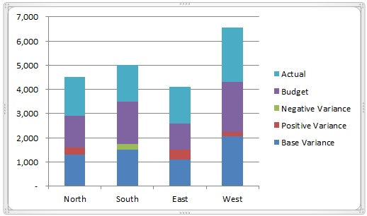
This post will explain how to create a clustered column or bar chart that displays the variance between two series. Actual vs Budget or Target.
Clustered Column Chart with Variance

Clustered Bar Chart with Variance

Overview
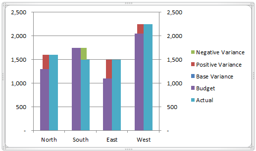
The clustered bar or column chart is a great choice when comparing two series across multiple categories. In the example above, we are looking at the Actual versus Budget (series) across multiple Regions (categories). The basic clustered chart displays the totals for each series by category, but it does NOT display the variance. This requires the reader to calculate the variance manually for each category.
However, the variance can be added to the chart with some advanced charting techniques. A sample workbook is available for download below so you can follow along.
This chart works when comparing any two numbers. It can be Actual versus Target, Forecast, Goal, Milestone, etc.
Download
The file below uses a slightly different technique by using a clustered column chart to display the variance, and then uses the Value from Cells option to display the data labels. This only works in Excel 2013. The advantage is that you can automatically display the variance label above the bar, and you don't have to move it manually as the numbers change.
Data Requirements
With any chart, it is critical that the data is in the right structure before the chart can be created. The following image shows an example of how the data should be organized on your sheet. It is a simple report style with a column for the category names (regions) and two columns for the series data (budget & actual data).
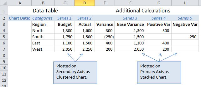
This technique only works when comparing two different series of data. This can include a comparison of any data type: budget vs. actual, last year vs. this year, sale price vs. full price, women vs. men, etc. The number of categories is only limited to the size of the chart, but typically you want to have five or less for simplicity.
Chart Requirements
The chart utilizes two different chart types: clustered column/bar chart and stacked column/bar chart. The two data series we are comparing (budget & actual) are plotted on the clustered chart, and the variance is plotted on the stacked chart.
The chart also utilizes two different axes: the comparison series is plotted on the secondary axis, and the variance is plotted on the primary axis. This puts the stacked chart (variance) behind the clustered chart (budget & actual).
How-to Guide
Data Calculations
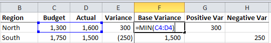
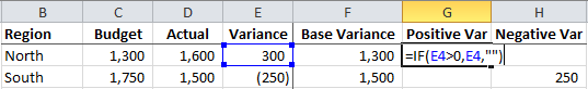
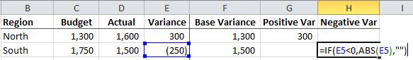
The first step is to add three calculation columns next to your data table.
- Variance Base – The base variance is calculated as the minimum of the two series in each row. This gives you the value for plotting the base column/bar of the stacked chart. The bar in the chart is actually hidden behind the clustered chart.

_ - Positive Variance – The variance is calculated as the variance between series 1 and series 2 (actual and budget). This is displayed as a positive result. An IF statement is used to return a blank value if the variance is negative. The blank value will not be plotted on the chart, and no data label will be created for it.

_ - Negative Variance – This is the same basic calculation as the positive variance, but we use the absolute function (ABS) to return a positive value for the negative variance. The negative variance needs to be plotted as a positive value to bridge the gap between the two series. Calculating this in a separate column allows us to assign the negative series a different color, so the reader can easily differentiate it from the positive variance.

How to Create the Chart
The example file (free download below) contains step-by-step instructions on how to create the column version of this chart. Creating the bar chart is the exact same process with stacked and clustered bars instead of columns.
The chart is not too difficult to create, and provides an opportunity to learn some advanced techniques.
- The first step is to create a Stacked Column Chart and add the five series to it.
 _
_
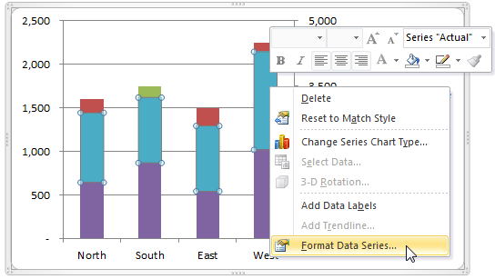
_ - Series 1 (Actual) and Series 2 (Budget) need to be plotted on the secondary axis. Right-click on the Actual series column in the chart, and click “Format Data Series…”

_
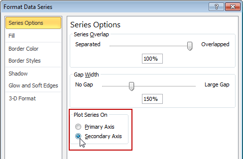
Select the “Secondary Axis” radio button from the Series Options tab.
_
Repeat this for the Budget Series (series 2).
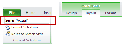
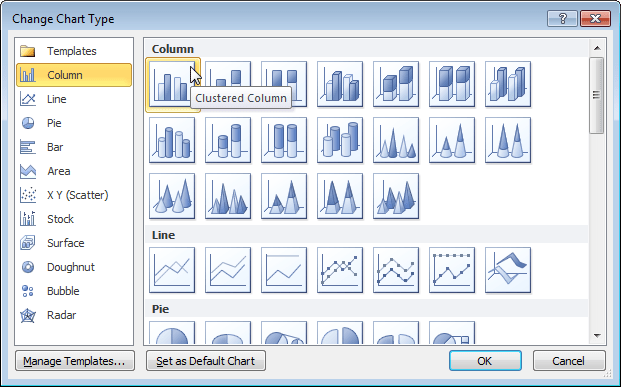
_ - Change the chart type for series 1 & 2 to a Clustered Column Chart. Select the Actual series in the chart, or in the Chart Elements drop-down on the Layout tab of the Ribbon (chart must be selected to see the Chart Tools contextual tab).

_
Click the Change Chart Type button on the design tab and change the chart type to a Clustered Column chart.
.
_
We can now start to see the chart take shape. The Acutal and Budget data are displayed in side-by-side columns for comparison. The Variance series are displayed in the background as a stacked column.
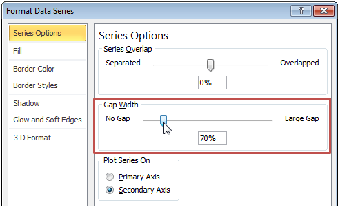
_ - Adjust the Gap Width property for both charts. The gap width can be changed in the Series Options tab of the Format Data Series window. This controls the width of the columns. A smaller number will create a larger column, or smaller gap between categories.

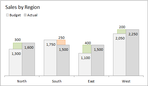
_ - Format the chart. The chart is just plain ugly with its default formatting options. We can make a few adjustments to make it more presentable.
– Move the legend to the top and delete the 3 variance series.
– Add a Chart Title.
– Delete the Axis Labels.
– Change the border and fill colors for the columns.
– Delete the horizontal guidelines.
_
_ - Add the data labels. The variance columns in the data table contain a custom formatting type to display a blank for any zeros:
_(* #,##0_);_(* (#,##0);_(* “”_);_(@_)
These blanks also display as blanks in the data labels to give the chart a clean look. Otherwise, the variance columns that are not displayed in the chart would still have data labels that display zeros.
_
The data labels for a stacked column chart do not have an option to display the label above the chart. So you will have to manually move the variance label above, and to the left or right of the column.

Additional Resources
Checkout my series of posts and videos on the column chart that displays percentage change.
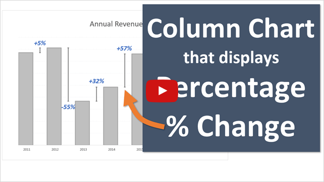
I take you through a series of iterations to improve on the chart based on feedback from members of the Excel Campus community.
Conclusion
This chart is a great way to display the series data and the variance amount in one chart. The guide is meant to help you understand how to create and edit these charts to tell your story. The source data table is simple in structure, and the chart can be re-used with different data so you do not have to go through this process every time.
Please click here to subscribe to my free email newsletter to receive more great tips like this. You will also receive a free gift. It's a win-win! 🙂
What do you think? Do you use another type of chart to display variances?
Please leave a comment. 🙂


Haven’t tried it yet but this is exactly something my boss would be interested in. Can it be done in 2007? Based on your screenshots you’re using 2010 or higher. Thanks Jon!
Hi Diana,
Yes, this technique will work in Excel 2007 and even 2003. I think your boss will be impressed. 🙂 Thanks!
Is the download missing?
Hi Ken,
It is available now. Thanks for letting me know!
Hi john,
i want to show % variance instead of Absolute number. followed this method but did not find similar result as primary and secondary axis are different units.
can u please suggest…how to show % variance in same graph.
Hi Prabin,
Great question. You can show the % variance by linking each data label in the variance series of the chart to a cell that calculates the variance.
I updated the file (the one available for download on this page) with an additional chart on the ‘Examples’ tab that displays the variances.
Here are some instructions on how to do this.
1. In column I of the ‘Examples’ tab I added the % variance calculation.
2. Click on the first variance label in the chart. This will select all the variance labels for that particular series (positive/negative).
3. Click on the same label again. This will select only the single label, and all other labels in the series will be deselected.
4. In the formula bar, type the equals sign (=), then select the cell that contains the % variance (cell I6 in the example).
5. Click Enter. This will set the data label value equal to the cell value and keep chart label linked to the cell value through the formula. So if the numbers change in your source data the chart will automatically be updated.
6. Repeat steps 2-5 for each variance label in the chart.
If you are displaying the positive and negative variances in separate series to display in different colors, then you can add an additional column to calculate both the positive and negative variances. Then repeat the steps above for all value labels in both variance series.
Excel 2013 has a built-in feature that makes this process much easier.
1. If you are using 2013, right click on any one of the data labels and select “Format Data Labels” from the menu.
2. In the Label Options menu on the right side you will see an option named “Values From Cells”.
3. Click this selection and you will be prompted to select the range that contains the labels you want to display.
4. Select the cells that contain your calculated percentage variances (column I in the example) and click OK.
This is much faster than selecting each label and creating a formula to point to the variance calculation cell.
Please let me know if you have any questions.
Thanks!
It works…Thanks John for your prompt response.
I like to visit other posts as well to find some new tricks.
Thanks Again!
Thanks for the great explanation so far but I have a further question. Is there a way to do these bar graphs if the targets are negative numbers? For example, Budget was -100, actual was -50 so we be the budget by 50 positive. When I tried it the variance was on the positive side of the graph and the budget and actual bars were on the negative side. Since my base variance was negative, the actual variance did “add on” to it.
Any suggestions?
Thanks. Lizz
Hi Lizz,
Great question! You will need to change a few formulas to get this to work. On the ‘Examples’ sheet of the file, make the following changes:
– Cell F6: =MAX(C6:D6)
– Cell G6: =IF(E6>0,-E6,””)
– Cell H6: =IF(E6<0,E6,"")
Use the formulas above when both numbers being compared are negative.
If your chart contains both positive and negative sets then you will need to wrap the formulas in another IF statement to first check if the numbers are positive or negative.
Here are the formulas to use when you have some rows that contain positives and some rows contain negatives:
- Cell F6: =IF(MIN(C6:D6)>0,MIN(C6:D6),MAX(C6:D6))
– Cell G6: =IF(MIN(C6:D6)>0,IF(E6>0,E6,””),IF(E6>0,-E6,””))
– Cell H6: =IF(MIN(C6:D6)>0,IF(E6<0,ABS(E6),""),IF(E6<0,E6,""))
You could also use the CHOOSE function instead of nesting the formulas in the IF statement. This would calculate faster if your workbook is very large and slow. I can provide more explanation on that if needed.
Please let me know if you have any questions.
Thanks, that solved my problem! My data isn’t too complex so the IF statements were fine.
I think the above is excellent
I am looking to graphically represent the % movement from a baseline target on a graph.
I have 10 departments. Each has a split of Permanent and Non Permanent staff. This gives a total of say 1000 people per department. Each department has a separate unique target of the % of non permanent staff they want to hit.
I am looking to show in a graph the movement from the base to their position now. Ideally i would like to show the movement in overall numbers but also in the % of non permanent staff change in that time period.
So the graph you have displayed is great, i just need to understand how to use it to best represent my problem
Any help would be gratefully appreciated!!
Hi Paul,
Great question on how to add the percentage variance to the data labels.
If you are using Excel 2013 there is a new feature that allows you to display data labels based on a range of cells that you select. It is the “Value From Cells” option in the Label Options menu.
To display the percentage variance in the data label you will first need to calculate the percentage variance in a row/column of your data set. In the example file on this post, the percent variance is calculated in cells I6:I9 of the ‘Examples’ tab.
Next you will right click on any of the data labels in the Variance series on the chart (the labels that are currently displaying the variance as a number), and select “Format Data Labels” from the menu.
On the right side of the screen you should see the Label Options menu and the first option is “Value From Cells”. Click the check box and it will prompt you to select a range. Select the cells that contain the percentage variance, and click OK.
You should now see both the percentage and number variance displayed in the data label. Checkout the screenshot on the link below.
Display Percentage Variance on Excel 2013 Chart Screenshot
You can then uncheck the Value option if you only want to display the percentage variance.
If you have an older version of Excel this process is still possible, but a bit more time consuming. You can set each data label to a cell value.
1. Click on a data label in the chart. Make sure only one data label is selected, NOT all labels in the series. You typically have to click the data label twice for the single selection.
2. In the formula bar, type the equals symbol = then select the cell that contains the percentage variance value.
3. Click Enter. The variance will be displayed in the label.
4. Repeat steps 1-3 for each data label in your chart.
Check out this screenshot for details.
Set Data Labels to Cell Values Screenshot Excel 2003-2010
The nice part about either of these methods is that the data labels are linked to the values in the cells. If your numbers change or you update the data, the labels will automatically be refreshed and display the correct results.
Please let me know if you have any questions.
Thanks, this is great!
Is there a way to do a stacked chart for the plan and actual along with the variance? For example, the plan consists of 3 groups and we want to show the breakout for each group for the overall plan and same for actual.
Thanks!
Hi P,
Great question! I would actually advise against a stacked chart if possible. I’m not a fan of stacked charts because it is hard to identify the trends in each group. Check out this article I wrote about stacked charts and some alternatives.
https://www.excelcampus.com/charts/dynamic-stacked-column-bar-chart-find-the-missing-trends/
I understand that you might still be required to create a stacked chart. If that is the case, and my article doesn’t convince you otherwise, please let me know and I’ll help you with a solution. 🙂
This post by Jon Peltier will explain how to create the clustered stacked chart, and we can probably add a total variance bar to the stacks.
http://peltiertech.com/WordPress/clustered-stacked-column-bar-charts/
Thanks for stopping by!
This was great information! I was able to graph exactly what I needed. Another question for you….I have 3 different groups of data that I would like to show on one graph. The first is a whole number between 500-600, the second is a whole number that is between 1-10, and the third is a percentage. Would it be possible to show all this information on a line graph? Thank you for your advice!
Hi Andrea,
My apologies for not getting back to you sooner! I am glad you found the information useful. In regards to your question, I would recommend creating a separate chart for each of these metrics. You could stack the charts on top of each other in what is called a panel chart. This will allow you to keep the vertical axis relevant to the data being plotted and display the changes in the trend. If you have them all on one chart, the smaller numbers will just look like a flat line.
The following article shows an example of a panel chart.
https://www.excelcampus.com/charts/dynamic-stacked-column-bar-chart-find-the-missing-trends/
Please let me know if you have any questions.
Thanks!
Hi John,
I have used this graph to show actual v budget data for hours. I want to now add in another column to compare attandence time v actual v budget hours, and also i want to show 3 line graphs, productivity, efficiency and booking efficicency, which are all in %. I assume i would need a third axis and this would not be possible?
Any help greatly appreciated
Hi Sarah,
For your first question about comparing the three different series (attendance v actual v budget), you will have to create a “clustered and stacked” column/bar chart on the primary axis. Jon Peltier has an article that explains this technique, and it also shows you how to add a line to the chart.
http://peltiertech.com/WordPress/clustered-stacked-column-bar-charts/
For your second question, the three line charts that are based on percentages would be difficult to add to this chart. It is also going to complicate the chart quite a bit, which is my biggest concern with it. I understand that the metrics are related, but it is probably best to think about what story you want to tell with the data. You might need to break the analysis into multiple charts, with each chart telling a story that leads to the overall conclusion. It is not always easy to do, but it will help you communicate your findings to the reader.
Please feel free to email me your chart. I would be happy to take a look and possibly do a case study on it.
[email protected]
Thanks
The download is missing, can someone help me? Thankss! Great job Jon, awesome!
Hi Vitor,
Thanks for the comment! The download should be available now. I switched hosting providers over the weekend and there was a little down time. Please let me know if you are able to download the file now.
Jon
Jon, thanks, its working perfectly!
See you
This is great thanks. I do have one additional problem I’d love to solve with this – my actuals are budget numbers are made up of say sales of apples and oranges as well as north/south/east/west. I’d love to still show one column each for the actuals and budgets but each column shows the breakout of apples and oranges (a stacked column I think). thanks.
Hi Senead,
Jon Peltier has written a great article on how to accomplish the stacked & clustered charts.
http://peltiertech.com/WordPress/clustered-stacked-column-bar-charts/
I tend to advise against this technique, or at least be cautious when you’re using it. If you only have to different series in your stack (apples and oranges), then this technique might work. The stacked charts tend to get cluttered with too many data points and it is hard for the reader to quickly draw conclusions from it.
I would recommend creating separate charts for each series. This will give each series a common baseline, and allow the reader to quickly see the trends. Checkout this article I wrote about stacked charts and let me know what you think.
https://www.excelcampus.com/charts/dynamic-stacked-column-bar-chart-find-the-missing-trends/
Thanks again!
Hi, thank you for providing this! The formulas listed for looking for negative and positive numbers, don’t seem to work. The second one specifically. Any thoughts?
Thank you so much!
Never mind! I figured it out — it had do with the quotes when I cut and paste. Thanks so much!
Hi Teresa,
I am glad you got it working. 🙂 Let me know if you have any other questions. Thanks!
Jon,
Thank you very much for the info! I do have one question. Here you are comparing just two different series of data. If I need to compare year over year data for 6 years but don’t want to show each year twice on the graph. How can I do it? Thanks a lot for your help!
Hi Amelia,
Are you looking for something like the following image?
This chart doesn’t have labels yet, but it can be done. Let me know what you think.
Jon
Hi Jon,
Hope all is well with you.
Can I request for your example spreadsheet for this type of chart. I am currently working on a very similar chart that needs to show variance for 3 series i.e., 2017 actual vs 2018 actual vs 2018 budget.
Hope I’ll get to hear from you the soonest. Thanks!
Hi, this excel is extremely great!
I have some issue to arrange the variance position..for example..In North, the variance is 300. If let say I increased the budget to 2000, the budget bar is overlapping the variance..I am trying to fix the position so that the variance will always on top of the budget or actual bar…but I couldn’t find this kind of setting…anyway to fix it?
Thanks Nelson! This is a great question. Are you using Excel 2013 by chance? If so, this is actually possible using Clustered column charts and the Value from Cells label option. Let me know if you are interested and I’ll explain how to do it.
I added a file in the download section above for the technique using Excel 2013.
Thanks Jon! It is really helps!
Yes i am using excel 2013, but at the label option > Label position, i couldn’t see the “Outside End” option..mine only have center, inside end and inside base..any idea?
Brilliant guide, thank you! (Was a bit trickier to “translate” this into Excel 2013 language, but I figured it out eventually – they actually make it easier to do this with 2013).
Now my graphs look as impressive as the data is 🙂
Thanks Emma! I should probably update for Excel 2013/2016. Glad you were able to figure it out. 🙂
Hi Jon, this is great thank you! I just have one question: I’m trying to compare consumption data across 3 years (2014 to 2016) – Is it possible to change the data table so that the graph includes 3 columns with consumption figures, and shows the variance between 2014 and 2015, and also 2015 and 2016? Let me know if this isn’t clear, thank you for your help!
Hi Marie,
Great question. That is going to be pretty tough to do. I don’t want to say it’s impossible, but will require quite a few more data series and logic. I will give it some thought.
That might actually be a good example/use for a post I recently did on dynamic chart data labels. In that post I explain how to create data labels with different metrics. One of those metrics is variance to prior period.
I’m probably going to update that post with examples for different chart types. I used the stacked bar, but it is a bit cluttered and I’m not a big fan of stacked bar charts. The technique could be used for bar, column or line charts too.
I hope that helps. Thanks!
Thanks for this Jon,
An excellent guide- and I’m now the proud owner of my own cluster chart with variances!
Love it!
Awesome! Thanks Mark! 🙂
Hi Jon,
thanks for this excel, but i am really having trouble when the change is a small percentage. for example if i haev only one row with the following entries budget =1000 and actual = 1050, the graphs representation doesnt really show the right picture. the actual and budget looks like its in a different axis. Appreciate your help in fixing this
Hi Ameer,
The axis max values might have changed to automatic. You will need to manually change the max and min axis values for both the Primary and Secondary axis of your chart. That should get everything lined up. I hope that helps. Thanks!
What’s up,I read your blogs named “Variance on Clustered Column or Bar Chart – Budget vs Actual – Excel Campus” daily.Your humoristic style is awesome, keep it up! And you can look our website about مهرجانات 2017.
Hello Jon,
First thanks for the explanation ! 🙂
I want to know, how can i put another indicator like PY (previous year) in the same series of Budget and Actual? now to see the GAP vs. PY
thank you very much
have anice day
Itahí
Hi Andrea,
It’s pretty challenging to add a third bar to this. There is a lot more complexity with the positive and negative bars lining up.
Thanks for the question though. 🙂
How can I show a % variance based off of this model?
Thanks
Hi Hunter,
You can use the “Values from Cells” option for the Data Labels to populate the percentages from cells instead of dollar values. I mention value from cells in this article on dynamic data labels. I hope that helps.
Asking this to see if it might be possible, didn’t see a comment that was trying to quite do this.
I would like to stack another column on top of the Actual bar to represent forecasted expenditures. Then show the variance between Actual + Forecast vs. Budget. The only way I can think to do that is to have some type of third axis, which I have no idea how to do and doesn’t sound possible (or at least manageable).
Hi Nathan,
I don’t believe it’s possible with this technique. I never like to say things are impossible, but getting the width of the variance bars to line up is going to be really challenging. It might be possible to overlay two charts with a clear background, but I have not tried that. It would still require a lot of maintenance. Sorry, I wish I had better news.
Hi Nathan,
I recently built a similar chart i.e.( Actual Type-A + Actual Type-B) v/s Budget. Sharing the same.
This is the method that I used:
Use Jon Acampora’s above mentioned method to calculate Base Variance, Positive Variance and Negative Variance.(Thanks Jon!)
Plot Actual & Forecast as Stacked Bar Chart on Primary Axis.
Plot Budget as Clustered Bar Chart on Secondary Axis.
To eliminate overlapping of Primary and Secondary Bars, add required no. of ‘Dummy Series’ with zero values on Secondary Axis.
Then use ‘Error Bars’ to show the Variances.
Steps to get the Error Bars in place:
Plot ‘Positive Variances’ on the ‘Budget’ Bar:
Click on Layout>Error Bars>More Error Bar Options> Select your’Budget’series
After you select the series, the ‘Format Error Bars’ window opens up.
In the Format Error Bars Window: Under Error Amount section, select ‘Custom’ option and click on ‘Specify Value’.
Then, select the cell range having ‘Positive Variance’ values as ‘Positive Error Value’. Enter 0 as ‘Negative Error Value’
Plot ‘Negative Variances’ on the stacked ‘Actual+Forecast’ Bar:
Click on Layout>Error Bars>More Error Bar Options> Select ‘Actual’ or ‘Forecast’, whichever is on topside of the stacked bars
After you select the series, the ‘Format Error Bars’ window opens up.
In the Format Error Bars Window: Under Error Amount section, select ‘Custom’ option and click on ‘Specify Value’.
Then, select the cell range having ‘Negative Variance’ values as ‘Positive Error Value’. Enter 0 as ‘Negative Error Value’
Now you should have the error bars in place. You can then format the Error Bars to have width equal to the Bars in the chart & to have different colors for Positive and Negative Variances.
Hope this helps.
Hi,
i added new data column in the same chart but the axis is not aligning good it goes left and right somewhere. can somebody help me with that
Hi,
i added new data column in the same chart but the axis is not aligning good it goes left and right somewhere. can somebody help me with that.
Hello Jon,
will it be possible to show in same excel graph the cumulated positive variance which will be consumed by negative variance during future time periods (calendar weeks, months).
I used your template to visualize weekly demands from customer against our weekly capacity.
I wanted to see until which week our positive variance will be enough to cover negative variances.
thank you,
Salahiddin
Jon,
I tried to revised the file to include 12 rows of data instead of only 4 as I am trying to represent a yearly comparison. For some reason it did not work. Do you have any TIPS?
Harley,
I adjusted the file for the same reason as you did and the only thing I had to do to update the graphs was adjusting the ranges of the graph so now it include the new rows I added. Right click on the graph -> select data – > edit Legend entries and Horizontal axis labels
I’m using the technique based on a Pivot Table, with slicers, that filter by the fiscal year. I get all 12 months based on the year i choose from the slicer. It works great. My only issue now (that I’m currently working to resolve) is that my “Base Variation shows up on top of the Posative and Negative, so those bars can’t be seen, only the $ amounts in the labels are visible. I’m working on it…
Hi Jon,
Great chart but one question as it is always useful to present the variance in % on top of the variance value. Is there a way where % can be shown on top of the variance value?
Kind regards,
Hatem
Thanks for sharing this technique and was useful to represent the variance chart
Thanks A K! 🙂
Hi Jon,
Thanks for this guide, it is very useful. I’ve tried them from scratch on my own, but for some reason the scale of the whole chart is wrong. Proportions for the positive/negative variance and for the actual are not accurate. Let’s say the positive variance is 3 and the actual is 1000, the positive variance bar still looks larger than the actual, which of course makes no sense. I’ve checked the axis for both of them, and they are the same, so I don’t know what the mistake could be. Do you have any idea? I don’t see this happening in your charts.
Thanks,
Laura
Hi again Jon,
I figured out what is causing my bars to be out of scale. If I take your excel file and I erase categories South, East, and West, leaving North alone, the whole scale of the positive variance goes wrong and it starts looking larger than the actual. Can you please help me figure out a way to only show one category without this happening?
Thanks,
Laura
This is very helpful. I wonder if we can also include forecast on the chart?
I combined this with one of the techniques explained by Jon Peltier in something recent you shared to get the data label to always be above so you dont have to move them. And then they are dynamic. I have a Max Positive, and Max Negative column. I do a line graph for the two data sets and just hide the line and the data points and have the label above.
Jon,
I follow the instructions above and it all works great with my 12 month fiscal year budget vs actual dashboard using the slicers to choose the fiscal year. The only problem is….
The Stacked Columns have the “Base Variance” on top and the Negative in the middle, and the positive variance on the bottom of the stack. how do I flip these so I can see the right one at the top (already have them color filled correctly, just can’t see the colors the way they’re stacked).
Hi Jon-
How do I adjust the chart data if my budget/target is positive but my actuals are negative (e.g. negative margin)? Is there a solution for that?
For example:
Budget = $40
Actual = -$6
Variance = -$46
If I use the standard formulae, the negative variance column “crosses over” into the budget column. The graph makes the actual column also “cross over” into the budget column below zero on the x-axis.
Any help would be much appreciated!
Thank you!
I’m fascinated with your innovative strategy, we should connect some time.
Very helpful. 🙂
Hi Jon,
Here’s my two cents
https://wmfexcel.com/2019/02/17/a-compelling-chart-in-three-minutes/
Hope you like it.
Cheers,
MF
Thank you this is very helpful!
Really appreciate this, Jon! I wish I had seen this 5 years ago! = )
I was looking for something for a personal budget and it does not seem to show low variances well. That said this is great for work. Fantastic great looking charts – thank you for taking the time to put this together.
Hi – not sure what I am doing wrong but I have attempted it a few times now and you lose me at ‘3’ because my resulting Clustered Column Chart looks very different. What am I doing wrong?
I have the same problem. Anyone got the solution?
Excellent Instructions; The Best I have seen, and have been easily replicate it for Engineering Team Dept Plan vs Act Hrs – However Only problem I have been unable to put data labels above the Variance Sections – Any tips? – that bit (to me) I don’t understand, KR, Trevor
Hi John, I’m trying to create the chart but I have a problem in the part where I have to change series 1 and 2 to a clustered column chart, I don’t know for what reason excel transform my chart into a clustered column chart but it separates base variance and negative variance to the left side of each region, and actual and budget to the right side of each region, this isn’t allowed me to create the final chart.
Hi Jon,
Under Overview, the download link for the Sample Workbook does not work (I used Chrome and Edge). Could you please have someone check that link?
Thanks,
Afzal
Is it possible to recreate this in Google Sheets?