Bottom line: Learn why a pie chart is not always the most effective way to present your data, and how to use a bar chart as a possible alternative.
Skill level: Beginner
Video Tutorial
Download the Excel File
Download the Excel file I use in the video to follow along.
An Effective Use of Pie?
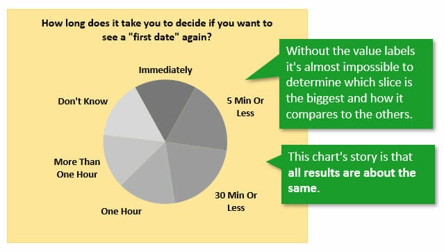
I recently saw this pie chart in a magazine and it caught my attention.
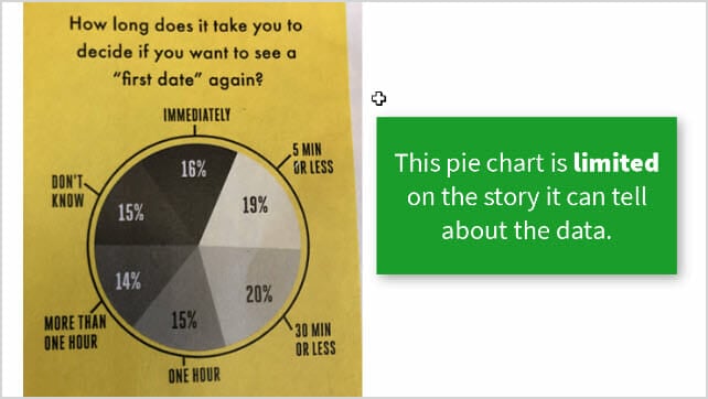
It displays the results of a survey based on the question, “How long does it take you to decide if you want to see a “first date” again?”
I had to study the chart for a minute to figure out the story it was attempting to tell. What insights can I immediately gain about this data?
Is it an effective use of a pie chart?
I think arguments can be made on both sides. It all depends on what message (story) the author is trying to tell.
Charts Are All About Story
The goal of any chart (graph) is to tell a story about the data. That is, what can we learn from the data to help make informed decisions?
Our job as chart creators is to tell this story in a way that is fast & easy for the viewer to understand. These are the basic principles of data visualization (aka chart building).
We want to turn a sea of data into a visual that tells a story in a matter of seconds. You've probably heard the saying before, “a picture is worth a thousand words”, and this can be true for charts too.
A Workout for Your Brain
If a chart is difficult to understand and doesn't present a clear story, then our brains have to do extra work to read it. This is not only time consuming, but can leave the reader confused or frustrated.
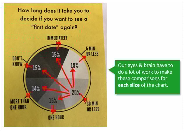
In the case of this pie chart, our eyes have to make a lot of comparisons between each slice to determine which is the winner, and how all the results stack up against each other.
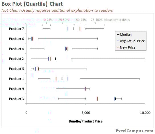
If you make confusing charts, then you'll end up having to follow your Excel and PowerPoint files around to explain the chart to everyone. Trust me, I've been there. One example is this really “cool” quartile (box) plot I made once…
What Story Does This Chart Tell?
The only story this pie chart can effectively tell us about the data is that all of the slices (categories) performed about the same.
If we remove the value labels, it's nearly impossible to compare and order the sizes of each slice. I explain more about this in my article on When to Use Pie Charts – Best Practices.
If we do want to make comparisons between slices, then we are forced to reorganize the data in our brain. So, let's see how we can do this for the reader.
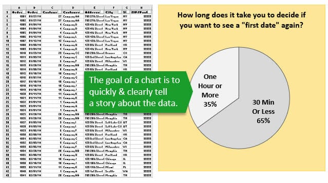
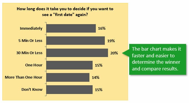
Bar Chart – An Alternative to Pie
One common alternative to a pie chart is a bar chart. Here is the same data presented in a bar chart.
I know it might not be as fun or exciting to look at, but it's easier to read. Checkout my article on pie charts to learn why we love circles (and pie) so much.
The bar chart allows us to quickly determine the winner (the longest bar), and also compare the length of each bar.
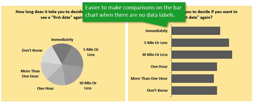
One way to really emphasize this point is by removing the data labels. What conclusions can we make about the data now?
Change the Story by Sorting
Another advantage of the bar chart is that we can quickly change the story by sorting the data.
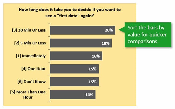
For the example above I sorted the values column in descending order (largest to smallest). This gives us a different view of the data and allows us to make quicker comparisons on performance.
A Few Cases for Pie
I want to be clear that I'm NOT saying we should throw out the pie chart and never use it again. Everyone loves a little pie in their life, right?
We just need to make sure the pie chart can tell the right story about the data.
A Clear Winner
One good case for pie is when there is a clear winner. I changed the data in the chart below to show that the “30 Min or Less” category accounted for 70% of the responses.
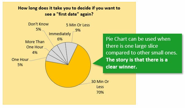
In this case our eye is drawn to this slice, and the other smaller slices are less significant.
Grouping the Data into Fewer Slices
Another option is to group the data into fewer slices. Since the categories are based on time, we can group them to display different results.
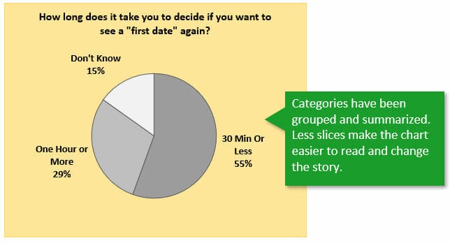
In the example above I took the original data and grouped & summarized it. To me, this is a much more interesting story about the data.
We can now quickly see that over half of the respondents make this dating decision in 30 minutes or less.
If we remove the “Don't Know” category, we get an even clearer picture of the grouped data.
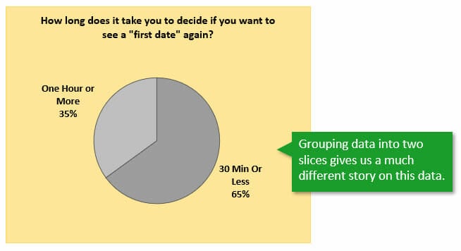
This chart tells a much different story from the original, and teaches us to be on our best behavior at the beginning of a date (or interview)… 🙂
Conclusion
As data analysts and chart creators, we are story hunters.
The story isn't always apparent when we first summarize/aggregate the data. We typically need to go through multiple iterations with charts to find and communicate a clear story.
Checkout my article and videos on Column Charts That Displays Percentage Change or Variance for other examples of chart iterations.
I also have an article on Analyzing Survey Data with Power Query & Pivot Tables and a full article on When to use Pie Charts.
How else can we present this survey data? Please leave a comment below with your suggestions and any questions. Thank you! 🙂
Free Training on Pivot Tables
Pivot tables are a great way to quickly summarize data for charts and interactive dashboards. If you are currently using pivot tables, but feel like you aren't getting the most out of them, then I have a free training just for you.
Right now I'm running my free training webinar on “The 5 Secrets to Understanding Pivot Tables”. During this 60 minute training I explain the critical steps to building pivot tables to prevent errors and truly understand how they work.
If you've been struggling to build pivot tables with your own data, getting error messages, or just not sure which fields to put in each area, then get registered for the webinar. We also talk about getting the source data in the right layout, which is the most critical step to building a pivot table.

Please click the link below to register for the upcoming webinar.
Click here to register for the Free webinar on Pivot Tables
I look forward to seeing you there!


Help! how to turn this sentence into a If function formula.
“The Sales Commission is 15% of the difference between the Total Sales(H5) of the employee and the Sales Quota(C20) if the difference is above 0, otherwise the Sales Commission is 0.
So far i have this part of the formula, but not sure about it. =IF(H5-C20<=0,"0"
=max(0.15*(H5-C20),0)
The categories are somewhat arbitrary, and almost seem designed to show equal values: Immediate, 5 minutes, 30 minutes, etc. I suppose in a more rigorous study you’d construct some sort of extinction curve, but then you’d also need an accurate timing mechanism. The timers used in speed chess come to mind…
This would be more interesting if it also said whether the decision was “Yes, I want to see this person again” or “No way”.
With this in mind, I set out to try a few charts. I’ll have to write a whole article about this, but I’ll show the first chart, which is a pie. I don’t know if your comments accept image tags, but I’ll try:
In my chart, I plot yes to the left and no to the right, with shorter times at the top and longer times (and don’t know) towards the bottom.
I made up the data so it should show that you can rule someone out very quickly, while longer decision times favor a yes decision.
I’ve also drawn a number of bar charts, with yes and no stacked, clustered, and stacked in opposite directions, and a couple varieties of Marimekko.
Hey Jon,
Great points about the arbitrary categories. Thanks for chiming in here. It doesn’t look like the image posted, but if you want to email me the file I can post it for you.
Thanks again!
There can be times where a pie chart is just as good as a different type of chart but it isn’t very often and to my mind it’s never better, only equal. I also find the categories arbitrary and the labels misleading. Does ’30 mins or less’ include ‘5 mins or less’? Is ‘1 hour’ exactly an hour, an hour or less, or between 30 mins and an hour? I also like to see the Don’t Know’s differentiated by colour, say very light grey, or represented separately, as in ‘of the 85 people who answered in our survey of 100’, percentages can be very misleading without knowing the sample size.
Hey Colin,
Great points here. I didn’t think about the categories being misleading like that, but makes sense.
I also like the idea of differentiating the Don’t Know’s. Awesome! Thanks for contributing! 🙂
When creating graphs (such as the much more effective bar chart alternative you created), what scale should the axis be? Should it always be 100% (although it might be slightly harder to distinguish between categories with similar values), or should it be truncated to a certain degree? Please note that the smaller the axis scale, the more pronounced the differences are “perceived” to be. Do you have any recommendations for what scale values (or proportions) should be used when reporting data with charts?
Hi Christopher,
Great question!
The axis should start at zero and the max should be greater than the longest bar. However, it does not need to be 100%. Here are some images that help explain the reasoning.
You can usually use the default Auto setting for the max that Excel sets. Sometimes you need to adjust it down a bit if it rounds up to high.
As you mentioned, when you set the Min to something greater than 0%, the results can be misleading. It does zoom in on the differences, but also makes it look like the smaller values are much smaller than the larger ones.
This is especially true if the axis is hidden, like I had in the original charts. Some experts will argue that you should not hide the axis. I think it depends on the audience, but it is a valid argument. We do want the reader to know that the axis starts at 0%.
Setting the max to 100% is more subjective. The image below shows that this adds a lot of blank space and can make the chart more difficult to read.
However, it does show the size of each bar as a proportion of the total 100%. I think that can be interesting with some charts, so there can be an argument both ways.
I hope that helps. Thanks again for the question! I’ll probably do a followup post on this.
We should all leave the pie (chart) for desert (Stephen Few).
Two comments: First, get rid of any unnecessary detail (e.g. tick marks on Y axis, [1], [2], [3] … numbering (most likely in there to sort) ) (Tufte, maximise data to ink ratio)
Second, a stacked bar or column chart is usually also a good option to replace a pie chart. In fact, in this example it could even add additional information. As mentioned already the groups could be misleading. I assume they are ment like 0 min, 0-5, 5-30 min etc.) When using a stacked chart you could convey a) the “winner” (length can be evaluated by humans much better than angles and values are on there anyway) and b) the cumulative value (i.e. what % decided in less than 1 hour which would include immediately, 0-5 , 5-30 and 30 – 1h). This would need sorting by time and an axis though 😉 .
Thank you very for providing free downloading. This is my first start to learn Pivot and I shall learn first and I shall revisit after my learning.