Bottom Line: View 5 different charts that can be difficult to read, cause confusion, and prevent good decision-making. Then learn some alternatives that do the opposite.
Skill Level: Beginner
Watch the Tutorial
Download the Excel File
This Excel file contains all of the charts that we look at in the video.
Choose the Best Charts
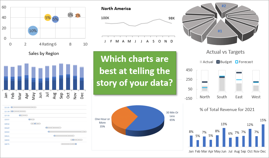
You want to use the best charts possible to convey data and tell your story. Here are 5 chart types that I feel are lacking in their ability to do that. Along with each chart, I want to show you a better alternative.
Bad Chart #1 – Stacked Column Chart
Despite the popularity of this chart, in my opinion, it's never the best option. The stacked column chart attempts to tell several stories at once. In the example below, the chart is telling the story of total sales by month, but it is also tryng to tell the story of total sales for each region by month. That's where I think it struggles to achieve clarity.
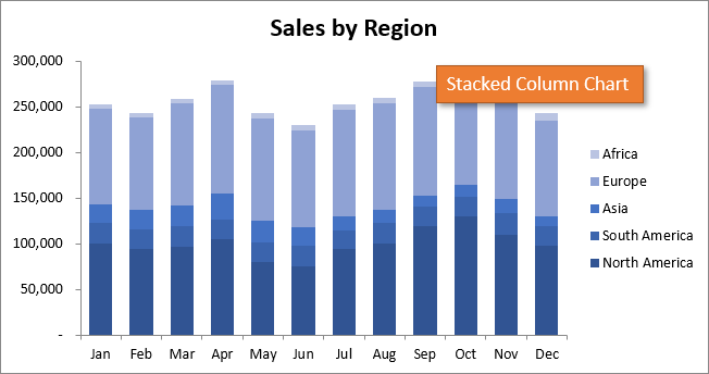
This is a bad chart because the data for each region (except for the bottom one) has an uneven baseline. Therefore it's difficult to accurately compare the monthly data because it's difficult to measure the size of each section. This difficulty is only compounded when the colors are similar, as above.
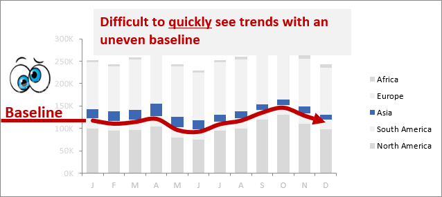
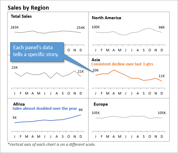
Because the Stacked Column Chart is trying to tell too many stories, it fails to tell most of them well. A better alternative is to create a Panel Chart, where each panel tells its own story.
Alternative – Panel Chart
Here is the exact same data, broken out into six Panel Charts. These panels tell each story separately and succinctly. It's much easier, for example, to see that sales in Asia are declining, while sales in Africa have almost doubled for the year.
I talk more about Stacked Column Charts and their alternatives in this post.
Bad Chart #2 – 3D Exploding Pie Chart
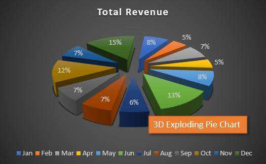
While they look kind of cool, a 3D Exploding Pie Chart can be deceptive to read. For example, in the chart below, is it immediately obvious which of the slices represents a larger data point?
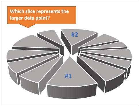
Most of us would say that pie slice #1 appears bigger than pie slice #2. But in reality, slice #1 represents 13% of the pie and slice #2 represents 15% of the pie. The confusion is caused by the fact that we are viewing the pie at an angle. This makes distance and perspective important factors in deciphering the data's story.
Alternative – Bar Chart
While even an old-fashioned 2D pie chart would be a better alternative for determining the size of each slice, I would recommend a bar chart, especially when the pie slices represent time periods. In the bar chart below, you can readily see a trend in the data over time that isn't as easy to perceive when the data is in a round pie.
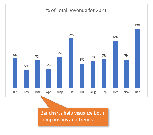
If you must use a pie chart, consider using fewer data series, if possible, for easier comparison.

If you want to learn more about pie charts and their alternatives, I've written a chapter in a book that I co-authored with other Excel MVPs on the love/hate relationship we have with this particular kind of chart. The book is called Excel Insights – A Microsoft MVP Guide to the Best Parts of Excel and in my chapter I include a life hack for choosing the best slice of pizza!
I've also created this post about best practices for when to use pie charts.
Bad Chart #3 – Clustered Column Chart
The Clustered Column Chart can be fine when there are smaller amounts of data. But as more groups are added, or more variables are clustered together, it can get very busy and much harder to read, as you can see here:
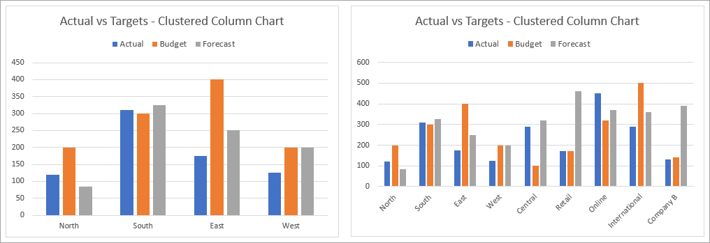
As you add more data, it becomes more difficult for the eye to take in all the vertical lines and different colors for comparison.
Alternative – Condensed Clustered Column Chart
The chart below is still technically a clustered column chart, but all of the data has been condensed into one column per region, and the colored lines represent the various data points. This type of chart is much easier on the eyes yet still conveys all of the data of the clustered chart above.
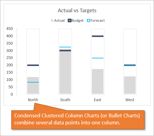
Another name for these charts is Bullet Charts. Learn how to create a chart like this using this tutorial.
Bad Chart #4 – Bubble Chart
Bubble Charts aren't always bad, but people often misuse them. For example, in this Bubble Chart, the three metrics displayed are not cohesive.
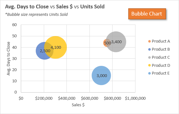
This chart doesn't really tell a story. That's because the data types don't really correlate with one another.
Alternative – Bubble Chart that Tells a Story
Here's an example of a Bubble Chart that makes more sense. By plotting the bubbles on a grid that compares a product's rating versus the number of days it takes to sell, you can see that larger or smaller bubbles (showing how many units were returned for each product) might indicate a correlation to those factors.
In other words, perhaps Product B has a high return rate not only because of its low rating but because it has a shorter sales cycle (perhaps because it is “pushed” on a customer without giving them time to think about their decision or be educated about the product.)
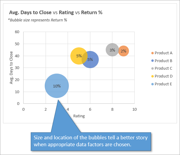
The point of a Bubble Chart is to display three different metrics that make sense together.
Bad Chart #5 – Box Plot (Quartile) Chart
This chart has gotten me into trouble in the past, so I want to make sure you avoid my mistakes. The chart below shows the distribution of prices that products were sold at.
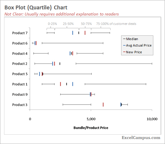
The problem I got into when presenting this chart is that I didn't consider my audience. The chart was too complex to readily understand without some background or training in reading charts like this.
Sometimes a chart can take so much explanation that it loses its helpfulness because you could just as easily spend that time verbally telling the story of your data instead.
By presenting this chart to an audience that didn't find it helpful, I was being what I call an Excel Hoarder. I'd love to describe to you exactly what that means in my free webinar called The Modern Excel Blueprint. You can find out where you land in this framework by joining the webinar, which you can do by clicking the image below.
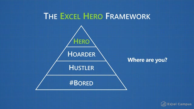
It's important to use charts that make sense to your audience.
Alternative – Comparative Distribution Chart
A better option that I could have chosen for my audience would be the Comparative Distribution Chart, which shows a distribution of data across two different series or segments.
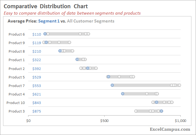
Check out this tutorial for an in-depth look at how to create and use this kind of chart: Comparative Distribution Chart – Histogram or Box Plot Alternative
Conclusion
I hope this discussion has been helpful for you in determining what charts or graphs you should use for data visualization for different types of data and audiences. Is there another type of chart that you would label as “bad”? Let us know in the comments below, where you can also leave questions or feedback.


Great tips! Totally agree with you on the stacked bar charts. This is a much easier way to tell the budget/actual/forecast story. Thanks!