This post will show you the proper way to setup or organize your source data for a pivot table.
Pivot Table Overview
Whether you are using Excel or a Google Spreadsheet, pivot tables are a great tool for summarizing and analyzing large amounts of data. They can be huge time savers for creating reports that present your data in a clear and simple format. With the advent of PowerPivot, there is no doubt that pivot tables are the way of the future for Excel.
Before you can create a pivot table, you must have your data laid out in the right structure. This is the most critical step, and also the most common mistake when learning how to create pivot tables. Once you have your data organized correctly, you will become much more proficient at creating reports, analyzing data, and finding trends.
This article will explain:
- The correct vs. incorrect structure for pivot table source data.
- Why it is important to understand this.
- How to convert your reports into the right structure using formulas
(free sample workbook).
Data Table Structure
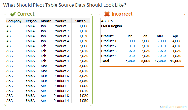
The first step to creating a pivot table is setting up your data in the correct table structure or format. This is the source data you will use when creating a pivot table. Your source data should be setup in a table layout similar to the table in the image below.
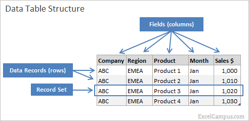
The following is a list of components of a data table. These terms will be used throughout the article.
- Fields – Columns that define the values in the rows.
- Column Header – Name that describes the data in the field.
- Data Records – Rows in the table below the header that contain the data.
- Record Set – One row of data that contains values for each field.
The data table contains a column for each field and rows for each data record. The column fields are named with descriptive attributes that define the values in the record sets (rows). For example, your sales table may contain the following columns: Company, Region, Product, Month, and Sales Amount. These are the descriptive fields that define what values will be in each row of the table. Each row will contain a sales record for a different combination of company, region, product, and month. It’s also important to note that field names (column headers) must be unique throughout the table.
Wrong Data Structure
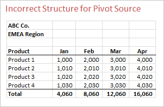
Sometimes you will receive a report that is structured like the image above, with some page header info, months across the top, and products or accounts listed down the first few columns on the left. This data is in the WRONG structure for a pivot table. The data is already in a summary format, which is what we want the pivot table to produce. However, you may want to use this data as a pivot table source to do your own analysis and produce different slices of the report.
Why is it Wrong?
It is important to understand why the data structure is wrong for a few reasons.
First, it will help you request the data in the proper format. When we receive data in a summary report format like the example above, we usually don't have control over how this report is produced. But somebody in the finance or IT organization does have control. They should be able to produce a report in the table structure you need for your pivot. So understanding why you need it in the correct format will save you time having to manually convert the report. Otherwise, you will basically have to reverse engineer the report to get it in the proper table structure.
Second, it will help you understand how pivot tables work to summarize, filter, sort, and slice your data. The basic understanding will allow you to learn more advanced techniques of adding calculated fields and items.
The job of the pivot table is to summarize your source data table based on the criteria you specify in the filter fields (Report Filter, Column Labels, and Row Labels). You can think of it as a very advanced way to arrange and filter your data. The pivot table is an extremely powerful tool, but can only be used to its full potential if the source data is in the right structure.
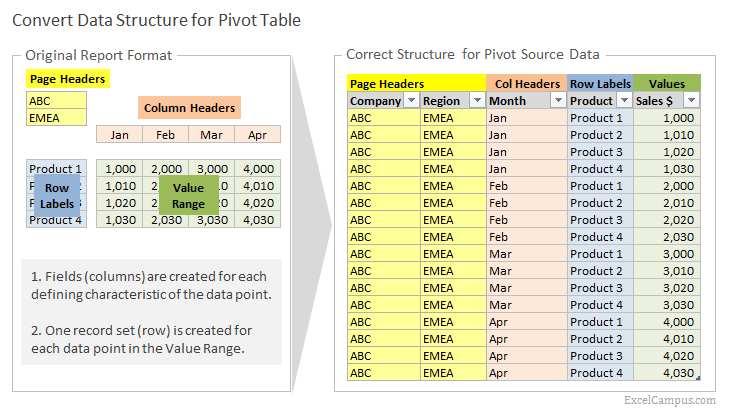
Getting the Structure Right – Setting Up Your Source Data for a Pivot Table
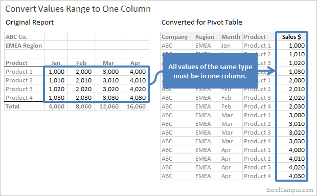
In the image above, the sales data table on the right contains all sales amounts in the [Sales $] column. With this format you could easily sum the column to produce the Total Sales $ for all companies, regions, products, and months. You could then start filtering the columns to see only the sales for one month and one region. A pivot table works the same way, and basically filters your table based on criteria you specify in the filter fields.
The basic rule of the data structure is that all values of the same type need to be in one column.
This one rule should hopefully make it easier to quickly determine if your data is in the right structure. If the data you are trying to analyze is spread out over multiple columns, then you will likely need to convert it before creating a pivot table. In the “Original Report” above, the Sales $ are in multiple columns by month (Jan – Apr). This one observation tells us that the data is in the wrong structure.
Converting the Data
We now know that we need to convert our original report into a table so that each value is in its own row (record set). Each value will contain a field (column) for each attribute that defines the value (company, region, product, month). This means that many of the field values will be repeated in the data table.
The following image shows where the values for each field are derived from in the original report. This mapping should help you understand what is needed to convert the report into the correct structure.
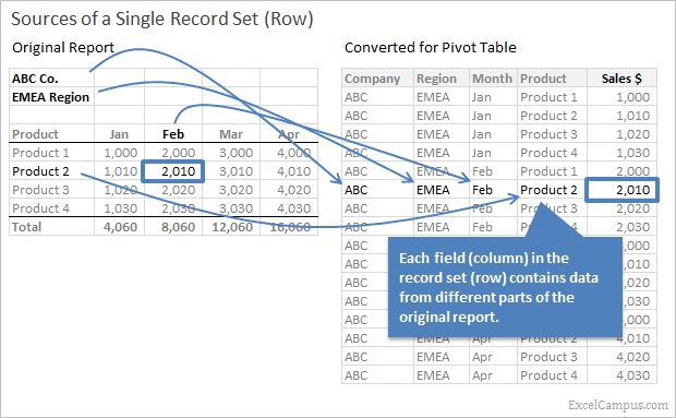
The image below shows another view of this conversion. Each part of the report is color coded to make it easy to see how the data is translated to the table. The Value Range (green) on the left side is basically stretched out into one column in the table on the right. All the defining characteristics of the values must be entered in the fields (columns) to the left for each record set (row).
In the original report format, the page and column headers are used to describe multiple values (data points). For example the column header for the month Jan is associated with all the rows below it for the different products. When the data is converted to the proper format, each value will be placed in a separate row, and a month column will be created that contains all the months. The row labels for products will repeat in a similar fashion. The page headers for company and region will repeat on every row of the data table because they are the same for every cell in the value range.
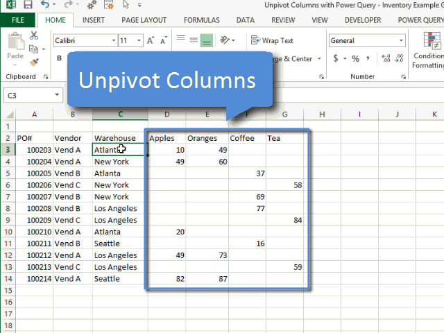
Solution #1 – Unpivot with Power Query
Power Query is a free add-in from Microsoft for Excel 2010 and 2013, and it makes this process really easy. Power Query will transform your data into the correct format with the click a button.
The following screencast shows how to use the Unpivot Columns button in Power Query.
I also have a video that explains the unpivot process in Power Query in more detail.
Video best viewed in full screen HD.
Checkout my article on How to Unpivot with Power Query for a full explanation. I also have an article with a full Overview of Power Query that describes some of its best features.
As awesome as Power Query is, you might not be able to get it. It is only available for the Professional Plus versions of Excel 2010 and 2013. Checkout my Complete Guide to Installing Power Query to determine if your version of Excel is compatible.
Solution #2 – Convert the Data with Formulas
If you are unable to use Power Query, then you will need to reverse engineer the report to the correct format before using it in a pivot table. This can be done with lots of copy/paste and transpose. However, there is a faster way using formulas.
The image below shows a sample of how a report can be converted into the correct table structure using a few formulas. A sample workbook that contains all the formulas is available for download below.
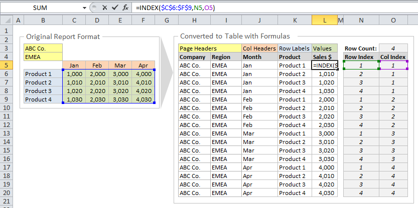
The model makes use of the INDEX function to reference the original report, and pull the data into the table. The [Row Index] and [Column Index] are helper columns that contain formulas to return the correct row and column numbers used by the Index formulas in the data table. The sample workbook contains two examples.
- Example 1 is similar to the report format above, with page headers, column headers, and row labels.
- Example 2 does not contain page headers, but does contain two different value types: sales and margin.
The file contains cell comments with more detailed descriptions of the formulas.
Download
Please click the link below and the Excel file that contains the conversion model will be emailed to you immediately. You can use this model as a template to quickly convert your report data into the proper structure for the source data of a pivot table.
You will also have the option to subscribe to my free email newsletter to stay updated with new articles and videos that will help you learn Excel. After confirming your subscription you will be able to download my “10 Excel Pro Tips” eBook. It's all free!
![]() Convert Source Data for Pivot Table.xlsx(34.2 KB)
Convert Source Data for Pivot Table.xlsx(34.2 KB)
Next Steps
Now that you have a basic understanding of how your source data should look, the next step is to start creating pivot tables (and impress your boss). 🙂
If you haven't already seen it, checkout my free video training series on Pivot Tables & Dashboards. This will help you get started creating pivot tables and show you what a powerful tool they can be.
Additional Resources
- Complete guide on How Pivot Tables Work
- 3 Part Video Series on Pivot Tables and Dashboards
- Learn How To Compare Multiple Lists with a Pivot Table instead of using messy formulas.
- Convert a Pivot Table to SUMIFs Formulas with this free VBA macro.
- Learn how PowerPivot can be used instead of VLOOKUP to create a relationship between two tables.
- This tutorial, INDEX Function – A Road Map for Your Spreadsheet will help you learn the INDEX function (it's a must know).
Please leave a comment below with any questions.


Download is not active. Please activate
Thanks for the heads up Zurman! I activated it. Please let me know if you have any troubles downloading it now.
Thanks again for the great article. However I might suggest that readers try a data reshaper tool (addin) for excel created by Tableau. Its free and a bit easier to use than the process described… given I am lazy, easier is always better. If one does a search with google on “Tableau add-in reshaping data in excel” you will be brought to the site where the zip file is located. Simple to use… ‘they give an example’.. Example, I wanted to convert a file containing mutual funds avg return by type (stock vs bond), sector, fund name over a 10 year life span. The original file had the years listed horizontally. My file contained 1008 records records, and tableau resphaped by data into approx 13000 rows. One click only!
Thanks for sharing Lax! I did not know about that tool. I briefly tested it and got the same results you did. It is very simple and definitely a time saver. Awesome!
Great post. In my experience, it is most common issue mid-level users (let’s say, people who know how to make pivot table, and use VLOOKUP, INDEX, MATCH etc.) have – bad data structure (not only in pivot table but all sorts of reports and models production).
Usually it is overlooked and there are no, or very less, chapters in Excel books which discuss this.
Few weeks ago there was article on DDoE in which Dick emphasize importance of some basic database knowledge for someone who tend to be good in Excel: http://dailydoseofexcel.com/archives/2013/06/25/how-to-be-great-at-excel/
Thanks Mladen! I completely agree with this being a commonly overlooked issue. I am not exactly sure why there is a lack of information on it, but it is such a critical step to creating a pivot table and understanding what you can do with it to manipulate your data.
I also read Dick’s article and that was part of my inspiration to write this one.
Thanks again,
Jon
Thanks for the write up Jon. I was ready to do the same thing for some folks at work but will, instead, send them here.
I use the Pivot Table Wizard technique described here to normalize a data table – no formulas required: http://www.tek-tips.com/faqs.cfm?fid=7103
Thanks Jim! I hope this helps your team.
The Pivot Table Wizard was removed from the ribbon menu in Excel 2007 and later versions. You can add it back to the Quick Access Toolbar or by enabling the classic 2003 style menu. There are instructions on Debra’s site here. http://www.pivot-table.com/2010/07/19/add-pivot-table-wizard-in-excel-2007/
I’m not exactly sure why Microsoft removed it from the ribbon, but it seems like there is a lot of mixed opinions about it. Some people find it useful, and others didn’t like it. I think it is difficult to understand for a lot of users.
I have actually developed an add-in that makes the conversion process much more intuitive than the wizard. I plan to post it on the site in the near future. Subscribe to the newsletter if you want to be notified when it is available.
Thanks again,
Jon
It is also possible to normalize or unpivot data with Data Explorer addin. M. Aleksander has post about this:
http://datapigtechnologies.com/blog/index.php/transpose-or-unpivot-entire-datasets-with-data-explorer/
It is much easier and one step operation. Of course, you must have Excel 2010 or 2013.
Thanks for the link. That’s a fast way to normalize the data. I like that word “unpivot”. I agree that it’s much easier than formulas. Unfortunately you have to have version 2010 or 2013 to use Data Explorer (now Power Query).
Automation is going to be much faster and easier than the formula driven approach. But it is one solution that works on all versions.
One other thing to consider with the Power Query solution is that your original report can only have one header row. Sometimes reports will have multiple header rows for months, years, days, etc. You could combine or concatenate the header rows into one row before unpivoting the columns in Power Query.
However, you might want to create separate fields for the different header rows. The Power Query solution would not work in this case. It will all depend on how your original report is formatted.
Yes Jon, you are right. INDEX formula maybe isn’t fastest, but it is most robust and versatile approach. And independent of Excel version too.
another fantastic tool Jon. I just used this to reformat the data structure on a pivot table where the data from DW was not in appropriate format. Your file did the trick putting the column data into a columns.
Thanks Don! I’m really glad it worked for you!
Jon,
Excellent article. Pivot Tables are a powerful tool, but so often we see them used incorrectly, leading to errors. Getting the data source setup correctly is an important step.
Because we like this article, we’ve added a snippet to Connexion, our collection of the most useful and interesting spreadsheet-related articles from the web.
See: http://www.i-nth.com/resources/connexion
Cheers,
Bob.
Thanks Bob! I’m glad you found it useful. Your Connexion collection looks like a great resource.
If you do have the data setup the correct way. How do you calculate a rolling 12 month number??….say June through December of 2012 and January through May of 2013??
[…] Reverse engineer the data with Jon Acampora’s Formula method. […]
Thank you for your explanation!! It’s an excellent article and the sheet is very clear.
Thanks Emiel! Glad you found it useful. 🙂
Jon,
This is a really helpful clear explanation. Is there a way to extend this method if your original data has blanks, and you want the converted data to ignore them?
For example, your Example 1 spreadsheet, say that May only had Sales on Product 1 and 4. So the converted table should end up with 18 records instead of 20.
Hi Bill,
Great question. One way to accomplish this is use the ISBLANK function in the INDEX formulas in the data table to check for blanks, then filter out the blanks from the table. Let me explain further.
In the Example 1 sheet, you could add the ISBLANK function to the formulas in column N to check if the values are blank in the original report. The formula would look like the following.
=IF(ISBLANK(INDEX($C$7:$G$10,Q6,R6)),””,INDEX($C$7:$G$10,Q6,R6))
You should be able to paste the above formula in cell N6, and copy down the column.
The formula is basically saying that if the result of the Index function is blank, then return a blank value in the data table. The double quotation marks (“”) in the formula represent the value to be returned. If the Index function does NOT return a blank then the result from the Index function will be returned.
With this new formula you will see blank values in column N if the original report contains blank values.
The next step is to filter out the blanks from the data table. Apply filters to the data table range (J5:N25). Click the drop-down filter button in cell N5 and uncheck (Blanks) from the criteria list.
You table will now display rows for all the value cells in the original report that are NOT blank. You can copy and paste the values of this table to another worksheet to use as the source of your pivot table.
This same formula that contains the ISBLANK function could also be used for the Row Labels and Column Headers column of the data table. You could use this method if your original report contained rows or columns that you want to exclude from the data table.
If you original report contains Total rows that summarize sections or Total columns that summarize columns (i.e. quarterly totals that summarize columns of monthly data), you will probably want to exclude these from your data table. The pivot table can recreate these totals, and you don’t want to double count your data accidentally. This is probably a topic for an entire post, but my point is that you can use this ISBLANK method to also exclude unneeded rows and columns.
Please let me know if you have any questions. I hope this explanation is clear too. 🙂
Very nice post. I just used it as a resource in a Stack Overflow comment.
I’ve got a fairly popular VBA data normalizing solution at http://yoursumbuddy.com/data-normalizer/. According to a couple of folks who’ve tested it, it’s quicker than the Data Explorer option.
And for more VBA and Unpivot discussion, see http://dailydoseofexcel.com/archives/2013/11/21/unpivot-shootout/.
Thanks for sharing the post Doug!
And thanks for the link to your solution. It looks like a very handy piece of code. “If the normalized list won’t fit, you must quit.”, that’s my favorite part… 🙂
How about if you have a dataset with the heading “owners”. These headings consist of various names, but also part owners, i.e.: “Yoris 50% and Ann 50%”. What would be the most proficient way to structure that?
Hi Kasper, I would be happy to help, but not sure I fully understand your question. Could you send me a sample file to [email protected].
Thanks
Jon, thanks a lot for an example!
It save my day.
Do you have a paypal to buy you a cup of coffee? 😉
Thank you Stanislav! That is very nice of you, and I appreciate your willingness to support me.
I see that you signed up for my free email newsletter. The best thing you could do to help me is forward those emails to a few of your friends that might benefit from them.
Thanks again!
Jon
Jon, thank you!!
It will be pleasure to do this.
Have a great day!
Hi Jon,
I am not able to download the sample workbook. Could you send it to me please.
I have to confess that your articles on Pivot tables have made me a Pivots Guru in the office.
You really break it down very well it demistifies pivot tables.
Keep up the good work
Philip
Hi Philip,
That’s great to hear! Pivot tables will definitely save you a lot of time. I emailed you the file. Please let me know if you have any other questions.
Thank you!
Jon
If you want to know more about “Pivot Table Report Adding a Data Field That Calculates the Difference Between Two Data Fields”, check this link ……..
http://www.exceltip.com/excel-pivot-tables/pivottable-report-adding-a-data-field-that-calculates-the-difference-between-two-data-fields.html
Thanks – really helpful. I had to process data that worked OK in pivot tables but couldn’t be processed by Tableau until normalised. Tableau has add-in software to do this but only works on PC.
Thank you Alastair. I am glad you found it helpful. I tried the Tableau add-in and was impressed by how well it was able to unpivot/normalize data.
Wow! Thanks!!
I’ve been looking for a solution for this problem for ages!
Amazing 🙂
Thanks for letting me know Mira! I’m happy to hear it helped you. I recently wrote another post on How Pivot Tables Work, that might interest you as well.
Please let me know if you have any questions. 🙂
Hi Jon,
Your article was great and so as you.
Sharlette
Thank you Sharlette! You are awesome! 🙂
Great explanation and very clear!
Cheers!
Thanks Chuck! 🙂
Your teaching style is excellent sir.
ve…r…y nice..
I cont set the ribbon of xl campus. can you help me.
This should appear at the top of the google search queue for crosstab to flat file conversion!! Unfortunately, it took me way to long to find this article, but I’m happy I did.
Thanks Ned! You are right. I didn’t think about that terminology when I wrote the article, but the article is about the converting the crosstab format to a flat file. Thanks again for the suggestion!
Hi:
Thank you so much for teaching all this practical info. You made my day!
I’m about to begin transcribing data from a survey, manually I’m sorry to say. If I understood the example correctly, the Row Labels would be the respondents, the Column Headers would be the responses to each question and the Value Range would be a number one if that was the answer? I believe we can transcribe the data faster this way before converting to a Pivot friendly table. If you know a better way, please do share!
Thank you.
Hi Brenda,
Thanks for the comment! I really appreciate that. 🙂
Survey data can be a bit tricky to setup for use with a pivot table. If the responses contain text, then the setup you described would work.
However, if the responses contain numbers then I would recommend making three columns for: Name, Question, Response
Name Question Response
Jeff Question 1 1
Jeff Question 2 1
Jeff Question 3 2
Jim Question 1 1
Jim Question 2 3
Jim Question 3 3
This setup gives you a lot of rows with repeating names, but it makes it easier to pivot on and analyze the data. You can put the Responses field in the Values area and the Question field in the Rows area. This will allow you to quickly change the calculation in the values area to Average, Standard Deviation, or any of the other calculations that might be useful.
Again, if you results contain text then the setup you described will work.
I hope that helps.Thanks again Brenda!
Thank you very much. I decided to assign codes to the answers as the survey has twentysomething questions with multiple answers, too big of a worksheet to handle! (My Windows version doesn’t support Power Query…)I’ll run a trial with actual data and see how it goes. Will keep you posted! thanks again.
Hi again!
Usig codes made the data entry a breeze, not so the analysis. Seems like each column has a separate auto-fill memory, so next time around I’ll give that a try.
Thanks!
Hi Jon,
Thanks for Excel campus Pivot table video, its an amazing powerful tools for analysis data. But when i am practice it i have no available data, so if provide any link for available raw data that is more effective for me to practice.
Thanks.
Dear Jon,
Your works are great, I am just starting to learn Pivot Table because of my job as inventory controller in a food business, Having a weekly report, this amazing.
Thank you Larry! Pivot tables are amazing and can save loads of time with reporting. Have a good one! 🙂
I’m new to the production home-building world, having come from custom. In my former life, I didn’t’ have to evaluate mass needs because I was performing one, maybe two, projects at any given time. Now, I’m helping to establish the “load” on any given vendor at any given time, broken down by subdivision. Unwittingly, I put FIVE YEARS of monthly projections in a table where a column represented a month/year (i.e., Jan-16). This “unpivoting” tool saved my bacon! I had over 8700 rows of data (over 130 activities for each house of a subdivision), with over 100 columns (activities, vendors assigned to that activity, and each month through 2021), and when PowerQuery was finished, I had all the “dates” in one column, and the “Settlements” in another column with over 685000 rows! Now, I can run the pivot table, and group as necessary, but the data is still not coming back correctly…
The issue is that I’ve pulled in vendors attached to activities in each subdivision. If there are say “2” settlements (houses closed) in a month, the default for the report is to sum each row for a vendor, but if the plumber has 4 activities, it reports “8” not “2.” I tried to change the values to MAX instead of SUM, but it still didn’t work correctly. Now I just have to find a way to get the report to tell me which unique vendor names appear in a subdivision, and then assign the correct number of settlements to that unique name for each month. Yeesh! Getting this correct now will be HUGE, because I can run this report monthly (or weekly) without having to spend DAYS inputting data anymore.
We currently have over 500 settlements annually, but we just acquired another builder, which means in the next two years, we’ll double in volume. Any help would be appreciated! You’re the man, Jon!
Hi Will,
My apologies for not responding sooner. I missed your comment. You can use Power Query to get a distinct count of the Vendors.
To do this you can use the Group By feature in Power Query. This will allow you to select the columns that you want to group by, and then choose Count Distinct Rows for the Operation. This will create a table that just contains the unique row combination for Vendor and Activity. Here is a screenshot of what that might look like.
You will probably want to Duplicate your existing query first. You can do that by right-clicking the query in the queries pane and selecting Duplicate or Reference. Duplicate will duplicate the entire query. Reference will create a new query that starts at the ending point of the original. If you change the original, then the referenced queries will change as well.
I hope that helps. Thanks again Will!
If you are using Excel 2013 or 2016 then there is also a new calculation type called Distinct Count. Here is an article that explains Distinct Count in more detail.
Useful comments ! I am thankful for the info . Does anyone know where I might get access to a fillable a form version to fill in ?
how can I Show Text in Excel Pivot Table Values Area?
[…] How to Structure Data for Excel Pivot Tables & Unpivot […]
Hi, Jon:
Overjoyed to think there’s a site like yours where I can start learning to become Excel-llento! Thank you!
I understand Power Query would be a better option for structuring data for pivot tables but that’s for Excel 2010 and up. At the moment working with Excel 2007 so would like to see if your conversion masterpiece can work the magic on what I have. Perhaps you (understandably) have an intellectual property on it?
Thanks Scottie! This formula solution should work well for Excel 2007.
Where have you been all my life! Thank you for this post. This is something I’ve been struggling with for so long.
Thanks again Jon!
Thanks Tade! It’s great to have you here. 🙂
Great article Jon! Nice use of graphics! If data isn’t normalized and consolidated it makes it incredibly difficult to analyze as a single data-set. At best 3D formulas & complex arrays can extract a minimal amount of insights.
I’ve helped so many people over the years that initially insist on spreading out the data into presentation or pivot layout mode often across several sheets. After normalizing and consolidating the real analysis can happen!
Thanks Kevin! I agree that getting the data in the right layout is by far the most critical step to creating pivot tables and analyzing the data with ease in Excel. It is also critical for other tools like Power Pivot and Power BI. Thanks again!
I really appreciate your work. I am in love with excel.
Thank you Quabena! 🙂
Thank you so much! I am from China and your method is so useful! But I have a question. Can the blank sells be remained in the new table? I need the blank data for further comparison!
Hi Tiffany,
Yes, your data can contain blank cells. It’s best not to have any blank columns. I hope that helps.
Hi, Jon
It’s me again. I am from China and I really love your article! But now I am struggle with this method.
Hope you can help me with a problem when I try to convert 6,100 row data which would be 10,000 row data after coverting. But I failed after click “close and load”. It says “data format.error could not convert to number”. Change the format cell of original data couldn’t solve this problem.
I really need your help! Thanks again!
Hi Tiffany,
It’s hard to tell what the error is without seeing the data. If your data contains Chinese characters, it could be something to do with that. I don’t have much experience with using Power Query in other languages. You might want to try posting to the Microsoft Answers forum. I hope that helps.
Hi,
Is it possible to link 3 separate data sources to one pivot table and the pivot table to select the required data source based on a drop down list?
Hi Sajjad,
That can be done using PowerPivot or Power Query to combine the data sources first.
Hello – my current project is trying to decipher a very complicated workbook with heavy pivot table usage and live data pulls. I have just started mapping it out, and came across something unusual. A very simple pivot table is pulling from a live data table on another sheet. However, the Column Label field in the Field List does not exist in the live data table, but is still pulling in correct data. In fact, the Data Source refers to only 2 columns of the 7 column live data table, and one of those two columns is actually past the frame of the live data table, devoid of any data. I thought this may be a custom field, but I am working in the 2007 version of Excel and am having trouble confirming my theory. Any suggestions would be greatly appreciated – thanks!
Hi Kerry-rae,
Sorry, I’m not sure I fully understand your question or issue. You might want to check the source data range to see if it is referencing the Table name, named range, or cell address range. The pivot table might also need to be refreshed.
very good post, i definitely love this website, keep on it
Thanks Enola!
You just saved me a lot of time I was going to have to spend making a new data table with the same source data – thank you very much for sharing! I will share your link.
Awesome! Thanks for your support Mags.
Hello! I have a pivot table which is the source data for a chart on my dashboard. Using a combo box on the dashboard users can select a parameter, such as ‘Year’ to filter the data to fit their needs. This works well for pivots driven by one overall filter. However, I have a chart that has three parameters, year, program and category. Year works great as it is in the overall pivot table filter position, however program is a column filter and category is a row filter and will not work. I am guessing the vba code should reference them with a term other than ‘pivotfields’, but what? The flat file layout that you say is needed will not generate the pivot chart needed. Do you have any recommendations on how I can automate this and still have the chart layout as needed. My current code is:
Sheets(“SCData3”).PivotTables(“ActionsPC”).PivotFields(“Program”).ClearAllFilters
Sheets(“SCData3”).PivotTables(“ActionsPC”).PivotFields(“Program”).CurrentPage = Sheets(“SCData3”).Range(“c20”).Text
Sheets(“SCData3”).PivotTables(“ActionsPC”).PivotFields(“Category”).ClearAllFilters
Sheets(“SCData3”).PivotTables(“ActionsPC”).PivotFields(“Category”).CurrentPage = Sheets(“SCData3”).Range(“c35”).Text
Hi Diana,
Sorry to not get back sooner. You can still use the PivotFields property. Instead of CurrentPage, we can loop through the PivotItems and set the Visible property for each item. Something like the following should work.
Dim pi As PivotItem
For Each pi In Sheets(“SCData3”).PivotTables(“ActionsPC”).PivotFields(“Program”).PivotItems
  If pi.Name = Sheets("SCData3").Range("c20").Text Then
    pi.Visible = True
  Else
    pi.Visible = False
  End If
Next pi
I hope that helps.
Hello,
I’ve been provided with a file with an existing pivot table report that is drawing from a data source worksheet; I open the Pivot Table Field List and can see several checked items (that appear correctly in the report), but are not visible in the data source worksheet. All data is set to Unhide and Freeze Panes are off. The data must be there, but I can’t seem to locate. Any help would be most appreciated!
Hi Brien,
Pivot Tables can contain fields that are not in the source data range. This includes grouped fields for dates (year, quarter, month, etc.) and calculated fields. The pivot table can create additional fields for these features that will be listed in the field list. The new fields are typically listed at the bottom of the field list, after all the fields that are in the source data range.
If the pivot table uses PowerPivot and the Excel Data Model, then there will be additional Measure fields that were created with DAX formulas. This is similar to calculated fields in regular pivot tables, but a lot more powerful. I hope that helps.
Thank you so much for sharing, and really like the way you explain it. As is new to me using Pivots, where would I find the Power Query tool in Excel to use to unpivot my source data.
My first column of data is not being recognised properly. It is type of document – invoice or credit memo. The next column are dates. When I filter the type dates show up. Why?? Thanks
I was suggested this blog through my cousin. I am now not sure whether this post is written through him as no one else realize such distinctive about my trouble. You are incredible! Thank you!
copie bague or blanc cartier http://www.bestlovegift.nl/
Thanks for the awesome job you doing. I want to update the source data for a dashboard and anytime I try, I get this feedback “The data source of a PivotTable is connected to filter controls that are also connected to other PivotTables cannot be changed. To change the data source, first disconnect the filter controls from this PivotTable or the other PivotTables.” I want to auto update the data source without disconnecting filter controls.
thank you.
Jon, first your videos and downloads are exceptional. You make it so visual and understandable.I have been successful with some of what I am asking you below, but this Sample sheet is being quite contrary. 1. I have 3 sales people completing spreadsheets like this throughout the month.
2. After each month, I copy paste their sheets to an exact replica titled HISTORY
3. I have tried everything I can think of to get this to a working pivot table and pivot chart to place on my Dashboard.
CHALLENGES:
• Want to be able to group dates into months and quarters – and create a slicer ( I have been successful with this on other dashboards, but this one is temperamental.
• I have already created a slicer with the Sales Person initials
• Row 500 has the total of “1”s for each column of sales items. (these could become rather large)
• Want to create slicer for sales items but when I do I get one for each.
• Want to show totals for each month, for each sales person, for each sales item(s) (based on slicer selections.
ULTIMATE GOAL Provide an interactive dashboard for the data.
Sorry the columns did not copy correctly. but there are a total of 9 columns
Date Salsman Cosmetics Ladies Wear
Kitchen Living
01/02/17 FG 1 1 1 1 1 1 0
02/01/17 EK 0 0 0 0 0 0 1
03/01/17 SN 1 1 1 1 1 1 0
04/01/17 EK 1 0 1 0 0 1 0
05/01/17 DH 0 0 0 0 0 0 0
06/01/17 DH 1 0 1 1 1 1 1
07/01/17 FG 1 1 1 1 1 1 1
08/01/17 FG 0 1 0 1 0 1 0
09/01/17 SN 1 1 1 1 1 1 1
10/01/17 SN 0 0 0 0 0 1 1
11/01/17 EK 1 0 1 0 0 1 0
12/01/17 FG 0 0 0 0 0 0 0
01/02/17 FG 1 1 1 1 1 1 0
02/01/17 EK 0 0 0 0 0 0 1
03/01/17 SN 1 1 1 1 1 1 0
04/01/17 EK 1 0 1 0 0 1 0
05/01/17 DH 0 0 0 0 0 0 0
06/01/17 DH 1 0 1 1 1 1 1
07/01/17 FG 1 1 1 1 1 1 1
08/01/17 FG 0 1 0 1 0 1 0
09/01/17 SN 1 1 1 1 1 1 1
10/01/17 SN 0 0 0 0 0 1 1
11/01/17 EK 1 0 1 0 0 1 0
12/01/17 DH 0 0 0 0 0 0 0
01/30/17 DH 0 0 0 0 0 0 0
02/28/17 DH 1 0 1 1 1 1 1
03/31/17 DH 1 1 1 1 1 1 1
04/30/17 DH 0 1 0 1 0 1 0
05/31/17 DH 1 1 1 1 1 1 1
06/30/17 DH 0 0 0 0 0 1 1
07/31/17 DH 1 0 1 0 0 1 0
08/31/17 DH 0 0 0 0 0 0 0
09/30/17 DH 1 1 1 1 1 1 1
10/31/17 DH 0 0 0 0 0 1 1
11/30/17 DH 1 0 1 0 0 1 0
12/31/17 DH 0 0 0 0 0 0 0
2018Jan30, Hi Bob,
I looked at the 9 columns of table-data you have:
1st, you start each row with a DATE(appears to be end-of-month);
then the 2nd value of each row you have the SALESMN (sales person’s initials–2 letters);
then the 3rd thru 9th values of each row (i.e. cols. 3 thru 9),
you have 1’s and 0’s–7 VALAUES;
BUT, at the start of you message to everyone, you only gave 7 field-names total for the data-fields (in each row)–so you’re missing 2 field names
–and you should have a total of 9 field names for each row.
Exactly what does each 1 and 0 represent in the sequence of the 7 values of 1’s and 0’s ??? If you have 7 values ( 1’s and 0’s), then you need
7 field-names to describe those 7 values.
Once you have that done, you can easily convert your table to any number
of Pivot Tables (“slices” I think you call it).
Joe Gervais ([email protected])
Hi John, Love this blog. I have learned so much from you! Unpivoting doesn’t work for me when I have more than 1 type of column that I am trying to unpivot. For example, I have Patient, diagnosis code and Present on Admission data. Each patient can have more than 1 diagnosis code and the there is a Present on Admission code for each diagnosis code. How would I unpivot that data?
I can always depend on you to cast the light! This is spot on to what I needed and have been fighting for several days! Thank you so much!!
Hi
I have a Table with Cust ID in the first col and transactional details in the other 6 col – 5K rows.
An app we use requires that all records for a Customer are on one row with each record placed on the row one after the other.
How would I do this ?
Thanks
Clear video! Thx you saved me a lot of copy – pasting 🙂
Hi, thank you for this very informative article, however I cannot download the file, the link seems broken.
The example to convert the data has not the columns as a date format, which is why it can be converted. But what is if the data has date in the columns? Than you can not create a table any longer, which is required when converting data.
Is there a way to have Power Query insert the Company (ABC) and Region (EMEA) columns, and have them automatically update when I change the Company and Region? If so, how?
your example, you illustrate how to unpivot the columns (which is great), but I’m not sure how to get the first two columns shown in your illustration “convert data structure with pivot tables”. Thanks!