Bottom line: This post explains how pivot tables work. You will learn what actually happens when you drag a field into each area of the pivot table, and why the structure of your source data is so important.
Skill level: Beginner
Pivot Tables are one of the most powerful and useful tools in Excel. They will save you a lot of time by allowing you to quickly summarize large amounts of data into a meaningful report.
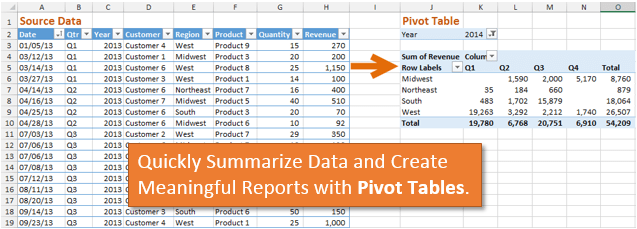
Understanding exactly how a pivot table works will really help you unleash the full potential of this amazing tool. This post should help both beginners and experienced users understand the mechanics of a pivot table, and why the structure of your source data is so important.
The following screencast animations shows how quickly a summary report can be created from a table (list) of data using a pivot table.
Click here to watch the screencast in your browser
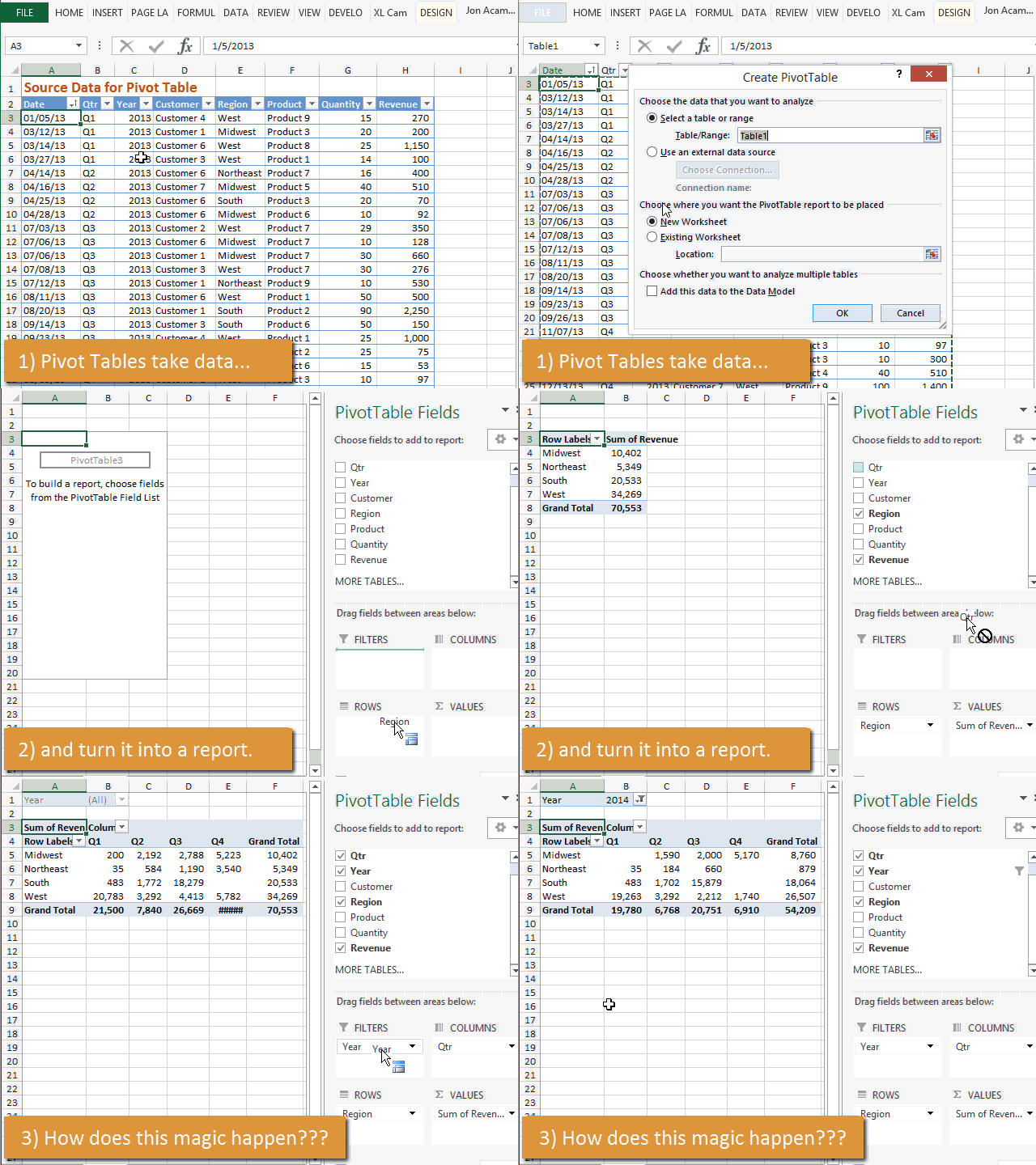
Let’s learn how this magic happens… 🙂
The Sample Data
For this post I will be using a set of transactional sales data an example for the source of the pivot table. Each row in the data set contains sales data for a product sold to a customer.
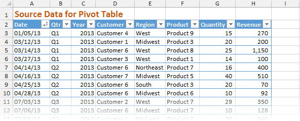
You can download this workbook to follow along.
How to Insert a Pivot Table
The first step is to insert a pivot table into your workbook.
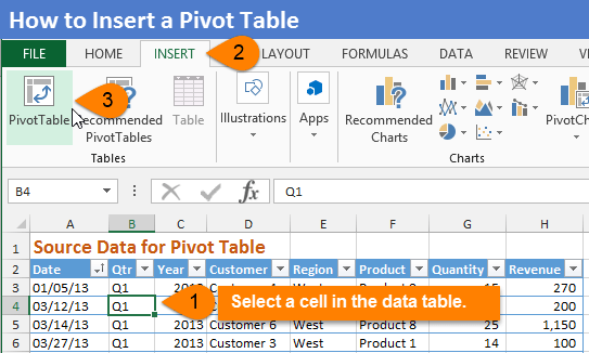
Typically you will want to insert your pivot table on a new worksheet.
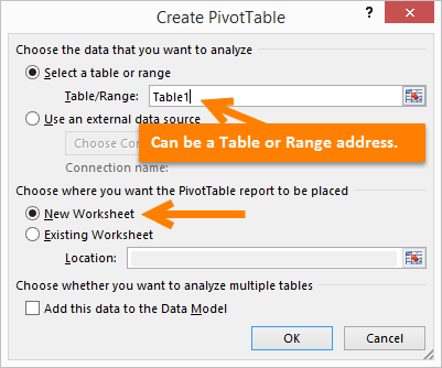
After you create the pivot table you will see a list of fields in the task pane on the right side of the screen. These fields are the columns in your data set.
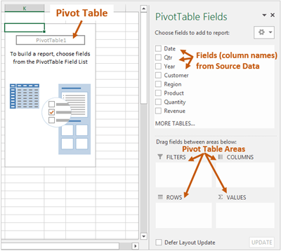
The Pivot Table Areas
The pivot table contains four areas that you can drag the fields into to create a report.
- Filters area
- Columns area
- Rows area
- Values area
The following diagram shows where each area of the pivot table is located on the report. This can be used as a guide to familiarize yourself with the different areas.
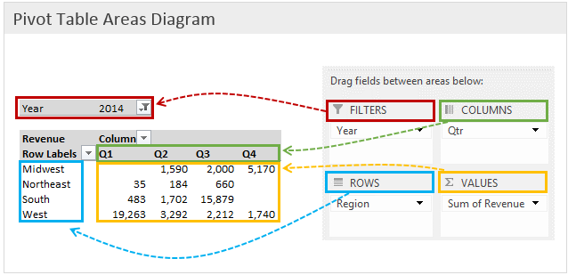
We are going to create this quarterly sales report by region as an example.
The Pivot Table Areas Explained
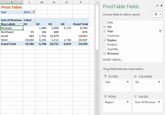
In the example report above I created the pivot table by dragging fields into the different areas on the Field List (task pane on right side).
Some magic happens when a field is placed in an area. That magic is different for each area of the pivot table. So I’m going to explain what happens when a field is added to each area.
Here is another link to download the sample file.
The Rows Area

The Rows area of the pivot table is where we typically start when building the outline of our report.
When you drag a field into the Rows area of the pivot table, all the unique values in that field will be displayed in the first column of the pivot. The pivot table removes all the duplicates in the field (column of source data) and only displays the unique values.
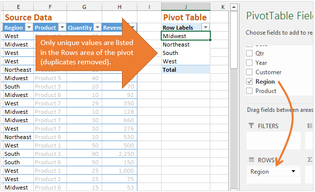
In my sample data set you can see the regions are listed more than once because we made sales in each region multiple times throughout the years.
When I place the Region field in the rows area, each region is only listed one time in the first column of the pivot table. Again, the pivot table automatically removes the duplicates and only displays the unique values.
The layout of the source data is extremely important for this to work, and I will explain more about this below.
The Values Area

The Values area displays the data (values) that we want to summarize in our pivot table report.
When you drag a field into the Values area, the pivot table will automatically sum or count the data in that field. If the data in the field contains numbers, then the sum will be calculated. If the data contains text or blanks, then the count will be calculated.
The calculation type can be changed later to other functions like Average, Max, Min, etc.
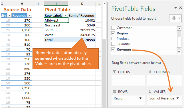
In this example I will place the Revenue field in the Values area. This field contains numbers (sales dollars) and the pivot table will automatically sum the revenue for each region that is listed in the Rows area.
Filter & Calculate – The Values Area Explained
What happens when we add a field to the Values area?
The pivot table performs its magic by filtering and calculating the data for each cell in the values area. This is a really important concept to learn. It will help you understand how pivot tables work, so let’s dig deeper.
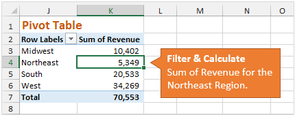
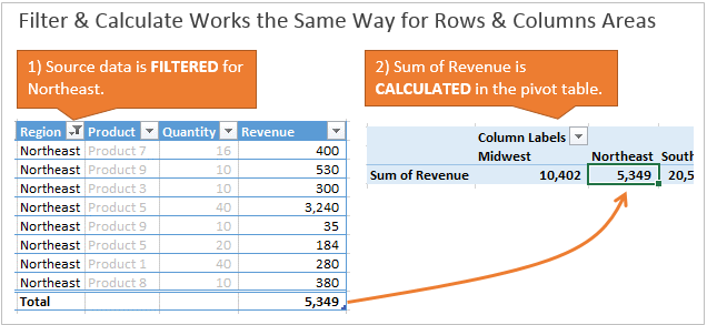
In the image above, the pivot table shows 5,349 in cell K4. This is the Sum of Revenue for the Northeast region.
How did the pivot table calculate this number?
We can break it out in two steps:
- First, the pivot table filters the source data for the criteria in the Fields, Columns, and Rows areas. In this case we only have one field in the Rows area, so the Region column in the source data is filtered for “Northeast”.
- Next, the pivot table calculates the Sum of the Revenue column.
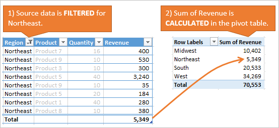
That’s it!
This process is then repeated for each cell in the values area of the pivot table. The Region column is basically filtered for each of the four regions, and the Sum of Revenue is calculated and placed in the Values area after each filter.
It’s important to note that I’m just explaining the concept of how this works. The source data table is not actually filtered on the sheet when you add a field into the Values area. However, understanding the concept of the calculation will also help you understand why the structure of the source data is so important.
Tabular Data Structure – Getting the Source Data Right
Since we now know that a pivot table uses filters to calculate the results in the Values area, it is critical that the data is structured in a way that can be filtered.
Pivot tables require your source data to be in a Tabular layout (format).
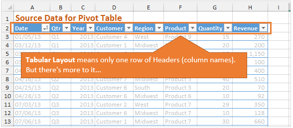
Tabular means that the source data can only have one row of headers (descriptive names for each column), and rows of data below the header.
However, there is more to it…
Unique Field Characteristics
Each header (column name) in the source data must only describe ONE characteristic of the data.
Let’s look at an example to help explain this. The following image shows data that could be considered tabular because it is a table of data with one row of headers.
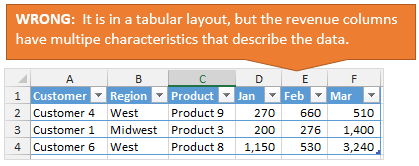
However, this is NOT the best layout for source data of a pivot table because the column headers describe more than ONE characteristic of the data in the column.
For example, column D contains revenue for January. This means the column contains two characteristics: the revenue amount and the month (January).
When the source data is structured like this, it makes it impossible for the pivot table to calculate the total revenue for a region. The revenue is divided up into columns by month and you cannot calculate the sum of one column to get total revenue.
Instead, the pivot table requires that there only be one column for revenue. This will allow you to create a report that displays total revenue by month, quarter, product, region, or whatever way you want.
Therefore, each column should only contain one characteristic that describes the data field (Revenue). To fix this we would need to create separate Revenue and Month columns. The data table should then look like the following.
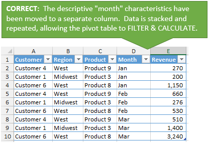
This is called unpivoting the data. It means the number of rows will grow, and the table will get much longer. But this is ok!
Remember that the job of the pivot table is to Filter and Calculate. It can only filter columns in a vertical manner, so all the revenue numbers need to be in a single column.
This gives you a lot more flexibility when you add the Revenue field to the Values area of the pivot. You will be able to quickly place the Months field in the Rows, Columns, or Filters area to see your numbers in different ways.
With this understanding of how the data should be formatted, you will begin to see the power of the pivot table.
I have a full article that goes into more detail on How to Structure Your Source Data for a Pivot Table.
The Columns Area

Now that we have an understanding of how the pivot table filters and calculates data, let’s see what happens when we add more fields to the report.
The Columns area works just like the Rows area. It lists the unique values of a field in the pivot table. The only difference is that it lists the values across the top row of the pivot table.
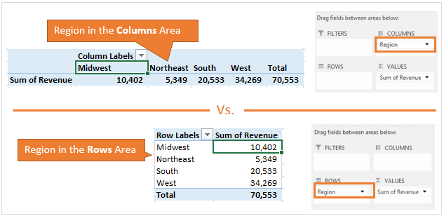
The image above shows what the pivot table will look like if you put the Region field in the Columns area versus the Rows area.
When the Region is in the Columns area, the values (Sum of Revenue) are placed horizontally on the sheet. The Sum of Revenue calculation works the same as before. The pivot table must Filter and Calculate the Region field in the same way.
Filter & Calculate on Multiple Fields
Let’s add another field to our pivot table and see how it works.
In the following example I have the Region field in the Rows area, and the Quarter (Qtr) field in the Columns area. The values area is calculating the Sum of Revenue. This is starting to look like a more useful report.
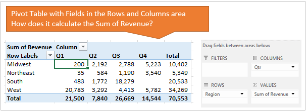
The pivot table calculates the Sum of Revenue the exact same way as before, by filtering and calculating. Now it just has two fields to filter for when it calculates a cell in the Values area.
In the image below the Total Revenue for the South region for Q2 is 1,772. How is this calculated?
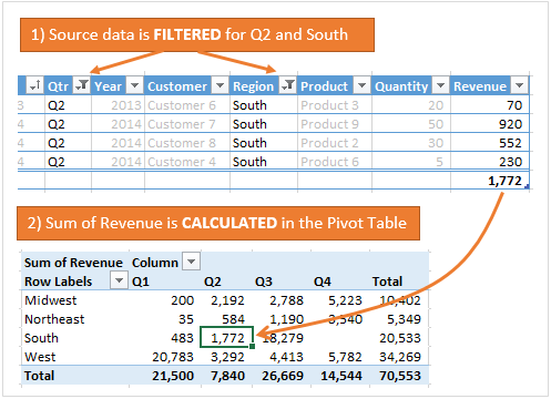
- First, the Qtr column is filtered for “Q2”.
- Then, the Region column is filtered for “South”.
- The Revenue column is then summed to get 1,772.
As you add more fields to the Rows and Columns areas, the pivot table just filters on more fields, then calculates. Although the report may get complex looking, the calculation process is actually a very simple two step process; filter then calculate.
The Filters Area – Filter the Entire Pivot Table

The Filters area applies a filter to the entire pivot table.
In the example below I placed the Year field in the Filters area. This does NOT make any immediate changes to the pivot table. Instead, it gives me the option to apply a filter to the entire pivot table.
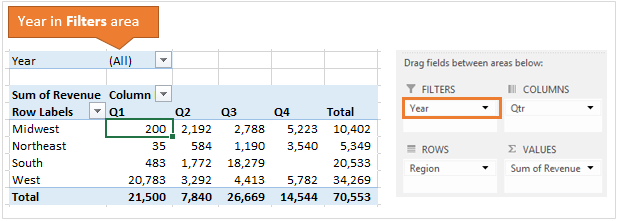
The fields in the Filters area contain drop-down menus that allow you to apply a filter to the entire pivot table.
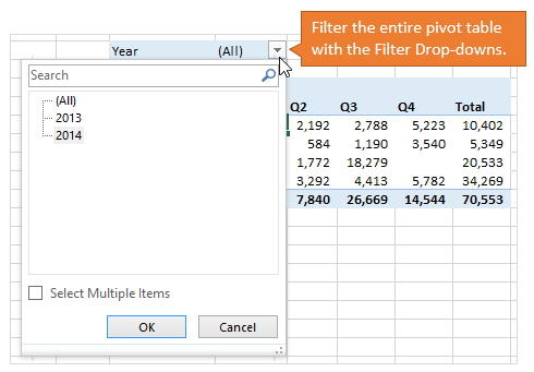
When I select 2014 from the Year filter, the entire pivot table is also filtered for only the rows in the source data that contain “2014” in the Year column.
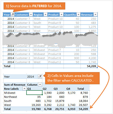
As you can see, our filter and calculate methodology still applies here.
When calculating a cell in the Values area, three filters are being applied to the source data to calculate the Sum of Revenue. The following image shows how cell L79 is calculated in the pivot table.
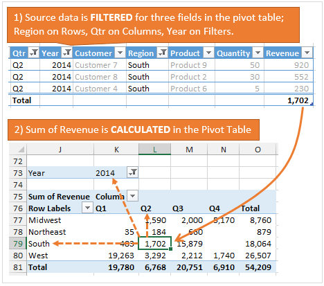
- First, the Qtr column is filtered for “Q2”.
- The Year column is filtered for “2014”.
- The Region column is filtered for “South”.
- The Revenue column is then summed to get 1,702.
Each cell in the Values area represents an intersection of the fields in the Rows, Columns, and Filter areas. The source data is filtered based on this criteria, then calculates the Values area for the specified type of calculation (sum, count, average, etc.).
Bonus – Add Multiple Fields to One Area
What happens when we add more than one field to an area?
Well, we can take everything we just learned and apply it here. The pivot table works in the same basic way.
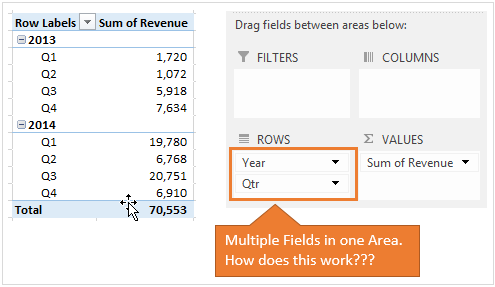
In the image above I put the Year and Qtr fields in the Rows area of the pivot table. You can see how this instantly gives us a different report using the exact same source data. This flexibility is the beauty and power of the pivot table.
Let’s take a step back and see what happens when I add each field to the Rows area.
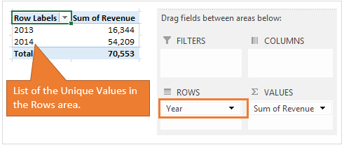
First, I add the Year field to the Rows area. As we learned before, the pivot table will only list the unique values (removes duplicates) in the Rows area. Even though there are a lot of rows in the source data that contain 2013 and 2014, the values (2013,2014) are only listed once in the pivot table.
Next, I add the Qtr field to the Rows area below the Year field. This time the unique values for the Qtr (Q1,Q2,Q3,Q4) are listed under each unique value in the Year field (2013,2014).
The list of unique values in the child field (Qtr) repeats for each unique value in the parent field (Year). This continues to happen as you add more fields to the Rows area.
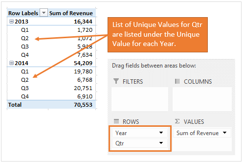
The report above displays our quarterly sales trend for each year. It nests each quarter under each year in the Rows area, and makes for a very useful report.
Now let’s make a quick change to the report…
In the following image I reversed the fields in the Rows area of the pivot. Now Qtr is on top and Year is below it. The same principal still applies. The unique values for each Year are listed below the unique values of each Qtr.
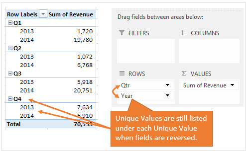
This gives our report a totally different look, but it is still very useful. This report allows us to compare the year-over-year sales for each quarter.
The same thing happens as you add multiple fields to the Columns area. I won’t go into details, but give it a try and see what happens when you move Year and Qtr to the Columns area.
Filter and Calculate on Multiple Fields in One Area
Now let’s take a look at how that year-over-year report works to calculate the Values area.
When multiple fields are added to one area, the Values area of the pivot table still works the same way using the filter and calculate principal.
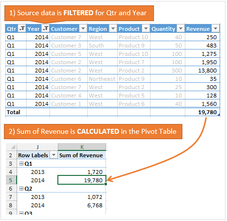
The source data will be filtered for all the filter criteria, then the Sum of Revenue is calculated. This happens for each cell in the Values area of the pivot table.
It doesn’t matter how many fields you have in each of the Filters, Rows, or Columns areas of the pivot. The Values area will still be filtered and calculated in the same way!
Filter and Calculate the RIGHT Tabular Data
I hope you have learned how pivot tables work by filtering and calculating your data. But the most important part is how the data is structured in a tabular format. Each field must have one unique characteristic that describes the data. The proper layout of the source data will really help you conceptualize your pivot table reports.
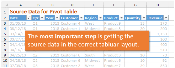
This will also help you obtain your data in the proper format. Often times we are at the mercy of our IT department to provide us with data. Requesting your data in the correct tabular structure will allow you to create just about any report you can imagine with a pivot table.
As you learn the power of pivot tables, your reports will naturally get more advanced. You will be able to quickly mine and analyze your data in new ways, helping you discover trends that can make a big impact for your organization.
Want to Learn More?
I have only scratched the surface of what pivot tables can do. There is a seemingly infinite number of ways you can use pivot tables and pivot charts to answer business questions, and impress your boss. 🙂
With new tools like PowerPivot, there is no question that pivot tables are the way of the future for analyzing and presenting data. Understanding the concepts of how pivot tables work will really prepare you for any reporting tool outside of Excel.
My recommendation is to: Learn > Practice > Repeat
There are a ton of great ways to learn pivot tables depending on what type of learning environment suites you best.
If you really want to immerse yourself and learn quickly, I recommend taking an online course. Here are two great resources.
Resource #1 – Free Video Series on Pivot Tables & Dashboards
I have put together a free 3-part video training series on pivot tables and dashboards. You can also download my pivot table checklist and all the practice Excel files that go with the videos.
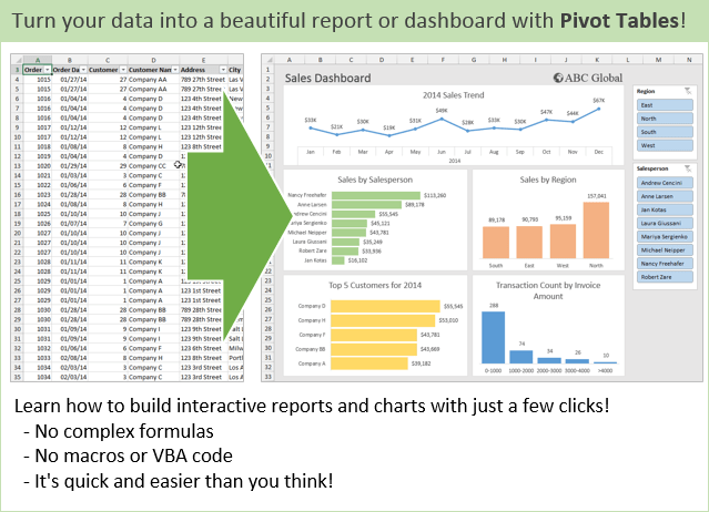
Click Here to Get the Pivot Table Checklist and Free Videos
Resource #2 – Core Pivot Online Course
A friend of mine, Dave Bruns from ExcelJet.net, has a great online course called Core Pivot. This course is a great way to get started with pivot tables. It contains over 2 hours of instruction that is broken up into short 2-3 minute videos. Learning pivot tables will really save you a lot of time, and help you get the most out of Excel’s most powerful tool.

Click Here to Learn More About the Core Pivot Course
Still Have Questions?
Learning pivot tables takes time. With practice you will gain a better understanding of how pivot tables work, and how they can benefit you.
Please leave a comment below with any questions or suggestions. Thank you! 🙂


That’s an epic post, Jon. Great resource for newbies, and I congratulate you on it. I especially like the PivotTable Fields and PivotTable Areas diagrams you put together. Just awesome.
Thanks Jeff! I tried to take a page out of the Weir book of blogging for this one. 🙂 You seem to crank out monster posts like this every time you write, and I don’t know how you do it. I’m actually thinking about cutting it up into a few posts to make it a little more consumable. Anyways, I’m glad you enjoyed it. Thanks again!
i agree, it was a very thorough post. I also like the animated gif you had in there. Helped to explain while the reader not having to click on a video link. Really good post to cover the basics.
Thanks Joe! I appreciate you letting me know about the animated GIF. I’m finding that many people prefer those over watching videos.
Have a great day! 🙂
I didn’t see this post until now! It’s a great explanation for beginners. The animated gifs turn it into a very easy to follow introduction about pivot tables. I wish I had seen this 15 years ago! I will recommend this to anyone who is new to Pivots. Thanks Jon!
Thanks Kevin! I’m glad to hear that you found it useful.
Your article helped me in my pratical project of my IT subjects thank you…
Very Nice,
Thanks
Happy
Wish I’d found you 2 years ago!!! Better a little late than never!! ☺
Thanks Virginia! I’m excited you are here! 🙂
Awesome resource Jon!
I’m definitely going to be including this one in a course that I currently have in process as a resource to refer my customers to. Your stuff is always on point.
Cheers,
Brad
Thanks Brad! I really appreciate that! Is that a live course or online?
It will be an online course. It’s a great way to leverage and train/reach more people. I’ll be sure to send you a note once it’s complete.
Muchas gracias por compartir sus valiosos conocimientos y experiencias, quisiera orientación acerca de como consolidar las tablas y gráficas dinámicas en un tablero de control (dash board), si es necesario incluir procedimientos en VB o alguna instrucción especifica para su integración.
Agradezco de antemano sus amables comentarios, saludos.
Hi Jon,
Appreciate your golden heart! many thanks for taking your time out and putting a nice piece of work for a beginner like me. It is a pleasant knowledge and will certainly take away my burden in some ways.
Many thanks once again
Thanks for the great feedback Shaji! 🙂
I deleted the main sheet still the pivot table is acquiring data, and its working in the same manner , however , i have deleted the main sheet. the main source of the data is deleted but still its not affecting the pivot table, why?
Hi Muhammad,
The pivot table data is stored in a pivot cache in the background. This means you can delete the sheet that contains the source data and the pivot table will still work. Some people do this to reduce their file size, since storing the data on a sheet and the pivot cache means you are technically storing it twice.
You can turn this setting off in the PivotTable Options menu on the Data tab, by unchecking the option “Save source data with file”. This will remove the source data from the pivot cache when you save the file. I hope that helps.
Thank you for very good information.
Could you tell me which software you use to create GIF:PivotTablesTurnDataIntoReportGIF640x480 in the tutorial.
Thanks Hao! I use Camtasia for all my videos and GIF creations.
Thanks you Jon. I love your answer and I love your great articles too. They are very helpful. And I usually visit your website for more tips.
This was of great help, thank you for posting this info am pretty sure lots of people use it.
Thanks again.
Hi Jon,
I am very very grateful for the videos. It feels like they made especially for me as I got it. I got encouraged with your assurance that pivot tables are easy. Thank you for your big heart. I am now determined to keep learning something new weekly. Please help me with steps to take. I am a beginner.
Thank you ever so much,
Kels
Jon,
Many thanks for this. Under the heading “Unique Field Characteristics” you have shown value headings Jan Feb Mar and under each revenues for that month.
In your very first example at the top you have similarly Q1 Q2 Q3, which do the same thing except for quarters not months.
So when you say:
“For example, column D contains revenue for January. This means the column contains two characteristics: the revenue amount and the month (January).” could not exactly (almost) the same be said about your first example, with the
only difference being quarter instead of month?
I am confused by this. thanks for any help
Hi Jim,
I believe the first example you are referring to (with the quarters) is already a pivot table. If the source data did have columns for quarters, then we would want to unpivot that data to get all the cells that contain values in one column. I have another article that explains how to setup the source data and unpivot in more detail. I’m also working on a full pivot tables course that explains the source data setup in a lot more detail. This is my far the most important step in creating a pivot table. It can also be the most challenging step…
Hi Jim, 2018Jan30
You’ve confused yourself by saying “column contains two characteristics”;
when in actuality the “value” (not the column) of the “revenue” in “January”
contains those 2 characteristic. Therefore, a record for a
data-table (not a Pivot Table) is created from that information as follows:
Month, FundType, Amount (or Value) Quarter
Jan. Revenue $100 1 <== this rows is 1 record.
(you didn't state the revenue amount, so I made up the value $100)
Once you have that data-table structure above, you fill it with any
Revenue or Expenditure amounts you want; you could even add a
column called DAY (actually they are "fields" of the record — each row is a "record" in your data-table), if you wanted to track daily amounts.
With that data-table extended to contain all transactions (i.e. more rows), you could summarize it many different ways (using various Pivot Tables that can be created from the data-table).
Each different Pivot Table is considered a
"filter" of the original data-table (with many records) as shown above
(e.g. summarized by FundType vs Month, you could
obtain either a "Revenue" Pivot Table or "Expenditure" Pivot Table).
Thank you for this nice post, it is very informative. I was just wondering if you could share the actual logic behind this pivoting, you know, how interchanging multiple rows and columns would actually manipulate and display the data, I mean the algorithm for this pivoting table.
Hi!
This was super helpful!
I do have a question about source data though. If one of my tabular columns is a percentage how does that calculate into the pivot table? Does it sum or average…I can’t quite figure it out, the value I’m getting is huge.
That was a lot of questions, any help is appreciated!
Thanks so much.
Thanks so much for this tutorial! It was incredibly helpful! I do have a quick question. The original information that I made the table from has notes in some of the cells however these notes do not transfer over to the table. Is there a way to insert notes in some of the cells instead of making another column of just notes?
Thank you, thank you, Mr. Acampora!!
I’m relatively new to spreadsheets (using LibreOffice Calc, though) and I was having a hard time wrapping my mind around pivot tables. This article has been super helpful to me. I am very grateful to you for it.
good examples,
thanks
Very helpful ! wonderful!
Of all the on line tutorials I have used, this is by far the best and easiest to understand, thank you
Nicely written Easy to understand for beginners. Thanks
This was an incredibly helpful article! The images and sample spreadsheets were particularly useful for visual learners like me. Thank you!!
Excellent article. I hate to admit it, but I didn’t know what a Pivot table even was. I was creating them (without knowing it) by hand, and now it is just a few clicks. Thank you for the clear presentation of this information.
Excellent introduction to a person with very limited Excel user skills. I am captivated by the range and versatility of the Pivot Table, plus the diversity of the mapping of information, for a wide audience, where different charts can illustrate the data/information in a way for them to best utilise the presentation for their individual requirements.
Many thanks.
Sean Sergent
3rd December 2018
Jon:
This was outstanding. I have looked at several explanations of pivot tables. This is definitely my preferred tutorial.
it seems that the VERY first thing is that I need to label my raw data as a table. without that I get an error message on the very first step (create a pivot table).
please include this step for us “raw” beginners who take things very literally!
eggs
Thnx Jon for the clear, simple & effective explanations. Couldn’t be better!
Very helpful!
The most comprehensive illustration and explanation I have ever read. Thank you!
I couldn’t agree more with Divine, an unbelievably detailed and helpful article. Great job John, thank you
Exceptional!! you have done great job explaining pivot table, Well-done!!
Do you still offer the Excel Training Course I saw in one of your videos?
[…] Krásně je to vykreslené na obrázku v článku Pivot Table areas diagram na webu Excel Campus. […]
[…] For an easy understanding, you can have a look at the Pivot Table areas diagram at Excel Campus. […]
Have got or come across a good way to assist the user to interactively repair a pivot table’s orphaned labels following an incompatible repasting of it’s source table? For example, a source table’s column is renamed and I don’t want the pivot table to just drop the corresponding dimension without giving me the opportunity to rebind it to the new source column. Unfortunately, most often, right before I do a refresh on the pivot table I am most likely to forget to look for what might go missin from it.
Btw, ’love your work.
I am browsing many times about a good content on pivot table but not found. Accidently I landed on this blog. This is the best approach to learn pivot table. Thank you so much for sharing the knowledge with us…
Hi there, I read this whole article. I have data which shows text pass or fail in three columns. In the next column I have data which shows yes or no. The problem I’m having is the pivot table will show the count of the first pass/fail column. If I add the second pass fail column, the pivot table counts and displays the second columns data the same as the first column, even though it is different. The second problem is if I add the yes/no column (as a third values field) it then displays data as pass/fail rather than yes/no. Do you know why this might be?
Thank you, you are great in what you do. I Learnt a lot. you really kept it simple
I am trying to show a week over week increase in orders depending on when I pulled the data. I pull the data every Monday. I would like to use error bars to show how it increases each week. I’m currently using a pivot table and I’m not quite sure how to do it. I watched you error bars video and I’m kind of lost. Please advise if this is possible. Happy to share the file. Thanks