Bottom line: Learn how to create this interactive dashboard waterfall chart that tells the story of what happened over time.
Skill level: Intermediate
Tools used: Charts, Pivot Tables, Slicers
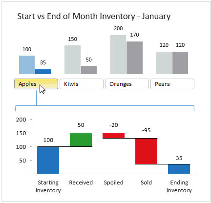
What Does the Dashboard Tell Us?
This interactive dashboard is great for displaying amounts of data between two periods of time, and compares multiple series or groups.
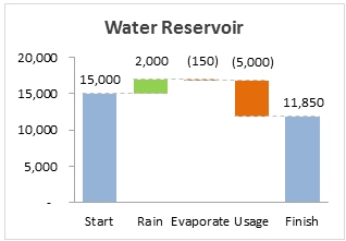
In this example, we are looking at the starting versus ending inventory of the month for a few different products.
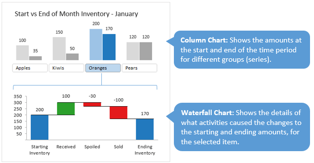
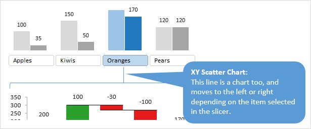
The column chart at the top of the dashboard compares the inventory levels for all the products. This chart is useful on its own, but we typically want to dig deeper and see what caused inventory to increase or decrease over the month. The waterfall chart at the bottom of the dashboard is perfect for this.
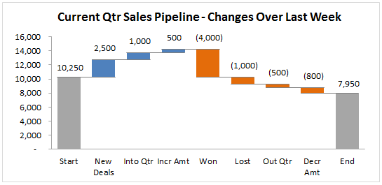
This type of dashboard can be used for all types of data, not just inventory. I've used it for sales pipelines, GL account balances, cash flows, and much more.
The Waterfall Chart Explained
When the boss asks the inevitable question, “What happened last month???”, the waterfall chart can be your savior. It's a great way to paint a picture of exactly what caused changes in your data over two time periods.
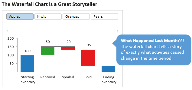
When creating charts and dashboards our goal is to tell the story of what happened in the past. This helps us make decisions, plans, and forecasts about the future.
The waterfall chart allows you to drill down on the details of your data to gain clear insights on what is happening with the business. This is essentially cross-filtering between the charts.
It is also very easy to read and understand, meaning you won't have to do a lot of explaining to your readers.
How to Create the Waterfall Dashboard
You're probably wondering how I created this dashboard… Well, the secret is:
- 3 Charts
- 2 Pivot Tables
- 1 Slicer
NO macros or VBA are required to create this, thanks to the slicer and pivot tables.
So how does it work? I'm going to explain how each piece of the dashboard works, without going into too much detail. Please feel free to leave a comment if you still have questions. You can also download the file to follow along.
Download the File to Follow Along
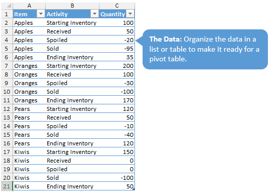
1) Setup the Data
First we have to start with some data. I compiled the data into one table on the ‘Data' tab. The data is arranged in a way that makes it ready for a pivot table. Please see my articles on How to Structure You Source Data for a Pivot Table and How Pivot Tables Work for more details on this layout.
2) The Pivot Tables
Once the data is setup in the correct layout, we can then create pivot tables to summarize the results for the charts.
The ‘Pivot' tab contains two pivot tables that are used for the source data of the charts.
The pivot table starting in cell B4 contains the data for the starting and ending data that is displayed in the column chart. Starting in cell F4, there is another range of data that is used to displays the colors of the selected item on the chart. A simple IF formula in cells G6:H9 only show the numbers for the selected slicer item (more on this below).
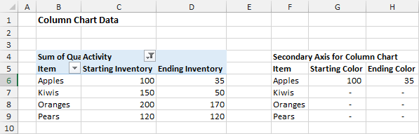
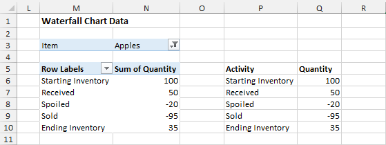
The pivot table starting in cell M3 displays the data for the waterfall chart. The slicer is connected to this pivot table, and slicers for the Item field which is in the Filters area of the pivot table.
3) The Charts
The column chart displays the amounts of the selected item in color (blue), and the rest of the bars are grey. How does this work?
The chart uses two axis, the primary and secondary. All the bars are displayed on the primary axis and are colored grey. The pivot table in cell B4 of the ‘Pivot' tab is the source data.
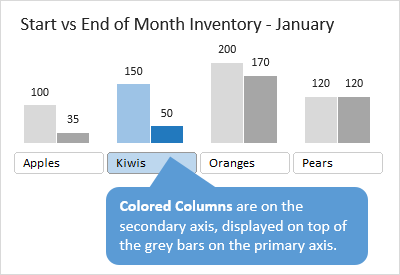
This data is plotted on the secondary axis of the column chart. The secondary axis is plotted on top of the primary axis, so we can color the bars blue for the series on the secondary axis. This gives us the effect where the columns on the chart for the selected item are blue, and all others on the primary axis are grey.
For the waterfall chart I used Jon Peltier's Charting Utility. This is a very handy Excel Add-in, and one that every chart maker should have.
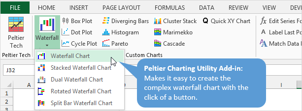
The waterfall charts are NOT easy to make. They are made up of a complex combination of column and line charts, and I've spent the better part of a day trying to create one on my own. The Charting Utility Add-in creates the complete chart you see here with a few button clicks, and it has a lot of features that allow you to customize the chart further.
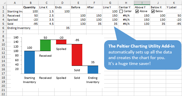
The ‘Waterfall Chart' tab was created with the add-in, and contains all the information necessary to plot the different series on one chart.
The XY Scatter chart is just used to create a vertical line between the slicer and the waterfall chart. The source data and formulas can be found starting in cell J6 on the ‘Pivot' tab. Basically the vertical line moves to the right or left depending on which slicer is selected.
4) The Slicer
As I mentioned before, the slicer is connected to the pivot table that starts in cell M3 on the ‘Pivot' tab. This filters the data for all the charts to make everything interactive.
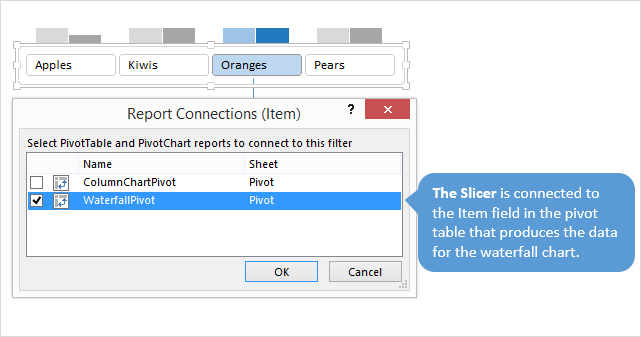
The nice part about the slicer is that it saves us from having to use VBA or macros. You don't have to worry about your users enabling macros to make it interactive.
Plus, the slicer can be created with a few clicks, and it looks great right out of the box.
Do You Use Waterfall Charts?
If so, what types of data do you display on your waterfall charts. Or, what types of data would you display on a waterfall chart now that you know what they do?
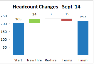
Here are a few examples:
So how do you use waterfall charts?
Please leave a comment below with your answer, or any questions you have.

Swing and a miss. I was very excited to see the dashboard, and to learn how to make it. The “Tools used: Charts, Pivot Tables, Slicers” let me know I could do it. Until I got to the Chart Utility. I use my Excel at work, and we have no budget for add-ins, so I was disappointed there was no other direction on creating the waterfall chart. Because of that, there’s not much help for me from this post.
“Swing and a miss” is a bit rude, in my opinion, Jomili. This is still a good post that has some good insight into a great data visualization idea.
You could always pick up the bat yourself, and see what hits you come up with if you type “Create Waterfall Chart” into Google. Because Jon Peltier’s utility isn’t the only way of creating a waterfall chart, and Jon Acampora shows in this post how they can be put to good use.
You’re right, that WAS rude of me.
Jon,
Please accept my apologies. I did go the Google thing, and can create a Waterfall chart. However, I still don’t see how the waterfall chart in the example was created, so I’m still missing that crucial piece. Could you put more detail behind that for those of us who don’t have access to the add-in?
Hi Jomili,
Apology accepted! 🙂 I totally understand your frustration, and I appreciate you expressing your concerns.
As Jeff mentioned, there are other ways to create the waterfall without the add-in. As most examples show, you will use a stacked column chart, and make the bottom column transparent so it is not visible to the viewer. This visible column basically holds up the amounts that cause the change between the two time periods.
Jon Peltier has a great explanation at the following link on how to create it manually.
http://peltiertech.com/excel-waterfall-charts-bridge-charts/
The major difference is that this chart won’t contain the horizontal lines like you see in the chart in the example. It’s not a deal breaker by any means, I just like the formatting of the chart created by Peltier’s add-in.
Regardless of how you create the waterfall chart, for this to work, the source data of the waterfall chart needs to point to the pivot table starting in cell M3 on the ‘Pivot’ tab. Checkout cell B2 on the ‘Waterfall Chart’ tab. It points to cell Q6 on the ‘Pivot’ tab. So basically the waterfall chart is using the pivot table as it’s source. Whenever a slicer item is selected, the pivot table in cell M3 is filtered, and the data in the pivot table changes. This then changes the data that feeds the waterfall chart.
I will update the file with a waterfall chart that is created manually, so you can get this working. Hopefully you can impress your boss enough to get that budget extended j/k. 😉
Well, I hope that at least gets me a bunt, with a chance to get to first base… haha! 🙂 Have a good one Jomili! Thanks
Jon,
Thanks for your graciousness in accepting my apology. And thanks for the link to Jon Peltier’s walkthrough. I like the way he walks through it. Between his post and yours I’m learning a lot these days!
Nice article! I think it’s a very good idea to put the the WaterFall Chart right under the column chart to explain the reason for the changes.
Good job as usual, Jon!
One little suggestion is to align the color used for Starting and Ending Inventory in both charts. 🙂
I love what you’ve done with the Slicer! Very clever.
I can see many applications for this e.g. instead of the waterfall chart you could put a line chart that shows the trend over time etc.
Mynda
Can you please create a video with steps on how to create this dashboard? I am trying to read the directions but it is very vague and i cant seem to follow on how to create this dashboard with the techniques with the bar chart and scattered charge to create the effects that you have.
Thanks Dave, I’ll add it to the list.
Hi Jon – did you create a step-by-step video for this dashboard? I’m having trouble duplicating your file as it seems there are a lot of in-between steps that I’m having difficulty with.
Hi Jon,
I was teaching my daughter how to use the filter in a pivot table and stumbled upon your article…..the slicer is great fun ! Thanks for this.
Thanks Aubrey! I’m happy to hear you are teaching your daughter Excel. Awesome! 🙂
hello, great chart… can the bard colors for negative (-) numbers be different? they are both red, can i have one red and one gray?
thank you!
ani
Hi Jon
Impressive! But I struggle with following to get the secondary chart out. pls help! Which data is following? If it’s not from pivot I m not able to superimpose another chart? Thk U!
“This data is plotted on the secondary axis of the column chart. The secondary axis is plotted on top of the primary axis, so we can color the bars blue for the series on the secondary axis. This gives us the effect where the columns on the chart for the selected item are blue, and all others on the primary axis are grey.”
Hi Alexa,
The source data for the top chart is the first pivot table on the Pivot sheet. The source data for the colored columns is in columns F:H of the pivot sheet.
You will need a pivot table or Excel Table to store the data because the slicers filter the pivot and that filter criteria value is used in the formulas in columns F:H.
I hope that helps answer your question.
I created the chart for gray columns, but how to add to that chart the colored columns? When I try to add secondary axis it shows me only option to manage Starting and Ending Inventory. I struggle to add Staring and Ending Color table data to the Chart with pivot table data.. Not sure if I explain it clearly 🙂
Hi Jon,
I was trying to make the Waterfall chart but I could not buy the Add-in. Is there a way to make the chart the same way without using the Add-in?
Hi,
This is a great article. Can you also please upload the video for it. Thanks
Hi Jon, this is a fantastic chart combo. I picked this one out of the ’10 Advanced Excel Charts’ email that you sent out on 25 Feb. I used the new waterfall chart instead of the add-in and have modified it using my own data. I love the use of a main bar chart with a slicer to filter the drill down chart below. Thanks so much for sharing.
Pretty awesome. Great and innovative user for slicers. I’m able to use this application for multiple charts and views
Could you take this a step further for stacked waterfall charting that includes some negative items? For example, I’d like to bridge net income to adjusted net income and some adjustments may be negative (e.g., tax effect), but with each quarter shown individually stacked in the bars of the chart.
This is really clever.
The way you combined waterfall charts with slicers highlights an important point — interactivity often determines how actionable a dashboard really is. Static visuals show the trend, but slicers bring flexibility to analyze it from different angles. A similar approach works well in Power BI too, as shown here:
https://inforiver.com/demos/advanced-waterfall-charts-in-power-bi/