Bottom line: Learn how to quickly create an interactive dashboard using pivot tables and pivot charts. It's easier than you think!
Skill level: Beginner

In video #1 and video #2 we learned how pivot tables and pivot charts work. I explained all of the basics to get you started. Then we saw how to use pivot tables to quickly investigate your data and answer questions about your business.
In this video we finally help Andy put the dashboard together. This dashboard will help communicate our findings and tell a story about the performance of our business. Plus, the boss will LOVE it! 🙂
The great part about using pivot tables and pivot charts is that they are very easy to update. When next month rolls around, we simply paste the new data to the bottom of our source data sheet, update the source range, and hit the Refresh button. It will only take a few minutes a month to maintain.
Video #3 – Building the Dashboard
Download
Download the file to follow along.
Topics Covered in the Video
This video is packed with tips for working with Pivot Tables and Pivot Charts. Here are some of the topics covered.
- The Report Filters area explained.
- Group dates into months and years to create a summary trend report and chart.
- Group amounts to create a distribution chart (histogram). One of my favorites!
- Resize all charts to be the same size.
- Prevent charts from resizing when column widths and row heights are changed.
- Add slicers to make the dashboard interactive.
New Features Added to PivotPal
Based on the responses from the pivot tables survey, I added a new feature to PivotPal.
If you are frustrated with having to change the layout settings for your pivot table every time you create one, then you are not alone!
Pivot tables have over 30 options and settings you can choose to get your pivot table looking and behaving the way you want it. These are some of the settings you probably change frequently:
- Turn off the automatic subtotals and grand totals
- Show a zero for empty cells
- Turn off the autofit column widths
- Use the classic pivot style
This usually requires you open the pivot table options menu and click different checkboxes on/off. That menu alone has 6 tabs of options.
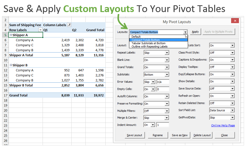
To help save time with this I added a new feature in PivotPal called “My Pivot Layouts”.
This feature allows you to create custom layouts with your favorite settings and options, and then quickly apply those settings to any pivot table with the press of a button.
The nice part is that you can create as many custom layouts as you like. Some pivot tables you might want to format to look like a financial report, other times you might want it to look like a tabular format with repeating labels. These layouts can all be saved and applied anytime with this feature.
See it in action in the video below.
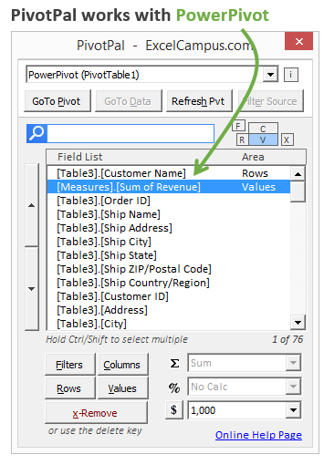
PivotPal now works with PowerPivot!
I have a PowerPivot data model that has 8 tables and 226 fields in it! You might have even more than that. Using PivotPal with these large models makes it extremely fast to find fields with the Search feature, and then add them to your pivot tables.
PivotPal is now available!
Click here to learn more about PivotPal!
Additional Resources
- In part 1 of the series we learned how to setup our source data and create our first pivot table and chart.
- In part 2 of the series we learn how to use the different calculation types to investigate our source data.
If you aren't already, subscribe to my free email newsletter to stay updated.
Please leave a comment below with any questions or suggestions. Thanks!

Hi Jon – I am more than just glad that I have found this blog. I appreciate you for making such comprehensive tutorials. You really made this a lot easier. I would appreciate if you can let me know how to get started with Macros and VBAs. I am really interested in learning them but unable to get a head start.
Once again – Very Well Done and Thanks for Your Help 🙂
Regards,
Fasi
Thank you Fasi! I do have a free 3-part video series on getting started with macros & VBA. That is the link to video #1 and you can signup there to get the other videos. I hope that helps.
Hi Jon
Thank you for your tutorials and videos – easy to follow, clear and concise instructions and to the point.
One thing I always struggle with when using Pivot Tables is connecting two tables together by creating a relationship between them. I find it very temperamental – some times they work and some times they don’t. Also, and this may be something I am doing wrong, when I update either of the original tables and then refresh the pivot table, it doesn’t bring any of the new data through.
In short, if you are thinking of creating a Pivot Table Relationship tutorial, it would be really useful.
Thanks again.
Louise
Hi Louise,
What method are you using to create the relationships?
Hi Jon
Apologies it has taken me so long to get back to you. I have one workbook with two worksheets, both containing different data but there is a common theme between them – they both have membership numbers on.
I want to create one pivot table that contains fields from both worksheets – what’s the best way to do it? Do you have any videos to explain?
Thanks again.
Louise
Hi Louise,
To create relationships you can either use lookup formulas like vlookup, or you can use Power Pivot instead of vlookup. Those links are to articles that explain more about each solution. I hope that helps.
Hi Jon
Thank you for the links, I will take a look. I was exploring the option where you can create a pivot table, add it to the data module and then add more tables to it, rather than using a vlookup. Is this something you’re familiar with?
Thanks.
Louise
Genius! Thanks so much! You have saved me.
Hi! i would like to thank you! your video’s did what you said they would… I’m only having one issue, I cant seem to lock the sheet so they can have access to the Slicers and the charts information but not letting them move them or enter data. How can i lock the sheets and only give them access to what i want? I’ll be waiting for your response. Thanks!
Hi Jon, I am new at 2013 window and I find this very helpful. I am sure I will have lots of questions once I dig deep into it. Hasma
Great job Jon, Your lessons are very helpful in creating Pivot Tables and in creating Slicers. Thanks for time and effort in creating these training videos for Pivot Tables and Slicers.
Hi Jon,
First, Thank You. Your knowledge and willingness to share has really provided me with the essentials I need to begin working with Pivot Tables & Charts. I’m slowly integrating into my work and getting a handle on how these can help make my job easier.
I’d like to throw one question at you, and hope you could point me in the right direction to finding my answer.
I’m working with a massive data table, and have got it working the way I want with many different pivot tables and a dashboard. Our business is fuel delivery, and I’m tracking litres delivered.
I have it set up similar to ABC Global, but my “Sales Trend” is litres delivered. I’d like to incorporate our litre budget into the dashboard graph and show two lines(or bars) – one actual and one budget.
My data table is generated from entering the data from each delivery slip – which doesn’t include the budget of course.
How would I go about adding a budget column to the “Sales Trend” pivot table and plotting it alongside the “sales” data on the chart?
Any direction you could provide would be awesome.
Cheers
Hi Jason,
Thank you for the nice feedback. Adding budget data to the source data can be tricky because you typically have budget data at a higher summary level than the actual transaction data. You can add a new column for budget, then only enter numbers for the budget row where it aligns to the summary level that the budget is at. Enter 0 for all other cells.
This is where Power Pivot shines because it allows you to create relationships between data tables. I don’t have a specific article on this yet, but I will add it to the list.
Thanks again!
Dear Mr.Jon
Really it`s more than wonderful.
Appreciated.
Great tutorial videos, easy to follow!
How yo get PivotPlus ?
Great Video, very easy to follow and learn…Great job Jon
Hi Jon. I notice at the 2-min mark of video 3, that the Sales by Region worksheet doesn’t have the slicer in the .xls file, though it already does in your video. There are other nuanced differences like dashboard chart headers on the first worksheett, so it’s clear it’s a different file. I’m gonna continue watching — hope this still works out ok.
(in response to my own comment)
I see how easy it was to generate the slicer that was missing. Just adding Salesperson and other fields to the Filter box of the Pivot Table Field List.
Alright, no worries! I figured it out 🙂
I learned some new tweaks with this tutorial. Thanks for Sharing.
Hi Jon,
Thanks for the great video and tutorials. I learned and applied to my work right away.
The slider is pretty awesome. But, it disappeared when I opened the sheet again. How to keep it on the sheet?
Thanks,
Sang
MAN.U R SIMPLY AWESOME!
Very insightful. Thanks!
You tutorials are very insightful. Thanks for sharing .
A big thanks in advance for you, your videos are very useful next time please
Hey Jon, thanks for the great work. Looking at yout source data, I discovered, that you have only one Product per Order. Like “Beer” 5x. That way you have only one line per order and a revenue for it. In my source I have multiple rows per one order, one row per product of an order. That way I do not have a revenue for the complete order.
However I would like to create a chart like yours looking at the grouped revenues: 1-500$…. Any Idea how to solve that?
Dear Sir,
I have try do some same job with file by slicer but this button is not hightlight to permit click on it. Can you explain and help me fix it. Thanks
Dear Jon,
Great valuable information that you assembled together in easy logical explanation. The best part is free! I’m a beginner this is really helping me. Great hard work I really appreciate your time.
Thank you!
Alvaro
Hi Jon,
Thank you so much for so many free but valuable info provided. I have learned lots from you and will learn more from you.
Much appreciated.
Ricky
Jon –
I just watched this series as a refresher. I’d forgotten how well the information is conveyed – and how you cater to the neophyte. Thank you so much for making there series available. Just bought PivotPal. Lock and Load!
Awesome stuff! I feel like I can walk right in & do it all – right now! Confidence is on 1000 thanks to you! Thank you!!!
Thank you Jon!
You did such a good job. Your tutorials are excellent!
I am a teacher and I recommended my students to follow your videos about Pivot Tables.
Sharing is caring. Your work is very useful!
Jon, You are a philanthropist in a real sense.
Your videos are really very helpful.
Regards
Zakir
You are awesome!! Thank you for making this so easy to follow!!!
Good Evening,can i get the sample data for practice?
Very good, clear, easy to follow, just what I needed to put some pizzazz on what would have been a very boring exercise. You made it seem just about a breeze and fun. Thank you.
Hi Jon;
I am a lean six sigma black belt. I love your presentation because I can save a lot of time to do the analysis and the dashboard is the visual management that the upper level in the company want to look at. I have not using the PivotPal yet and I am exciting to do the practice. Can I have your data to practice? I would appreciate if you do.
Your presentation is very clear and easy to follow.
Thank you again.
Thanks Jon … You have ignited the interest for doing Pivot …. All the videos are excellent and easy to understand … I have downloaded the files for practice … Thanks again
Hi Jon, Thank you so much! This is site is a tool for success!
The best videos. Very focused, concise and precise. I am impressed!! I learned so much in an hour. Thank you.
I learned a great deal from your video, and I plan to utilize this info in my new position. I also plan to obtain the Pivot-Pal add-in. Thank you for the info and your time!
Thanks a lot for clear explanation of using pivot tables in Excel.
Dear Jon, thank you very much for such a tremendous effort you’ve taken to put together these beautiful videos and neat files. Pivot table has always been a dark side of Excel for me and now with your gift I will be able to learn and apply it in my work. Thank you very much! God bless you! Ismayil.
Jon,
Let me also express my gratitud to you for high quality videos and clear instructions and the fact that you allowed shared your work on PivotTables. The toturials have made my work easier and engender appetite to learn and adopt Excel not only for work even for my personal life.
For that Jon, if you plan a Safari to Botswana (Jewel of Africa), give me a shout then we take from there.
As they say the “Blessed is the hand that Giveth”
Best Regards,
Thank you so much
I have two coloumns: “Country” in one column and “Expenses Per Country” in another column. I am using “Summarize Values By Sum” to get the total Expenses for each country. For example, in Germany the total expense is $498.78. And in Hungary it is $221.50.
In the two other columns I have “Country” in one column and “Average Daily Expenses Per Country” in the other column. I am using “Summarize Values By Average”. My intention is to get the average expense per day in each country. For example, in Germany there are 5 days (27-Sept, 30-Sept, 1-Oct, 7-Oct, and 8-Oct). Excel provides the average as $24.94. This is wrong. The average should be $498.78/5 days = $99.76.
The same issue occurs with Hungary which has 6 days (Sept 24, 25, 27, 28, 29, 30). The average expense per day for Hungary should be $221.50/6 days = $36.92 (not $6.92, which is value that Excel provides).
Is there a step I am missing to get the intended result?
Needless to say how grateful I am for these wonderful courses. I really appreciate all of them.
Thanks a lot.
Fred
Awesome presentation…making it exciting and easy on the mind to grasp and understand..GOOD JOB!! Jon
Hi Jon,
I tried to recreate the Pivot tables from your intro to Pivot Tables and Dashboards Part 3. For the Sales by Product tab I am encountering a problem with the % of Total Revenue. When I add revenue to values and change it show values as ‘% of column total’ it doesn’t add up to what you have. For example for beverages = $110,577.11 your % of total revenue shows 25.4% of a total revenue of $435,036.16.
However my result shows 24.66%. Also all the following percentages I have are incorrect. And I don’t know what I am missing here, since the manual calculations I do match with what your pivot table shows me.
Hi Jon,
I have the Excel for Apple Mac and it says that it can’t open the file and there is no Slicer option.
Do you have this file in a Mac friendly version, even without the Slicer section.
Thanks for your help and time, great videos and easy to follow.
Kind regards
Paul
Hi Jon
I been struggling to find someone with real knowledge of Excel formula & Tricks,
great work with excel samples & video tutorials on youtube, your videos Excel Pivot come in very handy.
Thanks mate… great job..! Will followup on your website as well…!
Corend
This video really gave me a great insight on Pivot Tables.
You are a genius and a gift from God!!! Thank you for the Support!!
A good video. Loved it.
Jon, can you tell me how to add slicer selected input. Suppose there is a pretty large number of options inside slicer, and I am selecting multiple options. It will be good if I could visualize the options I selected & their sum value.
Something like this would help in good visualization & clear understanding.
Jon excellent tutorials. Very informative & interesting sessions. Thank you.
Video is very helpful. Aprreciate it