Bottom line: Learn how to quickly create an interactive dashboard using pivot tables and pivot charts. It's easier than you think!
Skill level: Beginner

In video #1 and video #2 we learned how pivot tables and pivot charts work. I explained all of the basics to get you started. Then we saw how to use pivot tables to quickly investigate your data and answer questions about your business.
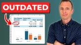
In this video we finally help Andy put the dashboard together. This dashboard will help communicate our findings and tell a story about the performance of our business. Plus, the boss will LOVE it! 🙂
The great part about using pivot tables and pivot charts is that they are very easy to update. When next month rolls around, we simply paste the new data to the bottom of our source data sheet, update the source range, and hit the Refresh button. It will only take a few minutes a month to maintain.
Video #3 – Building the Dashboard
Download
Download the file to follow along.
Topics Covered in the Video
This video is packed with tips for working with Pivot Tables and Pivot Charts. Here are some of the topics covered.
- The Report Filters area explained.
- Group dates into months and years to create a summary trend report and chart.
- Group amounts to create a distribution chart (histogram). One of my favorites!
- Resize all charts to be the same size.
- Prevent charts from resizing when column widths and row heights are changed.
- Add slicers to make the dashboard interactive.
New Features Added to PivotPal
Based on the responses from the pivot tables survey, I added a new feature to PivotPal.
If you are frustrated with having to change the layout settings for your pivot table every time you create one, then you are not alone!
Pivot tables have over 30 options and settings you can choose to get your pivot table looking and behaving the way you want it. These are some of the settings you probably change frequently:
- Turn off the automatic subtotals and grand totals
- Show a zero for empty cells
- Turn off the autofit column widths
- Use the classic pivot style
This usually requires you open the pivot table options menu and click different checkboxes on/off. That menu alone has 6 tabs of options.
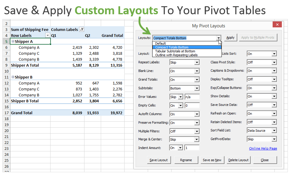
To help save time with this I added a new feature in PivotPal called “My Pivot Layouts”.
This feature allows you to create custom layouts with your favorite settings and options, and then quickly apply those settings to any pivot table with the press of a button.
The nice part is that you can create as many custom layouts as you like. Some pivot tables you might want to format to look like a financial report, other times you might want it to look like a tabular format with repeating labels. These layouts can all be saved and applied anytime with this feature.
See it in action in the video below.
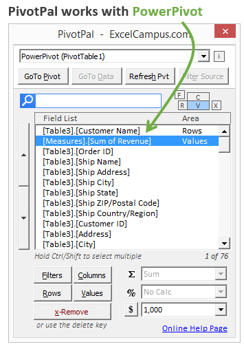
PivotPal now works with PowerPivot!
I have a PowerPivot data model that has 8 tables and 226 fields in it! You might have even more than that. Using PivotPal with these large models makes it extremely fast to find fields with the Search feature, and then add them to your pivot tables.
PivotPal is now available!
Click here to learn more about PivotPal!
Additional Resources
- In part 1 of the series we learned how to setup our source data and create our first pivot table and chart.
- In part 2 of the series we learn how to use the different calculation types to investigate our source data.
If you aren't already, subscribe to my free email newsletter to stay updated.
Please leave a comment below with any questions or suggestions. Thanks!

Jon – very nice video series!
The My Pivot Layouts feature in PivotPal looks great. I’ve always found setting layout options confusing (and a little annoying, since some combinations don’t even make sense) so I love the idea of defining my own layouts, then applying then to a new pivot table whenever I want. Very cool.
Thanks Dave! I wish I would have developed the layouts feature sooner because it has come in real handy the last few days. Looking forward to sharing it soon…
Thank you, Jon!
Great video. Especially the grouping functionality is a very cool feature I wasn’t aware of. It’s so easy – now 😉
Thanks Christian! It’s always easier when you know how, right… 🙂
Hi Jon,
thanks very much for your support. I do appreciate my excel skills has evolved rapidly.
One thing, I don,t yet have Pivot Pal. Just wish to know if it is an add in?
Thanks
Hiltonel
Hi Hiltonel,
Thank you! I am happy to hear that the videos helped you.
Yes, PivotPal is an add-in for Excel and I just released it today! You can learn more about it on the PivotPal product page. Please let me know if you have any questions.
Great work, thank you very much.
Very helpful and clear. I am interested in knowing what it takes to creat tools like pivotpal? Your pivotpal is seems very useful.
Thanks Abhishek! I created the PivotPal add-in with VBA. These add-ins can be created in VBA without any additional tools. If you are interested in learning how to create add-ins, I teach this step-by-step in my VBA Pro Course. The course is not open for enrollment right now, but you can get started with my free VBA training series. Please let me know if you have any questions.
Thanks again!
This is very helpful. Thanks a lot.
You have my Email, please keep updating me whenever there is something new. Have a nice day!
very useful thank you …
This is so cool! It took me a while mainly because of the type of information that I wanted from my data- I still need to play with it to see exactly how to get what I need from my data but the videos are very easy to follow along and you explain everything very well. Thank you so much, Jon!!!
Thanks Marilyn! I’m happy to hear you were able to create it, and I really appreciate the positive feedback.
Thanks again and have a great day! 🙂
This was a big help. Thank you
Thanks Lynda! 🙂
I am trying to figure out why I cannot connect a slicer to multiple charts/pivot tables on a dashboard. Wen I right click on the slicer border, it does not have a choice for Report connections. Rather it says, Pivot table connections. I am finding a number of sources that want to tell me how to do something, but very few that tell me what to do when something does not work as described. (I am using excel 2010.)
Hi David,
Hopefully I can help. In Excel 2010 that option does say Pivot Table Connections instead of report connections. It leads to the same basic menu though. You can only connect a slicer to multiple pivot tables if they share the same pivot cache. This basically means they need to share the same data source. Are your pivot tables all from the same data source?
Useful exercises. Am still working on it.
Really awesome Mr. Jon. These videos are helping me a lot and polishing my skills of data analysis. Especially slicer feature added an amazing part. I would like to appreciate your efforts and sharing such precious knowledge.
Keep it up. Wish you all the very best.
Thanks & Regards,
Thank you Asif! I appreciate the great feedback. Have a nice day! 🙂
Hi John
Thank you for your informative & powerful introduction to Pivot Tables. It was easy to follow (mind you I need the practice you recommend)
Look forward to sketching out my data design & expected outcomes, then exploring PivotPal.
Ciao
Malcolm
Hi Jon (spell check didnt auto correct this time)
I have a pivot table that has a list of all companies in the stock market from which I have extracted two data columns (measures of success)
-Return on Assets
-Return on Equity
I wish to see only the companies that pass BOTH criteria of being over a certain number, and if a stock doesn’t pass BOTH of those individual numbers it is left off the pivot report listing
I can now easily limit one data requirement but advancing and now need to filter out stocks in the pivot table with more than one filter.
Appreciate whatever guidance you can give.
Currently using Excel 2007 but happy to upgrade to Excel 2016 if the answer is in that software release.
Ciao
Malcolm
Hi Jon
More on the stockmarket data pivot report extraction.
Excel 2007
When i group the numbers in the pivot table, and sort them, it sorts from the left hand side of the number
example
11128
comes before
9285
and this with he lowest number forst.
Is this a version issue or a limitation?
Appreciate whatever insight you can give.
Ciao
Malcolm
Hi Malcolm,
It might be that your numbers are stored as text. If so, you will need to convert them to numbers for the sorting. Let me know if that helps.
Jon, thanks SO MUCH for this content! Beautifully explained and best part… its FREE! You’ve helped a desperate soul prepare for an interview with an analytics timed test, wish me luck!
Thanks again.
Jorge
Thanks Jorge! Best of luck with the interview. I hope you knock em dead with your new pivot table skills! 🙂
Hi Jon! Thanks for sharing your knowledge in PIVOT. I am managing a warehouse and inventory control that’s i am looking forward to present my report in a very concise dashboard. That is why really want to learn how to create those items in PIVOT. Your clear tutorial videos help me to learn and have knowledge on how to do these things. But I cannot create on my own because i couldn’t see PIVOT upon opening my Excel. I am using 2013 version. How about the PIVOTCampus?
Hi Kenji,
I am not exactly sure I understand your question. You should see the Pivot Table tools ribbon appear when you click a cell inside the pivot table.
If you are looking for the XL Campus tab on the ribbon, that will appear when you install my PivotPal Add-in. You can learn more about PivotPal here.
Thanks jon. I learned a lot from your videos; well presented and explained.
John, excellent series of videos about working with Pivot Tables.
I learn a lot with this information, and this will help me to build a Dashboard for my projects.
Thanks,
Carlos
Awesome! Thanks Carlos!
Hi Jon,
This is one of the best video on Pivot Tables so far i have ever come across in years. I learned a number of things on this topic, from the basics of Pivot table to all the way some of the complex things, including the Dashboard, and slicers. etc. It was simply superb presentation. PivotPal is even more exciting. Very very clear, concise, and accurate. You are simply amazing! Thanks for teaching this to us for free. You will be go far and will be benefited by the best wishes of all of us.
Hi Ravi,
Thank you so much for your kind words. I really appreciate the great feedback, and it’s comments like this that keep me motivated to keep creating more videos. Thanks again and have a great day! 🙂
Jon – Excellent video tutorials. Captured details so well and made it look so easy – love it! Appreciate all your efforts in creating these to help the community.
Thanks so much!!
Awesome! I’m happy to hear it helped. Thanks Nandu! 🙂
Everyone studder and laughed at me as a newcomer in my office. Why, with less than one year in database training, I did learn from early grad school, the power of excel comes from how smartly I learn to use- the simplest of tools, and how those tools could be organized to answer questions based on my source data. The main lesson! But even as grad school newbie, intelligence requires excel tools and a dashboard.
Everyone was quiet, and stoic, when Jon Acampora knowledge took me to center stage!! Thanks for the promotion. No one is laughing now! I am feeling better with my first 60+k salary coming toward my next paycheck.
That is honest and big money when you from the ghetto. Trust me, if you are selling, I am buying!! Thank you!!!!!!!!!!!!!!!!!!!
ps. This guy can teach old dogs, new tricks!!!
Hi Terry,
CONGRATS on the promotion! That is awesome! You made my day. I am so excited to hear that your Excel and pivot table knowledge helped get you there.
I think the willingness to learn new things, and take the risk to apply those skills, is what separates a lot of Excel users in the workplace. It’s great to see that you are doing this. To not only learn something new, but to also put yourself on center stage. These are the skills that will keep you in high demand in the future.
I really appreciate your nice feedback and it’s great to have you here. Thanks again Terry! Keep me updated on your progress in the future. I’m stoked for you! 🙂
Thank you. Your videos are extremely helpful.
I am, however still stuck on something: my raw data comes in with product names in rows and dates in columns + many other column headings that categorize the products further.
Since dates are in columns, and product lists slightly changes from month to month, how do I combine the worksheets?
Product Description Offer Jan 1/16 Jan 2/16 Jan 3/16
1 Cars A 234 1234 568
1 Cars B 564 4634 8987
1 Cars C 789 534 697
2 Planes B 5234 234 986
2 Planes C 567 982 8634
3 Boats D 634 8234 5685
4 Bikes A 973 374 613
4 Bikes B 4658 234 328
Very information. Love the videos. a couple questions… how can I create a table and not a chart so that I can copy and paste in my dashboard and and slicers. Second question – I am trying to create a pivot table with year, open, closed and the total $ of all by year but not by open or closed.. any suggestions?
Hi Jon,
You are really a guru! For years I have been using excel and couldn’t get anyone to explain what the Pivot table was all about. But under 30minutes you have deconvoluted the entire stuff in such an easy to follow way, that Made it easy for me to apply immediately. The pivot pal is even cooler. Thank you Jon, you deserve your MVP status.
Hi DEI,
Thanks for the nice comment. I really appreciate your support, and I’m so happy to hear that you are learning pivot tables. They are one awesome feature of Excel. Thanks again! 🙂
Jon,
Awesome awesome course!
Our company has 12 companies bidding for 13 job positions in 29 countries, and with your help, I was able to build a slicing/dicing tools so the managers can choose which companies to work in which countries. I have a few questions, for example, how to purge unneeded fields from slicers and how to sort pivot table charts. Thank you so much for sharing your superb knowledge.
Thanks Jewel! I’m so excited to hear that you are building dashboards with this training. In regards to the unneeded fields, you can hide the deleted items.
Right-click the slicer and choose Slicer Settings… Uncheck the box that says: Show items deleted from data source.
I hope that helps. Thanks again!
What a great tutorial! Easy to follow and easy to understand. Thank you!
Thanks Tobie!
I like the tutorials!
I copy two charts from two different sheets into a dashboard and try to insert a slicer. The slicer connects to the chart
I selected but when I try to connect to the other chart, I get only one chart title in the Report Connections box.
Hi Jim,
Both pivot tables/charts need to share the same source data range. They actually need to share the same pivot cache, which can be different from the source data range. But in most cases both pivot tables need to have the same source data range. I hope that helps.
Thanks!
I have pivottable1 and pivottable5 in the same workbook. Don’t know why.
When I try to connect a slicer, only the chart I select shows up in the Report Connection box. What did I do wrong?
Please disregard my questions from 8/27. I found my mistake.
Ok, thanks for letting me know Jim. Happy to hear you got it figured out.
Hi Jon
Thank you for your wonderful lectures on pivot tables. I hope to use Pivotpal and learn how to use it.
But I want to know how you are able to demo and narrate without making a mistake. It is edited – the speech?.
Thanks for the nice comment Cecil! Most of my videos are NOT scripted. I sometimes edit out small mistakes, or do a few takes to get it right. I do plan and outline the major points I want to cover first. A lot of it comes with practice. I have probably produced over 400 videos for Youtube and my courses now. When I first started I was terrible at it. But it got easier with practice, lots of practice! 🙂 I hope that helps. Thanks again and have a good one!
Hi Jon,
It was amezing videos and I would like to thanks personally for all the help. I am new to the excel world and your videos so easy to understand and work on it.
Look forwared for more videos and I want to be a part of your campus.
Thanks again.
Mohammed
Thanks Mohammed! And welcome to the Excel world. It’s an exciting journey and we will never run out of things to learn. 🙂
Amazing.
Thanks
Best Excel tutorial I have seen so far!
Thank you Sir.
Thank you Sohom!
Jon I just finish see your video 3 on pivot table. Wow You Know I have data just the same way it goes for a whole year. Now that I can change the month and year it will save me time. I use hade to do month by month and copy and paste the same month for the whole year which took a long time. Being able to minimize the year is going to be a great help. Currently I have PivotPal. How do I obtain Pivot Layouts? Lastly can these video be download?
You are a life safer. Thank you again
Elba
Hi Elba,
I’m happy to see you learning so much about Excel, and saving a lot of time in the process. I also recommend using Excel tables for your source data to save even more time. I will have an article about that in the future. You should see the Pivot Layouts button the XL Campus tab of the ribbon if you have PivotPal installed.
Thanks again Elba! 🙂
Jon Just to let you know I have the pivot layouts. I am so glad I listen to these video. My data files are at least 65000 records for each year. Grouping the year and the cost save me so much time. Wow thank you Again!
Ok great! I read this after I responded to your last comment, so you can disregard. I’m excited to hear about all the time you are saving. Awesome! 🙂
Hi sir,
Thanks for this demonstration, it was really useful for me. But I’ve a question about data base. In your exemple, you used a data base of december 2014. But if i want to do it each month or each week. I need to remake everything or you’ve means to do it automatically ? Because the only way that I find it was to copy and paste the new data base, but the problem was that the new one doesn’t have the same numbers of lines…
Sorry for my english, and thanks a lot 🙂
Hi Djilali,
You do NOT have to remake everything after adding new data to the data source. You just have to make sure the source data of the pivot table(s) includes the new data, then Refresh the pivot table.
If you use an Excel table for the source data, then you do not have to change/update the source data range when new data is added. Just refresh the pivot table. Here is a video on Excel Tables that might help. Thanks!
It was a very good video tutorial, great help for a beginner like me 🙂
Thank you Janelle! 🙂
Dear John,
Thanks for the educative tutorial that was rely helpful and saved a lot of my time. I am looking into improving my excel and my data analytical in generals. Any suggestions for courses or books. By the way i like your clarity and in depth content you have covered for such a short time. Keep up the good work.
thanks
Mahamed.
Hi Mahamed,
Thanks for the nice comment. I do have another free video series on the lookup formulas that covers some data analysis techniques. I also have a list of recommended books and courses on my resources page. I hope that helps. Thanks again!
Thanks you Jon!!!
Great videos and wonderfull explanations!
I am learning a lot of details and developping great skill in Excel 2013, because of your lessons!!
Thank you Miguel! 🙂
Your videos helped me a great deal; I was preparing for an interview that focused on creating pivot tables. Your videos are clear, concise, and at the same time detailed.
Thank you Monna! I hope the interview went well. 🙂
Thanks Jon!
Your tutorial is really awesome.
I just wanted to ask you, I am in working HR field.
Which all skills will be good to learn to improve my position?
Hi Iftekhar,
I think pivot tables are a great skill to learn for the HR field. You will typically be working with a lot of data sets from different sources. This means you have to match and combine data, and do a lot of lookups. You will also need to know data cleansing and preparation. I have a free video series on the lookup formulas that teaches a lot of these skills. I hope that helps.
Hi Jon,
This Pivot table, chart & Dashboard video was useful. Thanks a lot for sharing the excel file as well. This really helps me when I train people.
I thought of learning advanced excel like Macros, VBA, etc., and was wondering where I can learn with best examples. I hope I have landed a right place finally. Looking forward for more videos and exercises like this. 🙂
Thanks once again.
Hi Gayathri,
Thanks for the nice feedback. I do have a free 3-part training series on Macros & VBA that you might enjoy. I hope that helps get you started. Thanks!
Great Videos, very helpfull. Thanks alot. I’am waiting the next videos.
Thank you Edy! 🙂
Appreciate Jon put all three videos for the Pivot table skills. I followed all of them and learned a ton! Just one questions, when creating the pivot bar chart, for example sales by region, I can’t get the region in the Y axis and revenue on the Y axis with region in the rows and sum of revenue in the values. When I tried to switch the Row/Column, the data layout changes with switch but chart doesn’t. Is there anything I did wrong and how to fix it?
Thanks Bing. I appreciate your support. Great question! In this case we will need to change the chart type to a Bar chart. It is currently a column chart.
The chart will change to a Bar chart with the Regions in Y Axis. It might be difficult to see the region labels. If so, select the plot area of the chart. There are a few ways to do this. One easy way is to go to the Format tab in the ribbon and then select Plot Area from the drop-down on the left side. You will see a box around all the bars and y-axis. You can then resize the plot area with the mouse to make the plot area smaller and the axis labels bigger. I hope that helps.
Really, really great, excellent, perfect, detailed, wide-knowledge job, Jon.
Thanks a lot, Jon! I stay with you…
Thank you for your support Rudi! I really appreciate it. 🙂
Jon, thank you so much for taking the time to prepare and explain all features of Pivot Table, extremely helpful.
Thanks Rosa! 🙂
Hi Jon,
Really like your presentations.
I will be buying your VLOOKUP, Macro and Pivot table education videos soon!
Take care,
Ron
Hi Ron,
Thank you for the nice feedback. My apologies for not responding sooner. I am behind on blog comments due to the large volume I get every day.
I look forward to you joining the courses, and helping you learn more about Excel & VBA. Please let me know if you have any questions.
I finished the series and I have to thank you for this third video especially, I don’t know if my boss will get as interactive and fancy but I sure enjoyed this video! Im still surviving my first internship job haha
Thank you Julian! Congrats on finishing your job. I’m sure you will be able to use these skills in your future career. 🙂
Thanks Jon,
This has been a very informative session. I’ve overlooked pivot tables for too long, so, this has made that step a lot easier.
Well done.
Dave
Jon – Excellent work. Very clear, comprehensive instruction with good examples. Pls consider creating a workbook with exercises to enable your audience to confirm their understanding and maintain these skills
Thank you Lynda! I appreciate the feedback. I’m working on a course for pivot tables that will have more practice exercises. Thanks for the suggestion! 🙂
Thanks Jon,
The my pivot layout feature & also pivotpal looking superb,
onces again thank you very much for sharing Excel files.
keep healthy & god bless you 🙂
Thank you Vishal! 🙂