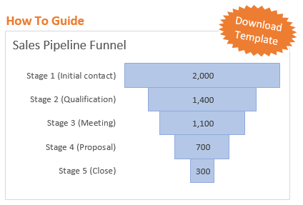
This post explains how to make a funnel chart in Excel. This chart can be created in 5 simple steps using a stacked bar chart.
The Excel file used to create this chart can be downloaded below for free.
What Is A Funnel Chart?
A funnel chart is similar to a bar chart, but the bars are centered to create a funnel shape. In this example, the funnel chart displays how many customers are in each stage of our sales pipeline at a specific period in time.
Why Use A Funnel Chart?
Because it's FUNnel! 🙂
Ok, besides that great reason, the funnel chart can help give the reader a visual picture of the stages in the process. In the case of the sales pipeline, we start out with a lot of customers in Stage 1 (Initial Contact), but only a small percentage of those customers make it to Stage 5 (Close) where the purchase is made.
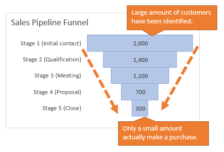
Centering the bars on the plot area gives the appearance of a funnel shape. Your data may not always produce an exact funnel shape like this one, but centering the bars makes the funnel process easier to understand and explain.
5 Steps to Creating the Funnel Chart
The funnel chart can be created in 5 simple steps using a stacked bar chart.

The stacked bar chart contains a “spacer” series that centers the bars. The data for this spacer series is created using a simple formula, and then plotted as the first series on the stacked bar. We then change the fill color of the series to be transparent, so the viewer only sees the funnel data.
You can download the file below to follow along. Or just copy the ‘Funnel Chart Example' sheet into your file, then change the data to make it your own.
Step 1: Setup Data & Create Stacked Bar Chart
The first step is to add a column of formulas to the left of your data column. This formula creates a spacer that will center each bar based on the largest number in your data set.
Spacer Formula: The formula finds the maximum (MAX) number in the data series, subtracts the amount in the current data row, then divides it by 2.
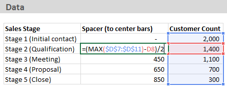
Once we have these two columns of data, then select the data and create a Stacked Bar Chart.
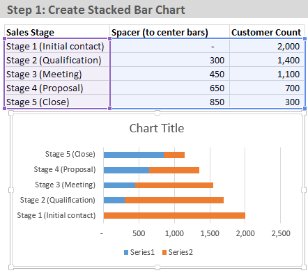
Step 2: Reverse the Order of the Categories
When the chart is initially created the categories will be listed in the opposite order from how they are listed on the sheet.
- To reverse this, right-click the vertical axis (the one with the category names), and select Format Axis…
- In the Axis Options click the checkbox that says “Categories in reverse order”.
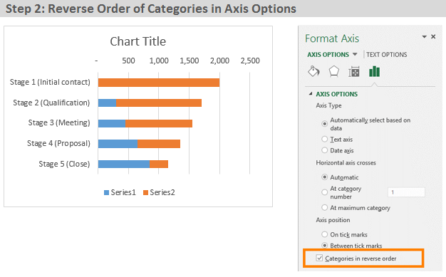
The categories will now be listed in the same order as they are listed on the sheet.
Step 3: Change the Gap Width to 0%
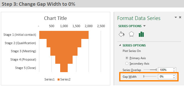
Next we will change the width of the bars so the borders touch. This gives the chart more of a funnel look.
- Right click on any of the bars and select “Format Data Series…”
- In the series options change the Gap Width to 0%.
Step 4: Change the Spacer Bar Color to No Fill
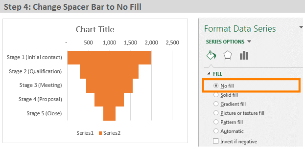
The fill color of the spacer bar needs to be transparent. This will make it invisible to the reader, and only the actual funnel data will appear.
- Right click on any of the bars in the Spacer series (Series 1) and select “Format Data Series…”
- Change the Fill Color in the series options to No Fill.
Step 5: Format the Chart for Presentation
You can now format the chart and remove all the extra junk. Excel adds a lot of elements (gridlines, legends, etc) that are not needed for this visualization.
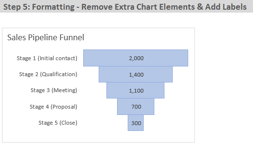
Here are the steps I took to format the chart:
- Remove the legend.
- Remove the vertical gridlines.
- Remove the vertical axis border (no line).
- Change the fill color and border color of the funnel bars.
- Change the chart title (include the date or time period of the data).
- Add the data labels to the funnel bars and center them.
Download
The file can be downloaded below. It contains these instructions to create the chart, or you can copy the ‘Funnel Chart Example' sheet right into your workbook and change the data.
Other Uses for a Funnel Chart
The example above used customer count data for different stages of a sales pipeline. The funnel chart could also be used to display:
- Number of students in each stage of education (undergrad, grad, phd, etc.)
- Number of employees in each job level (subordinate, manager, executive, etc.)
- Amount of receivables in aging (30, 60, 90 days past due)
- Age distribution of customers/population (20s, 30s, 40s, etc.)
What are some other uses for the funnel chart? Please leave a comment below with any questions or suggestions. Thank you!


Very neat – thanks Jon!
Thanks David!
Thanks!
Very Useful
Thanks Daniel! Please let me know if you have any questions.
Can you please tell me what is the use of a funnel chart?
Hi Mark, The funnel chart shows you the count of items in each stage of a process. In the case of the sales pipeline, we categorize each customer deal into a stage in the sales process. So in the first stage we have a lot of potential customers (leads) that we have initially contacted to try and sell to. If these customers show interest in buying from us, then we move them into the next stage in the process. We might then setup a product demo with the customer and that moves them into the next stage. Eventually the customer is ready to buy when we send them a quote, and we move them into the final stage.
The funnel chart shows how many customers we have in each stage at any one time. So it is a snapshot of our potential customer (leads) at a point in time.
There are many uses for a funnel chart though. Maybe you are manufacturing a product and the product has to go through various stages of inspection before it can be sold. The funnel chart can be used to show how many products you have in each stage of the manufacturing process.
Let me know if you have any questions. Thanks!
[…] is an overview of the 5 steps to creating your sales funnel in excel. Makes sure to check the article for more in-depth explanation and […]
Could you use them to manage a sales team?
Jon, how did you get your bars to be centered that way. My bars are staying on the left.
Hi Miles,
Did you create the spacer series? The formula in step 1 will create a spacer that makes the bars centered. Feel free to send me your file if you are still having issues. Thanks
Thanks a lot! Great tip.
Awesome! Thanks a lot Jon
Jana
Great template – easy to use and perfect for what my team needed. Thank you for posting!
Thanks for this template Jon. Very useful that you’ve done all the formatting. Greatly appreciate the fact that you share your not only your insights, but templates as well!
Thanks Rekha! 🙂
HI Jon,
Is there a way to use the spacer formula with the percent stages versus the number of customers in the funnel?
Hi Kristen,
Yes, the chart will still work the same if you use a percentage of total instead of number of customers. The spacer formula will be the same. It’s just a percentage instead of a whole number.
Hi,
I just used the template to feature in one of my presentations. It looks pretty sophisticated but surprisingly is very easy to execute.
Appreciate that you have provided ready to use template which actually works flawlessly!
Regards
Ravi
This was a great template; however my first value went above 2000, and in your template you had fixed the horizontal axis to 2000. This meant that my first value was cut off on the right-hand side of the chart. To fix this, I went into Axis Options for the horizontal axis and removed the Fixed maximum.
Looks great now – thanks a lot!
It’s great! THank you a lot!
Thanks Jon
Much Appreciated
Hi there, is it possible to make the bars stacked? So that we can show pipeline split by division at a each part of the sales funnel? Thanks!
Need trail
Hi Jon,
Great template and guideline; I used it succesfully.
But, I now want to update my sales pipeline file using Pivot Table and Pivot Charts.
So, now I have a Pivot Table “Sales Stage” with Count of Sales Stage showing amount of opportunities per Sales Stage.
How can I now create a Sales Funnel using this data?
Thank you in advance for your help!
Stijn
Using an online contact management system helps you keep your records clean and easy to manage. It also helps you find the right contact information. One tool to do this is GetProspect http://getprospect.com/email-finder , an online tool that is a data enrichment and lead management system. The tool offers a free email finding service and 100 verification credits per month. GetProspect allows you to search for contacts and companies by name and domain. It also allows you to import contacts and companies from your desktop, or from your integration with other marketing tools. The tool also offers 15+ datasets of information about potential clients.