Bottom line: In this video series you will learn how to use Pivot Tables to create meaningful reports and interactive charts and dashboards.
Skill level: Beginner
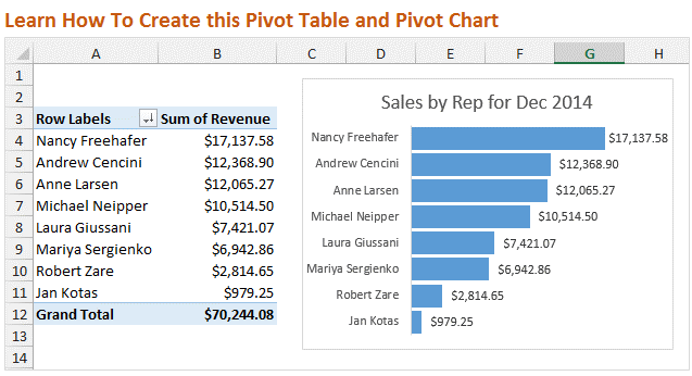
Video #1 – Introduction to Pivot Tables
In this first video we are going to learn how to setup your source data, then create a Pivot Table and Pivot Chart. I also show you how to reformat the chart to upgrade the look from the default settings.
Best viewed in Full Screen HD.
Note: If you are familiar with Pivot Tables then this video might be too basic for you. I would still love for you to watch the video, but don't want to waste your time. In the next two videos we will be putting together the dashboard. There is also a shorter video below where I give a Pivot Chart a makeover…
Downloads
Use this checklist to clean up your source data before creating a Pivot Table.
Use the following file to follow along with the video and create your own Pivot Table and Pivot Chart.
Pivot Tables are Amazing!
A few days ago I shared a story about how I got to teach my Dad how to use Pivot Tables. As you know he is really excited about Pivot Tables. They were easier to learn than he expected, and he is saving a ton of time when creating reports and summarizing his data.
So I want to share this same training with you!
Create Dashboards with Pivot Tables and Charts
In this video series we are going to follow my friend Andy on the journey to learn Pivot Tables.

Andy has been tasked by his boss to create some charts and a dashboard for an upcoming presentation. He really wants to impress his boss, but doesn't have time to learn complex formulas or macros. What he really needs it Pivot Tables and Pivot Charts.

As you will see, Pivot Tables allow you to quickly summarize and analyze your data. I am going to show you how you can discover trends and learn a lot about your data with just a few clicks.
Bonus Video: Pivot Chart Makeover in Excel 2010
In the video above I explained how to reformat the Pivot Chart. In that video I was using Excel 2013. I recreated the video using Excel 2010 because the menus are a bit different and I want to make sure you could follow along if you are using Excel 2007 or 2010.
Why the Chart Makeover?
When presenting your data visually on a chart you want the reader to be able to easily understand the story you are trying to tell. To do this you want to get rid of all the extra elements that do not contribute to the story.
In this case we removed the axis labels, legend, vertical lines, and field buttons. This stuff can be referred to as “chart junk” because it tends to clutter the chart.
The default settings of the Pivot Charts typically contain a lot of chart junk. These extras elements can be distracting for the reader, and take away from your story.
The type of chart you create will determine what elements you want to display. There are entire books written on the art and science of data visualization, and it is definitely a good topic to study.
PivotPal is Here!
I show a few of PivotPal's features in the 11:28 mark in the video above.
PivotPal is now available!
Click here to learn more about PivotPal!
Thank You!
I want to say a big THANK YOU if you took the time to complete the pivot tables survey! The response was overwhelming and I am still going through all the results. I will share more about that with you in the coming weeks.
Additional Resources
- In part 2 of the series we learn how to use the different calculation types to investigate our source data.
- In part 3 of the series we create the dashboard and add slicers to make it interactive.
- Checkout my article on how to structure your source data for pivot tables.
- Here is an in-depth article on how pivot tables work.
Please leave a comment below with any questions. Thanks again!


Great introduction to pivot tables! I can’t wait to dive into the video series and learn how to create effective dashboards. Looking forward to more insightful tips!
where is the link to download the data
Clear, concise, and incredibly helpful! Pivot tables always seemed intimidating, but this made them feel approachable—and the dashboard tips are a great bonus for data visualization!
I really enjoyed this first video in the series! The explanation of pivot tables was clear and informative. I’m excited to learn more about how to create effective dashboards. Looking forward to the next installment!
Where is the file from the video? Only links to another subscription forms!
Great introduction! I’m excited to learn more about pivot tables and dashboards. The video format makes it easy to follow along, and I can’t wait to see what the next parts will cover. Thanks for sharing!
Great introduction to pivot tables and dashboards! I’m excited to learn how to better analyze my data with these techniques. Looking forward to the next videos in the series!
Great introduction! I’m excited to see how pivot tables can enhance my data analysis skills. Looking forward to the next videos in the series!
Great introduction! I’m excited to learn more about pivot tables and how to create effective dashboards. Looking forward to the next videos in the series!
Great introduction to Pivot Tables and Dashboards! The video series looks promising, and I can’t wait to see how the concepts are expanded in the upcoming parts. Thanks for making this topic accessible!
This is a fantastic introduction to pivot tables and dashboards! I appreciate how clearly you explained the concepts in the video. I’m looking forward to the next parts of the series to dive deeper into these powerful tools. Thank you!
This video series is a fantastic introduction to pivot tables and dashboards! I appreciate how clearly concepts are explained, and I’m excited to apply these skills to my own data projects. Looking forward to the next videos!
Great introduction to pivot tables and dashboards! I love how you broke down the concepts into easily digestible parts. Can’t wait for the next video in the series!
Great introduction to pivot tables! I’m excited to dive deeper into the series. The examples were very clear and helpful. Looking forward to the next video!
This video series on Pivot Tables and Dashboards is exactly what I needed to enhance my data analysis skills! The explanations are clear and the examples are super helpful. Can’t wait for the next part!
Where can I download the samples files of your work so much appreciated for the best tutorials on knowing the introduction to become pro in using PIVOT Tables
This video series is a fantastic introduction to pivot tables and dashboards! I love how you break down complex concepts into easy-to-understand segments. Can’t wait for the next parts!
This video series is such a great introduction to pivot tables! I learned so much in just the first episode. Can’t wait to see how dashboards are covered in the next parts. Keep up the great work!
Great introduction to pivot tables! I’m excited to see how they’ll help streamline my data analysis. Looking forward to the next videos in the series!
Great introduction to pivot tables and dashboards! I’m excited to dive deeper into the series. The visuals really helped clarify the concepts. Looking forward to the next video!
Where are the sample data files you use in the video? Tried to “Download below” but did not see them. Found a lot of other things I don’t want to download.
The videos are not much good without the data files to follow along with.
Do you have a button somewhere labeled “excel sample data to use with pivot tables” or something similar?
This video series is a fantastic introduction to pivot tables and dashboards! I love how you break down the concepts into manageable chunks. Can’t wait for the next installment!