Bottom Line: Learn how to add the grand total row or column from a pivot table into a pivot chart.
Skill Level: Intermediate
Download the Excel File
If you'd like to follow along using the same Excel worksheet that I use in the video, you can download the file here.
Grand Totals in Charts
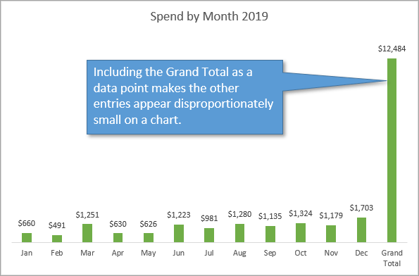
When creating a chart from a pivot table, you might be tempted to include the Grand Total as one of the data points. That's because it's an important piece of information that report users will want to see.
The problem, however, is that the Grand Total is always so much bigger than any of its individual components. So if you include it in the chart, it skews the proportion of the chart and makes the other data points a bit harder to differentiate in terms of trends or significant changes.
A better option is to list the Grand total as linked text somewhere on the chart so that the remaining data is easier to compare.
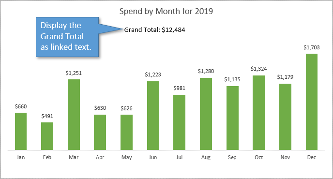
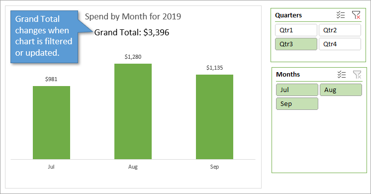
With this method, the Grand Total in the pivot chart is still dynamic. This means the total will update as the chart is filtered (with a slicer) or updated (with refresh).
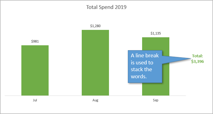
Let's take a look at how to include the Grand Total as a dynamic text feature in a pivot chart, as seen above.
Set Up the Pivot Table
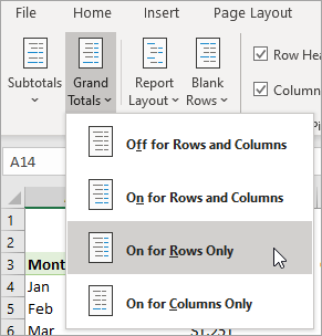
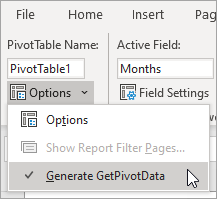
The first thing we want to do is make sure that the Grand Totals option and the Get Pivot Data option are both turned on for our pivot table.
Grand Totals Feature
- Select any cell in the pivot table.
- Go to the Design tab on the Ribbon.
- Select the Grand Totals option.
- Choose the option that is appropriate for your pivot table (usually On for Rows Only).
Get Pivot Data Feature
- Select any cell in the pivot table.
- Got to the PivotTable Analyze tab on the Ribbon.
- Select the Options drop-down.
- Make sure the Generate GetPivotData is checked.
Create the GETPIVOTDATA Formula
In a blank cell, type the equals sign (=) and select the cell that has the grand total amount in it. Because you've turned on the GetPivotData option, the GETPIVOTDATA function will automatically populate in your formula.

Format the Number with the TEXT Function
Next, we want to format the number to read how we want it. For our example, I want the number to read as a dollar amount with no decimal places.
We can't just format the cell, because the formatting will not pull over when we link to it from inside the pivot chart. Since that is the case, we will make the formatting part of the formula. To do that, we can use the TEXT function.
The first argument for the TEXT function is the value (which is the formula we've already written above). The second argument is the format. I want to use this format: “$#,###”
So now our formula reads like this:
=TEXT(GETPIVOTDATA(“Item Total”, $A$3), “$#,###”)
We've just created custom number formatting for the Grand Total.
Make a Linked Text Box
Start by clicking on the bounding border of the Pivot Chart to select it. (If you don't select the Pivot Chart before creating the text box, the text box will be separate from the chart and therefore won't move along with the Pivot Chart if you ever want to move it.)
With the Pivot Chart selected,
- Go to the Insert tab on the Ribbon.
- Choose the Illustrations drop-down menu.
- Choose the Shapes drop-down menu.
- Select Text Box.
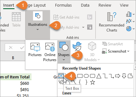
Then you will draw your text box wherever you want it to appear in the Pivot Chart.
Instead of typing text in the text box, go to the formula bar, type an equals sign (=), and select the cell where you've written the formula. This will insert the word Demo! into the formula.

Now the text box is linked to the cell containing the formula, and that cell is linked to the Pivot Table. So any changes that are made to the pivot table will dynamically change the amount in the text box. We don't want to link to the Grand Total cell in the pivot chart directly because the dimensions of the pivot chart can change, moving that Grand Total cell and breaking the link.
Joining Text to Your Formula
Our last step is to add some text into the text box so that it is not just a number. We can label the number with the text “Grand Total: ” and that is done by joining text to the formula.
To join text, just use the ampersand symbol (&). Type the text you want to see, within quotation marks, and then the ampersand, either before or after your existing formula, depending on where you want the text to appear. In our case, I'm writing “Grand Total: ” before the formula and joining them with an ampersand.

You can also create a line break if you need to, by adding the CHAR function and the number 10 in parentheses, and joining it to the rest of the formula.
CHAR(10)&
This can be useful when you are adding the Grand Total to the side of the pivot chart instead of the top, and you want to save some space. Like this:
Related Posts
If you'd like to learn more about using Pivot Charts, I've got a three-part series on the topic here: Introduction to Pivot Tables and Dashboards.
You might also be interested in this post: Create Dynamic Pivot Chart Titles with a VBA Macro.
Conclusion
This one task of displaying the Grand Total as text has helped us to pick up a variety of skills. We covered things like linked text boxes, joining text, custom number formatting, the CHAR function, and more. I hope some of that was new and helpful to you. If you have any questions or suggestions, please leave a comment!


Excellent, really useful, thank you
Hi Jon,
This is great! Thank you for sharing it!
I have found that the totals do make sense in certain charts, to get a quick view of a comparison to total.
For example, I have a chart with number of “Issues” by country. So when I see the visual I can quickly see that we have the majority of concerns in, top 3 countries.
I hope this makes sense.
That’s great! Good to know. Thank you for posting.
I actually use another method because this is something I have to include in my corporate charts: I create a simple Table linked to my Pivot Table, then I add any new columns I need to that and create a chart from the Table (I usually color the sum or total column differently); when I update the Pivot, the simple Table updates and so does the chart. The only drawback is having to expand the simple Table and chart to reflect any expansion of the Pivot Table. But it’s worth the small amount of time.
love it!
I have a table that containes about 170 entries that consist of stock trades. I would like to know how to create a pivot table that displays the profit or loss for each day in a month. I have only one column for the closing trade date – such as “3/2/2020”. a friend told me that I had to create three columns, one for the year, one for the month and one for the day. I would like to see a macro that parses out into three columns the year, month and day from my sell date column. In addition I would like to see a pivot table set up to display the p/l for each day in a month.
Thank you
Raymond Hennessy
A database should be a database. The last thing I need is my database being corrupted by a formula. (Just my opinion) I would like to share something with you, in regards to the daily work environment. I have only a few codes to finish in VBA for a manager/POS/Work order to estimate to invoice with parts & customer database sheet linked to accounting. Everything I looked up on the internet and youtube, to help me write these codes (I’m not at all familiar with Excel!) was not even close to what I needed. This is a Vacuum repair and sale shop (We fix everything like most Vac shops do) So here it is. 1-A control panel to look up open/or in progress jobs (Aprox. 40 open jobs daily) 2-Order/estimate template (Est. #, date, customer search and auto fill both direction for new or existing, cells calc. IFNAVlookup, transfer to invoice and delete est. print invoice, post to daily book, save invoice to pda and clear template. You might want to look at doing vids on drop down search, userforms, making a cell ref. name and invoice number for search(Private Sub searchsh_Change()) , and the importance of This workbook, Sheet2(Estimate) and modules and why codes have to go their. Learning the hard way (On a budget) took forever!! Thanks for the VBA code it will help out a lot.
Hi.. I am Luis, and I use Exce 2013, and the Pivot Table is showing a Grand Toral Column, that I don’t want.. How can I get rid of it !
test comment1
To answer the conclusion, something alike people try to display is mainly not grand Total, but more the average (mainly as a line). But like in the example, not easy to use with a pivottable (you copied the data in another tab if I am right).
do we have any way to show grand total on the pivot chart
i have 2 sectors inside 1 big business category
i always need to make a graph showing Y-1 compared to Y0 and B for Sector 1 and sector 2 and also to show the total for the whole business all in the same graph
To answer the question, and to address my specific question that brought me to this page, when the grand total is based on an average instead of a sum. I want to show month to month against an average over the last year, for example/
Hi John. You asked for a scenario where showing the grand total in the graph would make sense, so here you go! I have a pivot table with lots of different property types (approximately 20), and lots of other identifiers (approximately 30). For example, Breaking Strength (of steel specimens) is a property type, and Floor Level (which floor of the building the specimen came from) is an identifier. My pivot chart currently shows the average (as well as max, min, std. dev., etc.) of Breaking Strength for each Floor Level. I would like to show the grand total of average breaking strength, for example, on the chart so that the average for each Floor Level can be compared with it. In this case, since my summary function is average (and not sum) it makes a lot of sense to compare the overall average to the average of each floor level – the magnitude of the values is in the same range. Excel seems to have a way to do this (by right clicking on the table, selecting Pivot Chart Options -> Totals & Filters -> Show grand totals (for columns), but nothing happens when I do this, so not sure how it’s supposed to function… In any event, there’s an example where showing the grand total graphically would be useful!
I’m using a stacked bar chart to show how much work on my project has closed compared to the total amount of work. Thus, I’m looking to add the grand total into the pivot chart itself as one of the values in the stacked bar. Anyone have ideas on to achieve this most efficiently?
Hi Jon, thanks for this video.
Similar to Matt Chase below, I also have a scenario where showing the grand total as bar in the pivot chart makes sense.
In my Pivot Chart I show medians values for each country (I created a measure for this). The grand total is the median over the whole global data set. Here, it absolutely makes sense to show the grand total in the graph, so you can compare the country medians to the global median.
In general, I agree with you that it doesn’t make sense to show the grand total in the chart, when using sums. However, I you show median, averages, etc. it can be very useful.
Can you show how to do that?
Thanks,
Daniel
Hi this is helpful, but I am having trouble adding the grand total row with a bar chart of percentages. As it’s percentages, it will not disrupt the scale as it would with absolute numbers. However, I cannot get the pivot chart to include the grand total row. Can you help?
You opined that you could not see a reason to keep the “grand totals” bar along the x-axis. Here’s a need: (medical data)- wanting to compare individual hospital data with the network’s average–expressed with the 100% stacked format (solves the y-axis problem). That said: I couldn’t make it work. Help would be much appreciated. Thx
Hi, thanks for the info.
If i filter my pivot chart i lose the ground total, how can i avoid that?
Hi I’m using Pivot Chart with ‘Clustered Column’ chart type. I would like to have a total on the top-end of each column by using Combo chart format.
The title is How to Add Grand Totals to PIVOT CHARTS in Excel and you show an image of a chart that is suposed to be a pivot chart, but when you download the excel you realize the image comes from a simple chart and not a PIVOT chart so basically you don’t answer the question….
Here’s an example where grand total would be beneficial within a pivot chart. Over time, you might have two categories. In standard Excel formatting options, you could chart the two categories as a separate lines which might overlap each other or as two stacked lines where the bottom line is Cat 1, the delta between the lines is Cat 2 and the top line is actually the sum of the two categories.
However, in some cases, it might be more informative to graph the two lines independently (i.e., potentially overlapping) and to also graph the grand total as a third line.
I did this successfully, however, when I loaded this into SharePoint and used the Excel Web Access web part to display the bar graph with the grand total just under the title, the grand total does not display. How do I get it to display?
Nice Video, however… the grand total is much needed in cash flow pivot tables. The GT is than the net balance of cash in cash out. Would be nice to have the GT in the pivot chart.
“Here’s how to do it…. You shouldn’t need to do it so do this instead”. Appreciate the alternative provided but in my case and several others commentators below, we do want to give it a shot anyway.
THANK YOU!!! This is exactly what I have been trying to figure out how to do.
Thank you so much!
Really helpful, through didn’t find “Illustration” option under Insert bar. Thank you Jon!
Hello,
Thanks it is helpful but not what I was looking for.
I have an account statement that gets data input on a monthly basis.
I have 5 columns
Date Description Invoice Payments Balance
Each month an invoice amount is input against a date in the Date column.
The row Balance is updated automatically, and displayed only if there is a date inputted in the Date column.
If a payment is made then this is input on a new row, and again the row balance is updated automatically.
Obviously there are always empty rows with no data or date, so the Balance column is blank for those rows.
At the bottom of the statement is a “Total Due” amount cell.
After inputting the monthly data I want the “Total Due” amount to automatically update its cell with the last amount displayed in the Balance Column.
Many thanks
I create reports for total behavioral interventions with clients to submit to regulatory agencies. It’s important that the interventions per client are contrasted with the total interventions performed at our facilities during the same time periods.
So, it is advantageous to have “total interventions” as a separate bar on the graph to put individual totals into context. And, it would be handy to not have to do it manually.
Thank you
It would be nice to have the option to add the grand total for average metrics.
How do I import the PivotChart into PowerPoint without losing the text boxes?
Well done! Great explanation and solution.
I do have a scenario where I would like to see the grand total in the same pivot chart – Analysis of monthly spend on actual versus budget with expense breakdowns.
The columns would be the different types of expenses, the total is the total monthly spend.
If you are using a Pivot Chart and display the “data table” in the chart, how do you display the Grand Total Row from the pivot table in the data table of the chart?
Grand total for the year makes sense if you’re doing average by month (specially if you have multiple lines, one for each year) and you want the last entre to be your yearly avg