Bottom line: Learn how to use Chart Templates in Excel to quickly apply formatting and settings to new and existing charts. Includes instructional videos.
Skill level: Beginner
Cleanup the Chart Junk
The default chart formatting in Excel typically includes a lot of extra elements that aren't always needed for our charts. A nicely formatted chart should include only the minimal amount of elements (legend, axis, labels, gridlines, etc.). This makes the chart easier to read, and allows the data to tell the story.
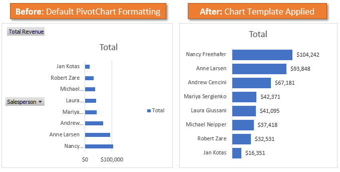
Entire books have been written on the principles of data visualization, so I won't go into a lot of detail here. The main idea is that we should use a minimalist approach to creating and designing charts (graphs). All the extra formatting is typically referred to as chart junk because it clutters up the chart and distracts the reader.
To learn more about this topic checkout the books by Edward Tufte and Stephen Few (Amazon links). My good friend Mynda Treacy from MyOnlineTrainingHub also covers these principles in her Dashboards Course.
Chart Templates to the Rescue
Even if you don't follow these principles, it's likely that the default chart formatting doesn't match your needs. After inserting a chart on a sheet, we typically take additional steps to format it.
This can be time consuming. My typical process to cleanup a Bar PivotChart includes a minimum of 7 steps and a total of 18+ mouse/key presses.
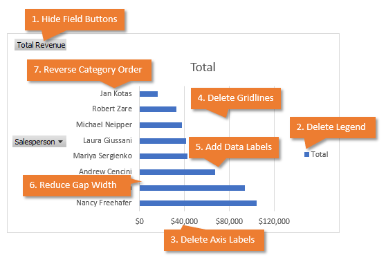
- Hide All Field Buttons
- Delete the Legend
- Delete the Axis Labels
- Delete the Gridlines
- Add Data Labels
- Reduce Gap Width
- Categories in reverse order
That's a lot of extra work and time!
Fortunately, we can automate this process with Chart Templates. We can save all the formatting options and settings to a Chart Template, and then apply the template to any new or existing chart.
If you'd like to learn how to create that pivot table and chart, checkout my free videos series on pivot tables and dashboards for Excel.
How to Create a Chart Template
To create a Chart Template:
- Insert a chart and change the formatting to prepare it for presentation.
- Right-click the chart and choose “Save as Template…”.
- The Save Chart Template window will open. Name the Chart Template File.
- Click Save.
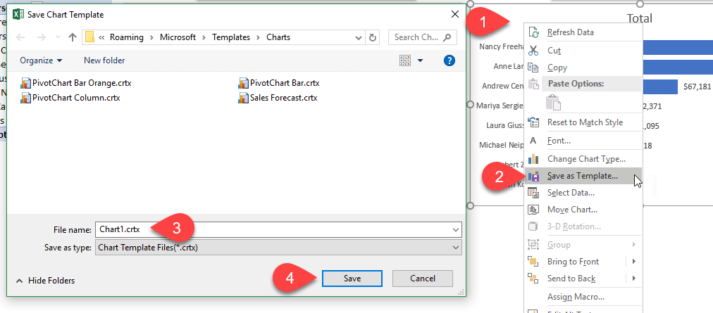
The Chart Template will now be available in the Chart Template Gallery on the Insert/Change Chart Window.
How to Apply Chart Templates
Now that you have created a Chart Template, you can apply to it any new or existing chart.
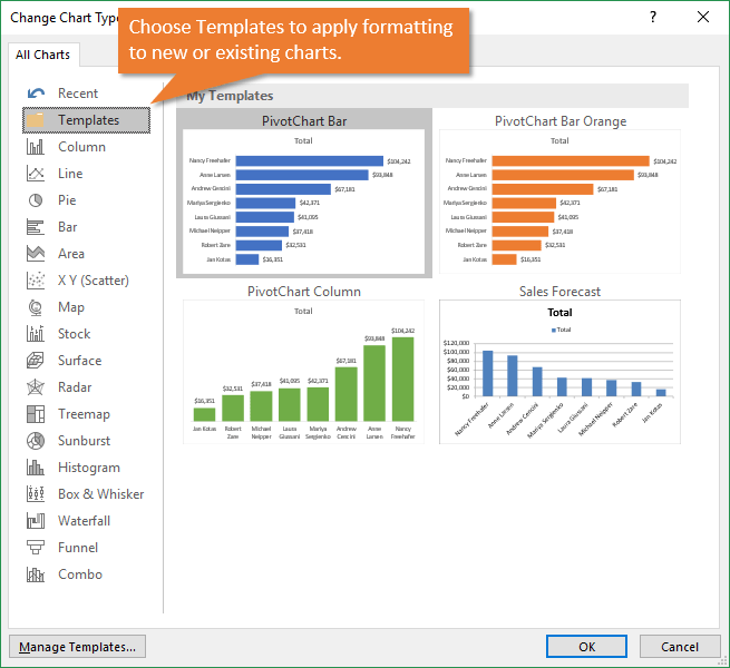
To apply the Chart Template to a new chart:
- Click a Chart button on the Insert tab of the ribbon to open the Insert Chart window.
- Click the Templates tab on the left sidebar.
- You will see a gallery of your Chart Templates. Select the one you want to use to create the chart.
- Press OK.
- A new chart will be inserted on the sheet and all of the Template's formatting options will be applied.
To apply the Chart Template to an existing chart:
- Right-click the existing chart and choose “Change Chart Type…”.
- The Change Chart Type window will open. Click the Templates tab on the left sidebar.
- Select the Chart Template you want to apply.
- Press OK.
- The chart type and formatting will be applied to the existing chart.
How to Manage Chart Templates
The Chart Templates are saved as crtx (chart template) files to your computer. They are typically saved in the following location on your computer.
C:\Users\[username]\AppData\Roaming\Microsoft\Templates\Charts
You can get to this location from the Chart Template Gallery by clicking the “Manage Templates…” button in the bottom left corner of the Insert/Change Chart Window.
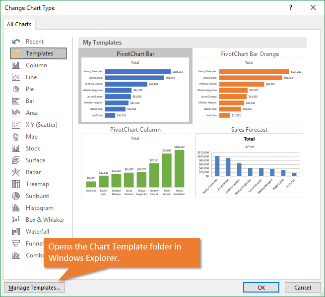
That opens Windows Explorer and navigates to the Chart Templates folder. From here you can add or delete chart template files.
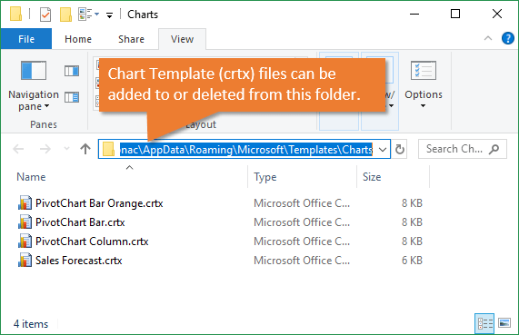
If you downloaded a crtx (chart template) file or received one from a co-worker, you can copy the file into this folder. It will then appear next time you open the Template Gallery.
Download the Chart Template
You can download the Chart Template I use for Bar PivotCharts below.
Chart Templates for Each Chart Type
It's important to note that the Chart Template also includes the chart type (bar, column, line, pie, etc.). So you will need to create a Chart Template for each chart type you use frequently. You might have separate templates for bar, column, line, combo charts, etc.
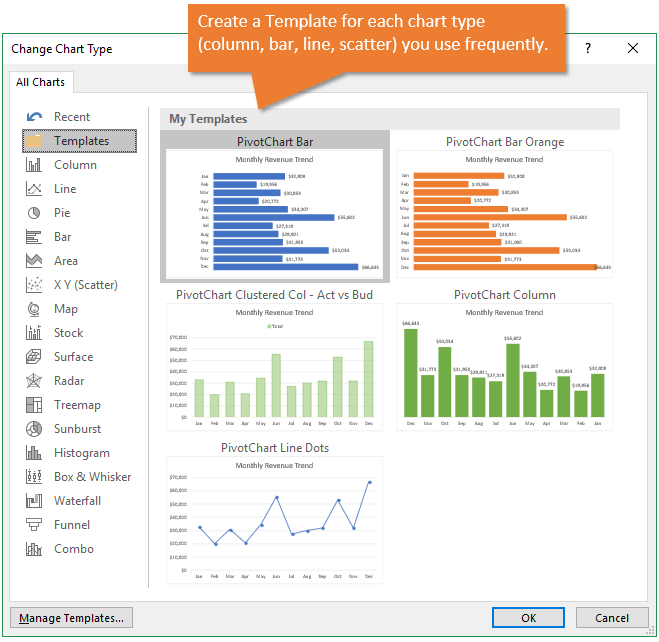
You might also want to create templates for different projects or reports you work on periodically. Any time you modify a chart and are happy with the results, right-click and “Save as Template…” This will make it easier to quickly apply all those settings in the future.
Sharing Chart Templates for Consistency
Another benefit of Chart Templates is that you can create consistent looking charts throughout your department/team/organization. Once you create a Chart Template, you can send the crtx file to everyone and have them use it on all their charts. This will ensure every chart uses the same colors, fonts, formatting, etc.
The video above contains instructions on how to import a Chart Template file. You can share this with your team when you send them a template file.What do you use Chart Templates for?
Chart Templates definitely save us time by allowing us to create our own default formats. We might have to take a few extra steps to format the chart, depending on the project, but the template gives us a good starting point to work with. They also help create consistency within your organization.
How do you use Chart Templates? Please leave a comment below with any questions or suggestions. Thank you! 🙂


Great tips Jon.
It’s amazing the depth of function in Excel.
Excellent solution to build consistency in the company once we have a style guide.
Eric
Thanks Eric! Yes, endless possibilities with Excel… A style guide is a great idea too! Thanks for sharing.
Hi Jon. Great Tip, Thanks.
May I create charts in EXCEL and use them at POWER BI ?
Hi Rita,
Yes, you can publish Excel charts, pivot tables, and other objects on a sheet to Power BI. You just need the Power BI Publisher Add-in for Excel. Here is the Microsoft help article that explains how to download, install, and use it.
Very useful tips.
Mynda’s webinars were also fabulous & I got to learn a ton about PQ (G&T), power pivot, besides dashboards & charts.
Thanks.
Thanks Sandeep! Happy to hear you are enjoying the webinars! 🙂 Here is the link for anyone that wants to register for the free webinars. They are only going on for another week.
Awesome! I have a set of charts I do quarterly and always wanted to be able to not recreate them from scratch each time.
Nice! Thanks Jenny! 🙂
This was terrific. I’ve been working on charts all week trying to get them to be consistent. The video came one day too late. It would have saved me hours. Thanks for this lesson. I know it will come in handy in the future.
Thanks Frank! Happy to hear you will be able to use it in the future. 🙂
I know what you mean! I, too, am working on a deadline so this is very timely.
Hi Jon, As always, thank you so much for making our tedious Excel tasks so simple!
Thank you Debbie! 🙂
Jon,
Thank you very much for the free e-lesson for creating chart template.
I do have one question about the color of the bars in the chart. I am wondering do you have a way to have different color on the bars, not just one color for all the bars. because some time each of bar representing different people or things.
Thanks,
Sue
Jon, as usual a great tutorial that is clear and concise on creating chart templates. I always enjoy your tips.
Don
Hi Jon,
Hope you are doing well. I’ve learnt a lot just from watching your YouTube videos.
I use power pivot excel at work and have created interactive dashboards from watching your videos. They were very helpful. Thank you so much.
I work for the state public health agency and I will be thankful if you could help me figure out how to accomplish this task.
We have 200 hospitals. I work on their data. They report on five metrics. I am expected to create a report including graph (1 summary graph) and tabular representation of the summary data for each facility.
Can you please share your thoughts on how this could be automated, so I don’t have to manually enter?
Thank you so much,
Riya
Thx Jon. This is very nice and practical. I never dived into Chart Templates. I used to record macros to do the trick, but from now on I will be creating templates!
Definitely time saving and being more flexible to know all those options in the future, Thanks Jon
Kate K
Thanks Kate! 🙂
Is you don’t wish to create a new template, is there any way to simply apply the formatting of one chart to another, similar to the format painter?
Jon
Is it possible to change a “default” chart format setting? As an engineering I have a standard set of font preferences, grid lines, titles etc. I would prefer these settings being the default ones as opposed to selectable from a template list.
Thank you. That was helpful, especially the right click on the chart and selecting “save as template”. The template then becomes available for other spreadsheets as well.
Thank you for saving me half an hour of color editing!