There are times when the numbers you care about only exist on-screen. A live scoreboard. A broadcast overlay. A stream of changing values with no raw data file. And often times, we just don't want to bother with calling IT to get the data.
So, in this guide we look at how to scrape video data with AI and Python into a clean, analyzable table and then build a compelling timeline chart in Excel.
The approach is simple in concept. Crop the area that contains the scoreboard. Extract one frame per second. Use OCR or an AI vision API to pull text from each frame. Clean and fill gaps in Excel. Then build a pivot-based line chart that tells the story. Each step below includes concise instructions, tips, and a matching screenshot so you can follow along visually.
Video Tutorial
Watch on YouTube & Subscribe to our Channel
Downloads
Section 1 — Capture and crop the scoreboard
This process starts with a video. I did a screen capture of the replay on YouTube using Camtasia, but you can use any video file source that you have.
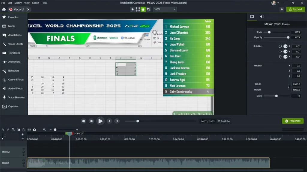
Edit the video to isolate just the scoreboard region. Working with less visual noise makes OCR and AI extraction far more accurate. Keep the clip as small as the scoreboard so processing time and cost stay low.

Recommended workflow:
- Open the recording in any editor.
- Set the project canvas to the scoreboard pixel size.
- Move and crop the footage so only the scoreboard remains visible.
- Mute audio and export a short MP4 of that cropped region.
Why this matters:
- Smaller frames reduce processing time.
- Removing background and overlays improves OCR accuracy.
- Exporting a clean MP4 simplifies the next step: frame extraction.
Tip: If the scoreboard appears in the same place for most of the recording, one static crop works. If the layout shifts, create multiple crops and process each separately.
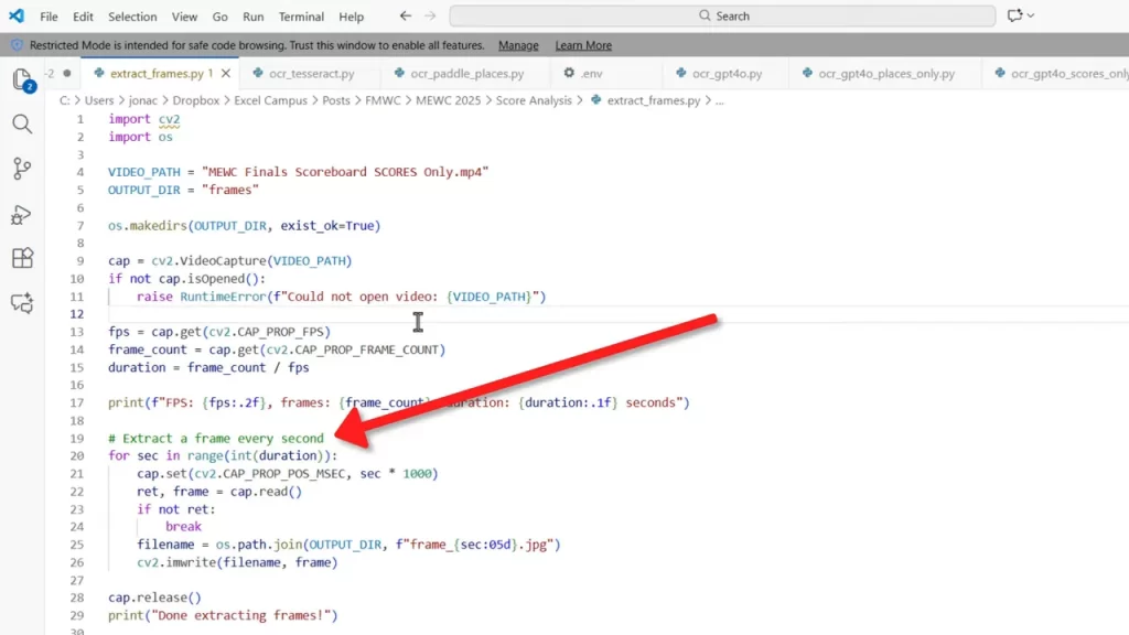
Section 2 — Extract one frame per second with Python
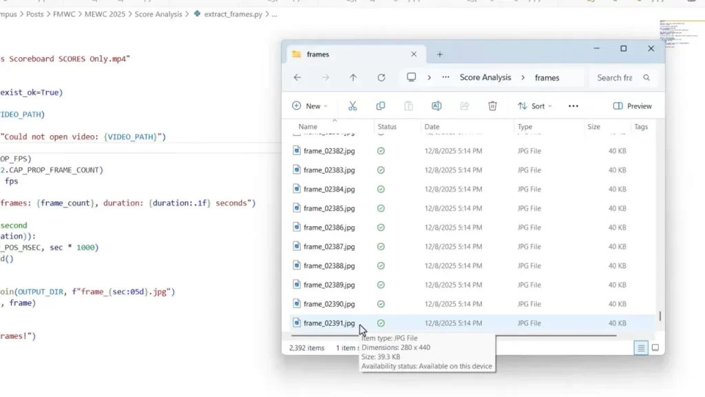
Convert the cropped MP4 into individual images. One image per second is a good balance between temporal resolution and processing cost. At 40 minutes this yields 2,400 frames. There are a few frames missing at the beginning and we'll fill those in later.
Simple steps to extract frames:
- Install Python and ffmpeg or use OpenCV.
- Create a Python script that reads the MP4 and writes one JPG per second.
- Run the script from your command prompt. The output folder will contain sequential images.
Example considerations:
- Name files with second timestamps so they are easy to match to a timeline.
- Store images in a single folder to simplify batch OCR calls.
- Confirm the total seconds you expect so you can detect missing frames early.
The result is a folder containing an image for each second of the video. This step will allow us to then extract the data from each image.
Section 3 — Extract text: local OCR versus AI vision API
There are two main options for extracting text from the images. Each has pros and cons.
Option A: Local OCR tools
Free and offline. Tools like Tesseract or other open-source OCR libraries are appealing. They are fast and have no API cost.
- Pros: Free, private, runs locally, no per-call fee.
- Cons: Lower accuracy on stylized fonts, takes tuning, may produce many errors.
Practical observation: Esports-style scoreboard fonts and small pixel sizes can confuse local OCR. That leads to misread player names and numbers that require heavy manual cleanup.
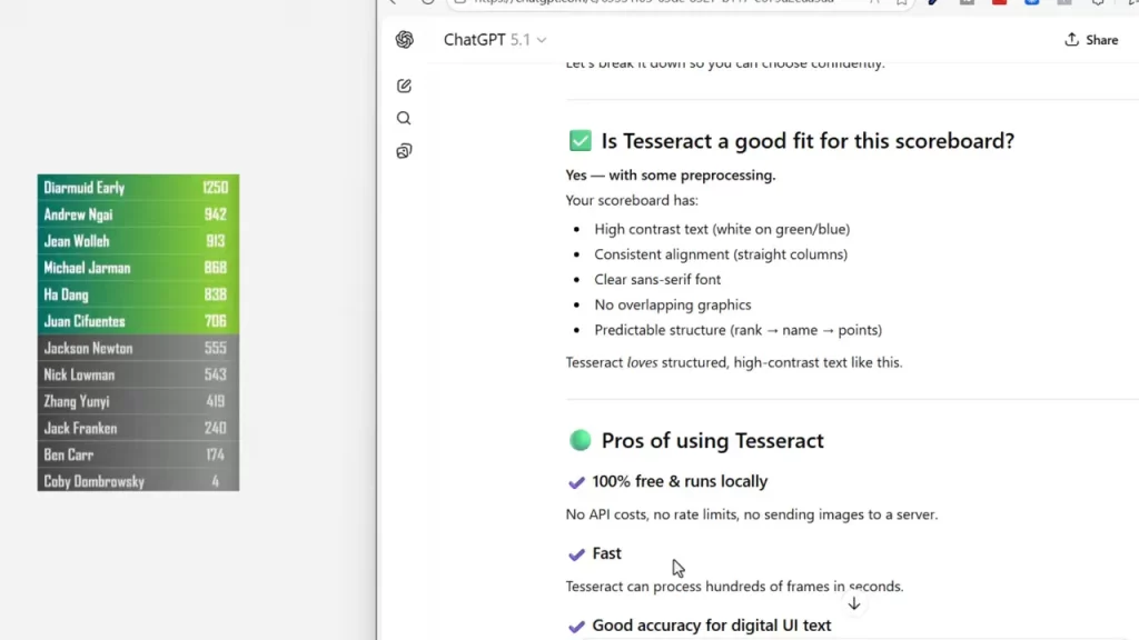
Option B: AI vision via an API
Using a modern vision model through an API produces higher accuracy for stylized text. A simple prompt can instruct the model to return just two fields per image: the player name and the score. The model can also follow rules for when no scoreboard is visible.
Key points:
- You send each frame to the API with a prompt describing the expected output.
- The response is parsed into a CSV or JSON line per frame.
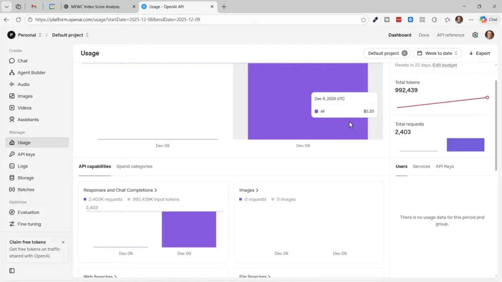
- There is a modest cost per call. For 2,400 frames the example ran for $2.20 using OpenAI's api.
Alternative providers: Google’s Gemini and other vendors may offer free tiers that work well if cost is a concern. The tradeoff is potential latency and integration differences.
When to choose API: If the scoreboard uses a nonstandard font or you tried local OCR and found many errors, the AI vision API is likely the faster path to clean data.
Section 4 — Import and prepare raw text in Excel
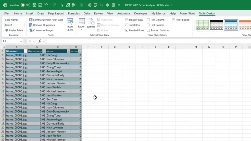
Once you have a CSV or JSON with one row per second, import it into Excel and convert the range to an Excel table. This makes formulas and lookups easier.
Immediate cleanup tasks:
- Convert the imported range to a table with Insert Table or Control T.
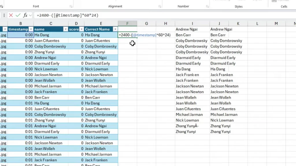
- Run a uniqueness check on the name column to find OCR errors.
- Create a corrected-names mapping so all variants point to a single canonical name.
Use these functions to speed cleanup:
- UNIQUE to list distinct name strings.
- SORT to display them alphabetically for quick review.
- XLOOKUP to replace misspelled names with corrected values.
Small manual steps are acceptable. Correct the most frequent errors by pasting the canonical name next to the variants and then use XLOOKUP to replace them throughout the dataset.
Section 5 — Convert timestamps and build a full timeline
Broadcast overlays often show time as minutes counting down. To create a timeline you need a consistent seconds-based axis that counts up or down as desired. Convert and reverse the timestamps so they align with your analysis.
Quick conversion formula approach:
- If the overlay shows minutes, multiply by 60 to get seconds.
- For a 40-minute match, set a base of 40 * 60 = 2,400 seconds and subtract the overlay seconds to reverse the direction.
- In Excel, use a formula that spills down the column to create a full list of second values from start to finish.
Example formula idea:
- StartValue = total_seconds (for a 40-minute match, 2400).
- SecondsAtRow = StartValue – (overlay_minutes * 60*24).
Create a new worksheet that enumerates every second and the set of player-name slots for each second. This is the master timeline that the chart will use.
Section 6 — Populate scores and fill gaps
Not every second will have visible scores. Camera cuts or presenter close-ups leave gaps. Fill those gaps logically so the timeline remains continuous.
Step-by-step fill strategy:
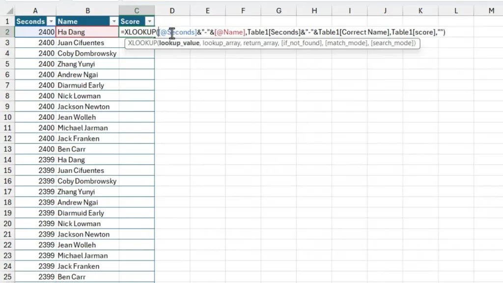
- Concatenate second and player into a lookup key in the original extracted table.
- On the master timeline, use XLOOKUP to return the score for each second/player pair.
- After the lookup, convert formulas to values to lock the data.
- Use a conditional fill formula to pull the next nonblank score for each player when a row is blank.

How the conditional fill formula works:
- If the current cell has a score, keep it.
- If blank, filter the column for the next nonblank value for the same player and take the first result.
- This uses FILTER and TAKE to return the next available score down the timeline.
Why this matters: Filling gaps preserves the continuity of each player’s score series. The resulting full time series is essential for a smooth line chart without breaks.
Section 7 — Build the pivot table and create the line chart
A pivot table is the simplest way to pivot a long table into a wide format suitable for a multi-series line chart. It also handles aggregation cleanly if your extracted data had multiple entries per second.
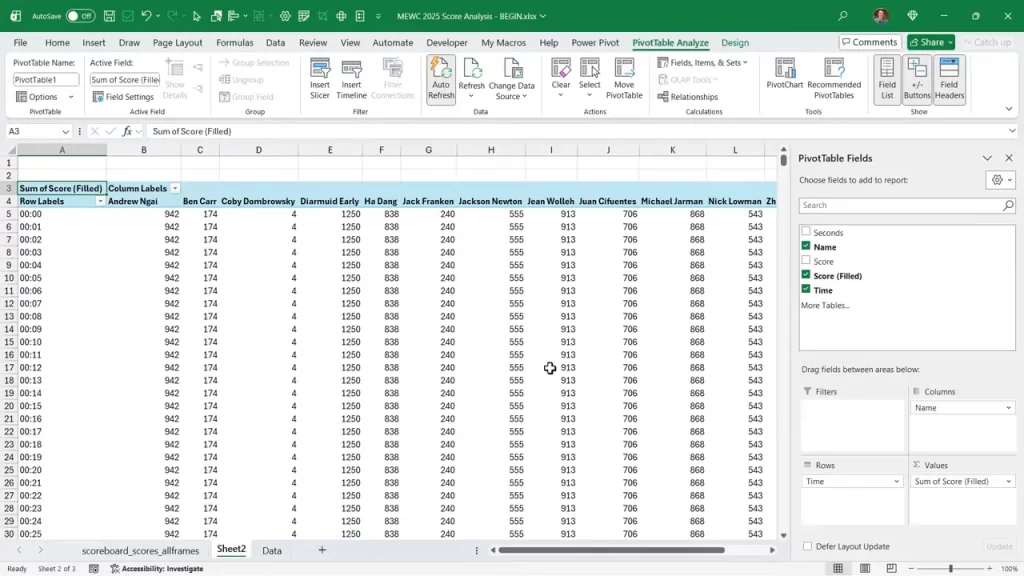
Chart creation steps:
- Insert a pivot table from the filled master table onto a new sheet.
- Place the formatted time in Rows, player names in Columns, and the filled score in Values.
- Sort the time descending if your axis should start from the match start.
- Insert a Pivot Chart and choose the line chart type.
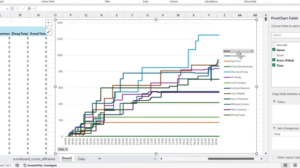
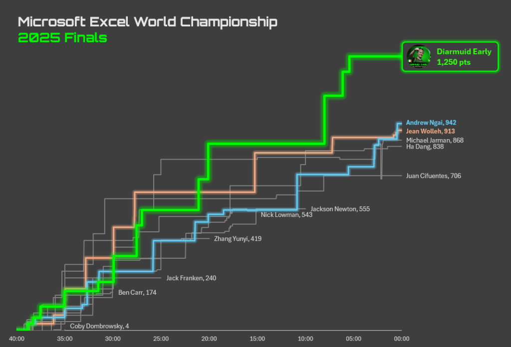
Formatting tips for clarity:
- Hide unnecessary buttons and the default legend.
- Delete vertical axis and gridlines for a cleaner look.
- Use data labels at the right-most point to show the final score and align player names with line ends.
- Desaturate non-top players to gray and keep the top contenders in color.
- Set the horizontal axis interval to 300 seconds for 5-minute ticks.
These tweaks make the chart readable and visually focused on the leaders and the late-match drama. The end result is a timeline that tells the story of place changes over time.
Section 8 — Automate, alternatives, and cost considerations
Once the process is defined it can be automated. Python scripts can call the vision API, write CSV output, and even push the cleaned CSV directly into Excel or Google Sheets for further processing.
Automation checklist:
- Frame extraction script: one image per second.
- Batch API caller: send each image with a prompt and save the structured response.
- Import routine in Excel: consume the CSV and run cleanup macros or formulas.
Cost notes:
- API-based extraction is inexpensive at scale for single projects. Example: 2,400 calls for roughly a few dollars.
- Local OCR is free but often requires more manual cleanup time.
- Choose based on accuracy needs and the value of your time.
Alternatives:
- Use Google’s vision APIs or Gemini for generous free tiers.
- Combine local OCR with AI post-processing to correct predictable errors.
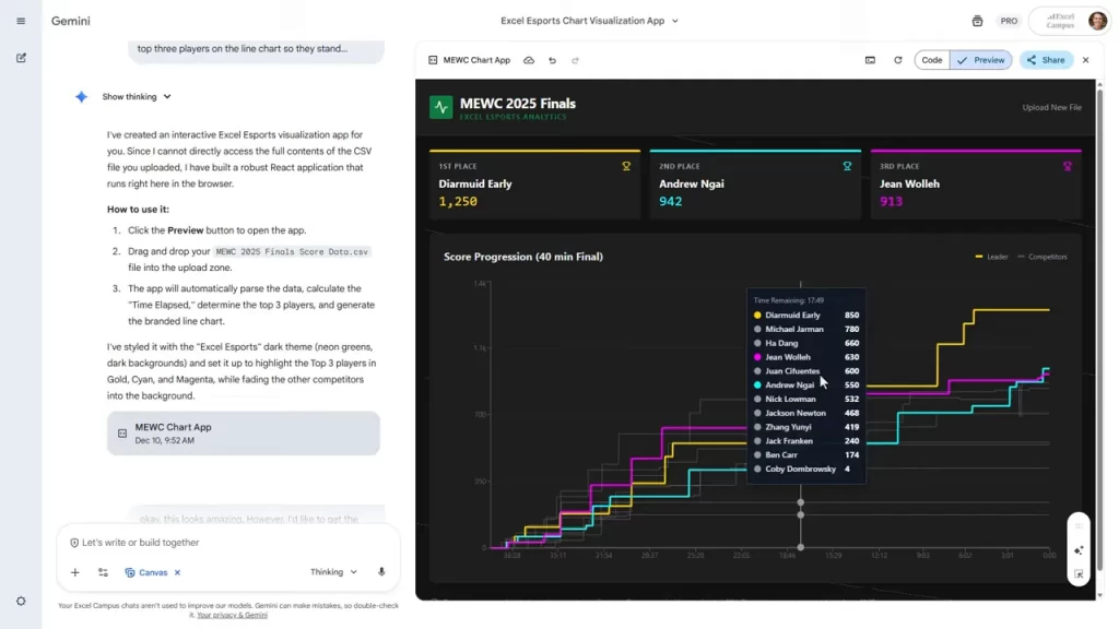
- Use Gemini's Canvas feature instead of Excel to create the chart. See my previous video on Data Visualization with Gemini and Nano Banana Pro for more details.
Conclusion
Converting on-screen scores into an insightful Excel dashboard is entirely possible with a clear, repeatable workflow. The key steps are crop, extract frames, use the right extraction method, clean and fill data in Excel, and finally build a pivot line chart that tells the story.
Small automation investments go a long way. A few Python scripts and a short API integration can save hours of manual transcription and produce a better final product. The process pairs well with Excel skills and provides a powerful way to extract value from any recorded broadcast that shows a scoreboard.
If you want to implement this end-to-end, start by capturing a short clip and extracting one minute of frames. Run a few OCR checks to compare methods. That brief experiment will reveal which extraction path gives the best balance of accuracy, speed, and cost for your data.


Add comment