Have you heard about Power BI yet?
No, it's not the name of a new energy drink. Although, it will probably add a lot of electricity to your morning and/or afternoon. 🙂
The BI stands for Business Intelligence, and Power BI is Microsoft's FREE new tool for visualizing data and creating interactive dashboards.
Power BI enables us to:
- Bring data together from multiple sources including Excel, databases (SQL, Oracle, SAP, Salesforce, Dynamics, Facebook, etc.), the web, and more.
- Clean and transform the data to create relationships between data tables.
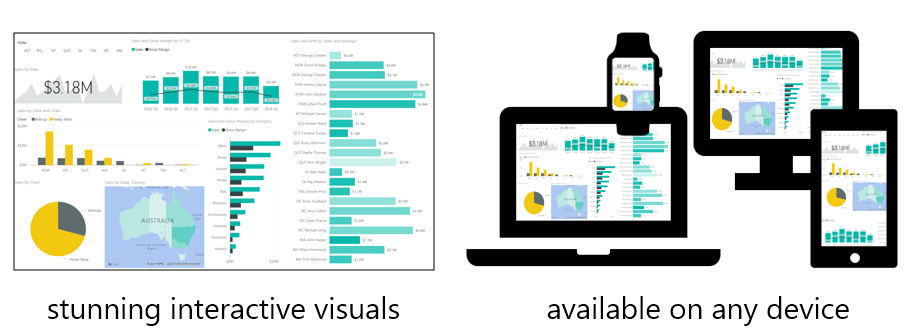
- Create interactive reports and dashboards that are accessible on any device including computers, phones, tablets, and even Apple Watch.
The reports can be refreshed any time with new data, and we can also schedule refreshes to happen automatically.
Power BI is the future of how we will analyze, present, and share data. It's a revolutionary new tool that provides us with a lot of opportunity.
As Excel users, we are fortunate to be living through this revolution. Thousands of companies have already starting adopting Power BI as their business intelligence solution.
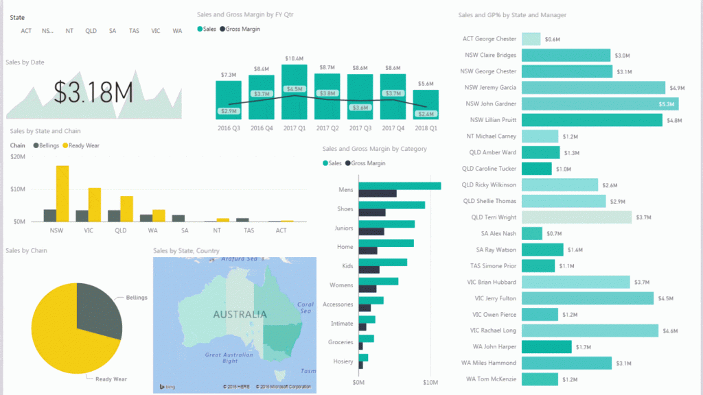
Power BI uses Excel technologies we are familiar with like Power Query and PowerPivot. It combines these awesome tools, and adds an incredible charting and visualization layer on top. This provides a beautiful interactive experience for the end user to discover new insights about our data.
The best part is that Power BI is absolutely FREE. This includes:
- The Power BI Desktop App that we can use to connect to our data sources, transform our data, and build our dashboard reports.
- We then upload (sync) the report books to the PowerBI.com service to share with our co-workers. The dashboards can be viewed on any device.
If you are currently creating reports and dashboards in Excel, and struggling to figure out a way to update and share these reports, then I recommend checking out Power BI.
The Power BI Dashboard & Data Online Course
To share in all the excitement around learning this new tool, I created an online mini-course on Power BI.
It's called The Power BI Dashboards & Data Course. In this course you will learn how to get & transform data from multiple sources and create interactive reports & dashboards in Power BI.
We walk through how to create an entire dashboard based on a few data sources from a company called Mammoth Mountain Ski Resort.
We bring data into Power BI from the following sources:
- Historical weather snowfall data from Mammoth's website.
- Post data from Mammoth's very popular Facebook page.
- Sales data from Excel.
- A calendar table with fiscal & calendar year calculations.
- Geographical data from Google Earth for interactive map visuals.
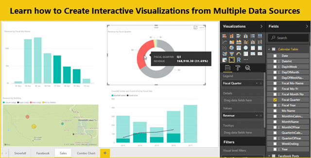
You will learn how to create relationships between data sets, which allow us to create charts and visualizations that compare data from multiple sources. We analyze trends in weather data, Facebook activity, and sales performance for Mammoth, to gain some pretty interesting insights about their data.
This mini-course follows my same simple step-by-step approach to learning. Each video is short in length, and focuses on a single topic. We start with a blank Power BI workbook at the beginning of the course, and build the dashboard one step at a time.
Click here to register for the Power BI Dashboards & Data Online Course


