Bottom line: Learn how to quickly create an interactive dashboard using pivot tables and pivot charts. It's easier than you think!
Skill level: Beginner

In video #1 and video #2 we learned how pivot tables and pivot charts work. I explained all of the basics to get you started. Then we saw how to use pivot tables to quickly investigate your data and answer questions about your business.
In this video we finally help Andy put the dashboard together. This dashboard will help communicate our findings and tell a story about the performance of our business. Plus, the boss will LOVE it! 🙂
The great part about using pivot tables and pivot charts is that they are very easy to update. When next month rolls around, we simply paste the new data to the bottom of our source data sheet, update the source range, and hit the Refresh button. It will only take a few minutes a month to maintain.
Video #3 – Building the Dashboard
Download
Download the file to follow along.
Topics Covered in the Video
This video is packed with tips for working with Pivot Tables and Pivot Charts. Here are some of the topics covered.
- The Report Filters area explained.
- Group dates into months and years to create a summary trend report and chart.
- Group amounts to create a distribution chart (histogram). One of my favorites!
- Resize all charts to be the same size.
- Prevent charts from resizing when column widths and row heights are changed.
- Add slicers to make the dashboard interactive.
New Features Added to PivotPal
Based on the responses from the pivot tables survey, I added a new feature to PivotPal.
If you are frustrated with having to change the layout settings for your pivot table every time you create one, then you are not alone!
Pivot tables have over 30 options and settings you can choose to get your pivot table looking and behaving the way you want it. These are some of the settings you probably change frequently:
- Turn off the automatic subtotals and grand totals
- Show a zero for empty cells
- Turn off the autofit column widths
- Use the classic pivot style
This usually requires you open the pivot table options menu and click different checkboxes on/off. That menu alone has 6 tabs of options.
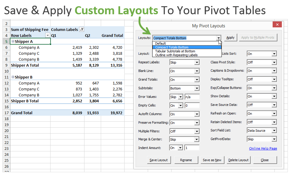
To help save time with this I added a new feature in PivotPal called “My Pivot Layouts”.
This feature allows you to create custom layouts with your favorite settings and options, and then quickly apply those settings to any pivot table with the press of a button.
The nice part is that you can create as many custom layouts as you like. Some pivot tables you might want to format to look like a financial report, other times you might want it to look like a tabular format with repeating labels. These layouts can all be saved and applied anytime with this feature.
See it in action in the video below.
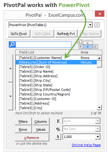
PivotPal now works with PowerPivot!
I have a PowerPivot data model that has 8 tables and 226 fields in it! You might have even more than that. Using PivotPal with these large models makes it extremely fast to find fields with the Search feature, and then add them to your pivot tables.
PivotPal is now available!
Click here to learn more about PivotPal!
Additional Resources
- In part 1 of the series we learned how to setup our source data and create our first pivot table and chart.
- In part 2 of the series we learn how to use the different calculation types to investigate our source data.
If you aren't already, subscribe to my free email newsletter to stay updated.
Please leave a comment below with any questions or suggestions. Thanks!


Exvellent
Hi Jon,
I must say that your lessons are insightful. Thank you and keep up the good work.
Regards,
Flavio
Hi jon!
These videos have been so extremely helpful to me in preparation for a new job opportunity. I did have a quick question/issue i’m running into with the 3rd video follow along packet. The beginning of the video where you’re separating the sales by region, i have all my pivot table fields set to the correct field names however my tables and graph aren’t changing to show the order dates in detail. It only lists Jan-Dec with a grand total. Any advice?
Source data is different. Download the Part 3 Excel file and it’ll show up as in the video.
Hi Jon
Thanks for the great training videos. These turn an onerous task into an easy one and produce a very usable dashboard!
Hi Jon,
Your unselfish act is greatly appreciated.
Thank you so much.
Thanks for share me this video and data
great video
Thank you so much for the informative videos! They are extremely helpful!
Thanks Jon for such wonderful videos. These are extremely helpful. Do you have courses on making advance charts in excel?
Thank you Shobha! I’m happy to hear it helped. I do cover charts in our Elevate Excel program. We mostly cover basic to intermediate charts and I explain why in the section on data visualization principles and making the charts easy to read/consume.
I hope that helps. Thanks again and have a nice day! 🙂
i love your videos
Jon – Thank you for these videos. Great refresher on Pivot Tables and Dashboards for an interview that I have later this week. Appreciate how easy to follow you make everything.
I have really enjoyed your lessons. I have been tasked with making excel spread sheets where the information was downloaded from a medical software. My issue is; I have to generate several different types of reports in the software, download to excel, but it creates new worksheets for each report. I created one sheet with all the data but I have to make new charts from beginning to end each and everytime and its so time consuming. I need to make these reports monthly. Can you help me figure out how to make this beneficial and less time
very informative i enjoy watching and learning
You have explained all things easily .
I was struggling for Dashboard but the way you have taught I have learned very well.
I like your Excel Campus videos
Please upload more videos regarding PPT also.
Great videos on Pivot Tables. This was a refresher for me but I also learned about Pivot Pal. You made it very easy to understand. Thank you.
Thank you Deb! I appreciate your support. 🙂
Hey Jon.. The tutorials are highly beneficial, but the excel file is not the same one you are working on.
Artwork. All in one place: knowledge, methodology, technology.
I am like a primary school teacher now during Corona working and sending on youtube homework assignments. It is not clear to me how you manage to be so concise, informative and even and all in 15 minutes.
As you said in the beginning of Part -1, I was too scared of Pivot tables. I will feel the people who use pivot tables must have some great IQ. But thank you John for making it so simple to learn. I am going to use your tips and create a dash board for my presentation. Thanks a lot.
This is simply super
Thank you Jon! Excellent videos. I can said now I know Pivot table.
Thanks so much for these videos. They are great and easy to follow. I watch the videos alongside the practice sheet on a different screen and copy what you do. You’ve given me the confidence to keep going with Excel! 🙂
Brilliant explanation.
Thanks a lot
Thanks Dave. Your video is really helpful and make things lots easier. Great job.
I Like the way you explain pivot table, step by step without any confusion.
I appreciate the explanations I have found here an on several other of your pages, but I have not yet figured out how to solve my problem. I am trying to set up source data so that I can identify how many times X event happened on a Tuesday or the 5th of every month.
We are trying track numbers of users and currently have weekly check sheets that are broken down by time and day of week, but I have dozens of them and want to quickly compare this time last year to this year or Tuesdays to Thursdays or 8:00 AM to 8:00 PM.
There are a lot of variables and I am really struggling with setting up this raw data. Can you help?
Good day sir jon,
Your videos are amazing. Thanks a lot for sharing.
And i just want to ask if you have courses available with certificates?
Thank you.
Even though you did this in 2015, I found it really useful – expertly explained with sample data too. Thank you.
The three video’s were very helpful.
They were understandable and well paced.
I am trying to improve my excel skills, as I look for work.
Hello, I am looking for information regarding how to group fields as shown in the video. Whenever I try to group data the group field label is disabled. How do I enable it?
Thank you so much Jon. I am often called excel queen at work and I thought I was very good at excel but going through your videos I rank myself Zero and I will certainly be an excel queen one day.
I really love your presentations. very precise.
but how do i get assess to your videos for practice. pls help
Your pivot table tutorials are wonderful. I’m new to pivot tables. The Pivot Table Source Data Checklist is a must for beginners. Other instructors should do this as well.
Very informative and easier to understand.
Thanks Jon.
nothing
Couldn’t find the full data set for Video 3. Only found Jan 2015
Thanks so much for this. Very helpful!
nice!
Great content, but I am trying to download workbook to follow along, but is not succeeding.