Bottom Line: Check out the new Microsoft Office theme, see how it's different from the old one, and learn how to migrate to the new theme or revert back.
Skill Level: Beginner
Watch the Tutorial
Downloads
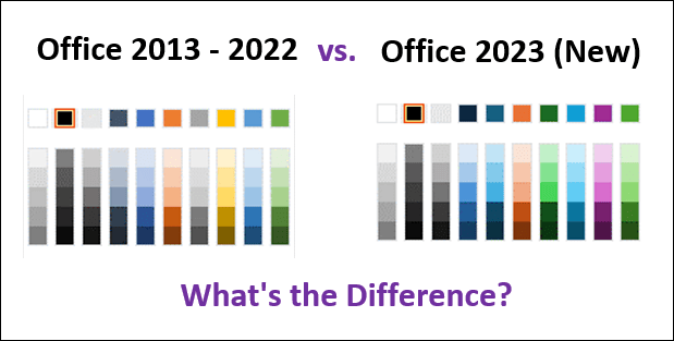
Microsoft's New Office Theme
Microsoft recently rolled out a brand-new theme for its Office products, and—woah!—purple has entered the building!
Flexing some vibrant new colors and styles, this new theme provides a fresh new look for not only Excel but PowerPoint, Word, and the other Office programs as well. Let me showcase some of the differences.
A Refreshed Color Palette
Take a look at this comparison between the old (2013-2022) color palette and the new one. You'll notice that yellow goes away, purple is on the scene, and the muted tones of many of the colors are replaced with more vibrant hues.
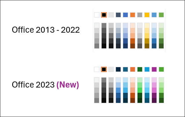
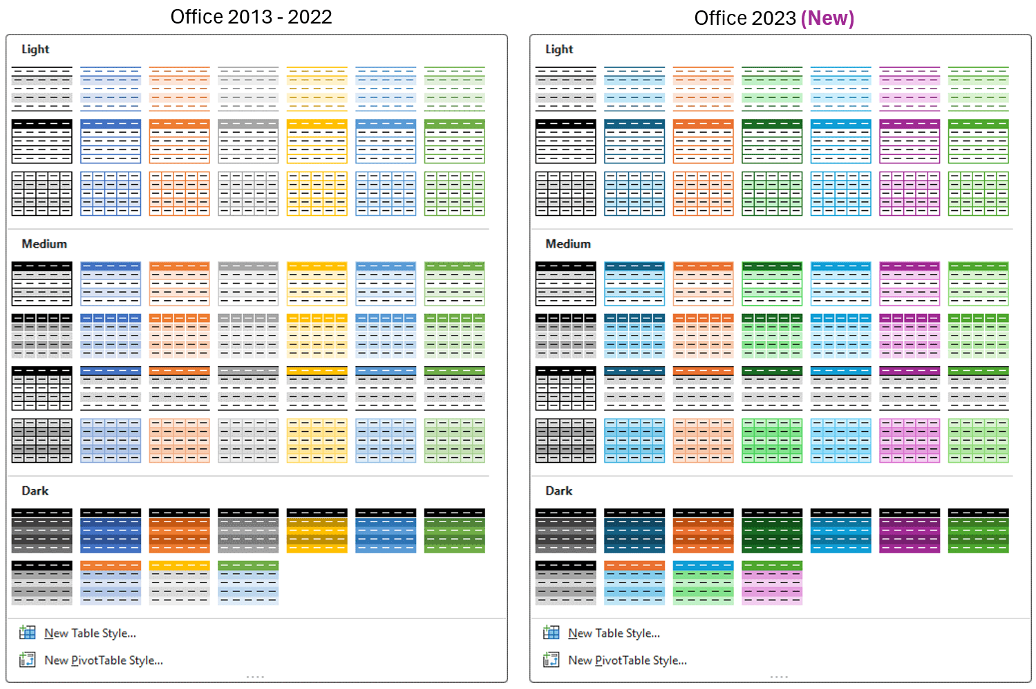
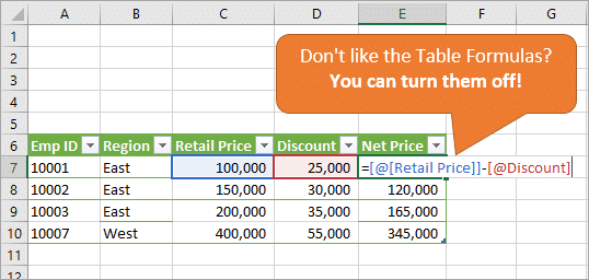
Table Styles
Another noticeable place you'll see the color changes is in the Table Styles menu.
New Fonts
In addition to new colors, there are also new font options. You're sure to notice that the default font for cells changes from Calibri to Aptos Narrow. While these fonts are similar, there are subtle differences such as the serif on the lowercase L to better differentiate it from the uppercase I. You can see what I mean in the word “Illustration” in the image below.
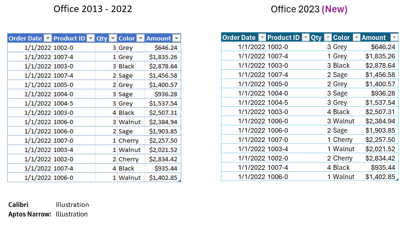
The letters of Aptos Narrow are slightly taller than Calibri, and the overall impression of the new font is a little more crisp, defined, and easier to read, in my opinion.
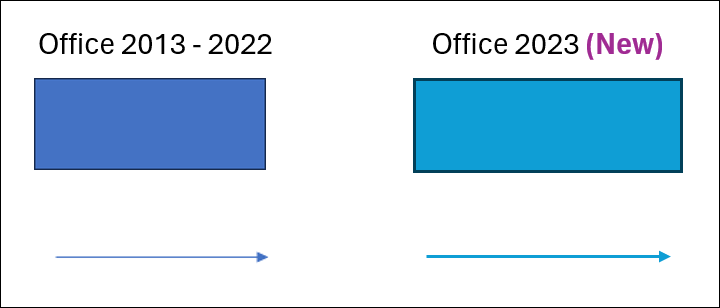
Default Line Widths
Another subtle change is the default thickness of lines on shape borders and arrows. You can see below how the width of the lines is more prominent, making them more noticeable.
Migrating to the New Theme
If you're liking these new changes, you can migrate to the new theme.
Your existing Excel files will not automatically update to the new theme. If you want them to change, you will have to do that manually.
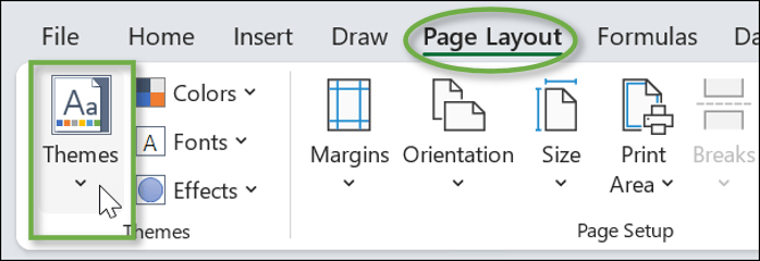
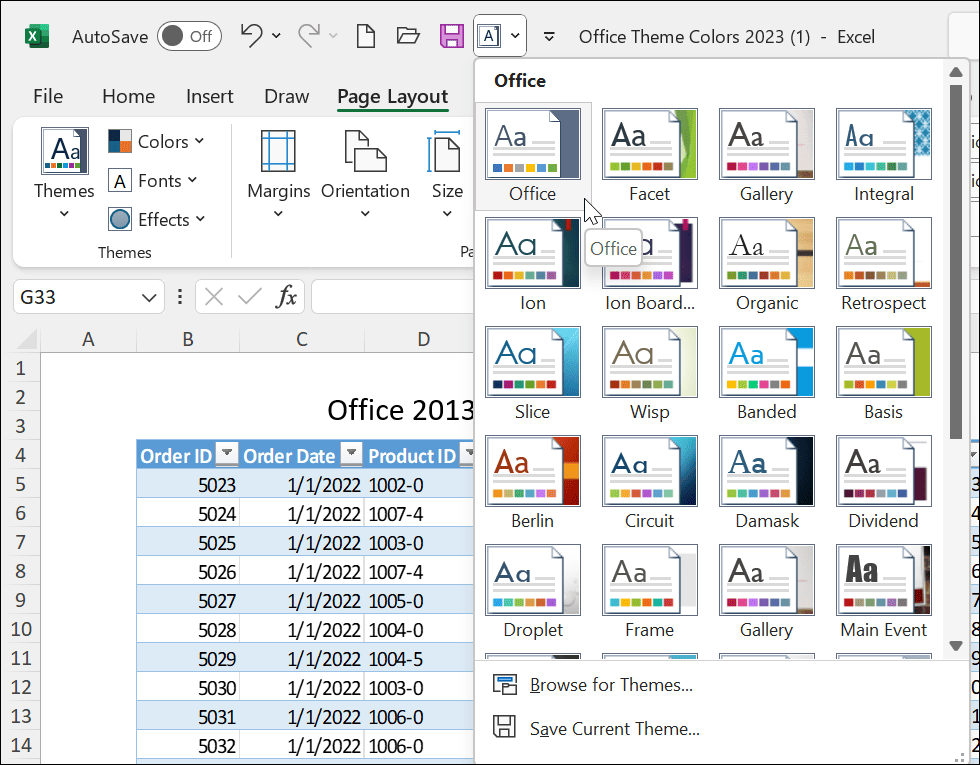
Changing the theme is easy. On the Page Layout tab, go to the Themes menu.
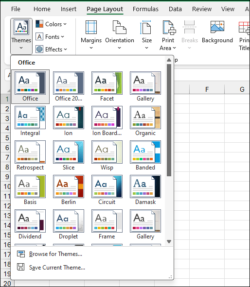
The new theme is simply called “Office,” and the old theme is now called “Office 2013-2022.”
When you update to the new themes, you'll notice instant changes to your colors. I personally think the most drastic is the change from blue to purple.
Reverting to the Old Theme
If you hate the new changes, you do have the option of changing the default theme back to what you're used to. The process is different depending on what Office program you are using.
PowerPoint
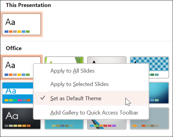
In PowerPoint, you can go to the Design tab and hit the drop-down button to see the menu of themes available to you. Just select the one that says “Office 2013-2022.”
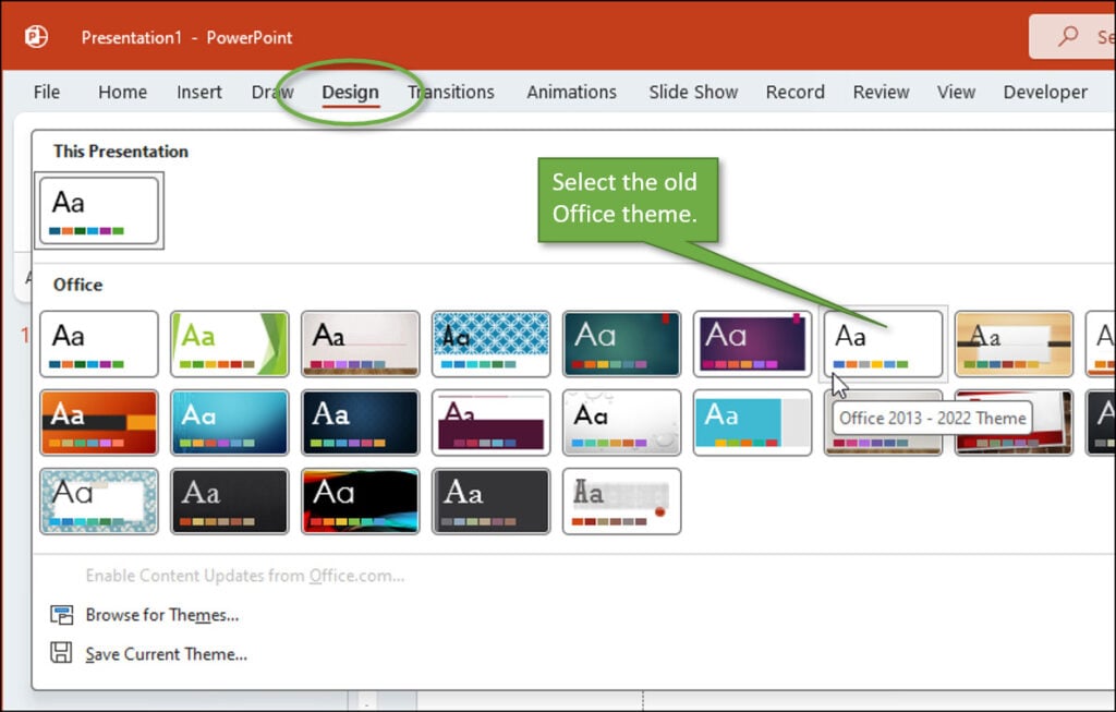
This only changes the existing file that you are in. To make it the default for all of your new files, just right-click on the old Office theme, and select Set as Default Theme.
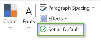
Word
The process is similar in Microsoft Word. Go to the Design tab and select the old Office theme from the menu.
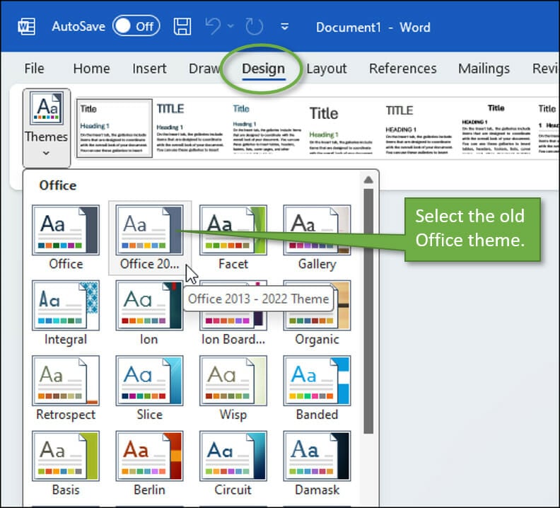
Once you have changed the theme to the old one, click the button on the Ribbon that says Set as Default.
Excel
Unfortunately, setting the old theme as the default in Excel is way more complicated. It involves saving a blank workbook with the old theme as an .xltx template file and then placing that file in the XLSTART folder on your computer. Then you have to create a new workbook using Ctrl + N on the keyboard because navigating to File and then New with your mouse won't work!
To me, this seems like an important fix that needs to be made before the new theme is rolled out to all users. We'll see if that happens.
If you would benefit from a step-by-step video showing you the process I just described, leave a comment and let me know. If there's enough interest, I will create a tutorial.
A Shortcut for Using the New Theme
Personally, I plan to use the new theme across all Office programs. As the new theme rolls out to the masses, there will be a transition time when you'll be copying and pasting between old and new, and vice versa, and you may want to change themes back and forth fairly frequently.
For that reason, I recommend you add Themes to your Quick Access Toolbar so that you can make those changes easily.
To add it, just right-click on the Themes option and select Add to Quick Access Toolbar.
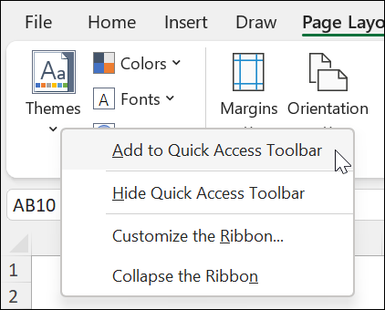
Once Themes is added to your Quick Access Toolbar, you'll be able to make the change instantly, no matter what Ribbon tab you are on.
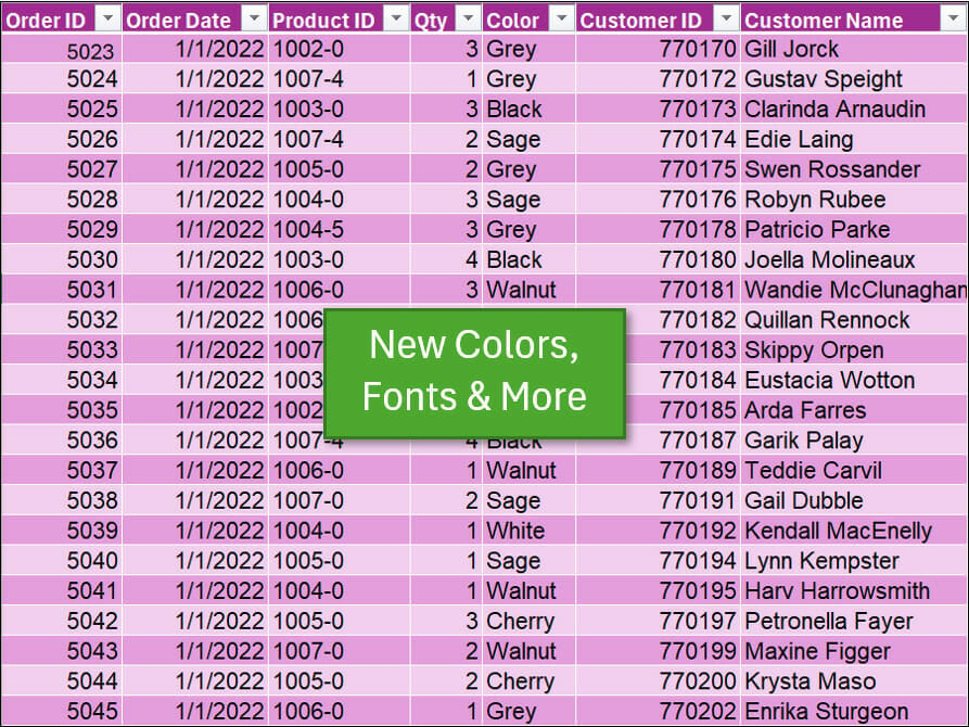
Power Query and Pivot Tables
The Power Query output will still be green in the new Office theme, just a more vivid hue:
And Pivot Tables will default to a more vibrant blue:
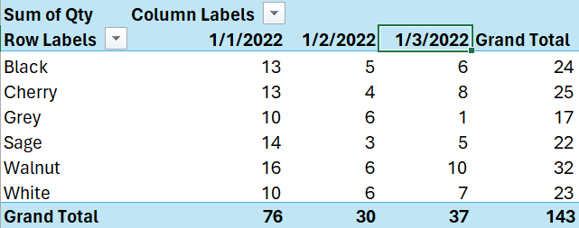
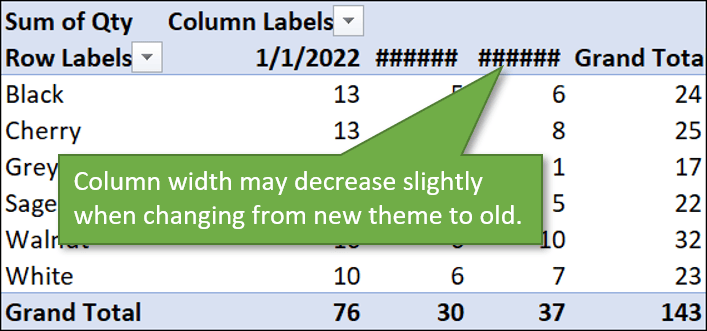
You might also notice with Pivot Tables that if you switch from the new theme to the old theme, the column sizes change slightly, so you might have to adjust the column width if you see any ###### going on.
Your Impressions?
This new theme has not been rolled out to all users yet, and I'm not sure of the timing for when that will happen. You can stay updated on that by following the Microsoft blog. In the meantime, I'd love to hear what you think of the new theme. Do you love it? Do you hate it? Leave a comment with your thoughts about it—or any questions you may have. We love hearing from you.

Overall, it is better with more bright colors and thicker border lines. BUT I would argue that we don’t need 2 greens and 2 blues. I would suggest removing the dark green and replacing it with the old yellow/yellow orange, and also getting rid of the dark blue and replacing it with the old grey. Basing this on color theory, there is a lot of connotation with the use of yellow (as cautionary) and also of grey (to hide, represent as old information), so getting rid of those as initial selections is not actually a time saver. I do like the purple as it adds another different color selection option. Obviously, you can select any color you wish under “More Colors” so it isn’t really a huge issue, but will probably be more of a minor hindrance removing those colors than a minor help. In my eyes, it’s an unnecessary change and the time in developing could have been used for bigger/more important things, but I do support the notion of continuous improvement.
My thoughts exactly!
Interesting. My “test” word, relative to fonts, is “IlLINO1S-0123.” Noto Sans lets me clearly see the different characters.
Thanks for the message, John.
The addition of purple is welcome, though a milder shade would have been pleasanter to work with.
It seems to me that having 3 similar shades of blue and 2 similar shades of green is absurd, just as losing my favourite (yellow, excellent for gentle highlighting) is a great shame. Why not include red or a coffee/tea brown?
Mild colours/tints are generally more relaxing to the eye and therefore easier to work with. Vivid ones may be better for users with lower visibility, such as suffering from cataracts (as I used to).
Awesome. Very vibrant. Luv it to the max.
Hi John,
Well, I cannot say I hate the new theme or love it.
I think this is all in the eye(s) of the beholder and what feelings the data needs to display.
I’m still happy with Office 2021 so … let’s keep it like that for now,
Oh, my! They do seem a bit garish, if I’m honest.
I really love the old theme but over time could grow to love some of the new theme. Love purple, but only on fabrics!
At 1st I loved the updated theme, especially the Black theme on both Excel and Word.
BUT at least in my case, when using the Black theme in Excel – you get a lot of flickering between black and white, when sliding the screen across your worksheet. It doesn’t happen to me on the white theme for instance (because there can’t be flickering between “white to white”).
Does it happen to you guys as well?
Am I the only one who doesn’t have the new theme? I’m on Microsoft365, it says I’m up to date, but it does not appear in the themes window in any of the office programs.
Very irritating!
Same here (both on Microsoft 365, and no new theme). I was wondering if you have to be on an Insider?
Got the update today. I don’t like or hate the new theme. Simply it’s a trouble.
Copying/Moving xls sheets based on the previous theme, creates by default a new-theme-sheet and changes colors and fonts. Complicated sheets with colors are all to be fixed .. and the simplest fix is to change back the theme in the new sheet .. but this way you never really fix the problem, you are just moving it to the next sheet-copy.
Also copy-pasting cells or formats from old sheets to new sheets doesn’t work.
Moreover the update of the template is difficult to implement; eventually it’s working but not automatically .. and any new sheet requires the Ctrl-N.
The tutorial for excel would be a good idea (I had to perform a few attempts before being successful)
Thanks!
I received the new theme this week, and would like to revert for Outlook. My replies have changed font from blue to purple, and while I can revert the theme in each individual message, I can’t revert it permanently. I’m able to change my reply colors in Options, but the color palette is the new one rather than the old, so the “correct” blue isn’t there. Does anyone know how to adjust that in Outlook for all messages, rather than individual?
How come no one (not even Microsoft) has explained how I obtain the new font scheme, colour scheme, the new Office theme that incorporates them, and the new font files (Aptos/Bierstadt and the other four newbies)? For something with such a big fanfare everyone seems to be going out of their way to still keep it a secret! Not all versions of Office do automatic updates; I have Office 2016 which appears to have no interest in obtaining these updates, so I will have to download them from somewhere, but no one is saying where.
I appreciate your article, because I absolutely hate the new font and the new colors.
For Excel … which XLSTART folder? My computer (Windows 11, Office 365) has at least two of those.
When I save a blank workbook, with changed theme, as Book.xltx to C:\Program Files\Microsoft Office\root\Office16\XLSTART, it somehow gets magically moved to C:\Users\[myusername]\Documents\Custom Office Templates\ (i.e. it no longer exists where I saved it). I close Excel, start it again, click on “Blank Workbook” and have the new theme rather than the good old theme.
When I save a blank workbook, with changed theme, as Book.xltx to C:\Users\[myusername]\AppData\Roaming\Microsoft\Excel\XLSTART, it stays there, but trying to create a new workbook as before gets me the new theme.
Being able to set the preferred default theme for Excel seems like such an obvious thing that many people would want to do. Sigh.
I can’t overstate how much I hate this update. The new colours are garish and certainly not to my taste. Who thought this would be a good idea? Why force a change on what is not broken?
No. no. no. no. Change for change’s sake must be discouraged. Why or why does the new theme have a font that makes it look like there is a space between the first and second letters in the formula bar? Maybe someone out there likes that idea, or uses it for something – but it isn’t this user.