Bottom line: It can be difficult to see the variance between two lines on a line chart. In this post I explain some alternative techniques to help highlight variances.
Skill level: Beginner
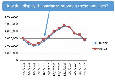
Nic asked a great question. He has line chart with two lines on it and wants to display the variance between the lines.
The variance between these two lines is actually very large in some months (over $200K). But the chart doesn't do a good job of showing it. This is because the scale on the vertical axis is quite large at a max of $6M.
So how can we display the variance better?
Solution #1: Display Variance Percentage on Chart
One possible solution is to add the percentage variance next to the line on the chart.
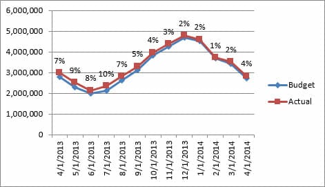
Normally this would be difficult to do, but Excel 2013 has a new feature that makes this easier. In the Format Data Labels menu you will see a Value From Cells option.
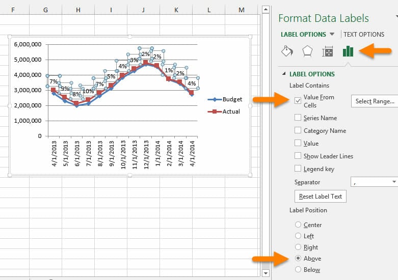
This allows you to select a range of values to add to the labels. For this example I calculated the variance in another column, then chose that column to display on the chart labels.
You can download the sample file below to see exactly how this works.
Solution #2: Display the Variance in a Different Chart
Often times we find ourselves trying stuff too much data in a single chart. I think this stems from putting charts on PowerPoint slides, and wanting to fit everything on a single slide.
However, I'm a fan of creating separate charts to display different metrics. This can really help you understand the trends better, and learn new insights about your data.
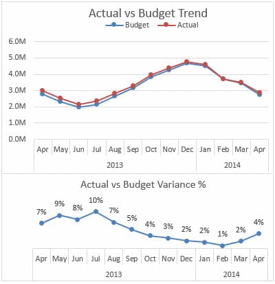
In the image above I put the variance % in a different chart, and placed it below the original trend chart. This allows the reader to clearly see the trend in the variance.
The variance from July to February is decreasing each month, while sales are increasing. This is obviously a seasonal business, and we will probably want to investigate why we outperformed our budget in the slow months.
The charts below just show another way to display the variances in a panel chart. A panel chart is just a group of charts.
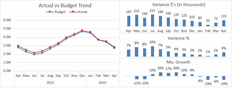
In the panel above I also added a chart that displays the month-over-month growth for the Actuals. This is basically the slope of each line on the line chart, but it is nice to see the actual numbers.
Panel charts like this are great for dashboards. I also have a free macro that allows you to add zoom buttons to each of the charts if you are displaying them on an interactive dashboard.
Download
You can download the file that contains all the charts below.
Ask Your Question
If you have an Excel question you can post it on the Ask a Question page, and I will do my best to get it answered.
How Would You Approach This?
I would love to hear your thoughts on this issue. How would you display the variances between the line charts?
There are a lot of different ways to accomplish this and it would be great to learn from everyone.
Please leave a comment below with your solution. You can post a link to a screenshot or file if you'd like.
Thank you!


Hi Acampora, very nice idea to present variance analysis. But I think download link is different and mentioned as “Variance on Column or Bar Chart Guide” whereas the page is about “Alternatives to Displaying Variances on Line Charts”.
I hope revised link will be available soon.
Asif
Hi Asif, I updated the page with the correct file. Thank you for letting me know!
Please let me know if you have any other questions.
Hi Jon,
i downloaded an excel sheet which was prepared to show the variance between values. i added my extra data in that but the axis is not properly aligned in graph can u help me with that?
Hi Jon,
I would put the variance onto the x-axis. Instead of putting the variance data on Column D, I would put it to Column A so that it goes together with Date on the x-axis. Also suggest to put ▲▼in the format to display variance.
Nonetheless, panel chart is a good alternative!
Cheers,
Awesome! Thanks for the suggestion MF. For those that don’t know, those up and down arrows can be inserted from the character map into a cell on your spreadsheet, then copy/pasted to a custom number format.
Nice suggestions from MF by putting ▲▼in the format to display variance. I would add one more thing in John Mo. Growth Column chart is to show negative variance in red by opting invert if negative. Rest Panel option is just great.
Thanks Asif! That’s another great suggestion!
Hi Jon,
I like your panel chart idea.
Another option maybe to change the scale to start at $1.5M and max at $5.5M so that the variances are clearer. Even Stephen Few would allow you to start your axis above zero in a line chart. It’s column/bar charts that must start at zero.
BTW, the new blog design is nice!
Mynda
That’s a great idea Mynda! Thanks for also mentioning that this should not be done with a column chart, as it can distort the overall scale of the chart.
The variance between these two lines is actually very large in some months (over $200K)
Sure, the absolute variance is large compared to what I get paid. But those two lines are practically making sweet, sweet budget love. So I’d say that the variance is very small to all intensive purposes.
Here’s my approach to something like this: turn one series into an area chart type, and leave the other as a line. Works great when you use mini-charts as sparklines, as per my comment at an old post at Jon Peltier’s place:
http://peltiertech.com/sparklines-for-excel-vs-excel-2010-sparklines-guest-post/#comment-26473
(Jon A – maybe you can insert the actual image here).
@Mynda: I would still keep those axis at zero. I think the distinction between bar and line charts re zero axis is an arbitrary one. About the only time that I have a line chart with an axis not set at zero, I’ll often also have one that is set at zero, so that you can get the true context.